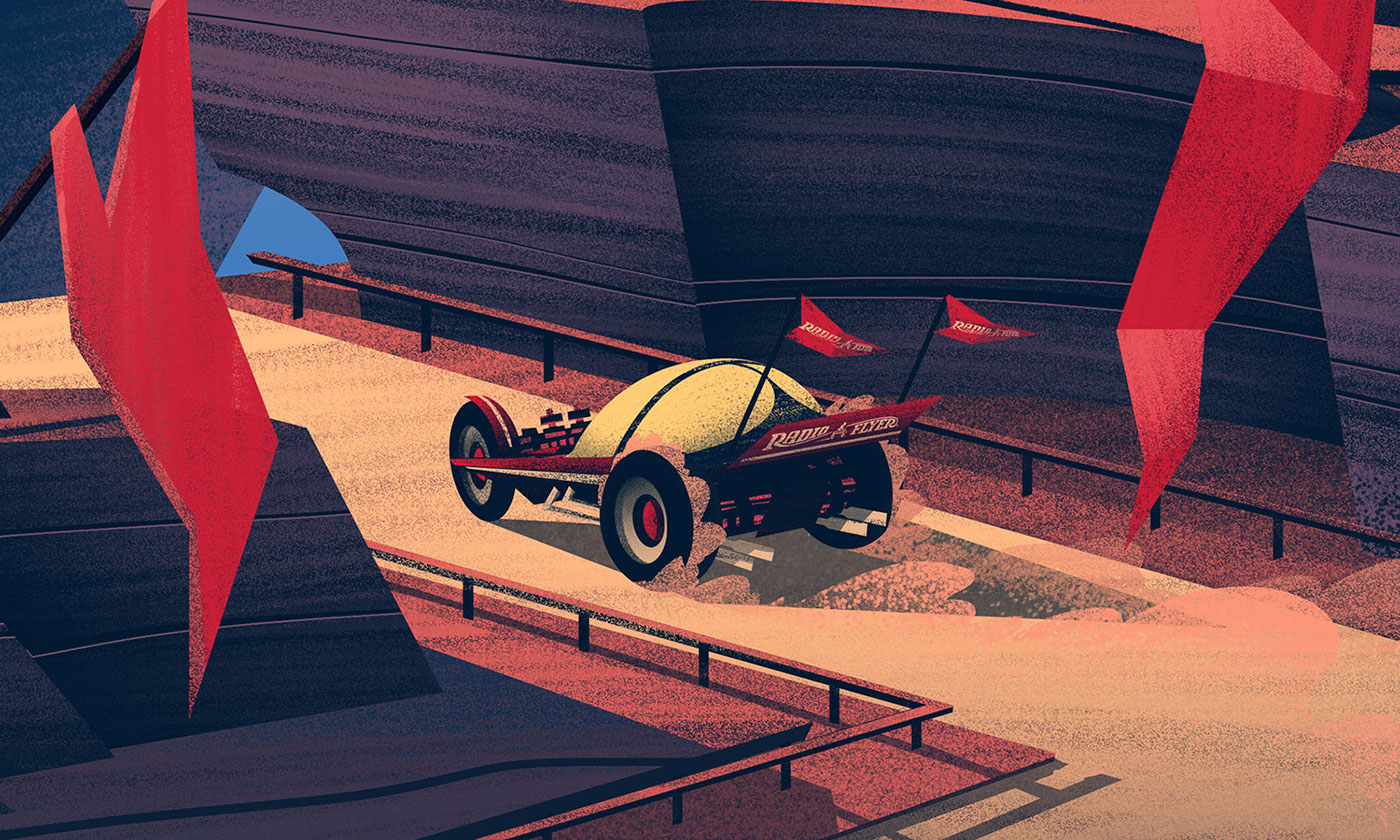
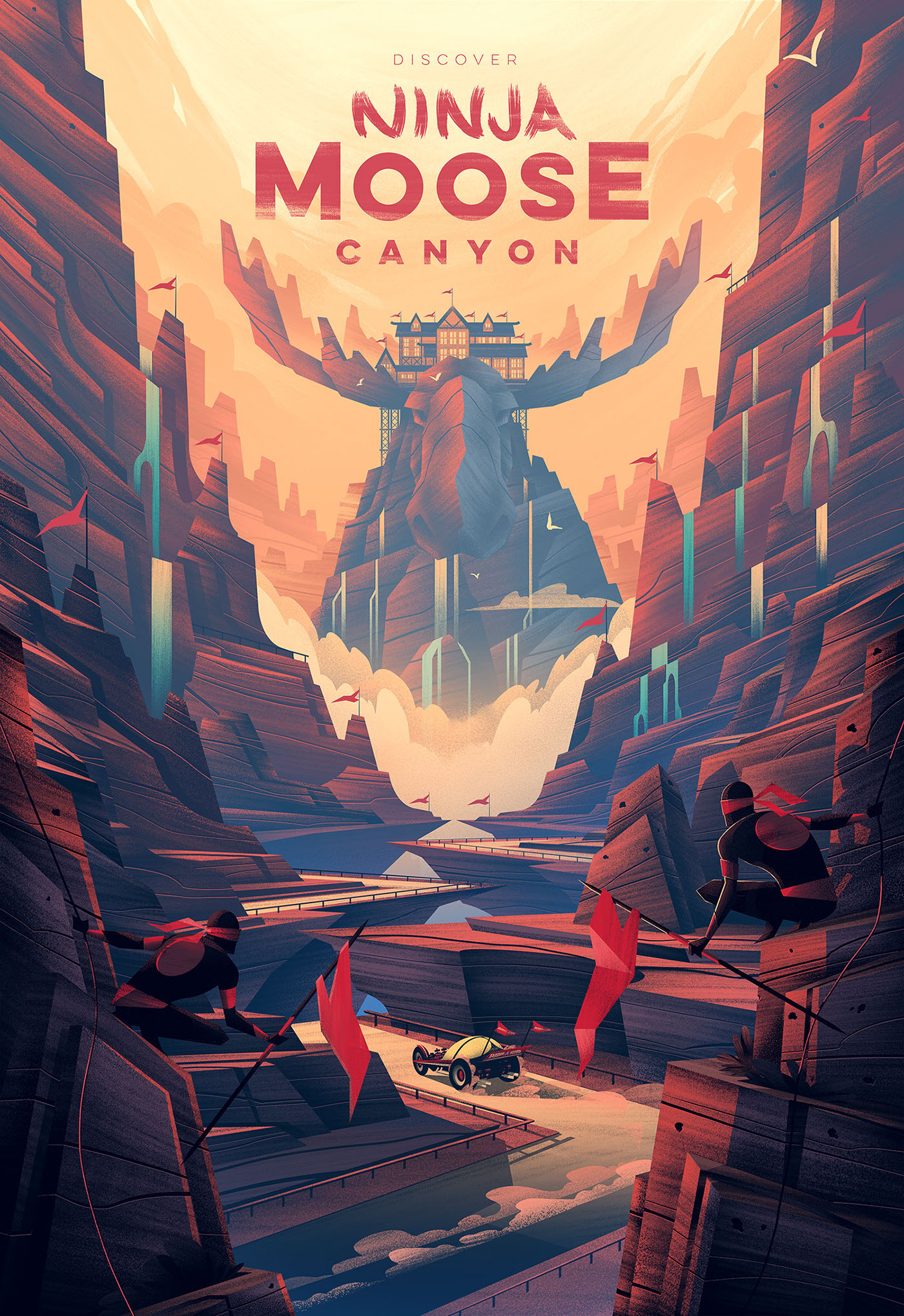
As a parent, and as someone who has vivid memories of his childhood spent racing down sidewalks and streets in a red Radio Flyer wagon, you can imagine my excitement at the prospect of working with SCB on the campaign marking Radio Flyer's 100th Anniversary. The project entailed creating a travel poster for a "Kid's Travel Agency" they were creating. I was part of a group of 10 illustrators tasked with bringing visuals to imaginative destinations such as the Ninja Moose Canyon. So grab your cup of coffee, hop in your red wagon, and let's explore how this piece was made!
Step 1: Concept Sketches
The first step in a project like this is to read, read, and re-read the brief to make sure I'm understanding what it is I'm illustrating followed by conversations with the team I'm working with. For this project, I had the good fortune of working with Kevin Grady from SCB (definitely check out his work - its amazing!). A good brief gives me just enough information to get my imagination churning without being overly restrictive. The brief I got from SCB was a great one: plenty of information but lots of room to explore.
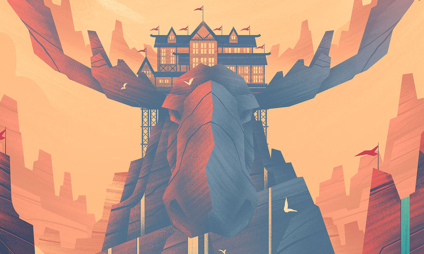
I took to sketching on my iPad Pro + Apple Pencil in my favorite sketching app, Procreate. With the sketch explorations, I wanted to create a larger than life canyon with Ninja's lurking in the shadows as a Radio Flyer racer (the kind I imagined driving in as a kid) rocketed through a track which twisted through the craggy rock cliffs. In the distance I imagined a towering mountain which had a Moose Lodge built on top of it. Kevin had a great idea to turn the mountain into a Moose formed out of rock, which really took the concept to the next level.
When I send sketches to clients, I'll often throw in rough tones to help distinguish some of the forms within the sketch as well as bring just a touch of mood to the piece.

Step 2: Values
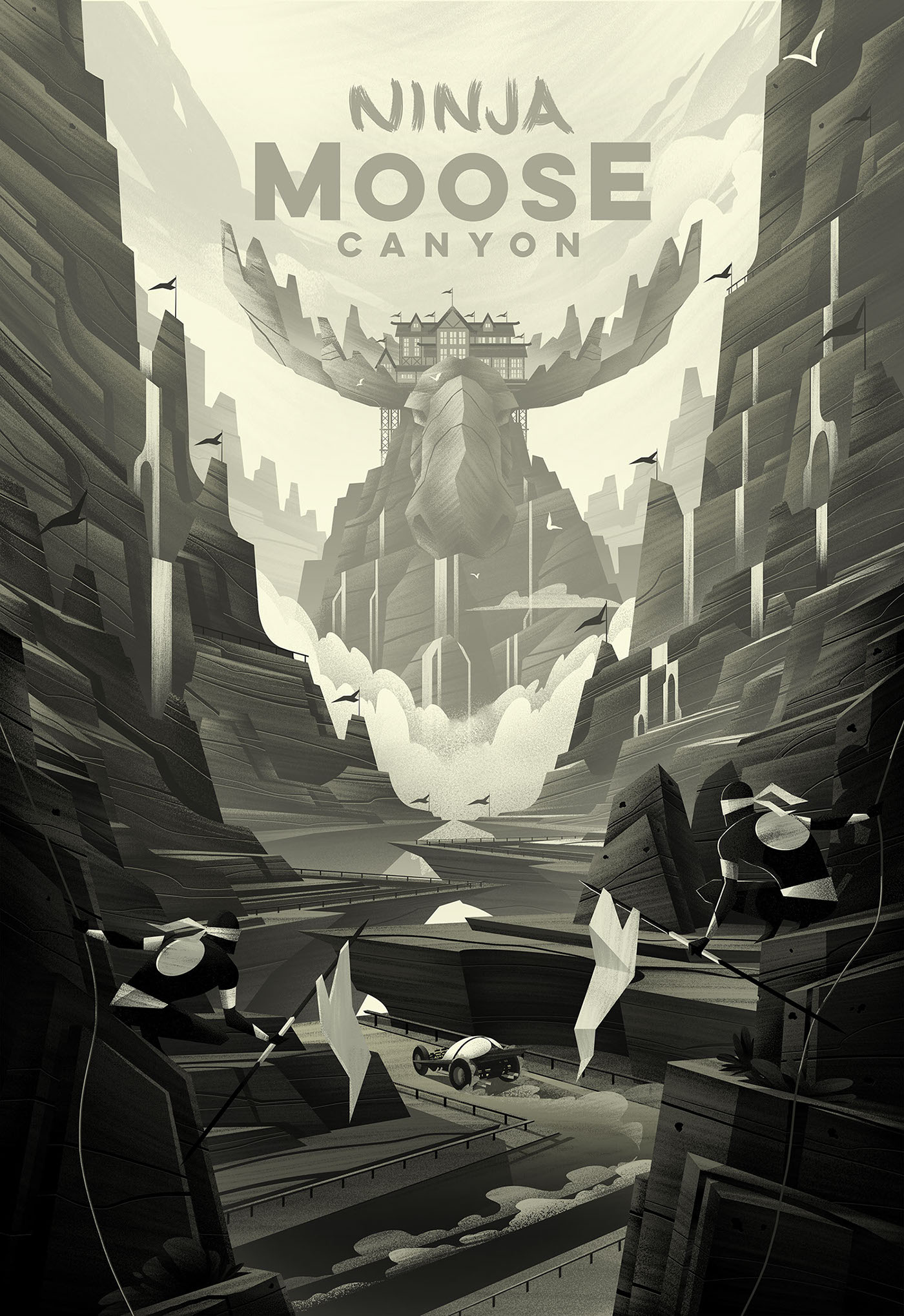
When the sketch was approved, it was time to move onto one of my favorite parts of the process: shape building, brush work, and adding values to the piece. At this point in the process, I'm working at full resolution (typically 300dpi) so I can control where each and every pixel is placed.
Normally I use a wacom cintiq in Photoshop for this process and the subsequent steps to bring the piece to color, but that was not an option this time around. I was having some computer issues which rendered my cintiq inoperable which meant I had to come up with a makeshift solution, and fast! I ended up grabbing an iPad app called AstroPad which seriously saved my bacon (in case you don't know, Astropad basically turns your iPad into a tablet you can draw on with your desktop computer). I used the iPad Pro + Pencil and Astropad to allow me to finish my piece in Photoshop.
Step 3: Color
With the values in place, it was time to move onto color. I wanted to use colors that stayed in the family of colors used by Radio Flyer so that largely determined the direction I was going to head. I was excited to be able to make the sky look dusky and hot as the canyons swept through the scene with touches of blue water tracing the forms of the rocks on the cliff walls. I made sure to keep my ninjas in shadows with just a touch of lighting to bring out their form. From there, the rest is history!
Conclusion
Big thanks to Kevin Grady and his team at SCB. This was a dream opportunity and I am so grateful to be able to contribute. Be sure to check out the posters the other illustrators created - they're fantastic!
Lastly, thanks to all of you who take the time to read my babbling and look at my work. It inspires me seeing how passionate these online communities are about work and I'm thankful to be a part of them.
Take care!