How did this all start?
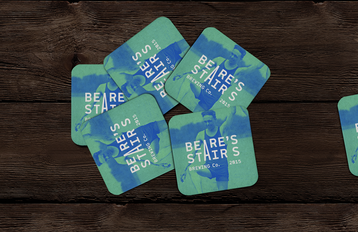
Born from a desire to create some beautiful packaging, Beare's Stairs was a passion project fuelled by our love of Darlinghurst and all things alcohol. The name itself comes from an iconic set of stairs that sit inside the suburb, which were built around the same time as our studio building. A clean and modern aesthetic, slammed together with the world of 100 years ago, celebrating the personalties and people that made Darlinghurst great.
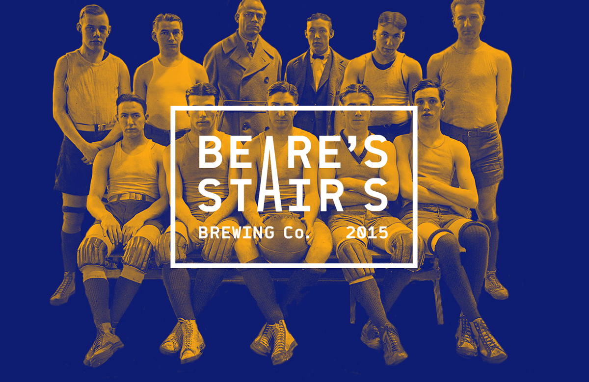
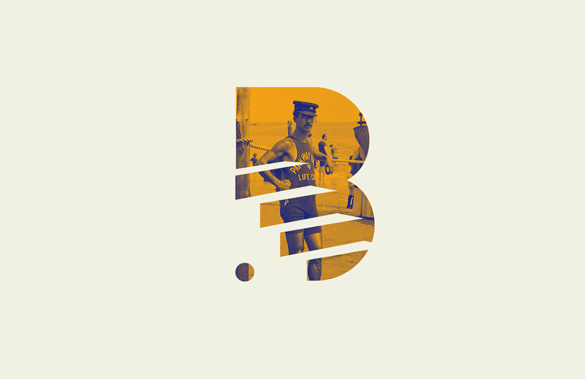
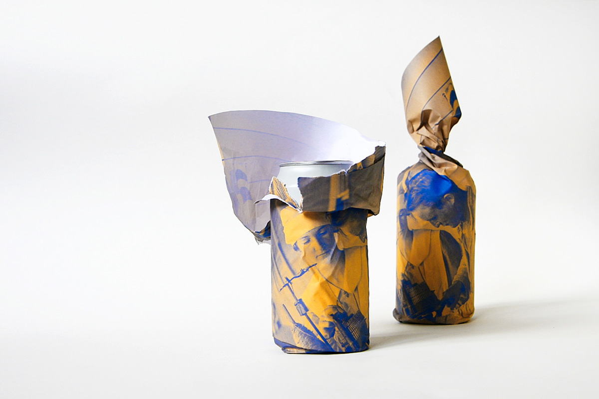
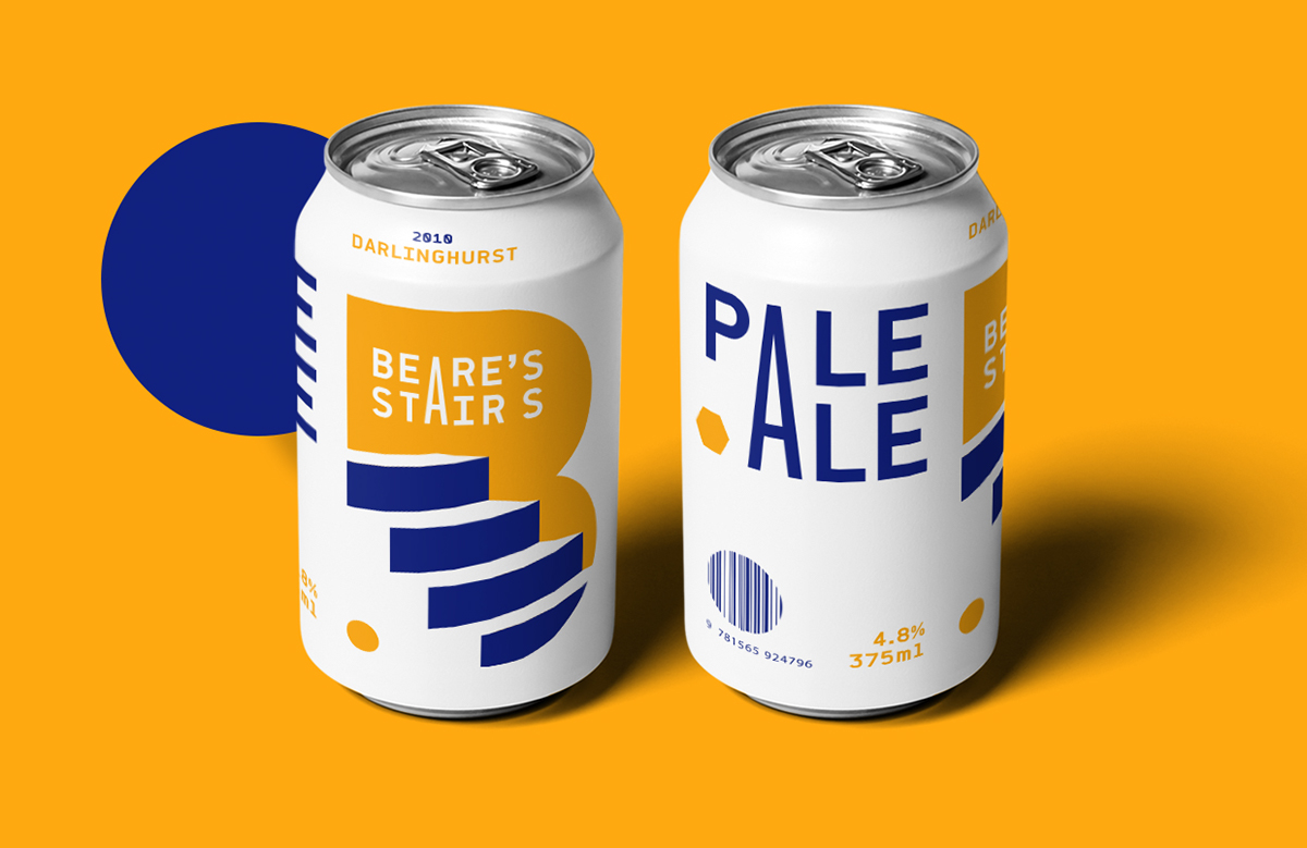
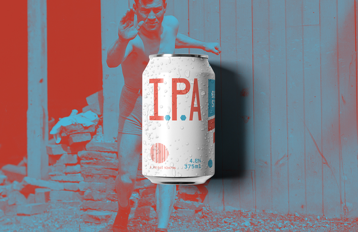
Each of the beers - a pale ale, IPA and Pilsener – was partnered with an archival image of a character that would have walked the suburbs' streets one-hundred years ago. These images, wrapped around the can, would be torn off to reveal the clean, white designs sitting inside. A contrast of old and new. Of photography and geometry.
We wanted something to stand out in a bottle shop and so, choosing the least used base colour, we landed on white. What resulted was a striking beer can design that really held its own amongst the deer-heads, hipster-arrows and old-timey-sailing-boats that adorn every other bottle on the shelves.
To see what some of the big players thought (and to score some free beer) we met with Young Henry's, The Rocks Brewing Company and 4 Pines. It was an insightful exercise, and one that cemented a lot of what we were thinking when we first set out on the project.
All we have to do now is start our own micro-brewery, start selling cases out of the studio and then make our way to market domination.


