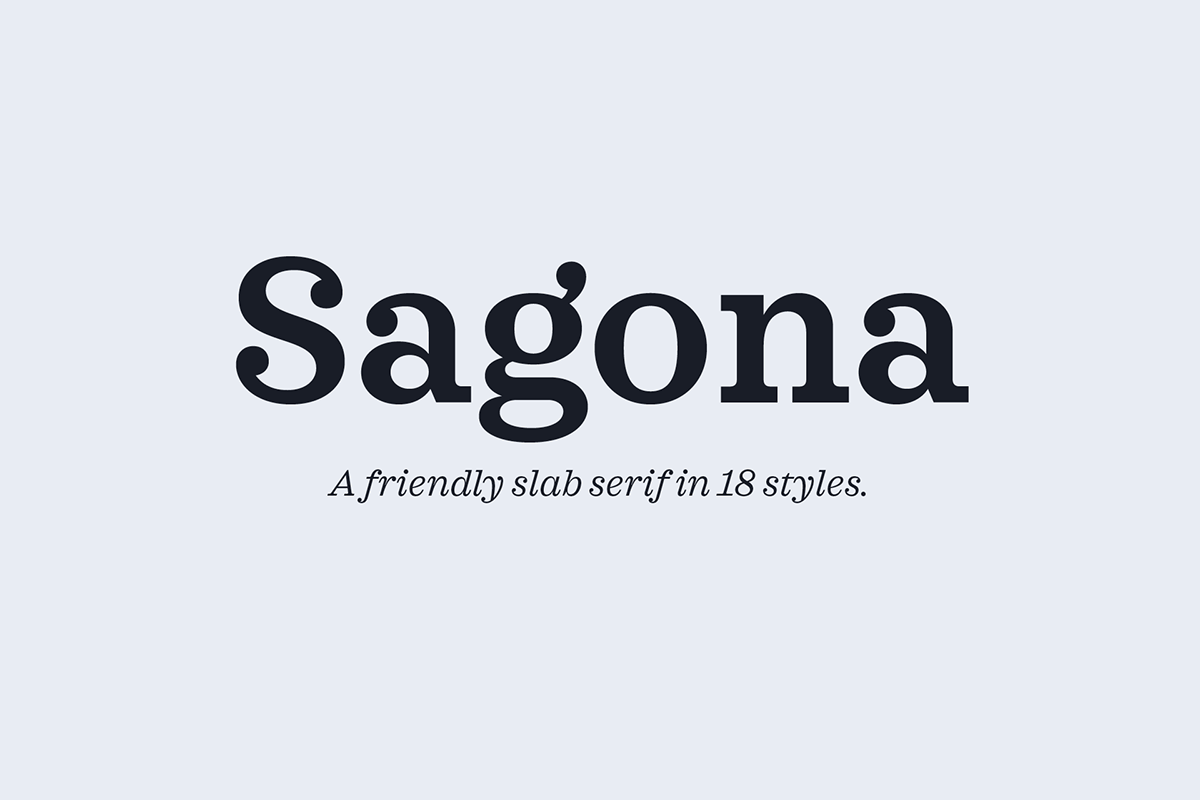
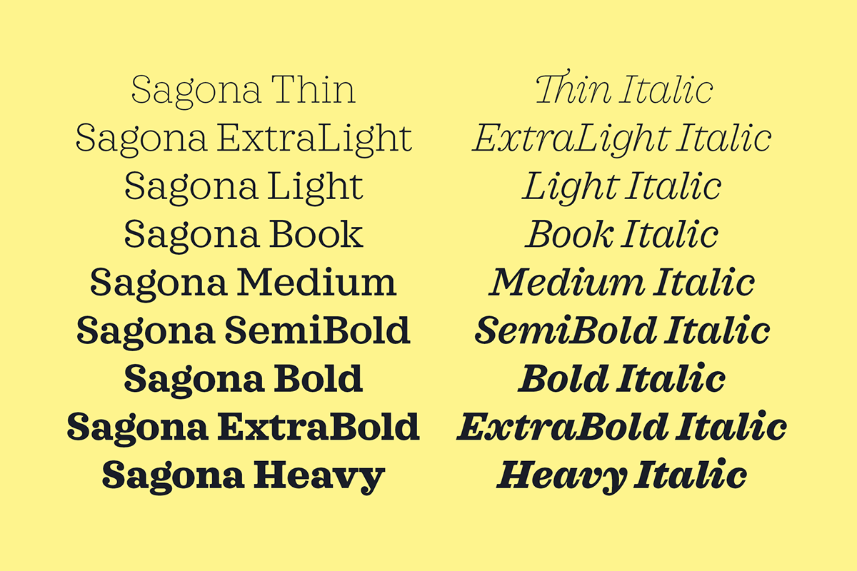
Sagona.
A friendly slab serif.
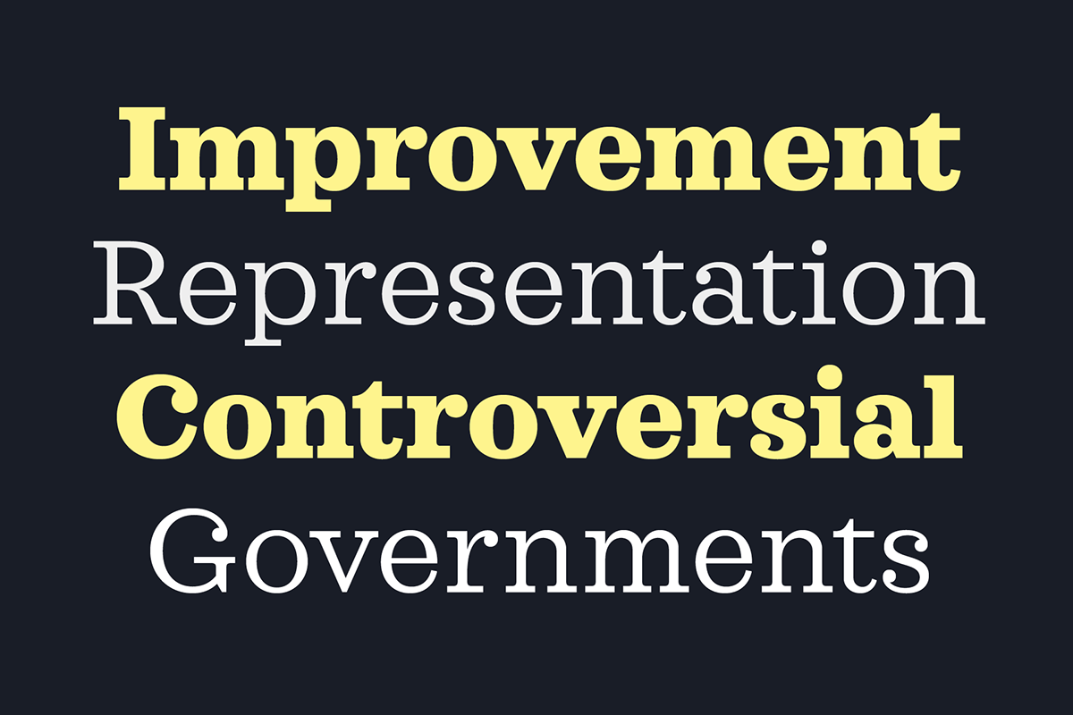
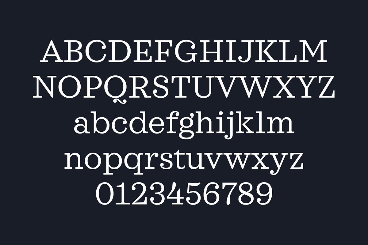
Sagona is a modern slab serif building on the clarendon/ionic model dating back to the 19th century. Sagona features strong serifs and a variable stroke contrast resulting in a versatile family working great in headlines and small texts.
Characteristics
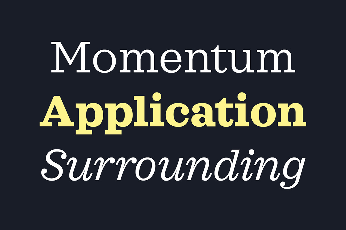
Sagona’s characteristically design background is clearly visible throughout the whole family. This historical approach is gently adjusted in order to let the family appear more welcoming and contemporary.


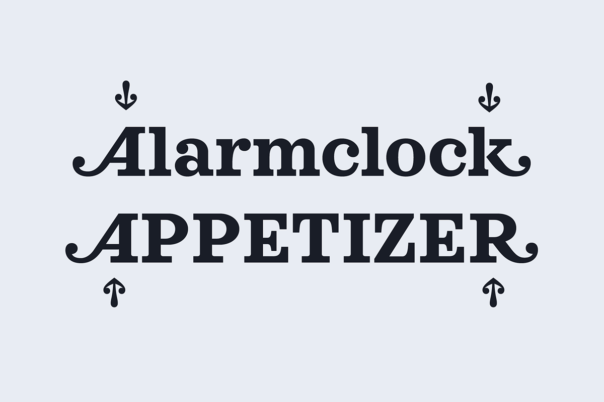
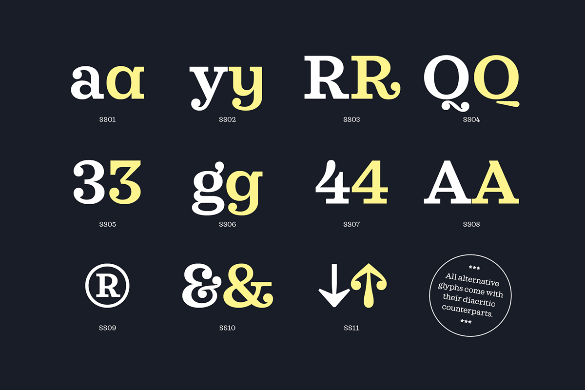
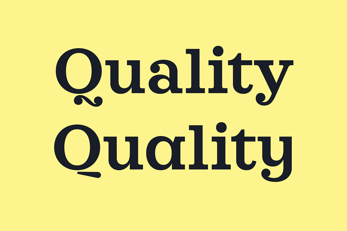
Alternatives
Sagona comes with a wide range of alternative glyphs in order to customize the family to special requirements when in use for logos or as a brand font. All alternative characters are available with their diacritic counterparts.


Opentype Features
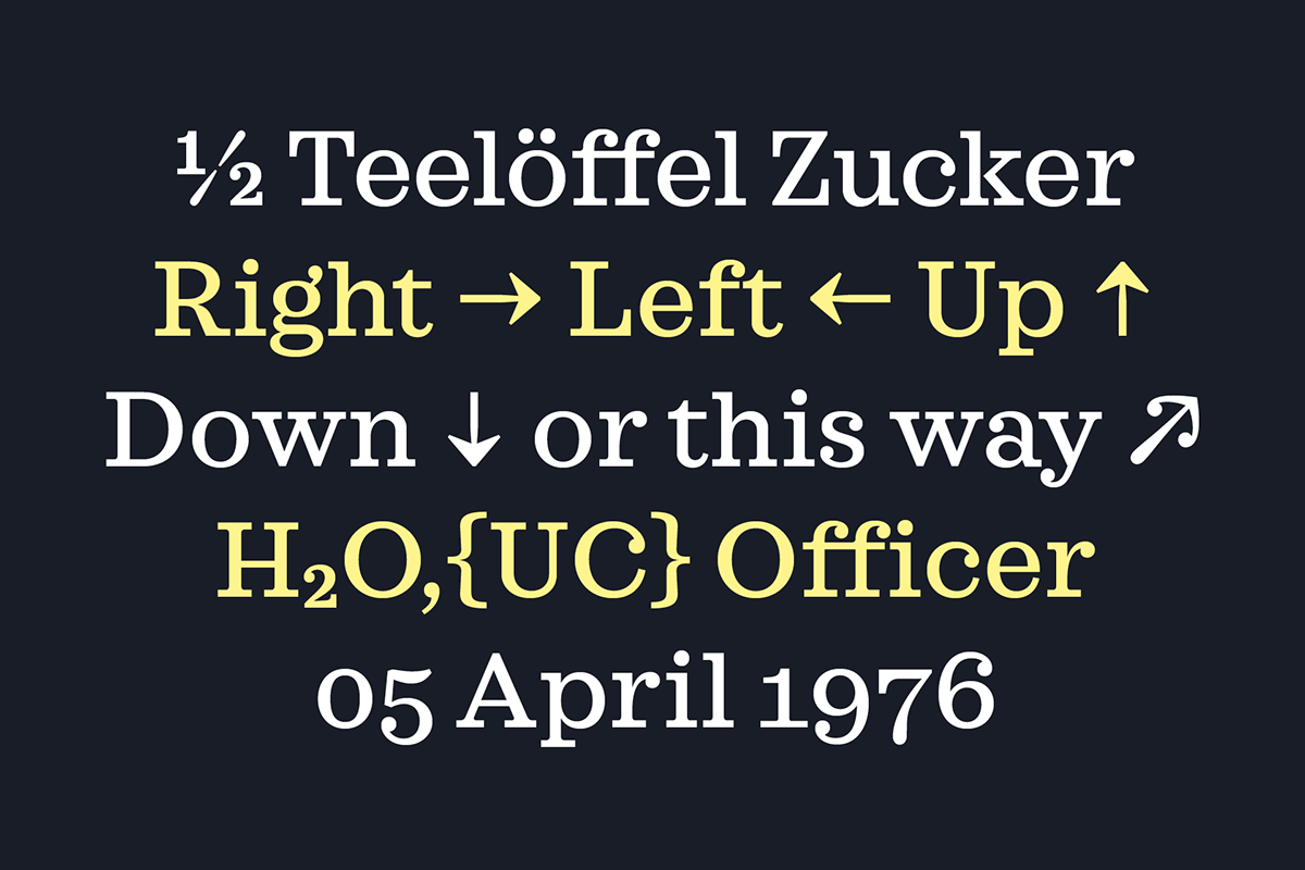
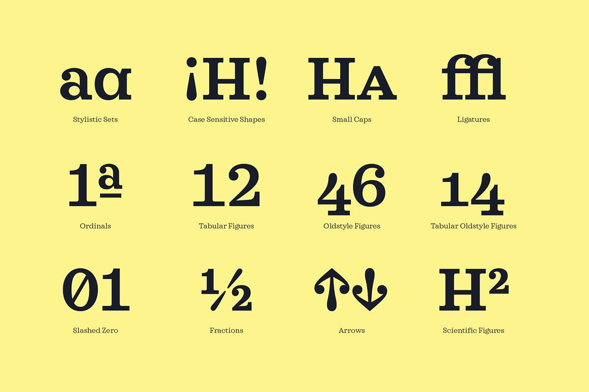
Opentype features are a great addition when it comes to solving complex design tasks. From small caps and case sensitive shapes to ligatures and tabular figures, Sagona is equipped for various typographical tasks.
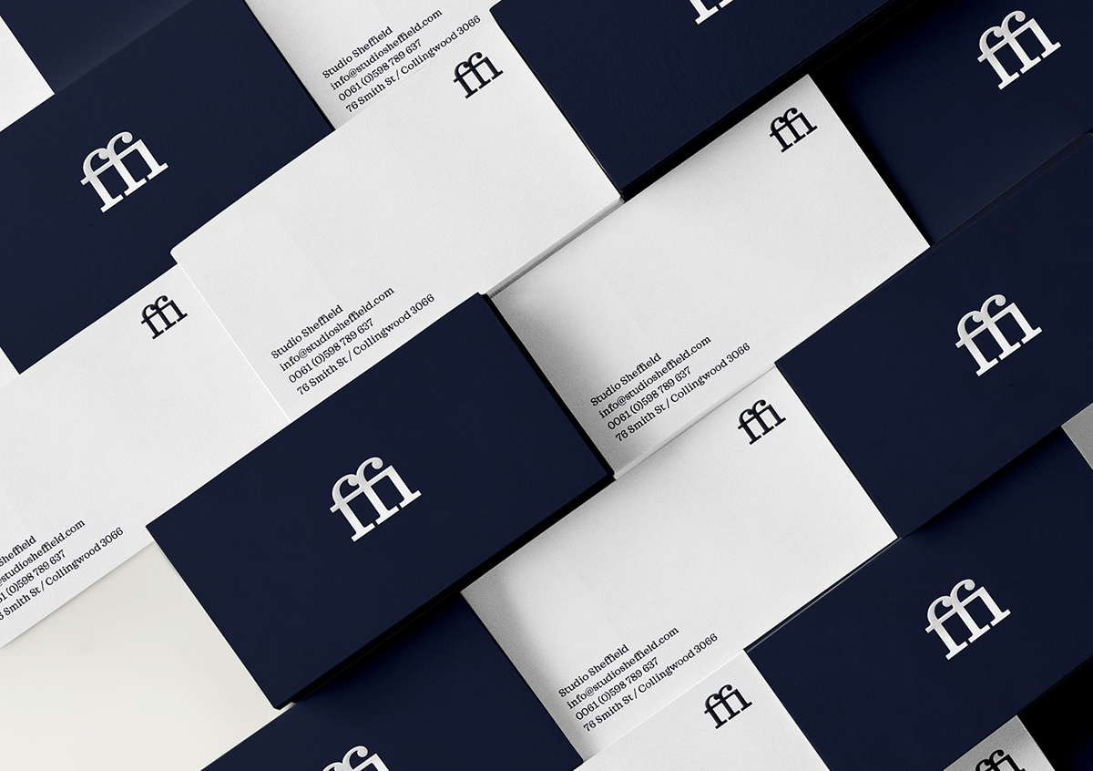
Ligatures
Ligatures help fixing the problem of colliding glyphs. Especially lowercase “f” is a usual suspect here. Therefore Sagona comes with standard ligatures like “fi” and “fl” plus discretionary ligatures for combinations like “Th” or “ty”.


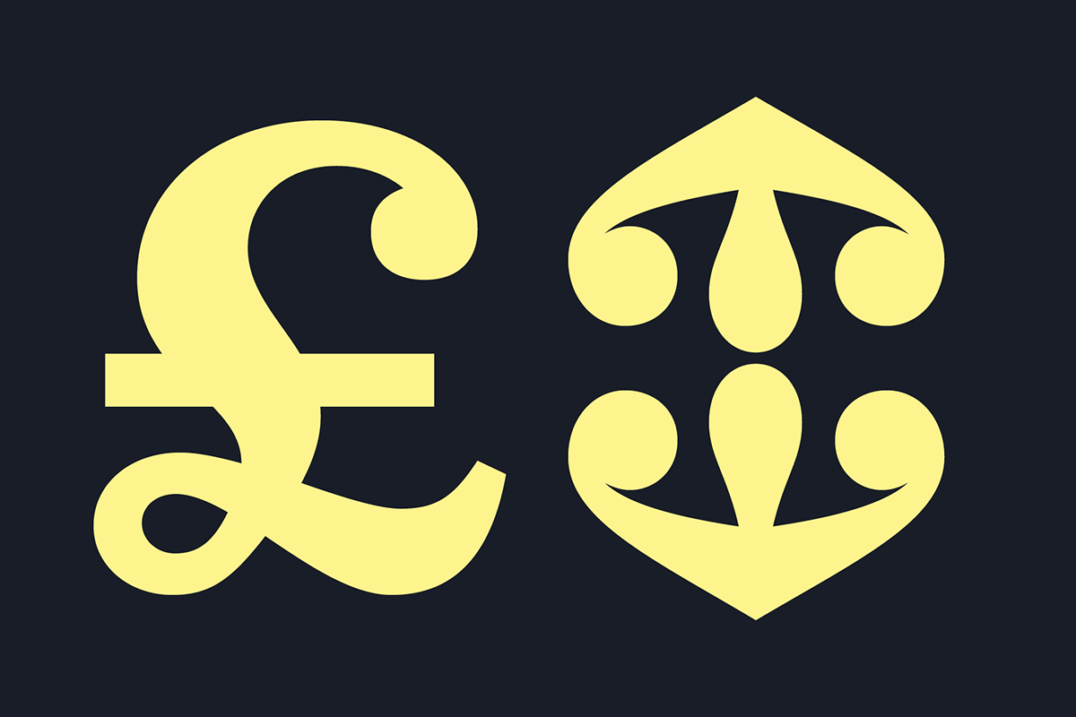
Initials & Finitials
Supporting the playful character, Sagona comes with initial and finitial characters making every paragraph an eye-catcher. These can be integrated via glyphs panel in Photoshop and Illustrator or via automatic positional forms in InDesign.