Osio
A collaborative design project with The Brighthouse for a US based medical supplies distributor.
Challenge
Osio is a leading distributor of medical supplies to local hospitals and ambulatory service centres across the United States. We were challenged with creating a flexible logo that would form the basis of a new brand identity system. The identity needed to be powerful and modern as it needs to instil trust in customers.
Action
I started by carrying out research to understand the market and competition. This helped to form the framework for the new identity which was conceptualised through the usual process of sketching. A number of different iterations were undertaken until we felt like we had an appropriate solution.
Result
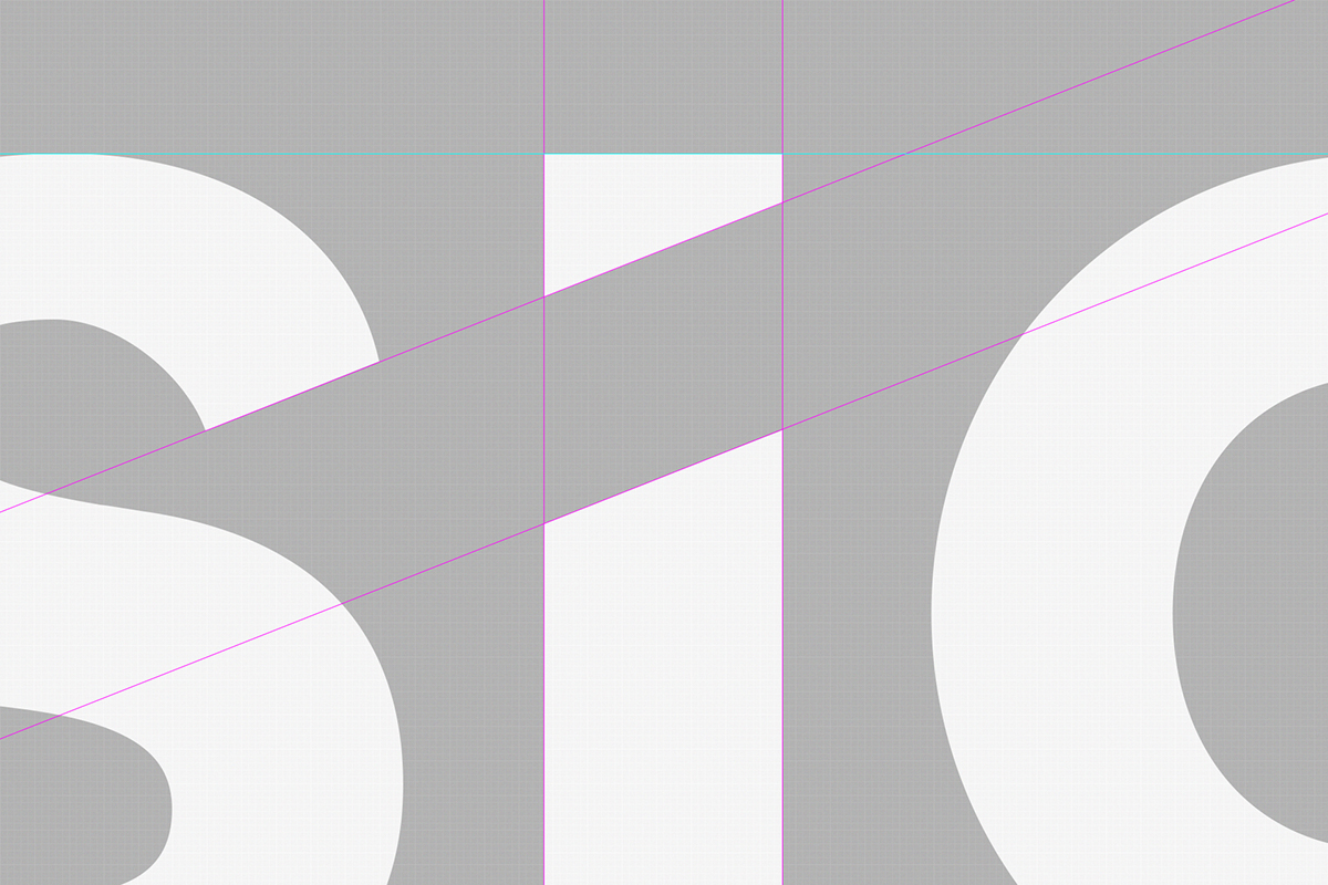
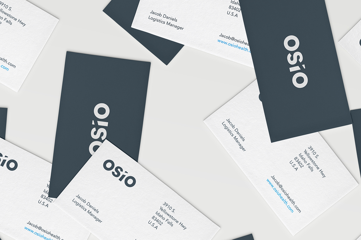
I have crafted a new logotype led by a strong and bold typeface. It provides maximum flexibility even when applied across other applications or touch points of the brand including packaging, marketing collateral, etc. The typeface was customised with a subtle indent (or negative space) between the letter ‘s’ and ‘i’ to represent the direct and straight-forward nature in which the business operates. We decided to use a dark blue colour as the primary brand colour to further establish the brands reliability and create trust. The colour of the dot above the letter ‘I’ would become a subtle indicator to each of the daughter brands that are a part of the mother brand. This provides a solid base for the identity to grow with the business and allows for the brand to gain more traction and drive the business forward.
Designed in collaboration with The Brighthouse