

OuroGen Dance Team
OuroGen is a Berkeley based, training dance team that started summer 2015 by five dancers - Ping Quach, JaeMin Kim, Felix Li, James Arias, and Nelson Chen. The team consisted of 20 members, myself included. I began to do voluntary design work for the team, creating their logo, apparal, and flyers.
About "OuroGen"
The Ouroboros is an ancient symbol depicting a serpent or dragon eating its own tail. The name originates from within Greek language; (oura) meaning "tail" and (boros) meaning "eating", thus "he who eats the tail" which represents cyclicality. Although there are different interpretations of ouroboros, it is widely identified as a symbol for eternity, an endless cycle of renewal through death and rebirth. It never dies - it only becomes a better version of itself.
The symbolic nature of the ouroboros is aligned with what we believe dance is. Instead of being a checklist completed from beginning to end, it is a never-ending process of self-improvement and progress - a recurring cycle of development. This is the origin of our intentions for creating OuroGen.
The OuroGen Logo
I wanted to depict the Ouroboros dragon in a clear and simple - minimal details, and clean. After many revision, I can up with a two stroke dragon with a wing. I chose a fairly circular font, Avenir, to match the shape of the dragon.
The OuroGen Logo, Cycle II
The original logo was black on a white background. After being a part of OuroGen that summer, one year later, I led the second cycle of OuroGen along with four other mentors. I also decided to give the logo a small makeover. The original logo is black on a simple white background. For promotional purposes, I place a white version of the logo onto a sky background that was used in one of our promotional flyers. This keeps the logo fresh, creates a connection to the workshops we are hosting, while keeping the logo recognizeable.

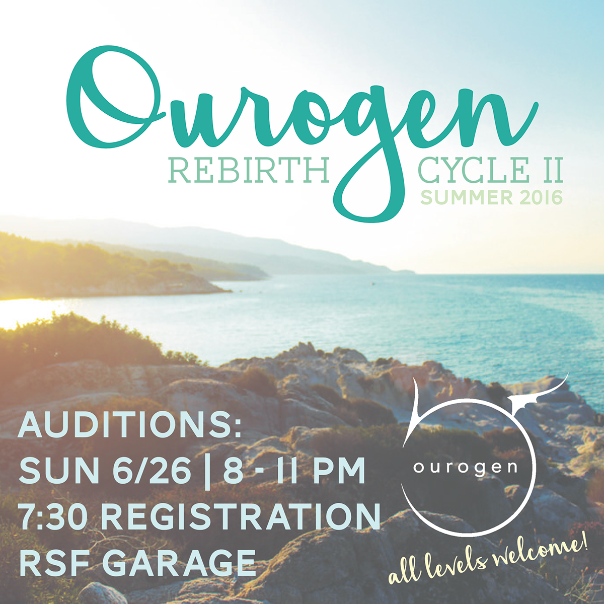
Audition flyer for summer 2016 dance season
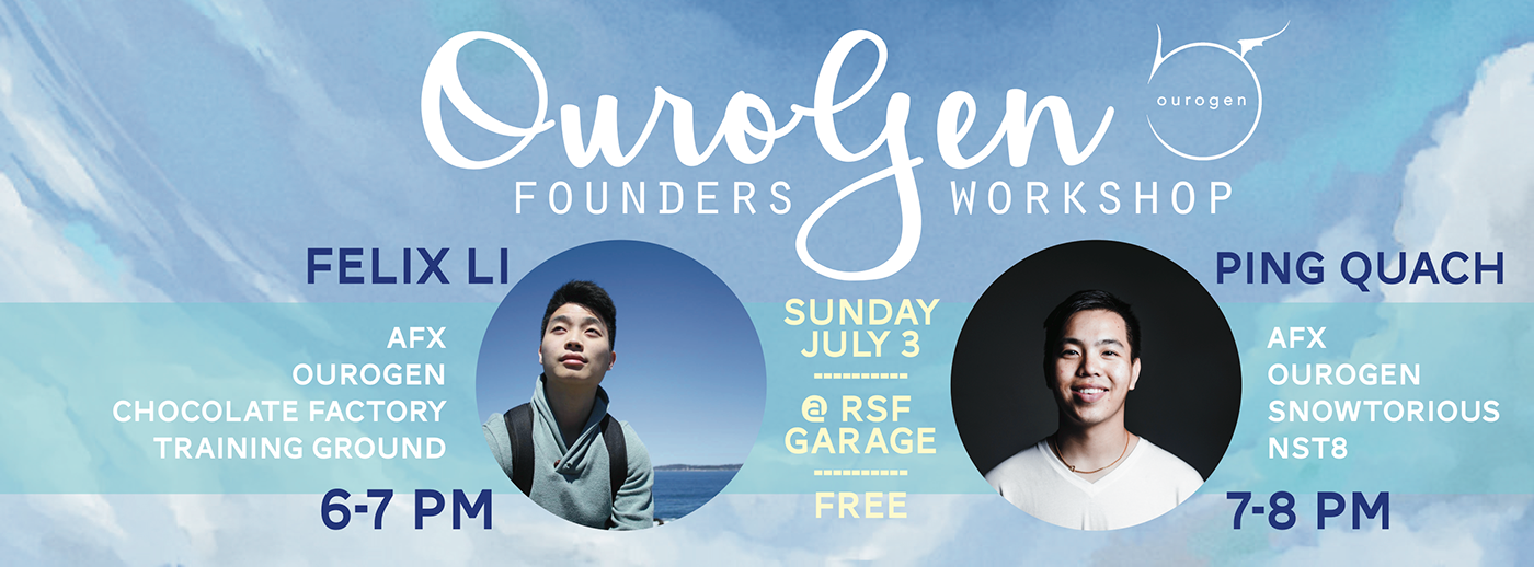
Our First Workshop Series
We brought together three out of the five original OuroGen founders to host a dance workshop for us. These are the flyers that were created, both in Facebook cover photo and square format to use as a Facebook profile picture.

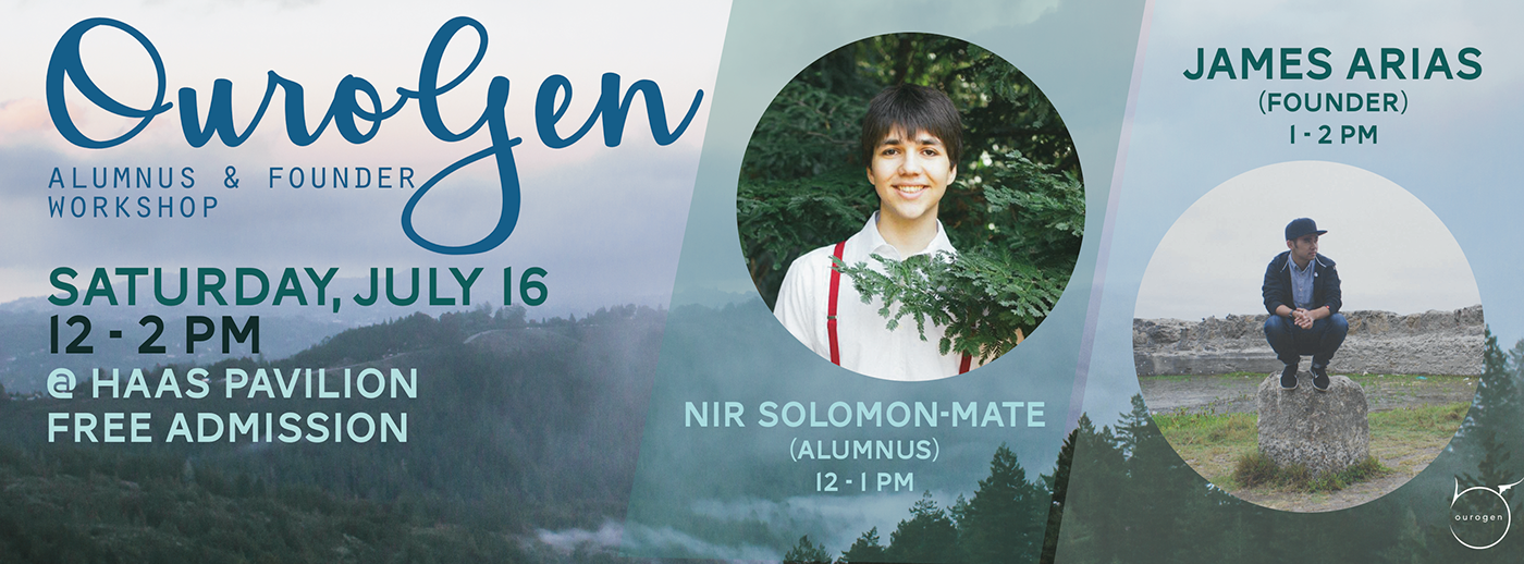
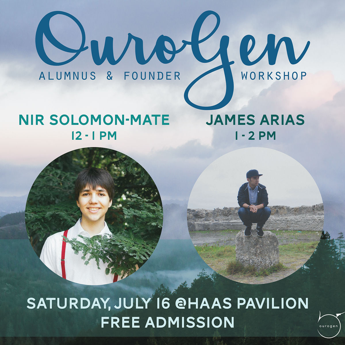
The dance season has reached its halfway point. We are hoping to host more dance workshops (and so I have more flyer designs to work on!) Look out for more coming soon!


