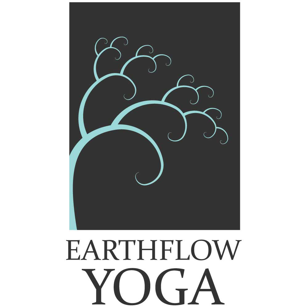


Earthflow Yoga Branding
Earthflow Yoga is the brainchild of Stacy Petersen. She offers yoga classes and camps, river retreats and courses in meditation and self-discovery. Her philosophy and system of yoga emphasize connection to the earth. Stacy also spent much of her life as a dancer and loves combining movement with nature.
She wanted a logo that would reflect these ideas. Stacy’s first idea was to use a tree as her symbol, and the real challenge was how to add movement to that. We tried several ideas with trees appearing as dancers, with twisting trunks and branches reaching to the sky, but nothing was quite there yet.
Then Stacy hit upon the idea of a fractal, a curve repeating itself and reaching outward. I combined that idea with the tree concept and we were there! I like how this design also has the feeling of a wave, reaching out but also drawing back toward itself. One of Stacy’s main goals with Earthflow Yoga is sharing the way that yoga has transformed her own life and I feel that the wave reflects that.
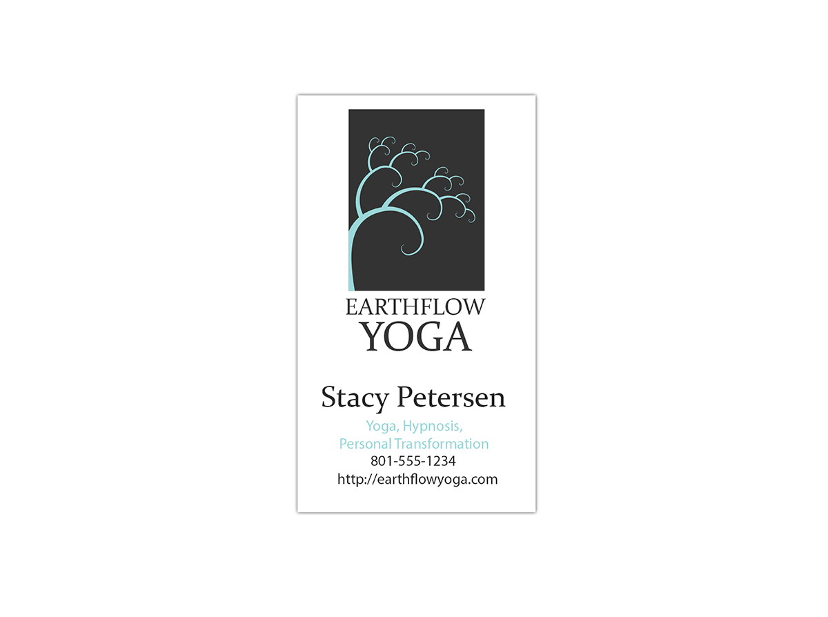
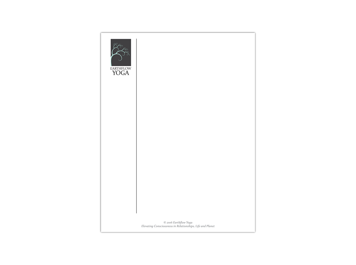
I wanted to keep the rest of her collateral clean and simple, showcasing Stacy herself and also her love of nature. The postcard features both photos of Stacy and her own nature photography.