UGIC (Utah Geographic Information Council) Branding
The Utah Geographic Information Council (UGIC) is a nonprofit organization whose mission is to lead the effective application of geographic information in Utah. Their membership includes individuals from all levels of government, private industry, educational institutions and other nonprofit groups.
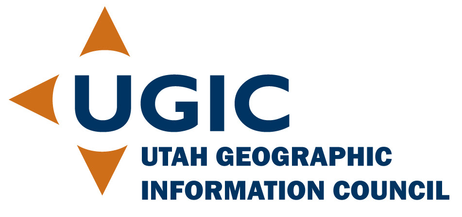
UGIC had been using a logo created years earlier which featured GPS equipment that was no longer used in the industry. Geographic Information Systems are cutting edge and very technology forward and their logo was not reflecting this.
I wanted to create something that was timeless and would not need updating as technology changed. I used the points of the compass as inspiration, surrounding the U (for Utah) with 3 compass points and letting the rest of the letters of the acronym provide the fourth point.
Their original logo was brown and orange, but they wanted a little more variety. I kept the original orange to represent Utah's red rock desert and added a dark blue to represent the Great Salt Lake, two of Utah's most identifying geographical features.
Additional items I created:
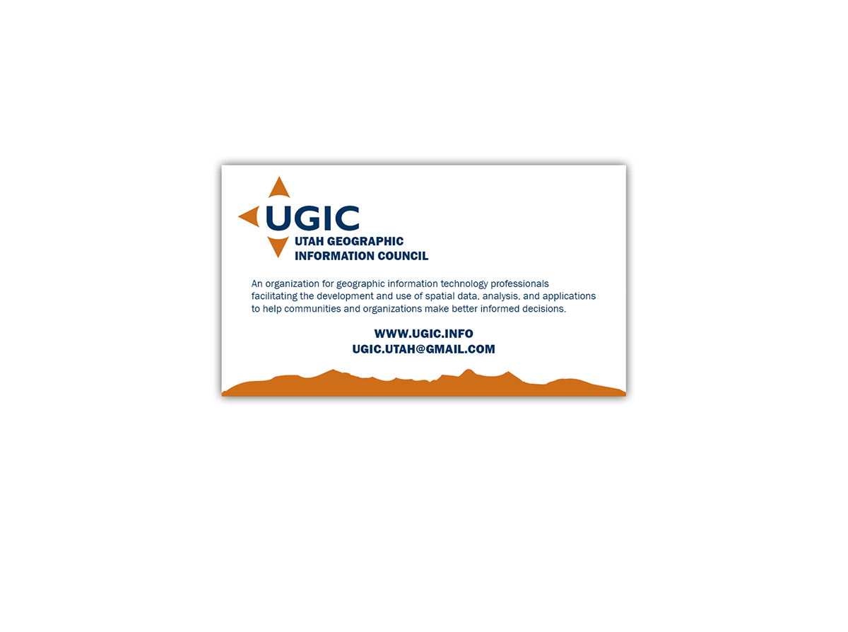
A business card that can be used by any of the board members
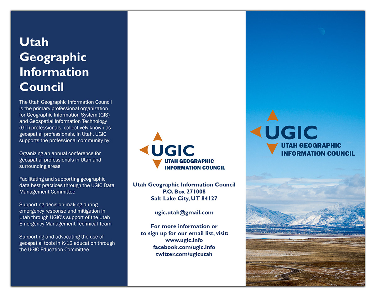
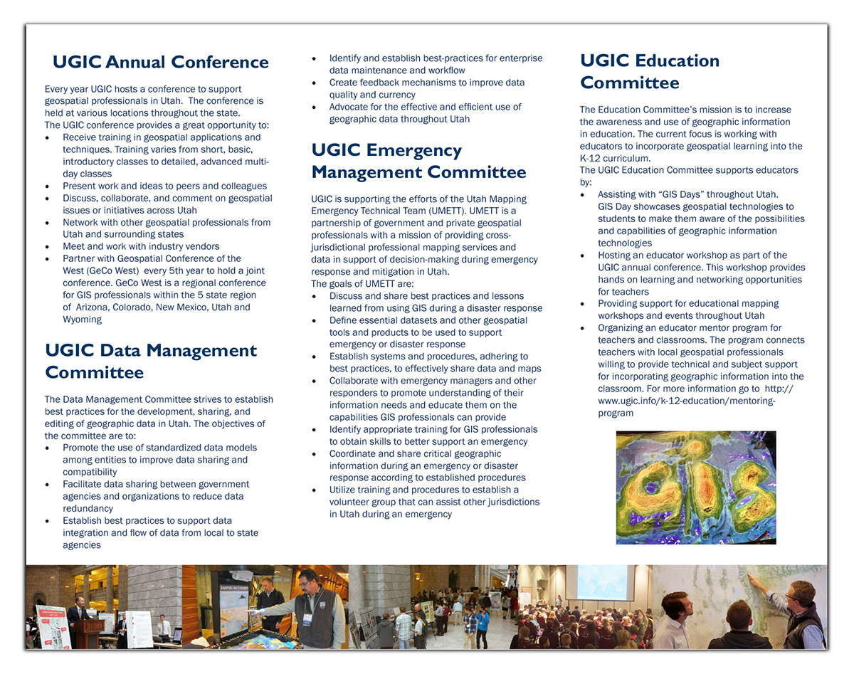
A brochure using the new logo and my own photography
A wordpress website http://ugic.org