BETON (Concrete)
The logotype and identification for Fundacja Beton (Beton Foundation), Beton Fim Festival and Betonik workshops was something we have wanted to work on for a long time. We enjoy working for cultural and educational initiatives and this subject stirred us positively. It turned out that the idea of modernism, Le Corbusier and functional designing are all very close.
We looked for forms, which could be easily associated with the activities of Fundacja Beton and that wouldn’t limit them to the raw material of “beton” (Polish for concrete). The foundation envelops a wide variety of interests starting with the beginning in the 20th century and the modernist legacy as well as different ways of depicting architecture in film, computer games, unfinished projects projects, and futuristic utopias.

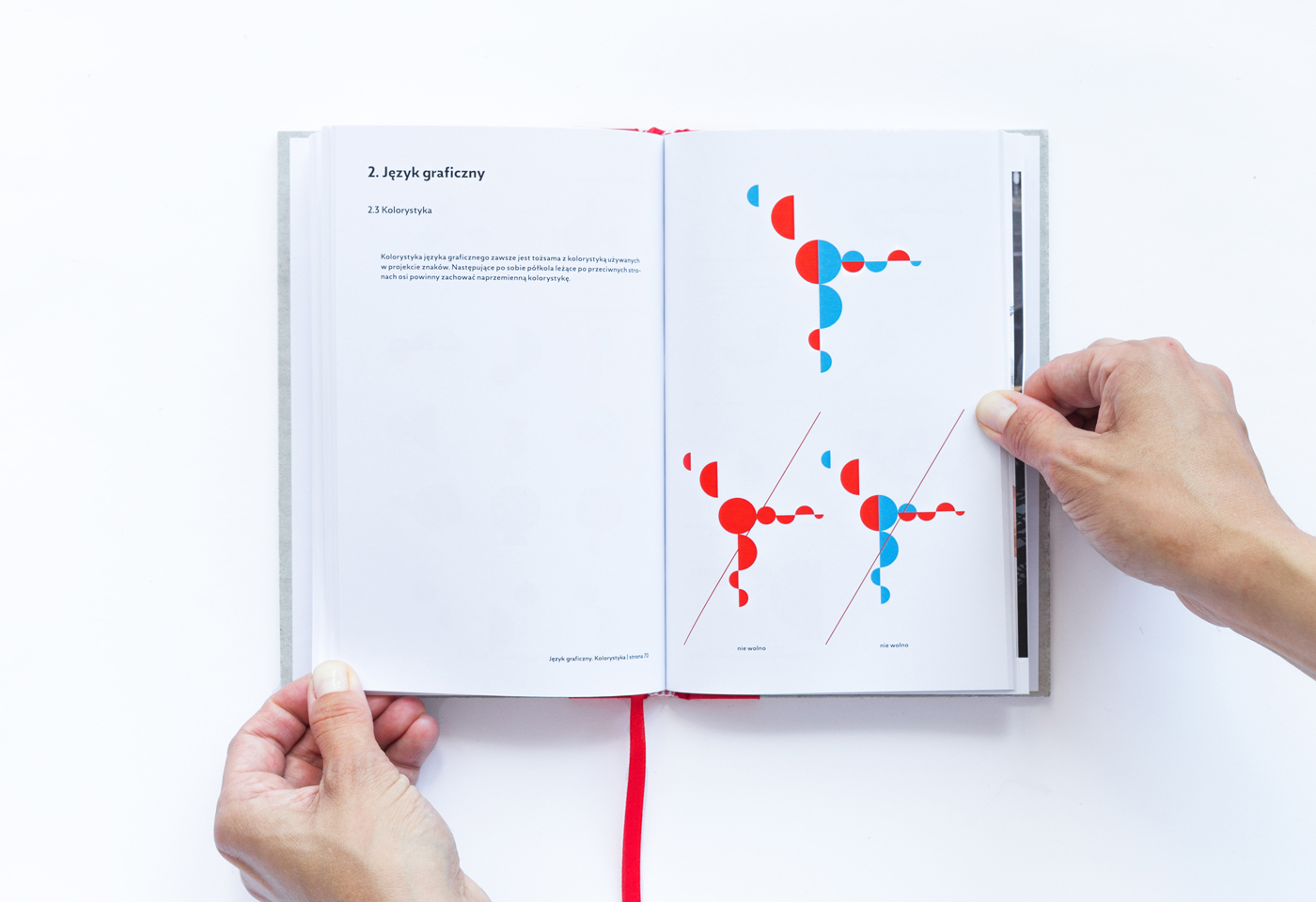
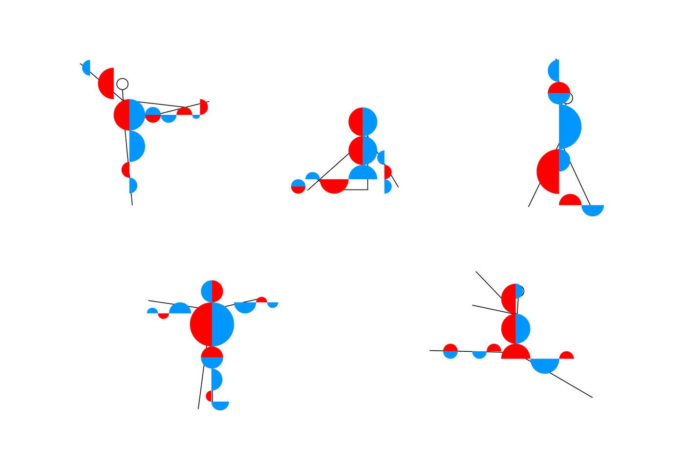
The sign is based on le Corbusier’s drawing of the the Modulor - a schematic, universal projection of the human proportions in architecture and space. We simplified the original drawing and based our project on circles and semicircles, transforming these organic shapes into letter B. We also saved the original colouring of the Modulor. Its expressiveness builds the brand’s language and gives the opportunity to create a diverse, strong, c o n c r e t e message.
The sign is based on le Corbusier’s drawing of the the Modulor - a schematic, universal projection of the human proportions in architecture and space. We simplified the original drawing and based our project on circles and semicircles, transforming these organic shapes into letter B. We also saved the original colouring of the Modulor. Its expressiveness builds the brand’s language and gives the opportunity to create a diverse, strong, c o n c r e t e message.
Breaking up these forms into semicircles and placing them in the layout is a never ending game resembling building with blocks. It’s a game that can be simply a play with aesthetics but on the other hand, in juxtaposition with photographs of concrete architectural legacy it brings to mind projects from the golden era in the XX century, with architectural detail and good everyday-use design from the 50s and 60s. All of the compositions of the forms are based on the brand’s language and the variation of the human form in different poses (made with blue and red shapes of the basic sign).


Breaking up these forms into semicircles and placing them in the layout is a never ending game resembling building with blocks. It’s a game that can be simply a play with aesthetics but on the other hand, in juxtaposition with photographs of concrete architectural legacy it brings to mind projects from the golden era in the XX century, with architectural detail and good everyday-use design from the 50s and 60s. All of the compositions of the forms are based on the brand’s language and the variation of the human form in different poses (made with blue and red shapes of the basic sign).


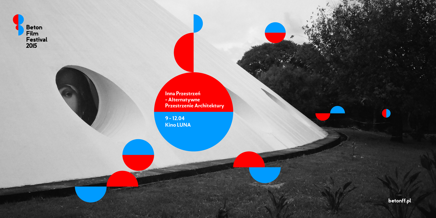

The identification for Fundacja Beton, as well as for Beton Film Festival and Betonik (kids’ workshops), is one coherent, legible brand language. It is a solution, ready to communicate various content revolving around the foundation’s interests. The font used in the sign is Zigfrid, inspired by German lettering and designed by Mateusz Machalski. Simple, functional, it has an architectural flair, also fits perfectly with the pure and brutal character of concrete.
The brand identification for Fundacja Beton is a project which tells many stories about architecture and man and his impact on architecture itself, in a language that we know.


brand manual cover made of concrete