SYFY BRAND REFRESH
When I was head of creative at Syfy, I was asked to develop a brand refresh for the network. The new look needed to encompass OSP, ID's and graphics packaging for all on-air and off-air promotion. As the quality of programing on the network was dramatically improving both in terms of storytelling and production values, so a new graphic presence was needed to match. The 'look' needed to be both ownable and naturally migrate across platforms. It needed to be clean yet have approachability and surprise. It needed to take the brand to a new visual space that was unique and wouldn't be perceived as gimmicky or superficial.
It wasn't an easy process. Initially the Syfy Design Director Calvin Chu and I approached around ten design groups to pitch. Ten of the best firms globally. After numerous rounds I never felt we were really capturing the essence of the change in the brand. So the team and I regrouped, went back to the brief, and really synthesized what we were trying to achieve. We knew the logo was iconic. But the 'white space' on-screen environment it occupied felt overly synthetic and sterile. So we decided a mix of environments - some fantastical and some natural, some huge and some small in scale - would give the logo, and by extension the brand, a new strength and purpose.
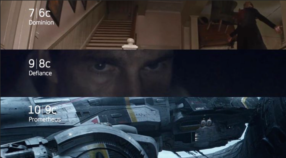
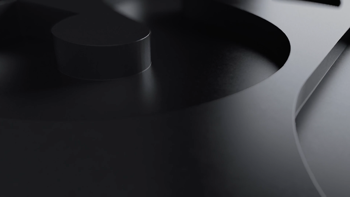
After an exhaustive year long process the brand refresh launched. What you see here are frames and a comp reel that illustrate the new packaging and language. But they only scratch the surface. For the full picture go online or take a look at the channel. I'm delighted with the result. It was an arduous process, but always full of surprise and creative collaboration.

Credits: SYFY
Creative Director Design: Calvin Chu
SVP Creative: James Spence
EVP Marketing: Michael Engleman
Art Director: Ben Sherman
CD/Copywriter: Ben Cochran
Producer: Bill Ikin
Producer: Kate Leonard
Creative Director Design: Calvin Chu
SVP Creative: James Spence
EVP Marketing: Michael Engleman
Art Director: Ben Sherman
CD/Copywriter: Ben Cochran
Producer: Bill Ikin
Producer: Kate Leonard
Partner: SIBLING RIVALRY