Visual Grammar Exhibition Poster
Brussels, 2012
Invited by MuirMcNeil to participate this is Neubau’s poster contribution to the ‘Visual Grammar’ exhibition hosted and curated by Julien van Havere from Modern Theory. The exhibtion took place at MAD, Brussels 2012.
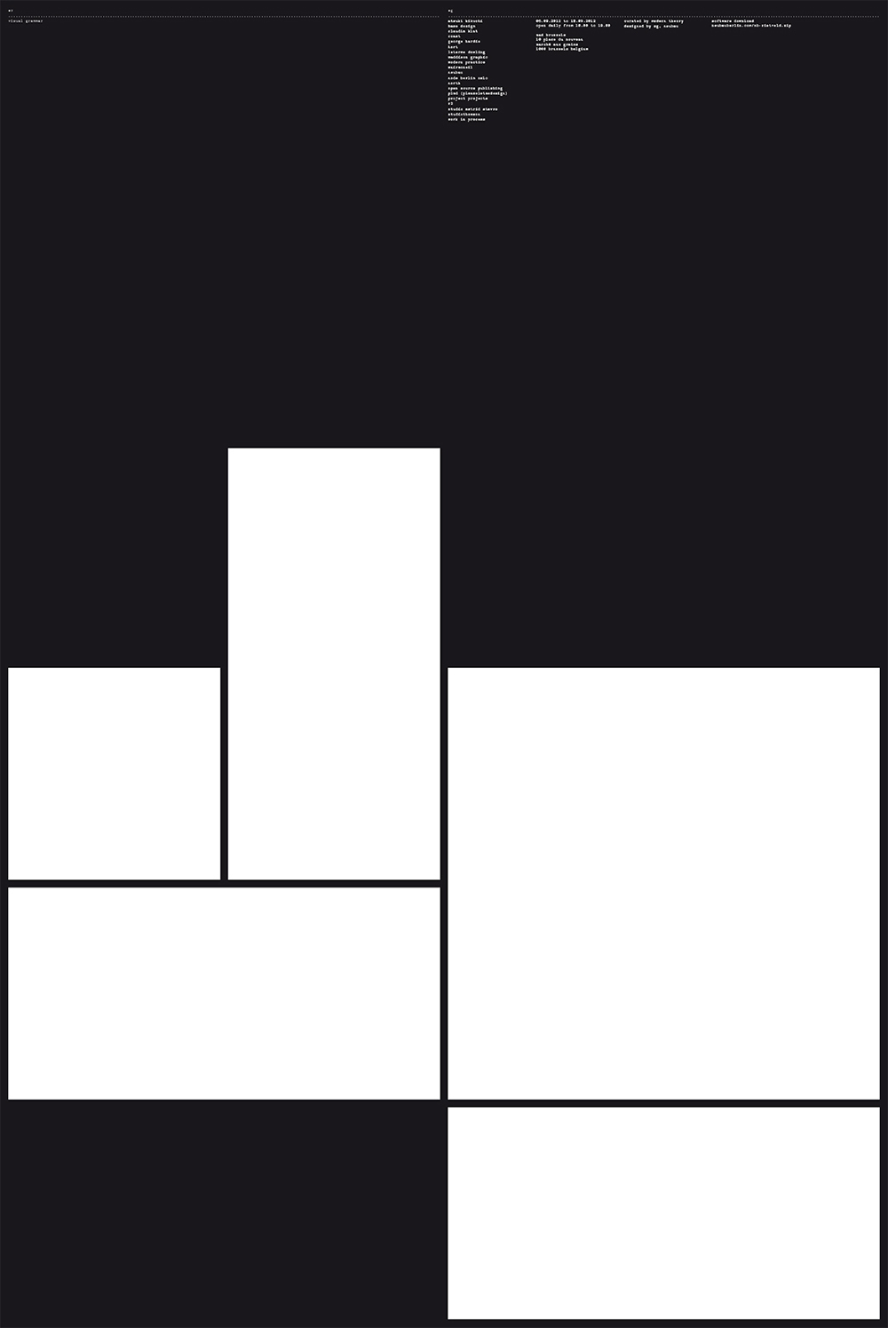
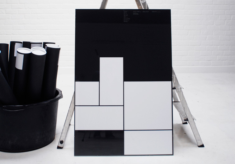
The silkscreen printed poster in the size of 70 × 100 cm is dominated by the grid of two glyphs (‘vg’) displayed in NB-Rietveld™ Pro. Read the synopsis by Paul Heys below. Find the background story for the creation of the typeface at the bottom of this page.
Curator: Modern Theory
Original size: A2, 700 × 1000 mm
Design: Stefan Gandl
Typeface: NB-Rietveld™
Year: 2012
Order
Standard Edition
Standard Edition
Synopsis
Text by Paul Heys
This poster addresses fundamental issues surrounding visual grammar, and examines the essential and dominant components of visual language, affect and locality of graphic design. It also presents an interchangeable level of discourse, connecting leading principles of design history and the ever-evolving modes of interactivity that surround both contemporary poster design and international studio culture.
The viewer is immediately presented with ‘NB-Rietveld™ Pro’, a detailed and geometrically demanding typeface consisting of simplified visual compositions reduced to their vertical and horizontal directions. ‘This challenges the perceptions of the visual object and it’s creative potential’ [1] offering the ultimate in simplicity and abstraction within the bounds of conceptually driven, neo-modern typography and typographic-led graphic design.
In accordance with supplemental data contained in this communication system the typefaces ‘NB-Rietveld™ Pro’ and ‘NB-Typewriter™ Pro’ are controlled through a rigorous studio development programme in order to interrogate essential philosophies pertaining to simplicity of construction, form, harmony and order within system-based graphic design.
As a means to exemplify Neubau’s philosophy and methods of production regarding the importance of user-centred software development and data creation, Neubau Berlin invites you to participate in this research by downloading ‘NB-Rietveld™ Pro’ outlining a critical juxtaposition of the hand-crafted and the instant availability of internet-ready software utilized or obtained for the making of auxiliary design and/or graphic design output.
[1] Leborg, C. Visual Grammar, Princeton Architectural Press, 2006

NB-Rietveld™ Pro
Stefan Gandl, 2008
In 1917 Gerrit Rietveld invented his legendary chair that became known as the ‘Red and Blue Chair’ after it was painted in primary colours in the 20ies. Rietvelds’ chair represents one of the first explorations by the ‘De Stijl’ art movement in three dimensions.
In 2008 Stefan Gandl designed a tribute typeface named NB-Rietveld™ after being invited by Wim Crouwel to sit on one of his original Rietveld ‘Red and Blue’ chairs.
The typeface is based on a rigid 9×9 grid interpreting the overall look and simplicity of the chairs’ construction elements.

