Concorde Hotels & Resorts
is a regional hotel managed
by HPL Hotels & Resorts, targeting mainly frequent business travellers. Their
identity system was in need
of a revamp, and we were
brought in to refresh it back
in 2010. Since then, we've continued to work with them
to carry the brand through
its communications and advertisements.
The many components that we were involved in for this extensive rebranding exercise included—art direction and photography of its new photo bank, conceptualising its messaging with strategic copy-writing, and developing a new identity system that would take the brand through to the next stage.
Our relationship still continues with them today as HPL Hotels & Resorts' agency-in-charge for Concorde Hotel's brand communications.


The rebranding.
Throughout the rebranding development, we focused on keeping a
key balance between the old and the new, making sure that we didn’t alienate or overly discard the brand’s original essence. With that in mind, it was decided that the existing logomark be kept, as it had become recognisable by the hotel’s patrons and partners over the years.
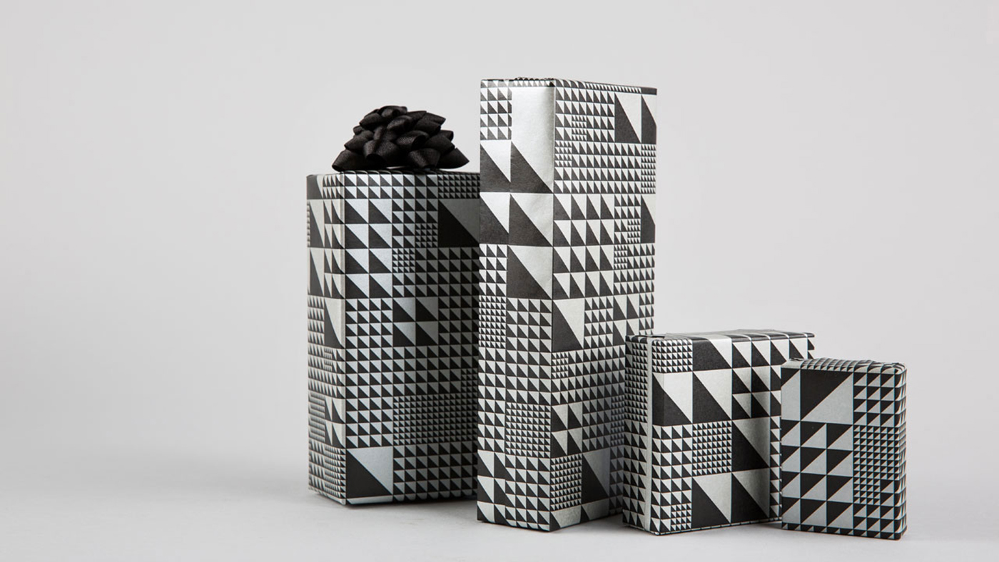
The colours black, white and silver were chosen as the new corporate colours to keep the overall image serious, yet understated. The overall brand’s look and feel was kept fuss-free and contemporary, with the existing logotype replaced with a timeless modren classic, the Avant Garde typeface. We also saw the opportunity to adapt the logomark into textures that could be used as graphics for the hotel’s collaterals from their packaging, stationery, and interior.
key balance between the old and the new, making sure that we didn’t alienate or overly discard the brand’s original essence. With that in mind, it was decided that the existing logomark be kept, as it had become recognisable by the hotel’s patrons and partners over the years.
The colours black, white and silver were chosen as the new corporate colours to keep the overall image serious, yet understated. The overall brand’s look and feel was kept fuss-free and contemporary, with the existing logotype replaced with a timeless modren classic, the Avant Garde typeface. We also saw the opportunity to adapt the logomark into textures that could be used as graphics for the hotel’s collaterals from their packaging, stationery, and interior.


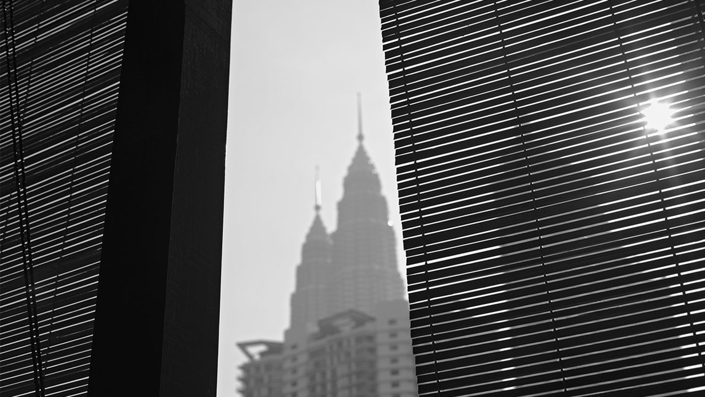
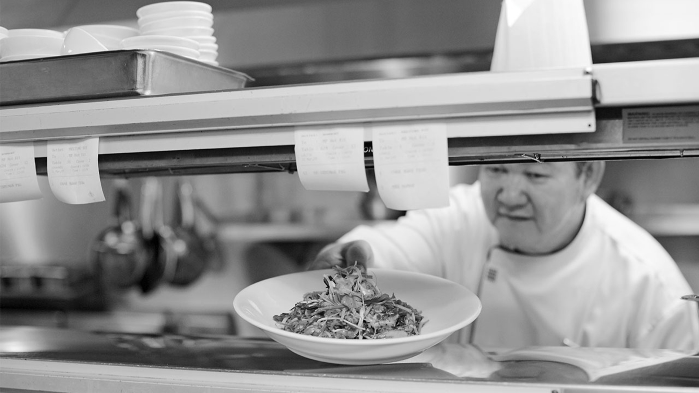
The photography bank.
A photo bank was also created to enhance the brand’s new direction, showcasing behind-the-scenes of the hotel’s daily happenings, providing a glimpse of a traveller’s touch points with the hotel, the staff on their usual duties, the exchanges between the hotel and its customers. We took charge of art direction and photography.


The brand identity guidelines.
The extensive rebranding exercise was eventually compiled into a comprehensive collection of five brand guideline books to serve as a design bible for all the hotels, making sure the new branding was disseminated and kept consistent throughout.


The brand's communications.
Many years on, we continue to help Concorde Hotel carry its communications to the appropriate audience. As their agency-
in-charge, we've since worked with them on a new brand campaign, brand brochure, and advertisements for various trade, business and travel magazines.


Client — HPL Hotels & Resorts
Creative Director — Kai Yeo, Edmund Seet
Designers — Anthony Lew, Edwin Tan
Photographer — Caleb Ming, Alvin Tan
Year — 2010 to present
Creative Director — Kai Yeo, Edmund Seet
Designers — Anthony Lew, Edwin Tan
Photographer — Caleb Ming, Alvin Tan
Year — 2010 to present
thebureau.com.sg


