When writing for a website, I look to capture the essence and the personality of the relevant brand. I always try to keep in mind the visuals and the navigation as well.
This home page for a movie project needed to sound mysterious enough to intrigue the reader without actually inspiring the authorities to shut it down.

An FAQ for a tech company doesn't have to consist of boring techspeak. When it's consumer-facing and targeted at non-techies, accessibility becomes extra important.

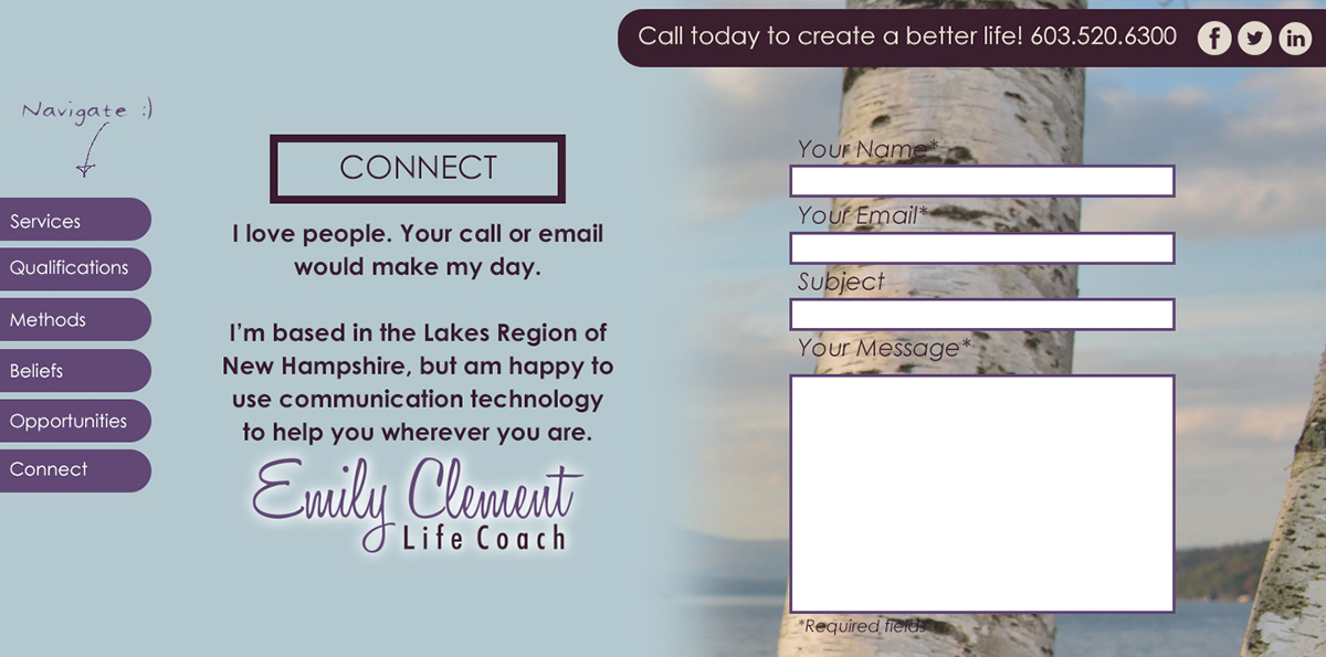
A contact page may not need to be fancy, but a few choice words might make the difference in whether a visitor feels comfortable enough to take that next step and reach out to you.
For this page, one might wonder why the logo has a bird on it. We decided to just tell the truth. Sort of.

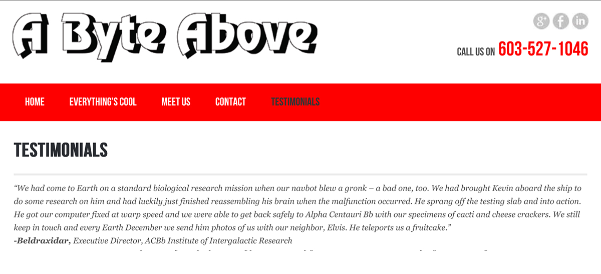
The A Byte Above site actually contains a whole page of these testimonials from actual customers. I cut them out so I could show you the one I wrote, although you would have likely figured out which one it was anyway. This customer is a fun guy and he likes his content to reflect that. You should have him fix your computer (only if it is broken, though).
Check the "services" list on this page. We wanted language to which potential clients could relate, not just provide a list of stuff Emily knows how to do.


