Since the first day when I begun my studies on
Visual Communication major I wanted to start
practising graphic design as soon as possible.
When new chief editor considered to change the
format entirely, I drafted some of my proposals.
Thinking further together resulted a brand new
visual identity including a revamped logotype
too. Using it as headline on a single photo as
full-page background finally formed a decent
magazine lookout. To leave behind the news-
print feeling, for inner pages we shifted from
groundwood paper to bleached white paper.
Although we modified the trimming size too,
still remained non-standard (303×237 mm).
Renewal endeavours of the next
editorial staff involved not only the
look & feel, but we reorganized the
content structure as well. Main part
(16 pages) of the magazine was
made up by 8 permanent chapters
rest of the space adjusted to actual
needs. Illustration played key role
in entertaining purpose, thus most
articles came with an image, plus
all issue featured a full-page photo gallery about a recent public event.
In response to demand for flexibility I suggested
5-column grid system in 43 mm/3,5 mm division.
Although we were taught Adobe InDesign by the
course curriculum, but as we wanted to learn
something new we gave a try to QuarkXPress 8.
To guarantee coherent page design through the
entire issue, I used file inclusion technique. Each page
was edited separately based on the same template then
finally embedded into single layout file containing header
and footer graphics plus the 5 mm bleed with printing marks
outside of trimming zone.
To help freshmen students with orientation around the campus,
I designed a clean map of the
college neighbourhood. Placed
it on the back cover which had
thicker paper, they could tear off
to carry with themselves around.
Finally some of my favourite pages that I enjoyed the most to put together:

.
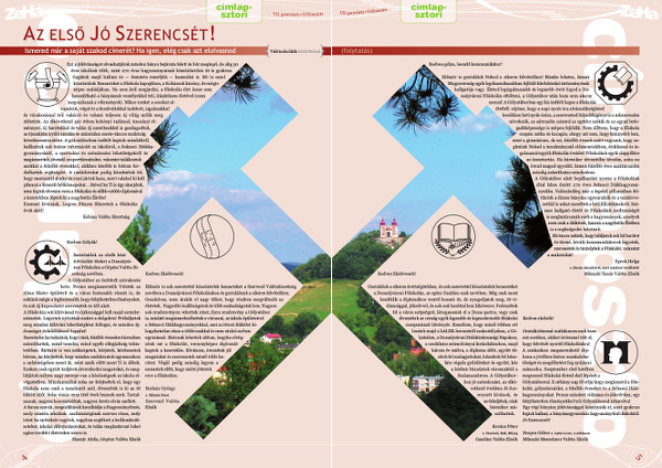
.

.

