Heinz Schauperl Logistics
Branding
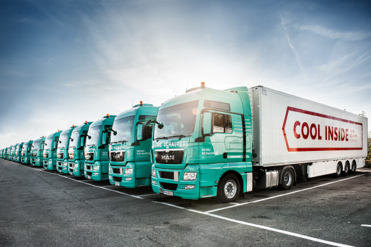
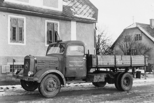
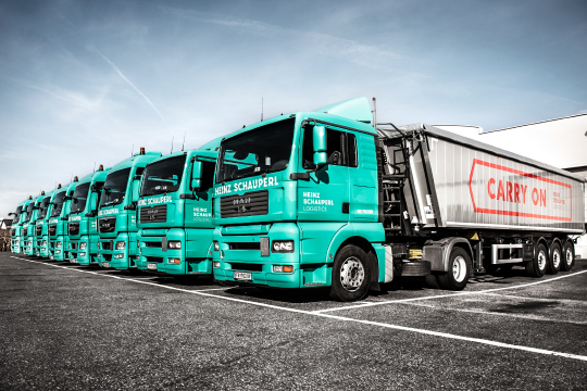
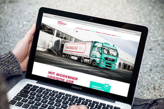
Ever since its foundation in 1929 Heinz Schauperl Logistics has been on the move. The success story began in the little Austrian village of Feldbach when Schauperl started as a small family business. Now more than 100 trucks are part of Schauperl’s vehicle fleet. The company has developed into a progressive provider of logistics and transport services.
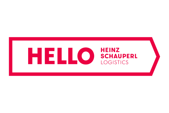
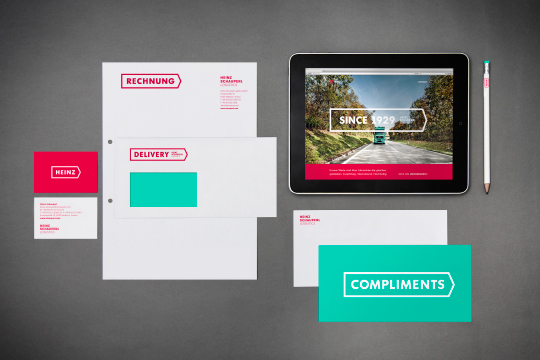
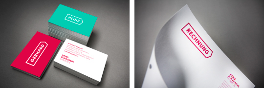
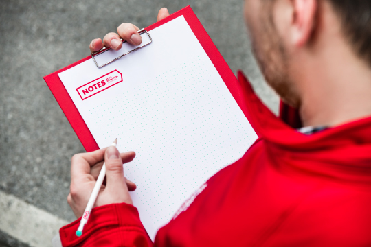
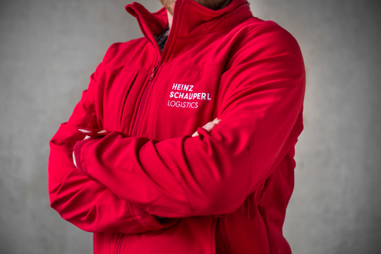
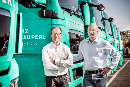
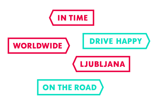
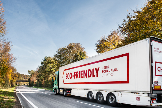
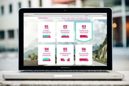
Now moodley brand identity has put Schauperl’s corporate design up a gear. The red direction sign is a symbol of their straightforward attitude. After moodley’s facelift the traditional company now looks like the modern brand that it is. New naming, new corporate design, new website – just the colour combination mint and red remained unchanged. You still get a sense of the company's roots even as it drives flat out into the future.
Branding by moodley brand identity.


CREDITS
Client: Heinz Schauperl Logistics GmbH
Creative Direction: Mike Fuisz
Art Direction & Grafikdesign: Nicole Lugitsch
Text: Matthias Alber
Director Digital: Birgit Taucher
Programming: Sissi Bieber
Project Management: Jasmin Gottfried


