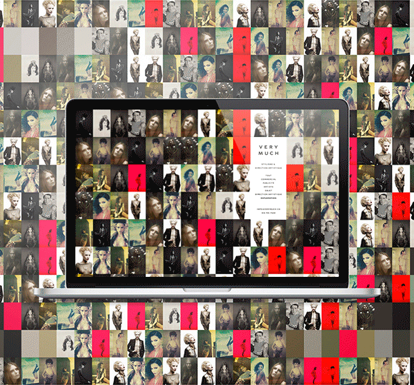
Very Much offers a unique package in Montreal print styling: a bigger team
with more experience that can handle assignments of any scale and scope,
a flexible style, generosity and unprecedented customer satisfaction.
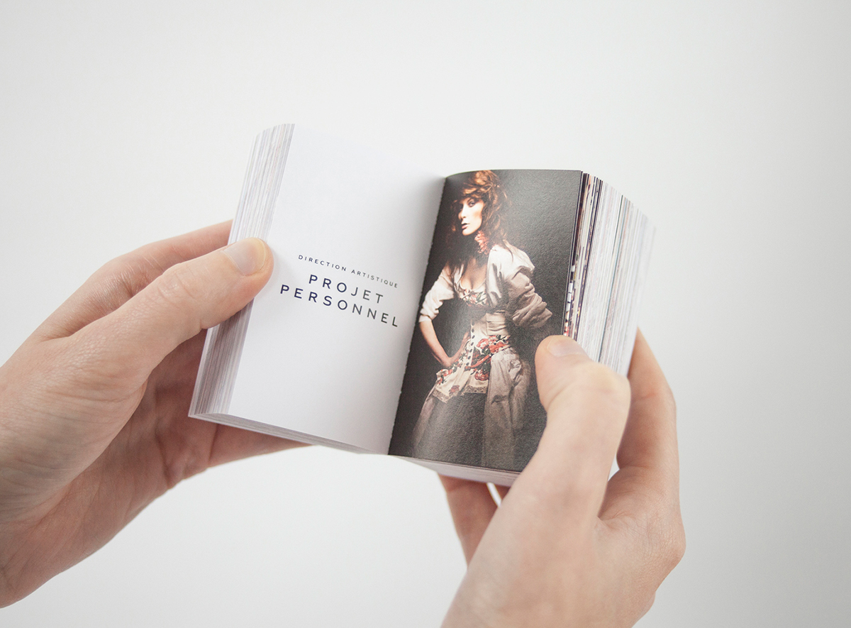
This promise of quantity and quality has been applied to all forms
of communication: naming, web navigation, promotional posters made up of
tear-off cards, 4‑in‑1 business cards and portfolios in non-standard formats.
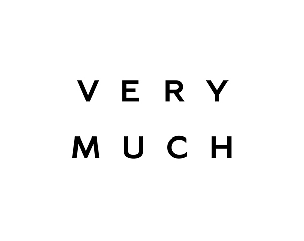
The typeface created for Very Much features characters of deliberately
simply design that complement any style of image. The modern look of
the sans-serif characters is balanced by detailing and classic construction.


Naming and copywriting: Rachel Lecompte
Art direction, graphic design and typography: Gabriel Lefebvre
Printing: L’empreinte

