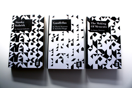


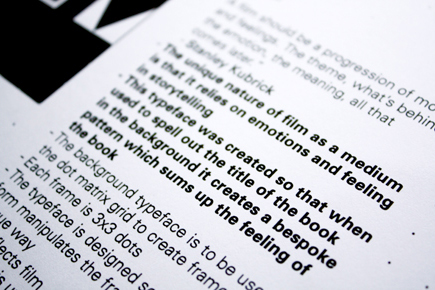

CATEGORYPrintCLIENTD&AD Student Awards 2009 - Faber & FaberABOUTThis was my response to the Faber & Faber brief for the D&AD Student Awards 2009 which asked the designer to make at least 3 covers for their new Print-On-Demand service using primarily typography.As this was focussed on FF's film titles I decided to try and find something unique about film which for me is the fact that film as a medium relies on emotions and feelings in storytelling. As such I created a typeface that when used to spell out the title of the book in the background creates a bespoke pattern which sums up the feeling of the book. This was to be used on a dot matrix grid to create frames, with each frame being 3x3 dots. The typeface is designed so each letter form manipulates the frame in an unique way. This reflects film, as each frame in a piece of footage is unique. When these frames are combined they create the feeling and tone of the film and as such these frames combined on the book cover create a bespoke tone and feeling unique to that title.The typeface is not meant to be legible and is indeed reversed out so that the forms become more abstract and one has to focus on the feeling they create.The covers would be computer generated by a simple programme which would place the type on the relevant grid. This makes it ideal for the POD service as the books can be easily produced for online and print purposes. Furthermore titles can be added to the series with ease and they are ensured their own bespoke cover in both B-Format and Demi-Format.Didot was used as the secondary typeface in order to compliment the Avant Garde feel to the aesthetic created by the grid system.

