利郎LESS IS MORE是利郎男装旗下一条轻时尚服装线。我们重塑其品牌LOGO,设计全新品牌字体,并探索其在服装上的应用。
平衡利郎自创始以来高度延续的简约理念与新一代年轻潮流之间的关系,是工作的基础逻辑。LESS IS MORE是品牌名,同时也是品牌主张。我们意图将「LESS」与「MORE」之间相互转化的关系,建筑成LOGO独特气质的来源。一方面,我们对「MORE」进行了「更少」的处理。将大写R变成了小写r,使之在结构上更利索:去除复杂化,并且不带来识别习惯上的不适应。另一方面,我们在「LESS」上做了「更多」细节上的显化:让LOGO中的三个S既各有不同,又不增加信息处理时的视觉负担。
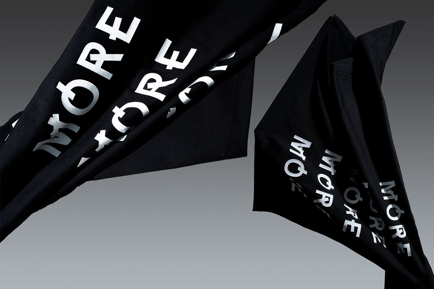
这种「LESS」与「MORE」之间相互转化的关系同样延续在全新品牌字体中。我们在字母常规笔画上,分别做「多一笔」和「少一笔」的结构性尝试,完成了三套品牌字体的构建。这三套字体通过或随机性或有意识的组合排列,构成了利郎LESS IS MORE的轻时尚全新气质。
LESS IS MORE is a brand name for fashionable men's clothing, and it is also a brand proposition.We use the mutual transformation relationship between "LESS" and "MORE" as the source of inspiration for the brand vision.On the one hand, we treated "MORE" with "less". On the basis of not affecting reading, the uppercase R has been changed into a lowercase r, making it simpler in structure;On the other hand, we made "more" detailed changes in "LESS": making the three S's in the LOGO different without adding complexity.We also made three sets of brand fonts for clothing: a font with normal strokes, a font with one more stroke, and a font with one less stroke.