


x15ventures
Making a mark in the ever-changing world of fintech is a hell of a fight and it’s one that x15ventures — an Australian venture scaler powered by CommBank — is fired up for. Well and truly walking the walk, it was time for an identity upgrade that could talk (flex, grow and expand) the talk for a growing team across an increasing number of touchpoints. We came aboard to help bring their strategy, visual and verbal identity in line with the constant scaling, expanding, moving and shaking they so readily demonstrate in their work.
What's all this then?
x15ventures is a venture scaler powered by CommBank. It was set up in 2020 to scale early-stage ventures that could help reimagine the bank’s products and services, benefiting the bank’s 15 (now 16) million customers and beyond. To achieve this, x15 occupies a space that is neither corporate, nor startup. In fact, it’s very intentionally somewhere between the two – close enough for x15 and its ventures to benefit from CommBank's strategy, scale and stability, but separate enough that it has the autonomy to try new things.
And what seems to be the problem?
Although x15 had launched a number of ventures, its proposition – including its mandate to build, buy and invest – was often misunderstood (lumped in with other corporate venturing models), inconsistently articulated, and no longer an accurate reflection of what the business had become. It had outgrown much of its early brand work. To complicate matters further, x15’s audiences are many. It needed a flexible yet recognisable brand system that would help distinguish x15 in market, particularly with the talent it required to build the next generation of digital solutions, but also founders, its peers in the venture capital industry, and audiences inside CommBank.
So how'd you go about it?
In partnership with our pals at Untangld, the strategy landed on “access advantage” — which demonstrates the brilliant collision of corporate and venture worlds, and the unique mix of benefits x15 is able to offer by occupying the space between both. With x15 beside you (whether you’re part of a venture, a core team member, or founding team), you benefit from both the security and the freedom to innovate, and ultimately shape the future.
From here came our creative concept, “made to scale”, informed by the idea that x15 is here to help take things (ventures, careers) to the next level and allow them the space they need to move, grow and thrive. x15 occupies a space where ideas and expertise collide to create big, impactful things, to push boundaries. While we got to work on bringing this to life visually, we worked with copywriter Cat Wall to give it a voice and make sure x15’s passion, quiet confidence and welcoming nature was felt in every message, as well as a suite of easily-channelable TOV guidelines for the internal team.
An exciting, impactful brand evolution
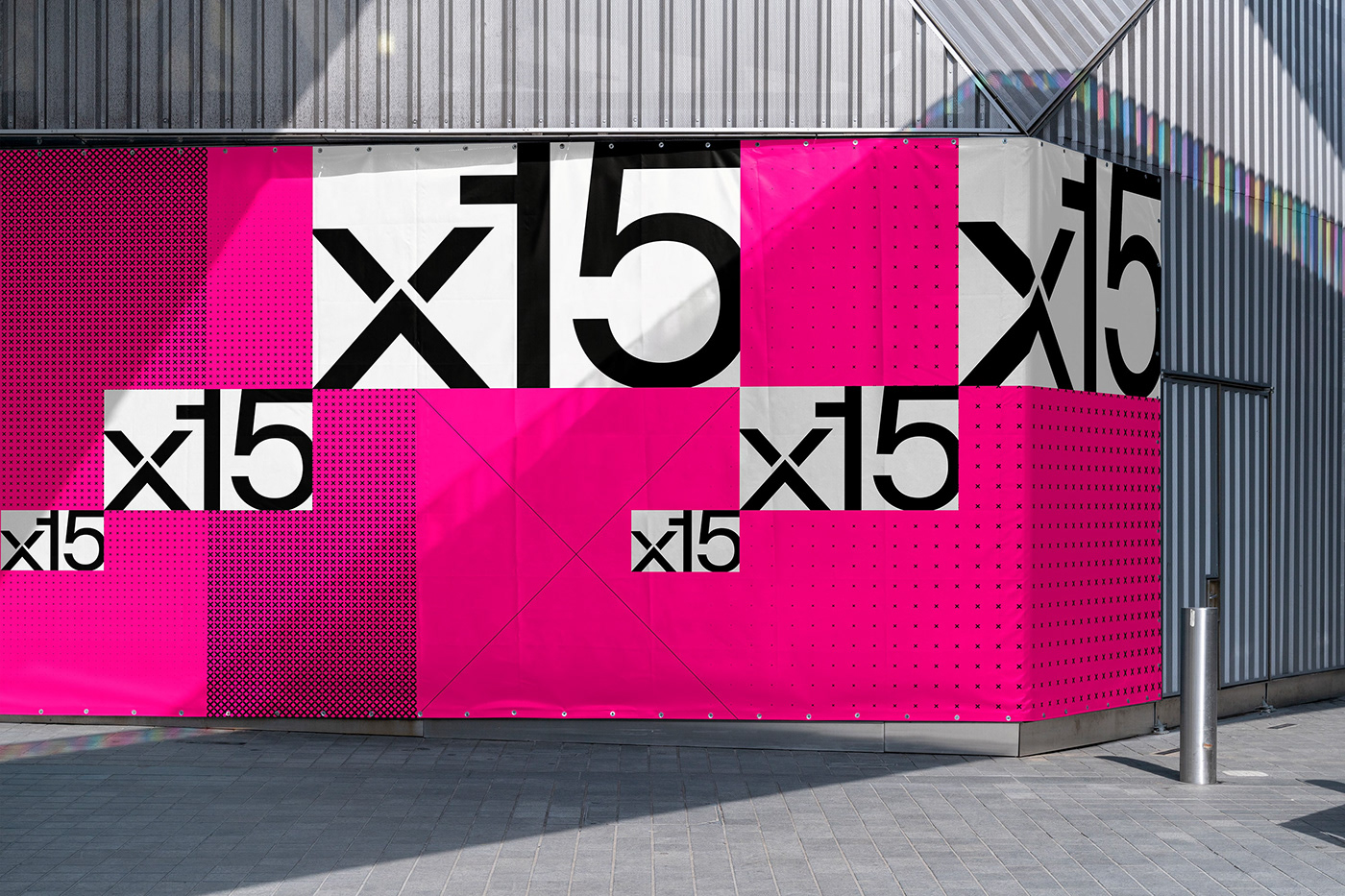
It was important to the x15 team to retain brand attribution by keeping the DNA of their original identity intact. We refined their existing logo and retained the hero brand colour, but it wouldn’t be a boundary-pushing rebrand if we didn’t, well, push some boundaries with the wider design system. The primary palette remains the same but it’s used differently, letting the neutrals do the grunt work while the brand’s signature pink is saved for impactful highlights. We also introduced Catalogue — a modern, simple, geometric typeface. The tweaks strike a beautiful balance between consistency and flexibility, while bringing the brand into the modern space it belongs.
We also created a system of patterns, shapes and wireframes, inspired by early NASA prototypes of the X-15 rocket, which helped inspire x15’s name. These grids and symbols keep the brand working, a nod to the prototyping and testing conducted by a team in the process of creating a new venture. Again, these elements sing in motion, showcasing scale, collisions, collaboration and the dynamic working nature of the teams behind the brand.


Our style of image treatment, made with millions of Xs, speaks to the 15 millions of customers that x15 serves. Intertwined with our dramatic, strong typographic system, you begin to see all the moving parts behind a brand that’s truly made to scale.
Scaling, shifting, always moving
With the brand built to be digital-first, motion needed to work its magic. The expanding and scaling at the core of the creative idea easily translates into movement and brings the fast, ever-changing nature of the venture world to life. The brand’s motion principles came together through experimentation and testing across a range of applications, utilising programming to create dynamic typography and patterns, and allowing us to build a robust system that’s easily-updated for the x15 team.


Hitting the xccelerator
Separate from the core x15 identity, we needed the brand to flex to Xccelerate — their expedited investment program that helps early-stage founders understand the pathway to partnering with a corporate. We rolled out the idea of supercharging your startup, leaning into the existing palette’s neon green and introducing a suite of patterns inspired by the X-15 rocket’s record-breaking speed. The outcome is a system that can both stand alone when it needs to, and also sit in aesthetic partnership with x15.


And the end result?
x15 can now proudly stand out with a brand identity that’s as attractive to employees as it is to founders. The dynamic and constantly-moving rebrand gives the team a simple yet endlessly flexible, expandable design system rooted in a powerful strategic foundation that anchors every aspect of the brand to their core beliefs. Living and breathing in the fintech world, x15ventures now looks, sounds and feels like a brand that’s ready to help shape the future of a generation.


