


Helsinki Region Transport (HSL) is an authority overseeing the operation of all of Helsinki's public transportation. The system comprises local buses, trams, metro trains, ferries, commuter trains, and bike-share. Some 370 million journeys are made on HSL's transport services annually.
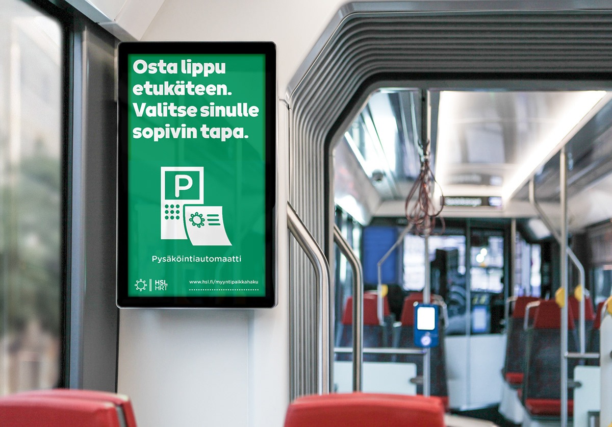
From 2010 to 2020, Kokoro & Moi was responsible for designing and developing the brand identity extending from the visual identity to information graphics and publications, and from advertising to physical and digital environments, the appearance of the vehicles and comprehensive guidelines, and many other elements of the public transportation system.
From 2010 to 2020, Kokoro & Moi was responsible for designing and developing the brand identity extending from the visual identity to information graphics and publications, and from advertising to physical and digital environments, the appearance of the vehicles and comprehensive guidelines, and many other elements of the public transportation system.
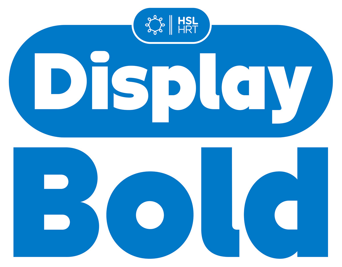
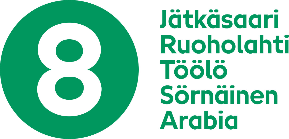
As one of our last projects for HSL, we designed the custom typeface for display use. The new HSL Display, with its bold and round shapes, plays an essential role in the brand's communications, helping to build a consistent, inspiring, and recognizable brand experience through all the HSL's touchpoints.
The HSL Display font is based on the design language of the visual identity we designed for HSL, with its rounded and bold shapes. The brand attributes, approachable and easy to use, are also reflected in the font. The simple design of this geometric sans-serif font incorporates details that make it distinctive and recognizable. The way of using semicircular shapes in the counters (white spaces enclosed inside letterforms) in the letters a, b, d, g, p, q, å, and ä, along with half arch shapes between the shoulders and stems in the letters h, m, n, r, and u, create a characteristic appearance for the typeface. Flattened geometric dots in the letters i, j, ä, and ö add personality. The font offers two weights, Bold and Medium, expanding its usability for various text style needs.


