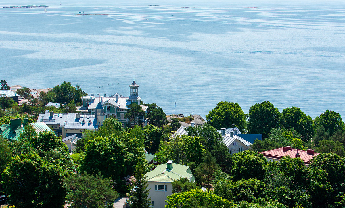
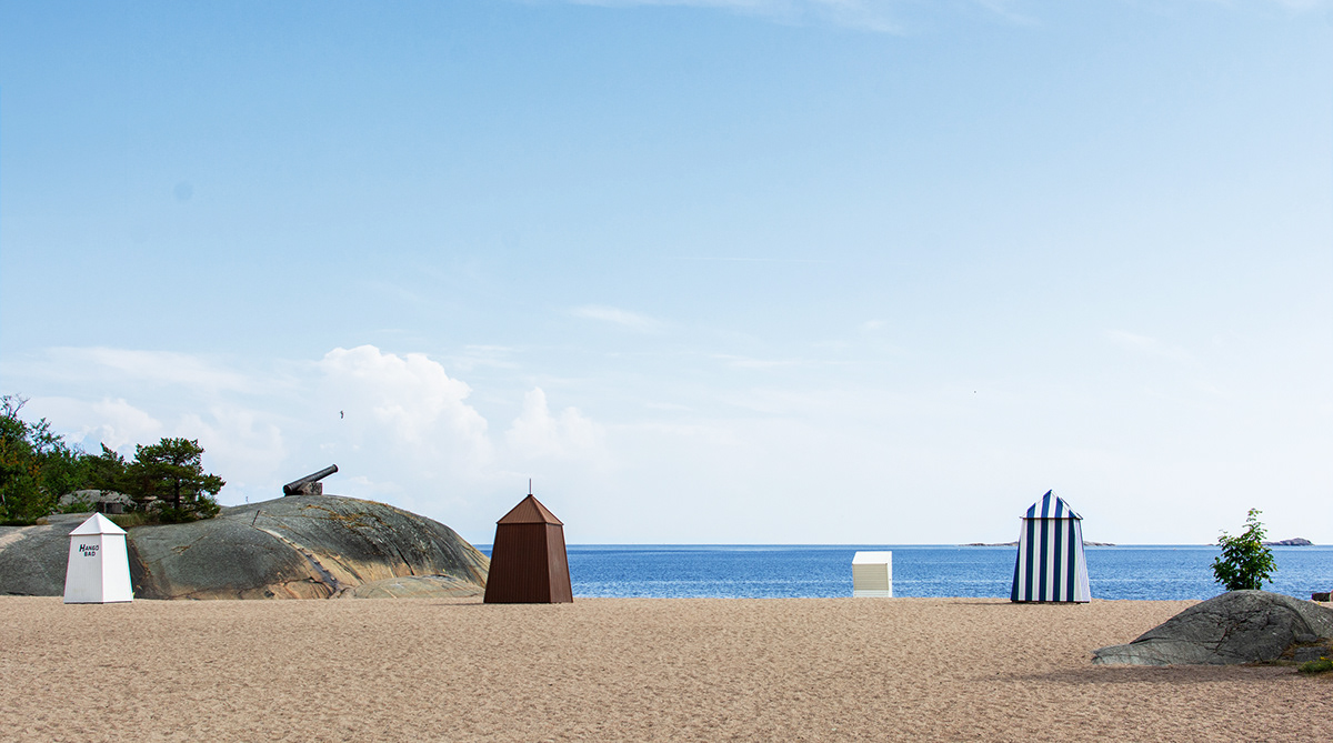


Hanko, founded in 1874, is the southernmost city in Finland (and often regarded as the sunniest one, too!). Situated on a peninsula surrounded by the sea, it captivates visitors with its magnificent sandy beaches, ruggedly beautiful rocky coves, and charming downtown with historic villas.
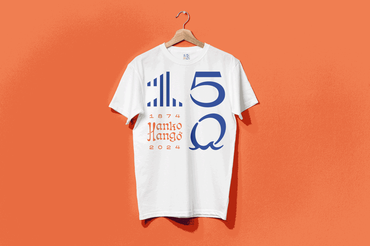
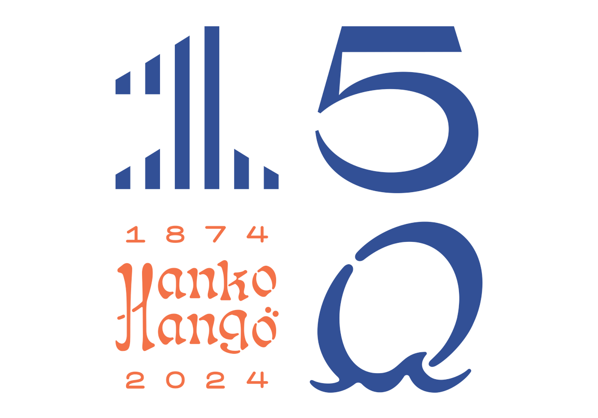
In 2024 Hanko will celebrate its 150th anniversary. Kokoro & Moi was chosen to design the visual identity for the festive year. The work extended from the anniversary logo with its different variations to colors, custom typography, and guidelines.
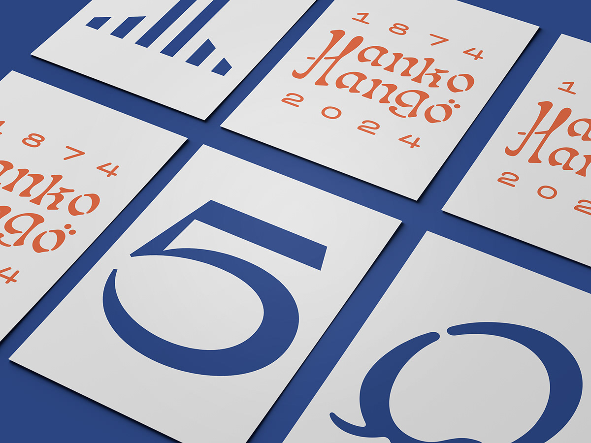
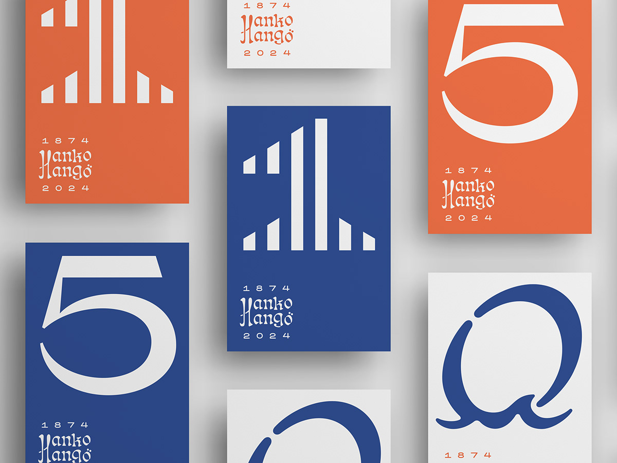
The logo for the anniversary is visually rich, showcasing the qualities and imagery associated with Hanko. The logo incorporates various typographic styles, forming a diverse and contrasting composition.
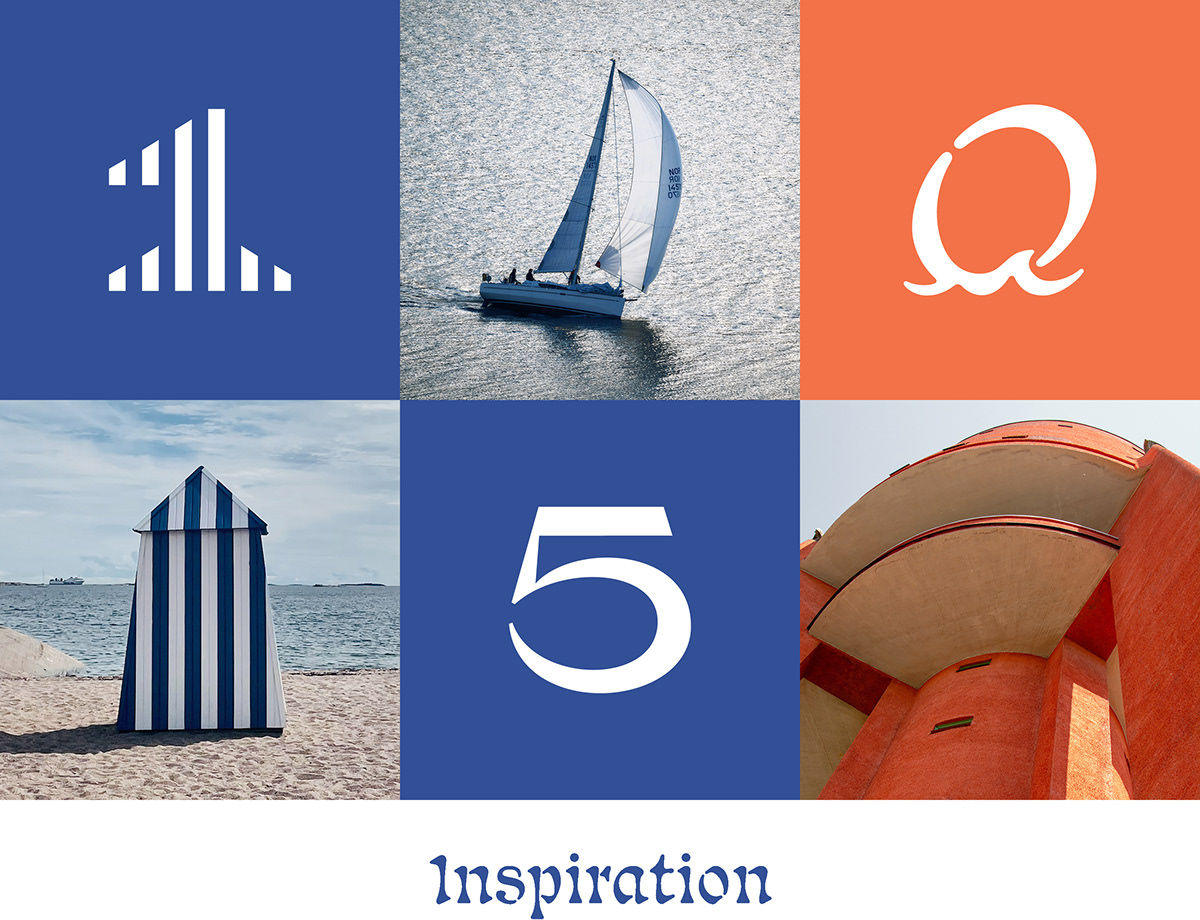
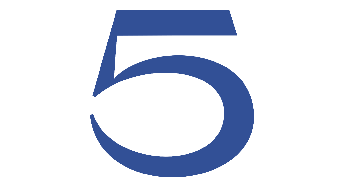
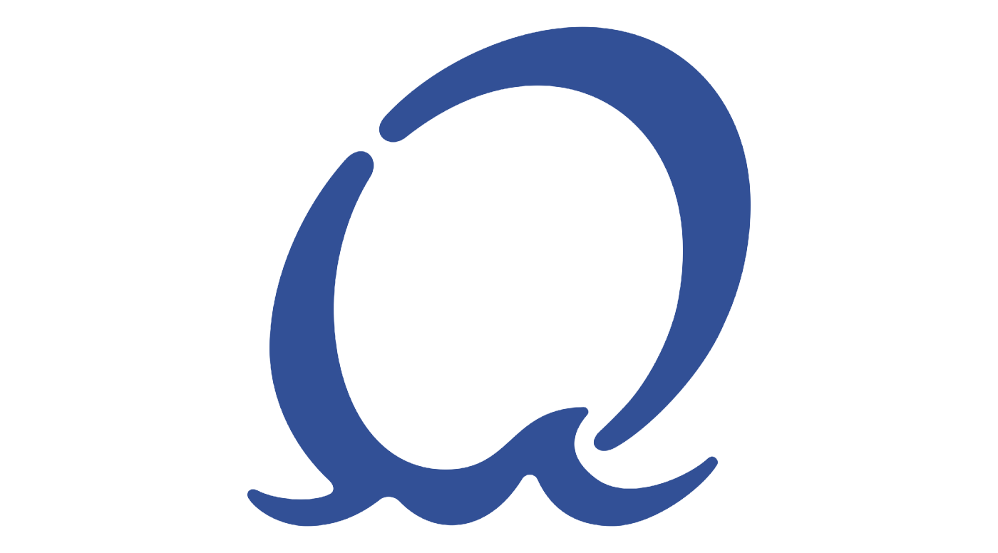
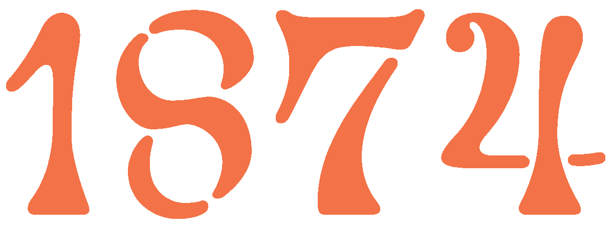
The historical typography of "Hanko/Hangö" pays homage to the old villas along the shore. (We got the inspiration for typography from the old postcard we found). The modern, sans-serif year numbers are placed alongside the name. The sleek number one in "150" echoes the vertical stripe of a familiar beach cabin. The number five features a form reminiscent of the harbor and old industrial aesthetics. The elegant, forward-leaning zero evokes thoughts of the sea as it sails on the crest of a wave.
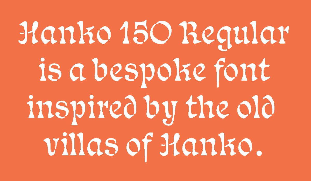
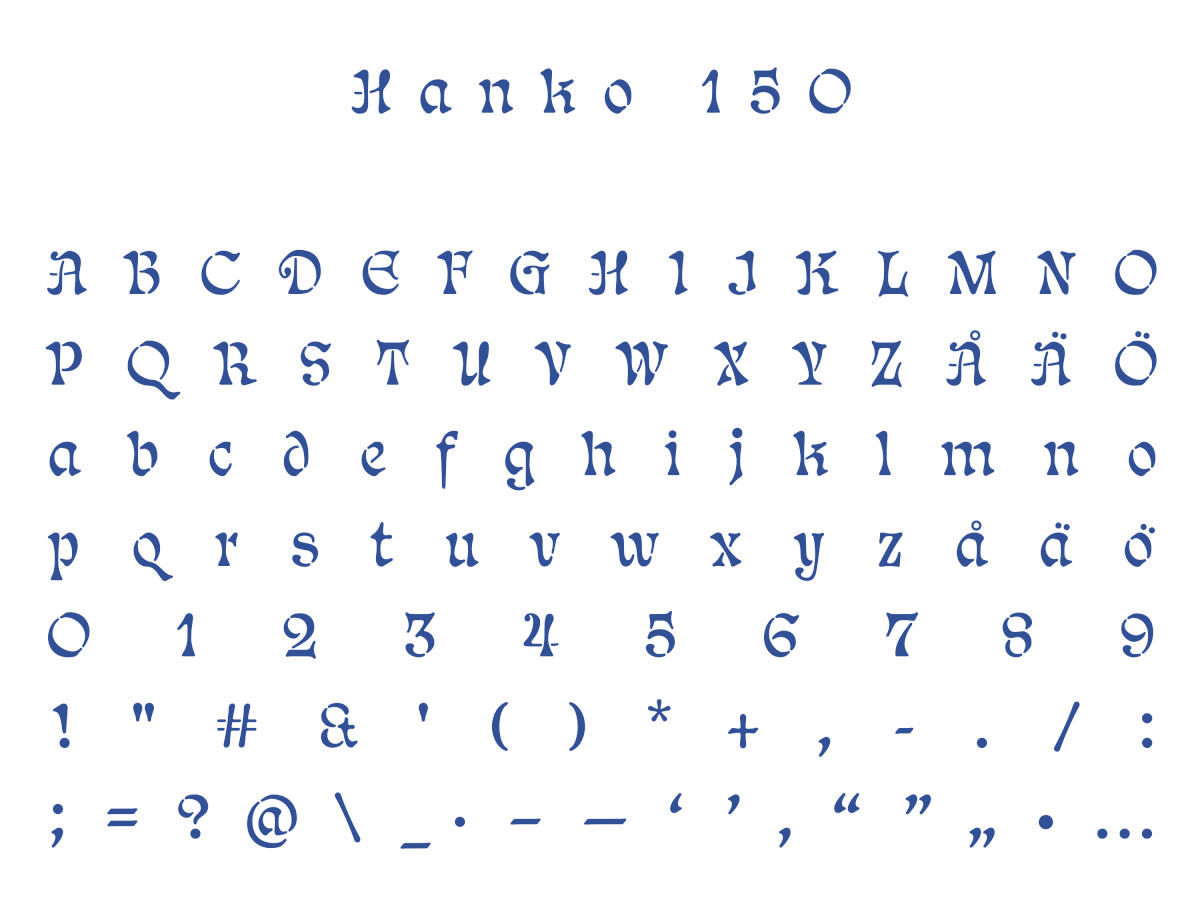
Based on the typographical style of the words "Hanko/Hangö" in the logo, we designed a bespoke font. Hanko 150 Regular is intended for use in headlines and individual larger words and highlights. The colors, blue and orange-red, are inspired by the surrounding sea and the prominent landmark emerging from the urban landscape: the water tower.
