XANDÔ
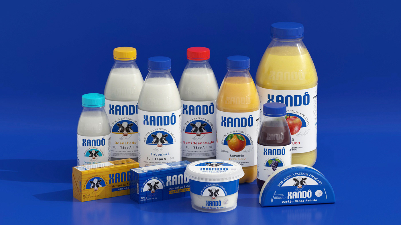
Xandô is a national company that operates in the dairy segment and is recognized by the market. Its products are in the categories of milk, cream, fresh Minas cheese, and fresh and natural juices.
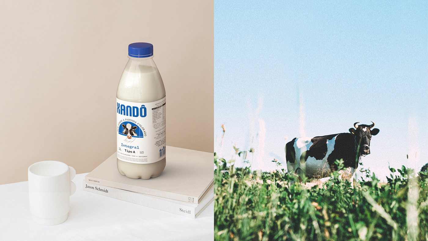
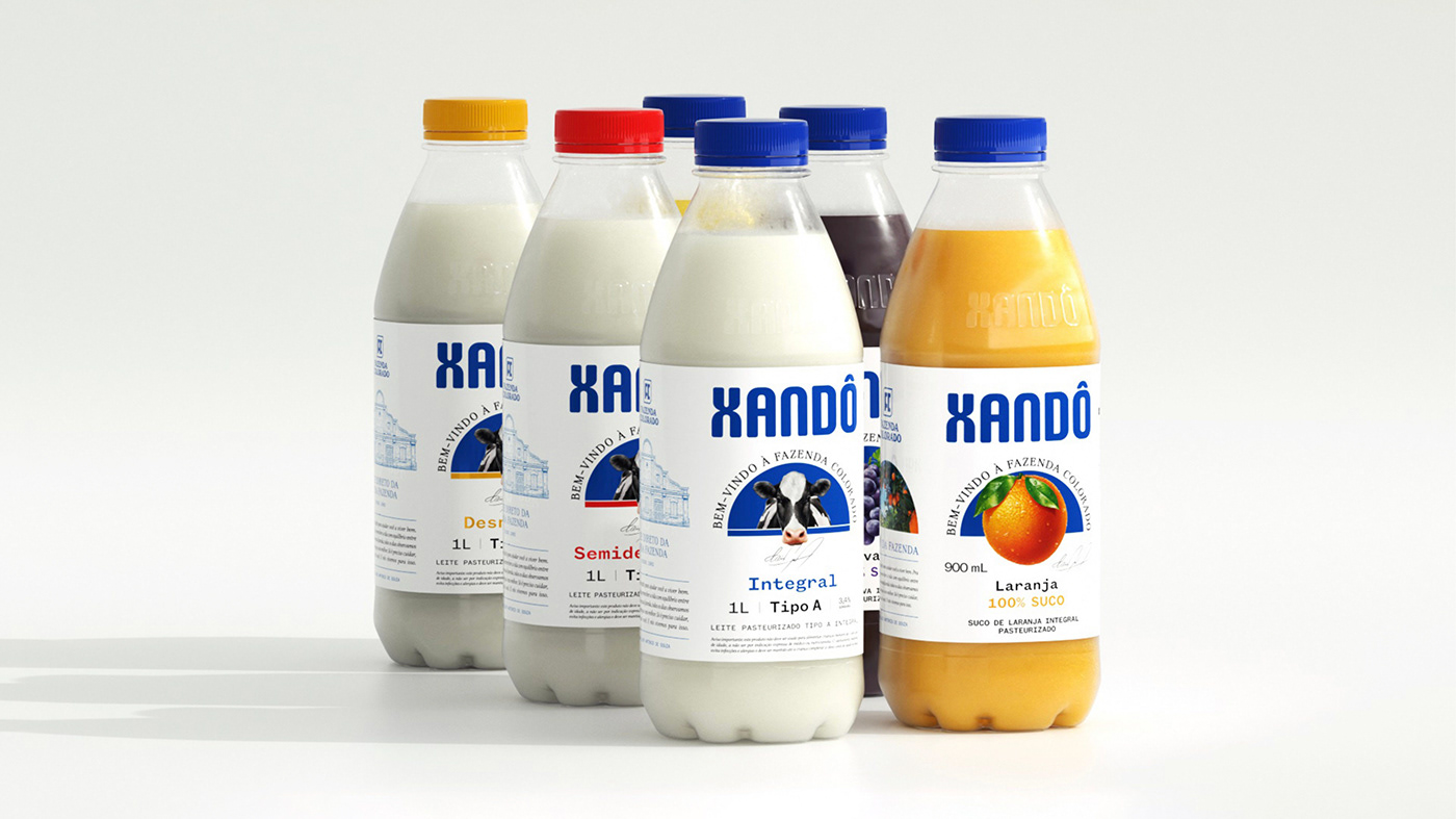
In the last 2 years, the brand has innovated its product lines and changed the bottle material from HDPE to PET. With the same drive, we redesigned the packaging, logo, and language to create a moment of evolution for the brand, not a rupture.
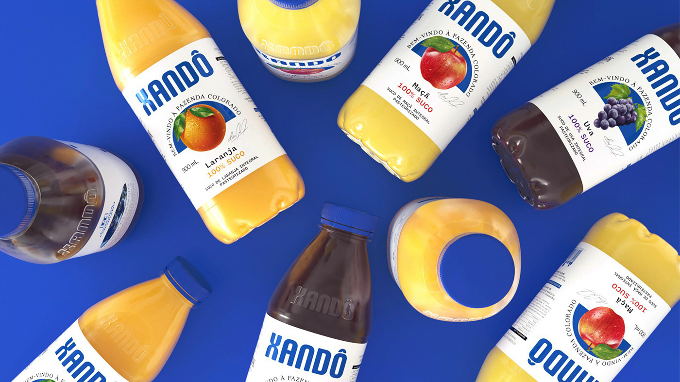
The expansion of the portfolio also required a more consistent visual thread that would bring Xandô's personality to the fore and create a stronger connection between product and consumer. The new packaging represents a brand with a wide reach, a family heart, and a strong emotional appeal.
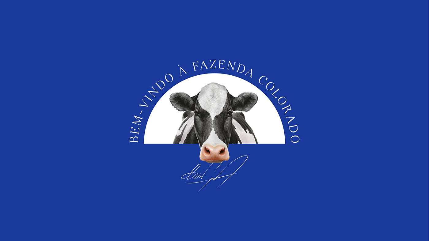
Based on its tradition, we went to Fazenda Colorado, the beginning of everything, and where we discovered the storytelling of that place: the farm is the soul of Xandô because its products are on the consumer's table in less than 24 hours.
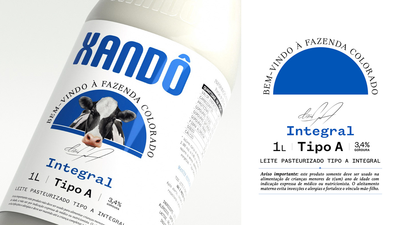
Therefore, we dressed Xandô milk with elements that harken back to handmade work. We brought the signature of the brand's founder, representing the care that exists in each production stage. At the same time, the graphic choices are inspired by the brand's history and invite people to delve deeply into this story and its authors.
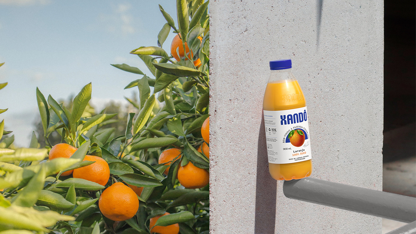
The graphic design solution for the juices is an invitation to the public to get to know the essence of the brand: from the architectural design of the headquarters, the arc emerges - which brings two important pillars of the language: the graphic element of fruits, highlighting the plantations and the product's appetite appeal. The other, the window, which takes the consumer to the farm, brings the farm to their homes.
The brand's blue is maintained, with slight contrast adjustment, bringing more prominence to the whole packaging. The typography brings a mix: the serif reinforces the classic and tradition of the brand; the mono typography imitates the labels of old typewriters, bringing a feel of the farm milkmaid to the packaging, with a more contemporary design.
For Xandô.