Illuminating the Editor’s Desk
The Association of Editors and Audiovisual Editors of Catalonia (AMMAC) is a non-profit association that brings together editors from across a range of sectors: fiction, documentary, television, advertising and corporate. Their current website and identity did not reflect the importance of their role in audiovisual production. Our task was to create a website with personality that would convey the scope and value of their work, at the same time becoming a reference point for members seeking advice and legal information.
AMMAC was launched in 2018 by a small group of editors concerned about the need for better representation, greater recognition and collective action within the industry. Acting for the editors of Catalonia before the audiovisual sector, official institutions and society, it calls for fairer work, gender equality, and the exchange of knowledge and resources. They also want to emphasise that beyond technical skills, editors bring value and creativity to the sector.
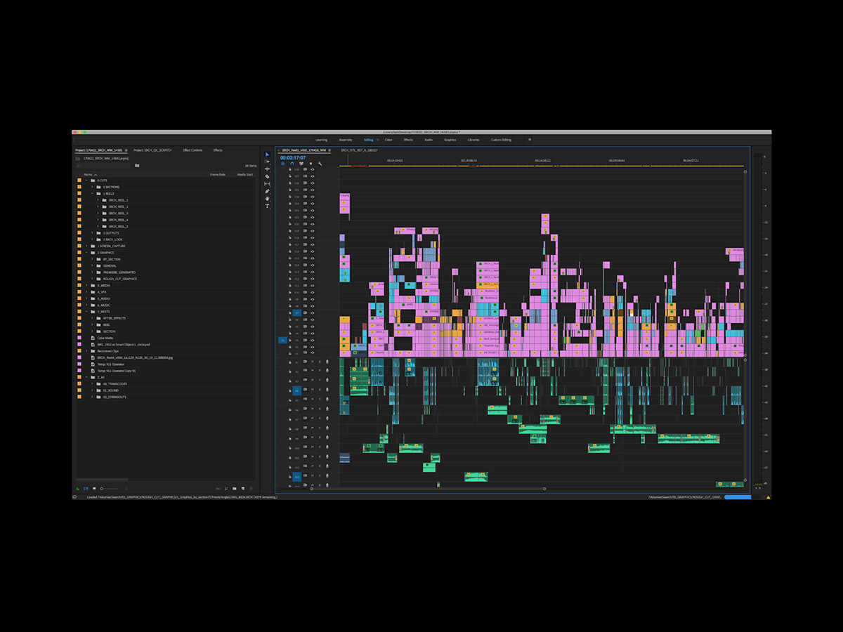
It was clear from the outset that our design proposal had to be specific to the industry yet universal, highlighting the breadth of knowledge, creativity and expertise that these editors bring to their projects. As such, we were inspired by the visual aesthetic of editing software, specifically the programs Adobe Premiere Pro and Avid.

.


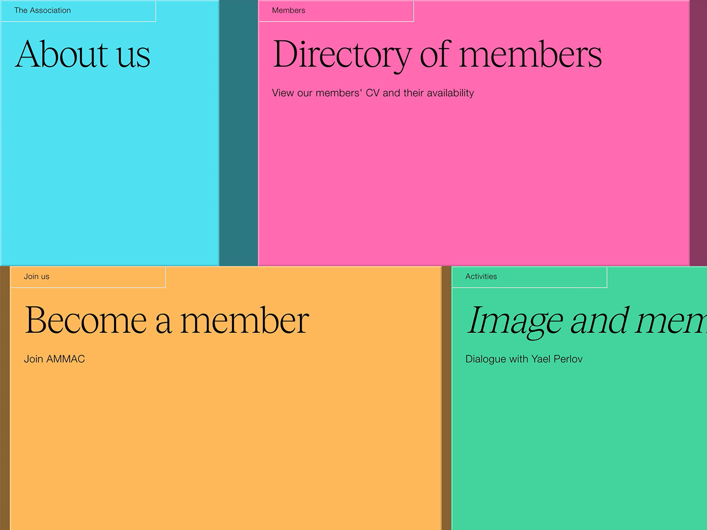
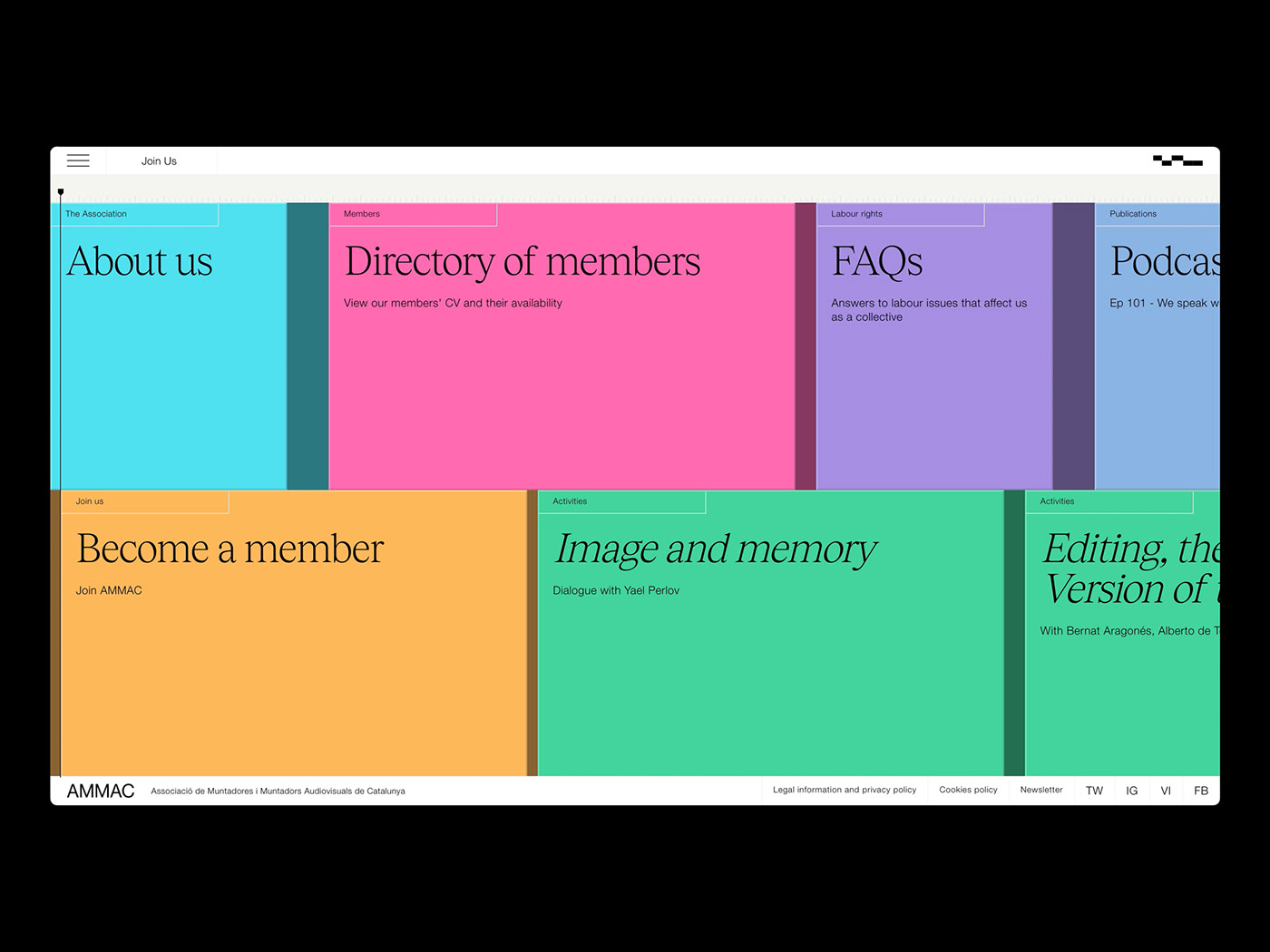
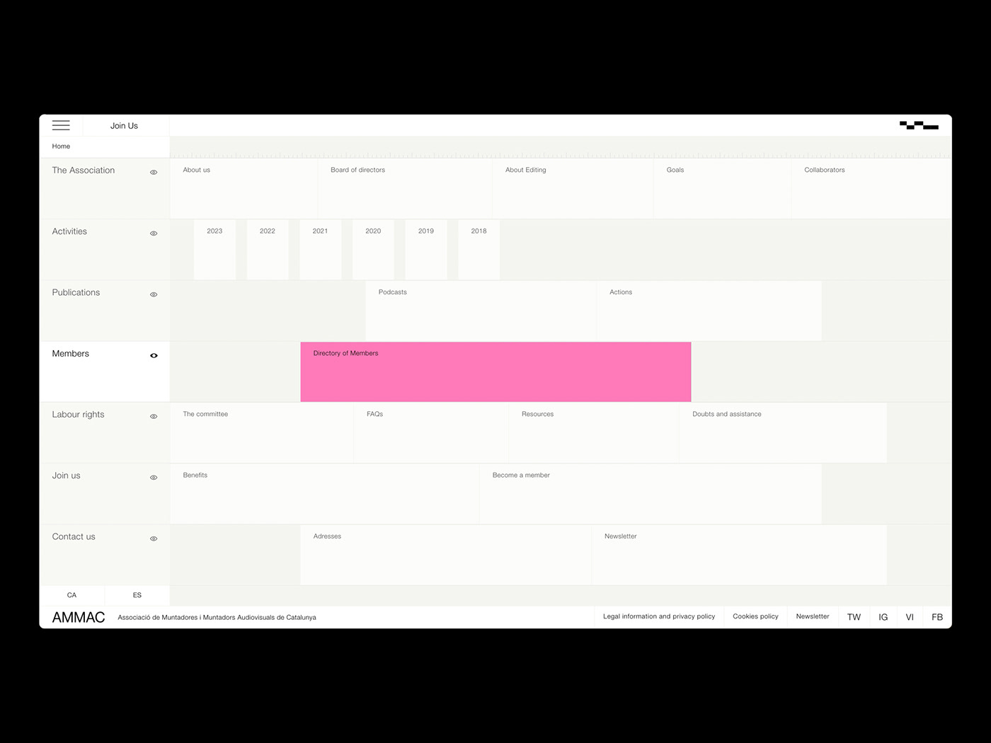
On entering the desktop version of the website, users are invited to navigate via an intuitive horizontal scroll that mirrors Premiere Pro’s “timeline” feature. Each layer corresponds to a section of the menu containing different blocks of content. When entering each section it is as if you are zooming in on specific clips or layers mounted horizontally and consecutively, one after the other. A responsive simplification of the desktop design, for the mobile version the blocks of content are mounted one on top of the other rather than horizontally, maintaining the concept but in a way that allows for vertical scrolling.
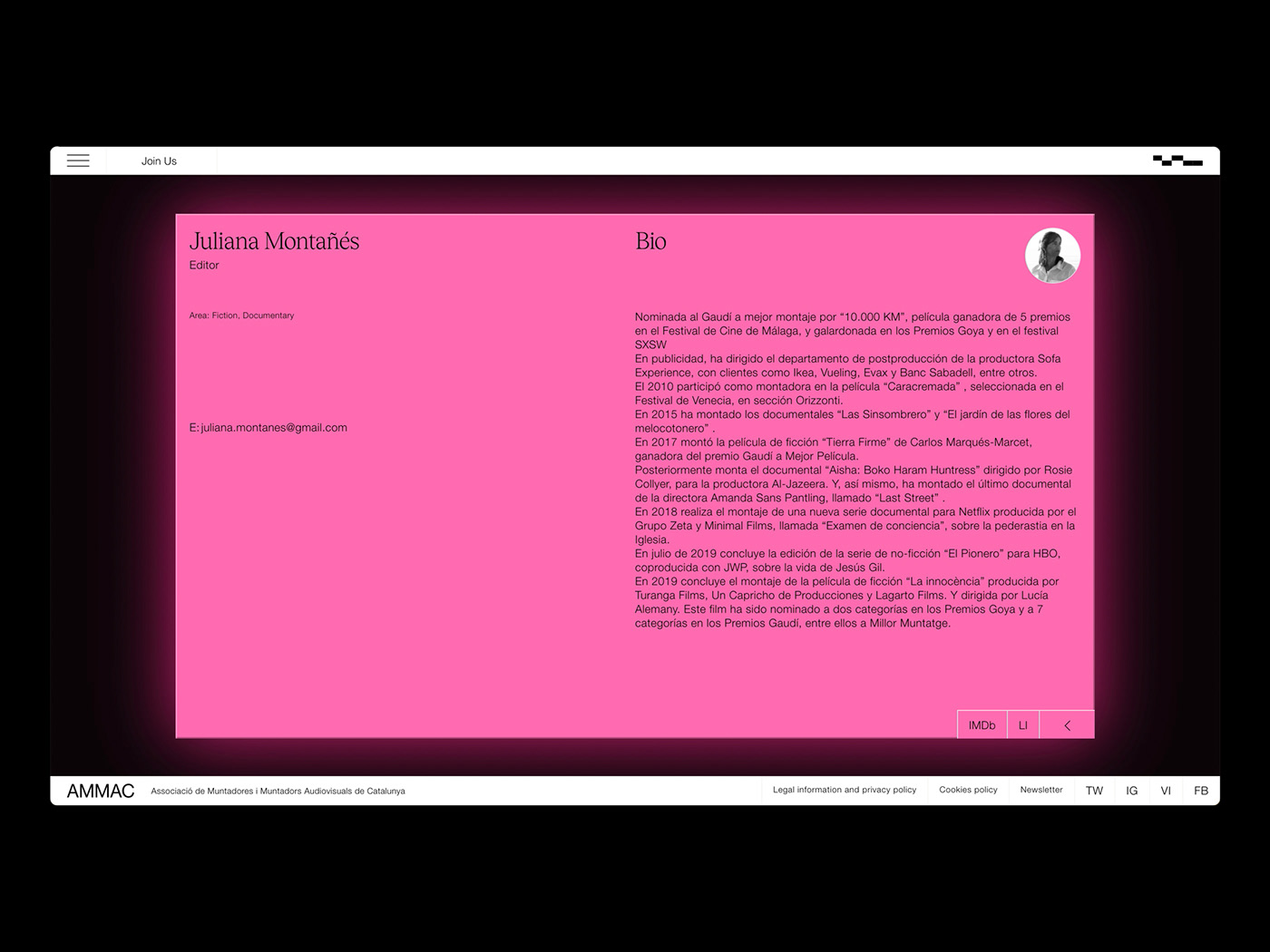
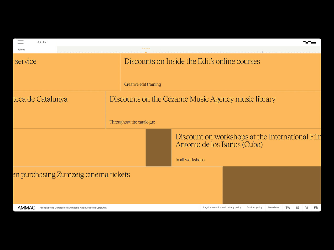
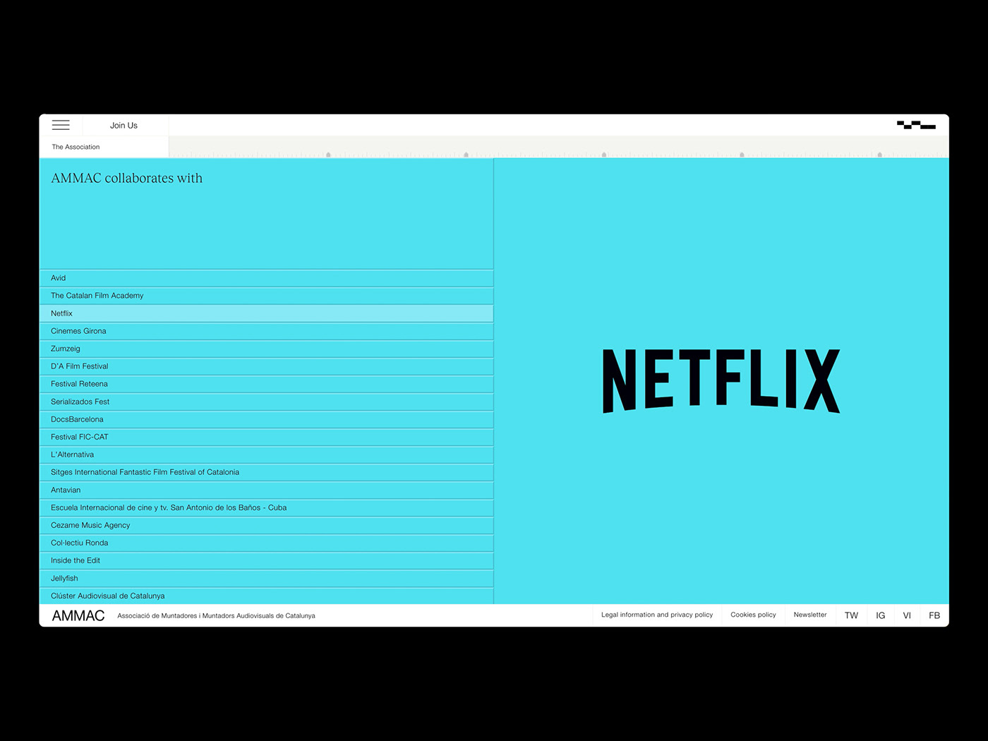
We opted for Premiere pro’s vibrant colour palette of pink, blue, green, turquoise, orange and purple. However, instead of choosing the “dark mode” normally associated with video editing software, we decided to use white, bringing the homepage closer to an editorial environment and moving away from the classic “gamer” look. When entering an in-depth article or professional profile, the colours pop at the edges with a hazy “glow” effect – a nod to the typical lighting environment of an editor’s desk and a subtle reminder of the digital nature of their work.
.
.
.
.


.
.
.
.
.
.

