To create big through short distance
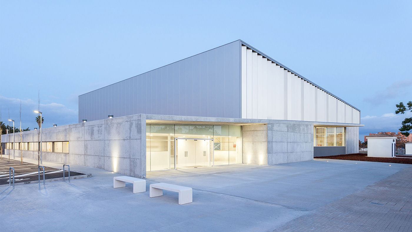
With more than 25 years of existence and projects around the globe, CMV Architects decided it was time to organize and rethink their positioning towards their natural evolution. What initially started as a small collective of architects, over the time became a firm with more than 40 collaborators spread across Mallorca, Barcelona, Lanzarote and Vietnam. However, their main belief, which has always distinguished them from other big architecture firms, has remained intact: the vocation to connect people and companies with stimulating spaces through design, architecture and personalized style.


We wanted their new visual identity to reflect these values, regarding their atemporality and contemporaneity, so we knew we needed to be minimal on the interpretation, but broad in its meaning.
This proximity with the client has always been the main approach for each project, regardless its magnitude: whether they’re creating a mediterranean family residency, a luxury resort or a big skyscraper in Ho Chi Minh City It is the collaborative and human factors that allow them to have this flexibility and to adjust solutions to each problem.
Starting by gathering the initials of the founding partners, the logo merges the M and V to subtly emphasize the union between them and clients. By doing so, we’ve also understood we were facing a spring: a symbol for flexibility, extension and boost. All those characteristics are applied to CMV, regarding the scale, length, effort and the enthusiasm.
The logo also holds a formal contrast between straight and rounded corners, in order to express the intention to look out for every detail, as their focus for every single finishing.
Taking the rounded details on a solid logo shape, the corporate typeface follows the same characteristics: a functional and solid construction with rounded tweaks, that make its reading more empathic.
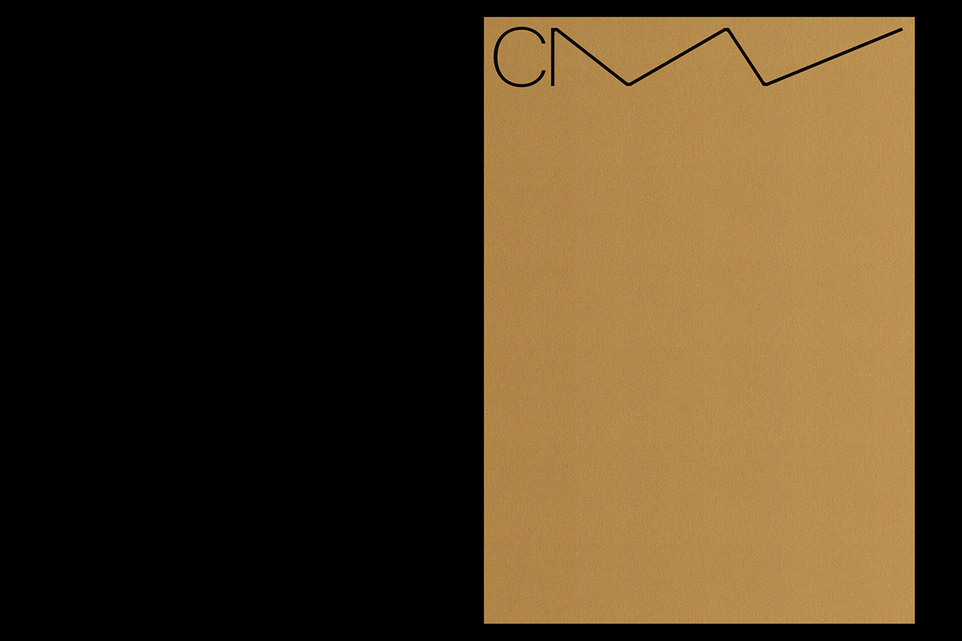
As for the visual language, the flexibility and adaptability is extended to colour and layout. Black & white are the only initial state, allowing any other colour to be adopted from any past project and future landscapes.
A responsive grid system was also developed for key elements — from the web, to folders or flat plans — where the logo reacts to its main use.
To highlight some of the key categories of CMV’s projects, we’ve designed a group of pictograms that follow the same construction principles, helping the visual language to gain coherence in all sorts of applications.
The web was the firm’s main problem to solve in the visual identity process, due to its complexity. As in any other element, we applied very simples rules, that could make it easy to use and survive over time.
Starting out from a square number, we reorganized the content in 4 main sections, to which the logo adapts and interacts, generating a flexible / responsive grid system that allows each section to become unique.
The user-experience conveys all the key elements: changing color while hovering and flicking through project titles, to subtle rounded corners in every image frames.


..
.
As for the printed matter, such as stationary and presentation elements, we backed out to the foundations of the project, resuming all of those materials to a more silent appearance, allowing colour and logo flexibility to show up only in two particular pieces (folder and special envelope), in order to not spoil those particular gestures and let the identity remain cohesive during another 25 years.


.


.
