CONCEPT:
As part of a massive brand make-over and before re-doing the visual identity for the Austrian real-estate company SEG, we decided to create an image campaign that would help to position it in the high-end market. Conducted in social media (Facebook and Twitter, mainly) as well as physical billboards and press ads, quotes from designers, architects and urbanists would appear every two weeks on these supports and redirect to a complete essay on the company's website.
As part of a massive brand make-over and before re-doing the visual identity for the Austrian real-estate company SEG, we decided to create an image campaign that would help to position it in the high-end market. Conducted in social media (Facebook and Twitter, mainly) as well as physical billboards and press ads, quotes from designers, architects and urbanists would appear every two weeks on these supports and redirect to a complete essay on the company's website.
EXECUTION:
The main challenge was to achieve brand recognition with consistency while also catch attention week after week. We chose a typographic treatment that would be relevant to the style and/or period of each quote. This also allowed the use of typefaces not commonly used in press ads.
I conducted some extensive research in typographic history to match the author's period with relevant typefaces (based on period but also geography)
The campaign was very successful in raising brand awareness and positioning.

Press inserts appeared in Die Presse, Der Standard, Kurier and all relevant newspapers as well as weekend supplements.


Quotes appeared on all of SEG social media.
OUTDOOR ADVERTISING

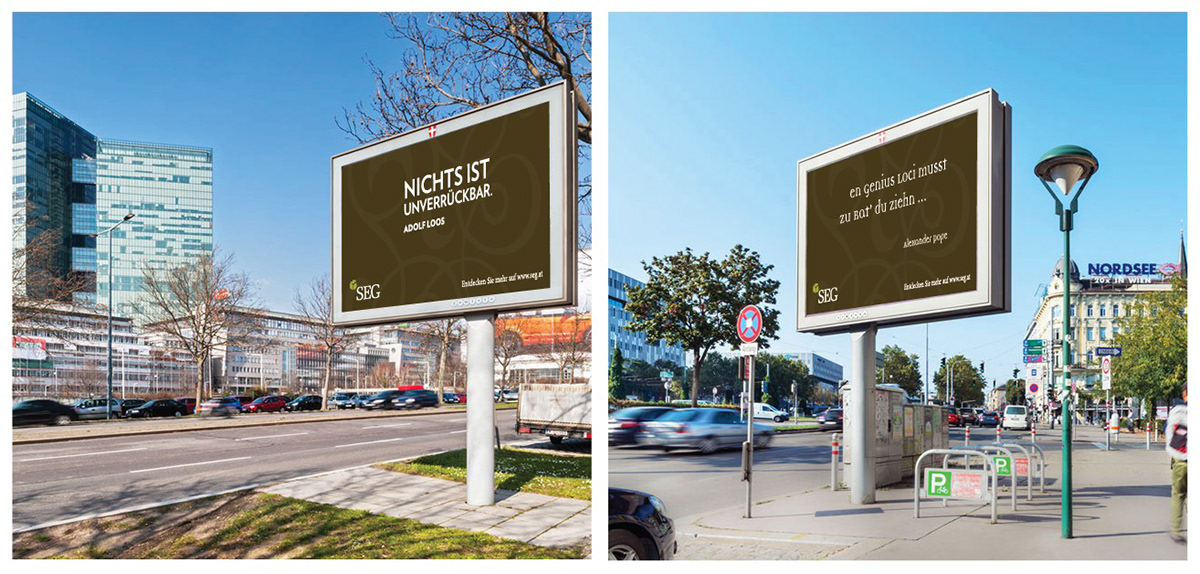
Billboards were placed around Vienna as well as on construction fences.
FREEBIES:
It was decided that a poster with all these quotes would be offered as a high-quality, letterpress poster to customers of the company.
It was decided that a poster with all these quotes would be offered as a high-quality, letterpress poster to customers of the company.


