SEG GmbH
BRANDING | CORPORATE IDENTITY
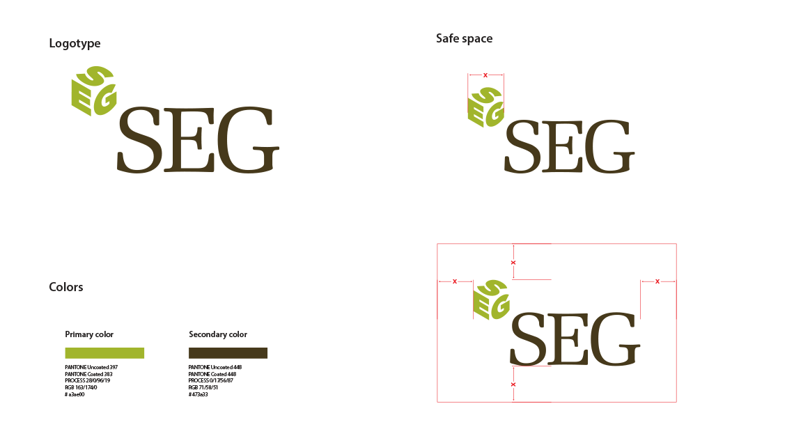
This leading real-estate company had a logo but no clearly defined identity system and no clear guidelines, which resulted in inconsistent branding. Additionally, the existing branding was out-of-touch with its market position. It has shown through market research that the company is perceived as dynamic and innovative. As part of the reworking of the corporate design we have decided to give it a more modern edge.


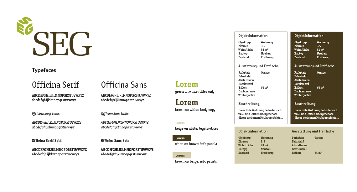
The first task was to bring some order in the corporate style guide. I defined a list of typefaces that offer legibility and advanced features, essential to set both text and numbers. The usage of colors and fonts was clearly defined.

his complex graphic element allows great flexibility to be used as backgrounds, overlays, and graphic accents, creating a pattern that is always different yet consistent.


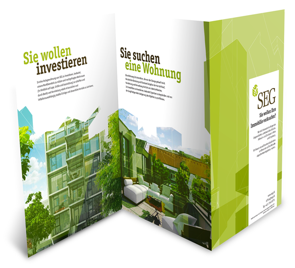
A six-page corporate brochure showing the new image. Unfolding the brochure reveals on one side material that is aimed at investors while the other side features content more targeted to the end-user

Booth designed for the trade-show WIM-Messe 2014. We were all happy to see how every branded element worked together to create a cohesive experience.


