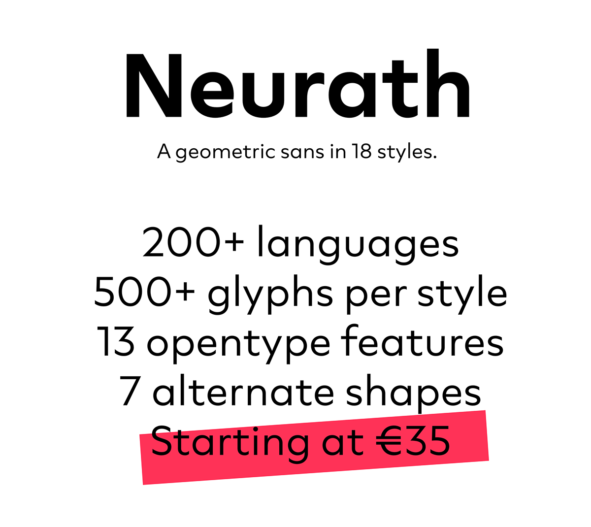
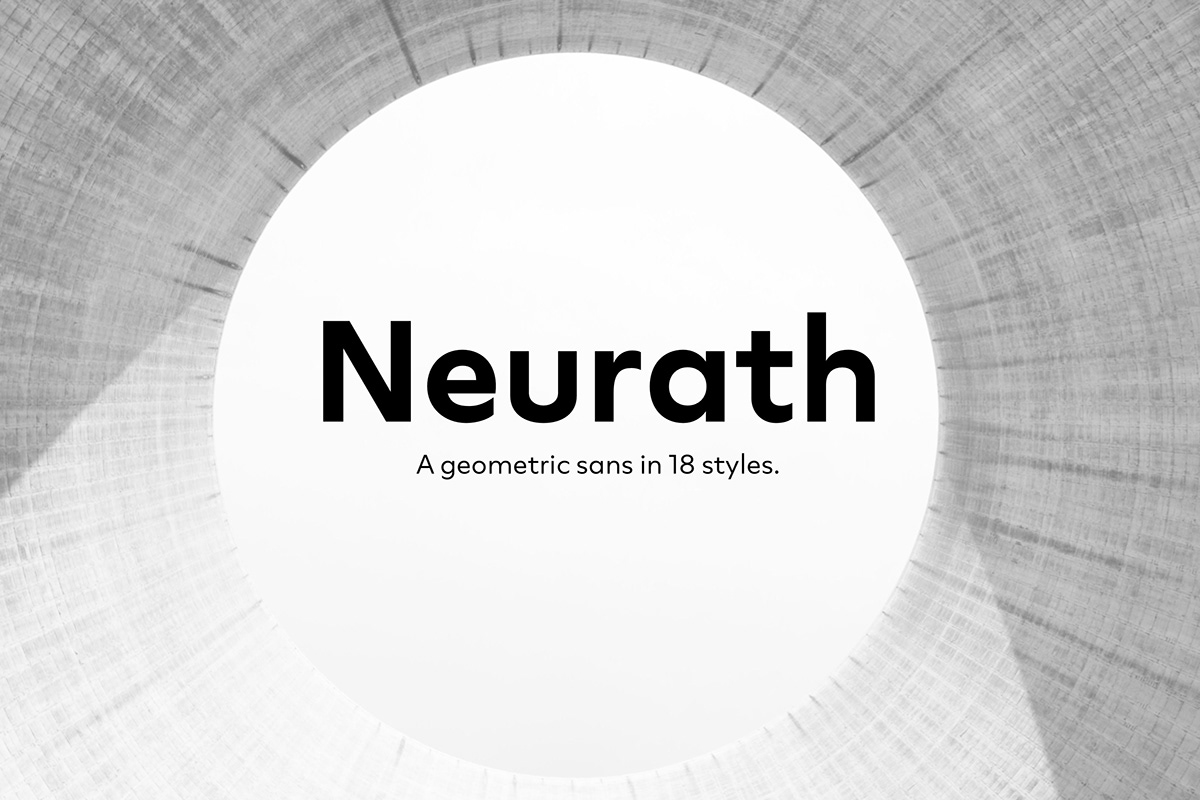
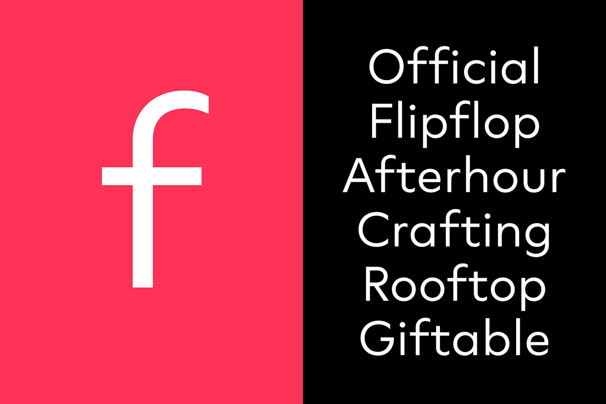
Neurath.
A new interpretation of a classic.
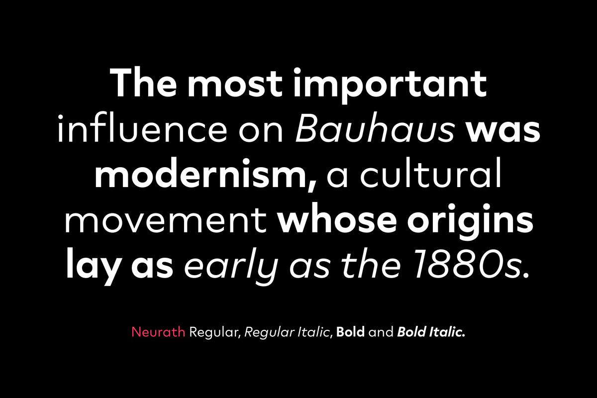
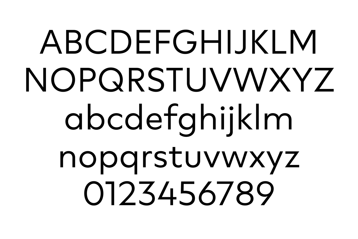
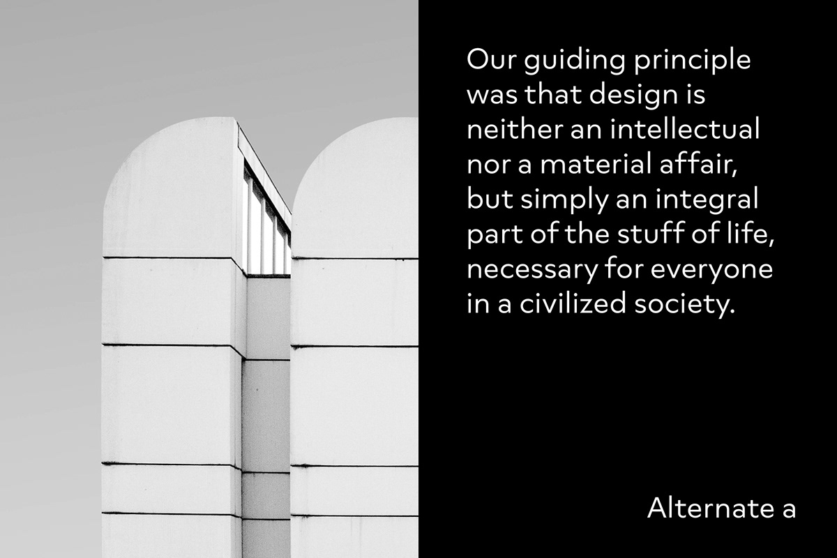
Neurath is a modern interpretation of Paul Renner’s Futura from 1927. While Renner pursues strict geometry, I tried to subtly breath in a touch of humanity. Varying terminals in the original were unified and many opentype features integrated to create a modern tool suitable for everyday use. With its 18 styles, the family is ready for any typographical purpose.
Neurath was named after Austrian born graphic designer Otto Neurath (1882-1945), who paved the way for the development of pictograms with the introduction of the ISOTYPE system.

Characteristics
While Futura pursues a strict geometry, Neurath subtly breathes humanity and approachability into the original. Varying terminals in the original were unified and the x-height was lifted to modern standards to create a contemporary tool suitable for everyday use.

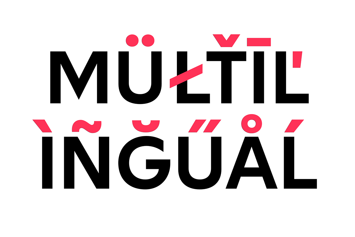
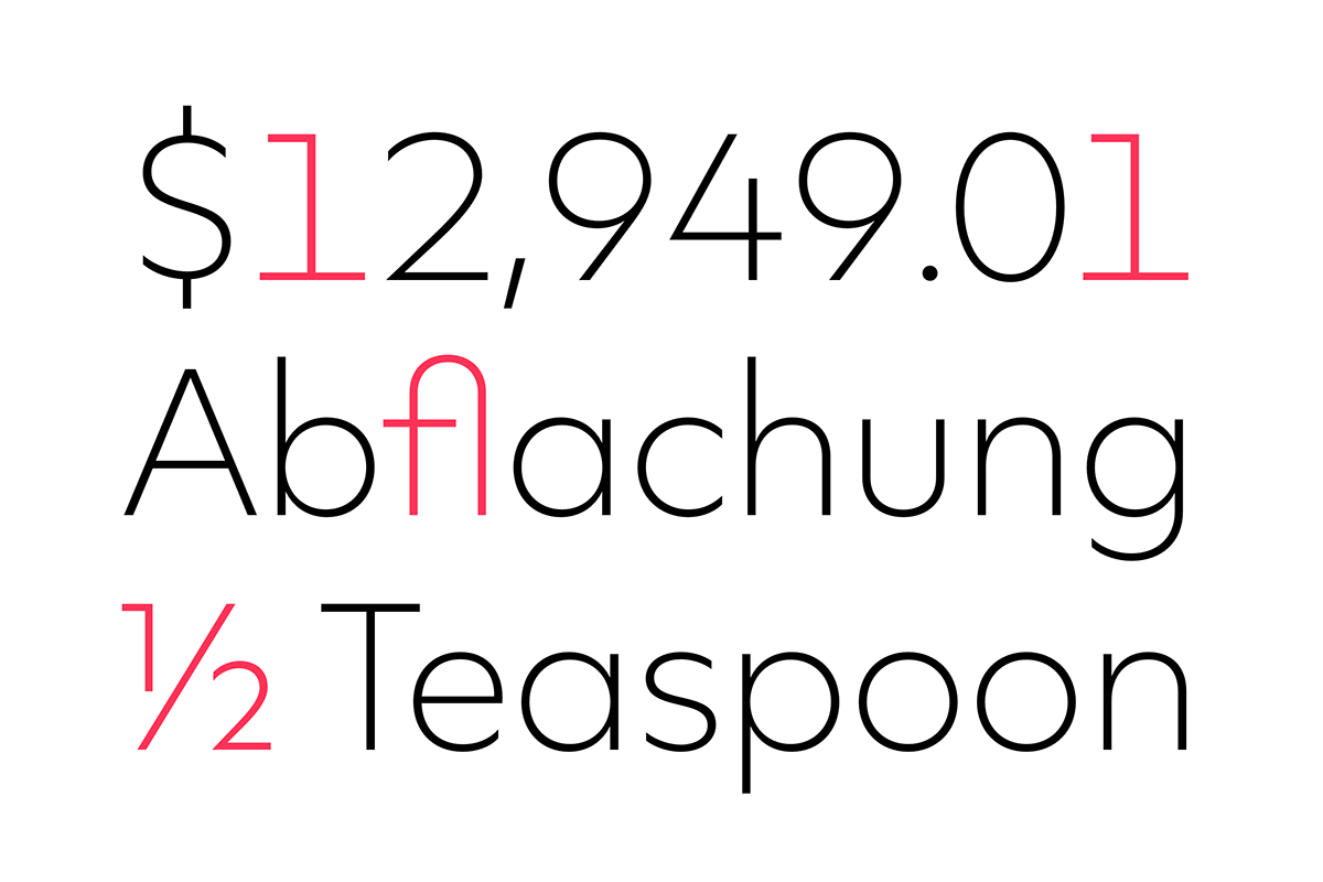
Alternates
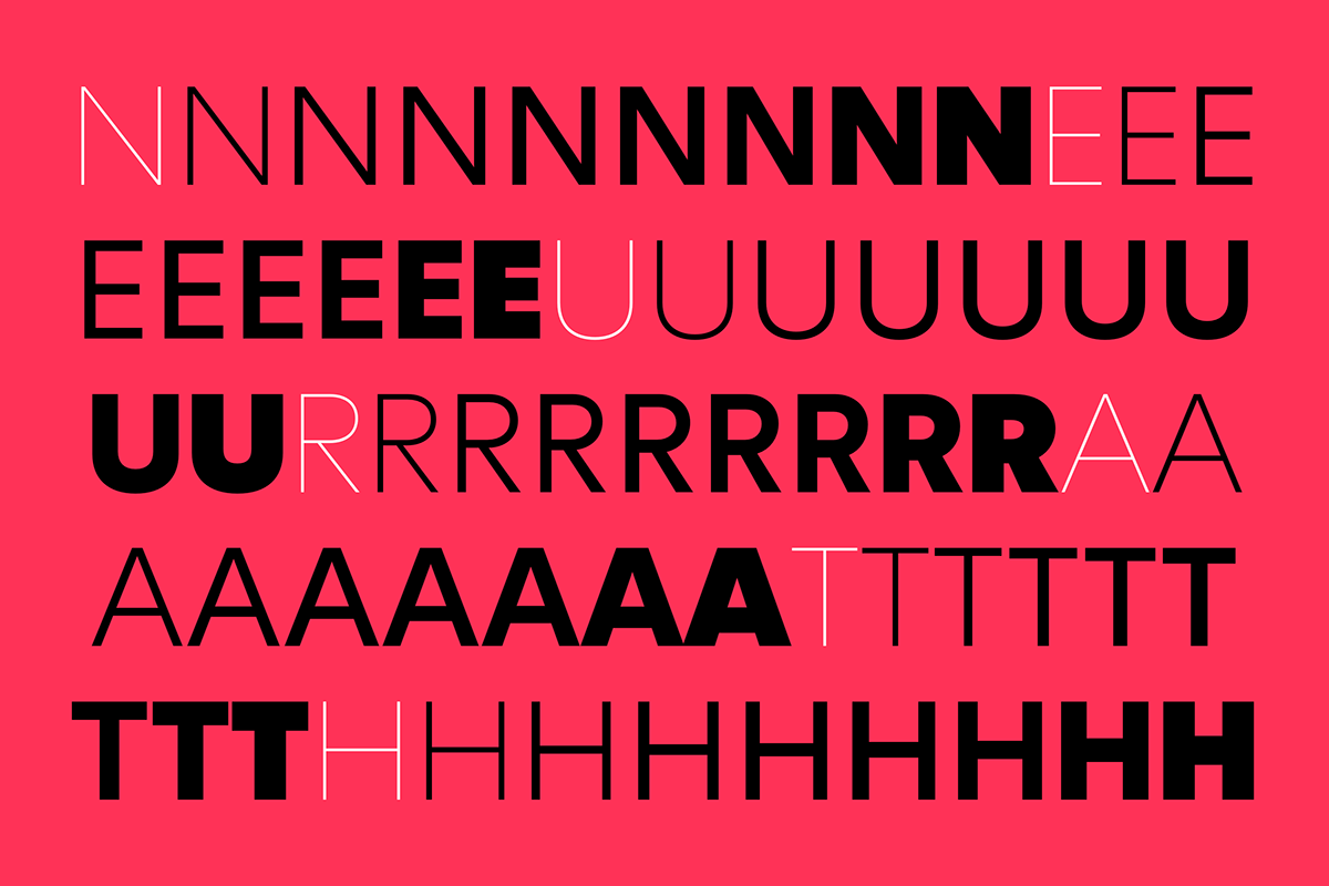
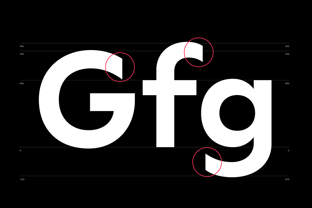
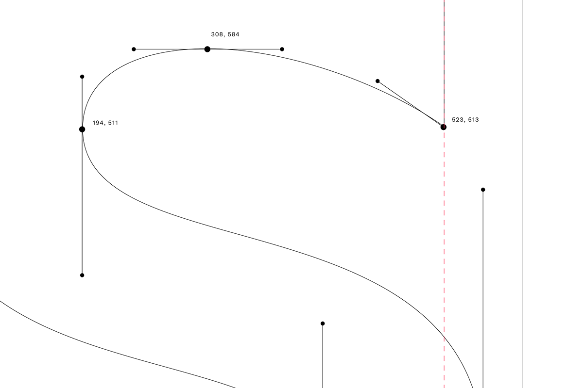
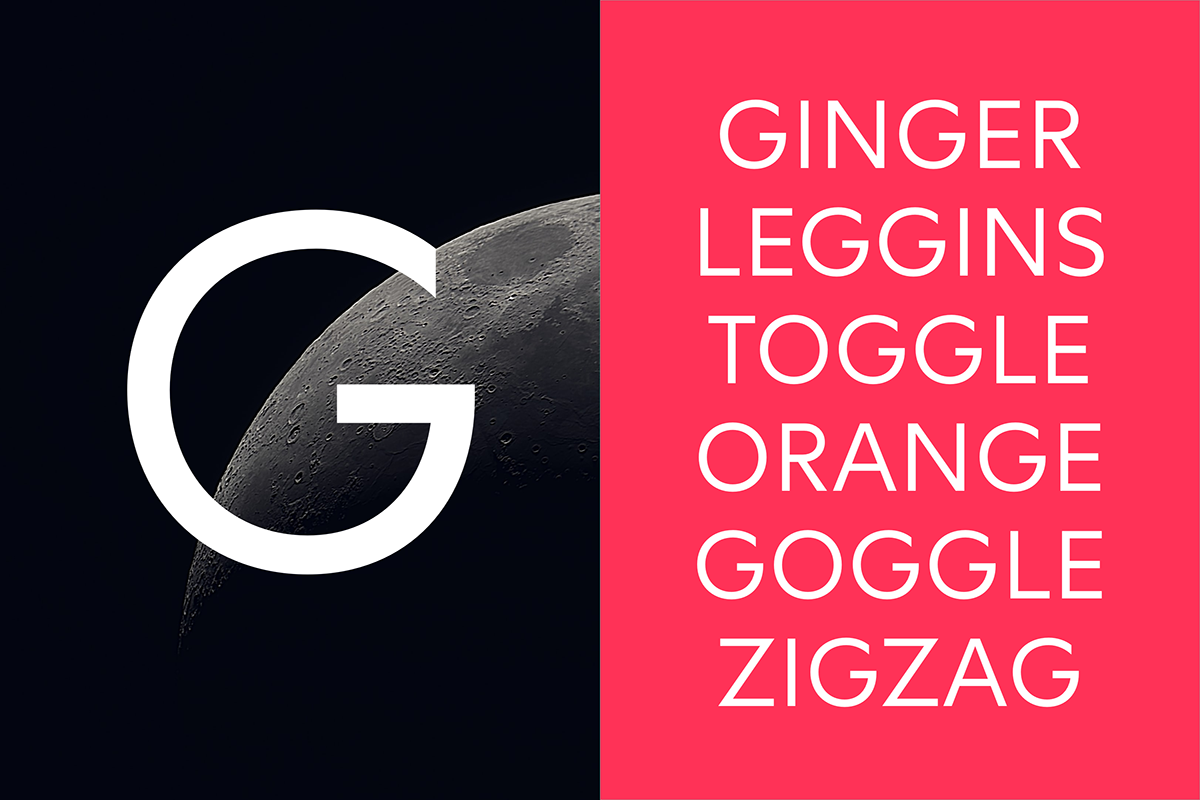
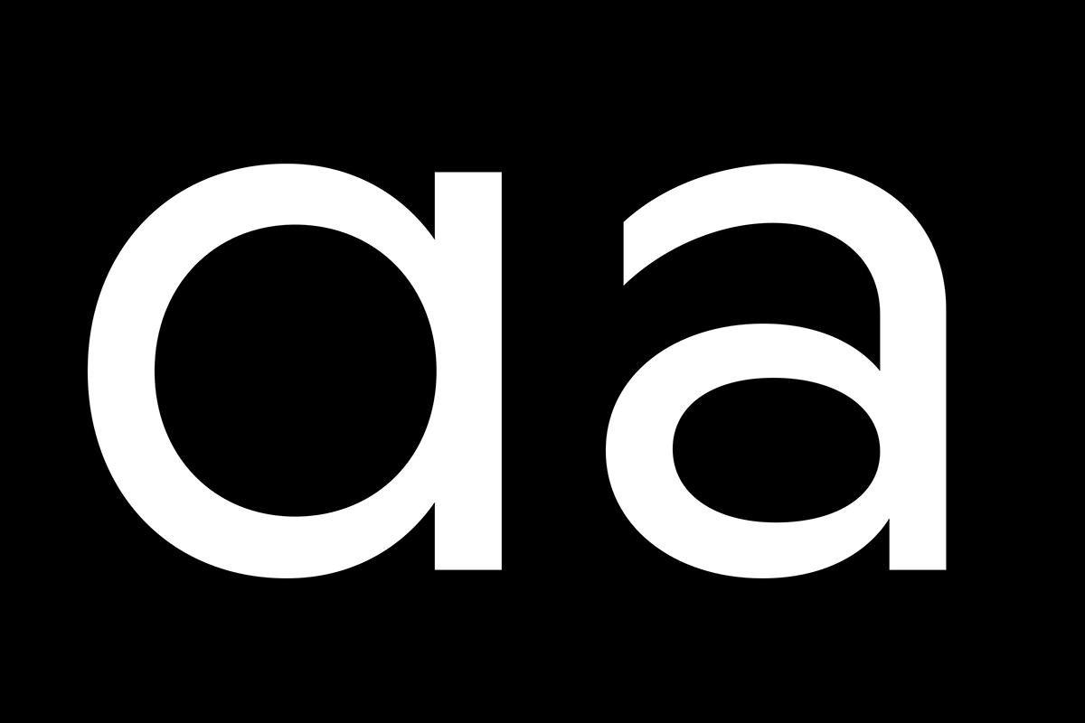
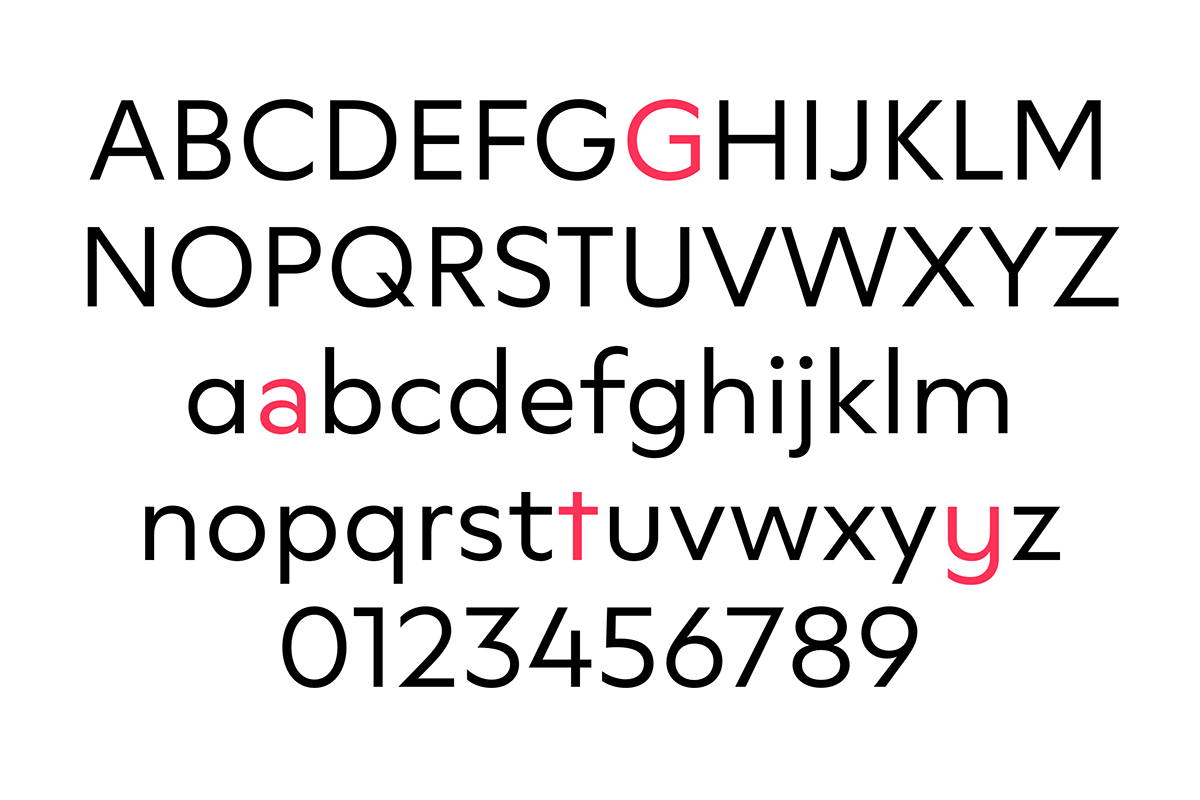
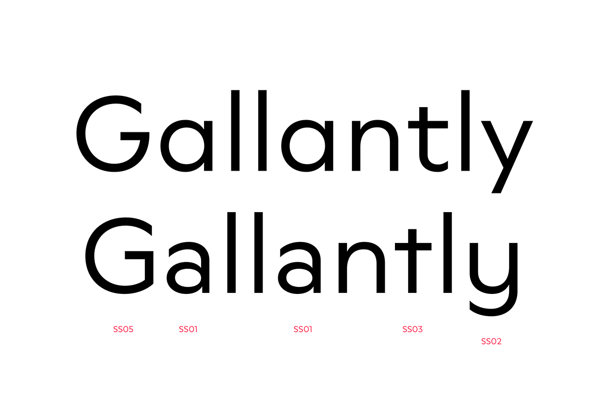
Neurath comes with several alternative character shapes to allow designers to customize the appearance of a paragraph. Used wisely, a unique brand font can be created with little effort. Some alternative shapes are subtle, such as the flat-sided G or the geometric t. Others, such as the double-storey a, the friendly y or the historical ß, result in completely new design possibilities due to their differentiated forms.

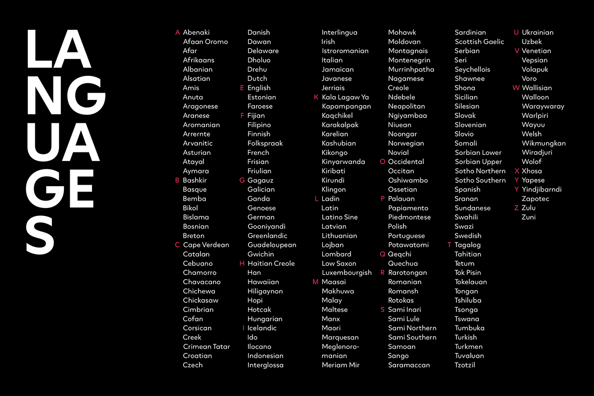
Languages
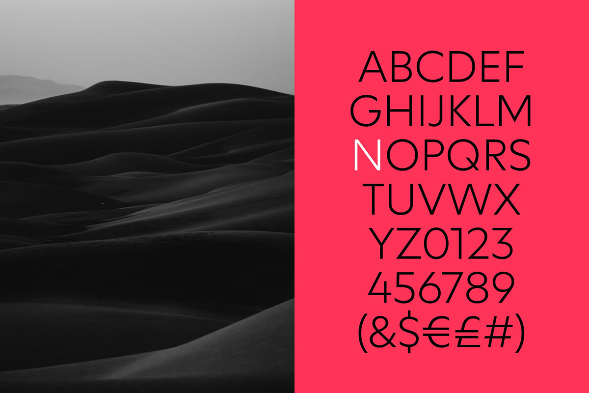
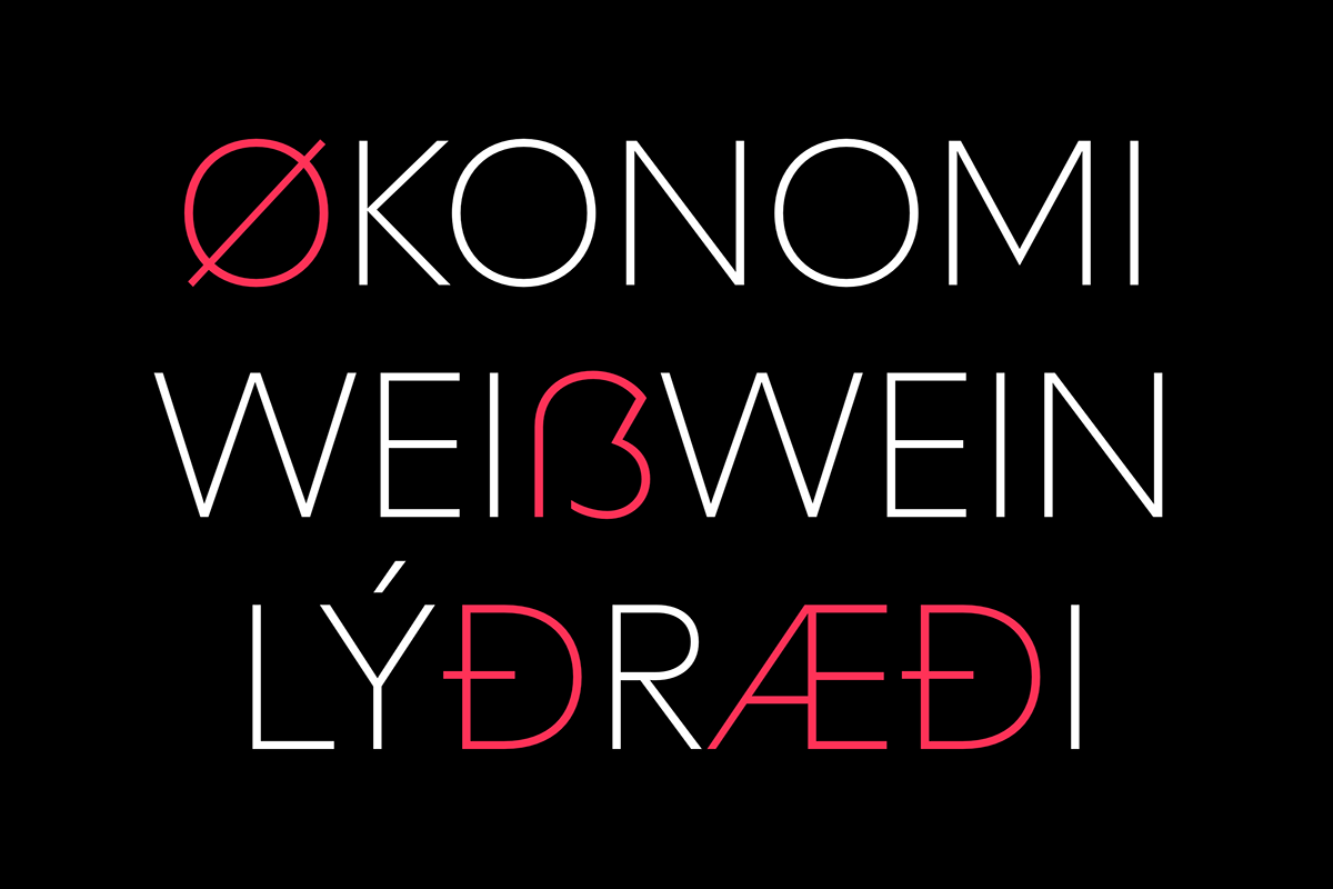
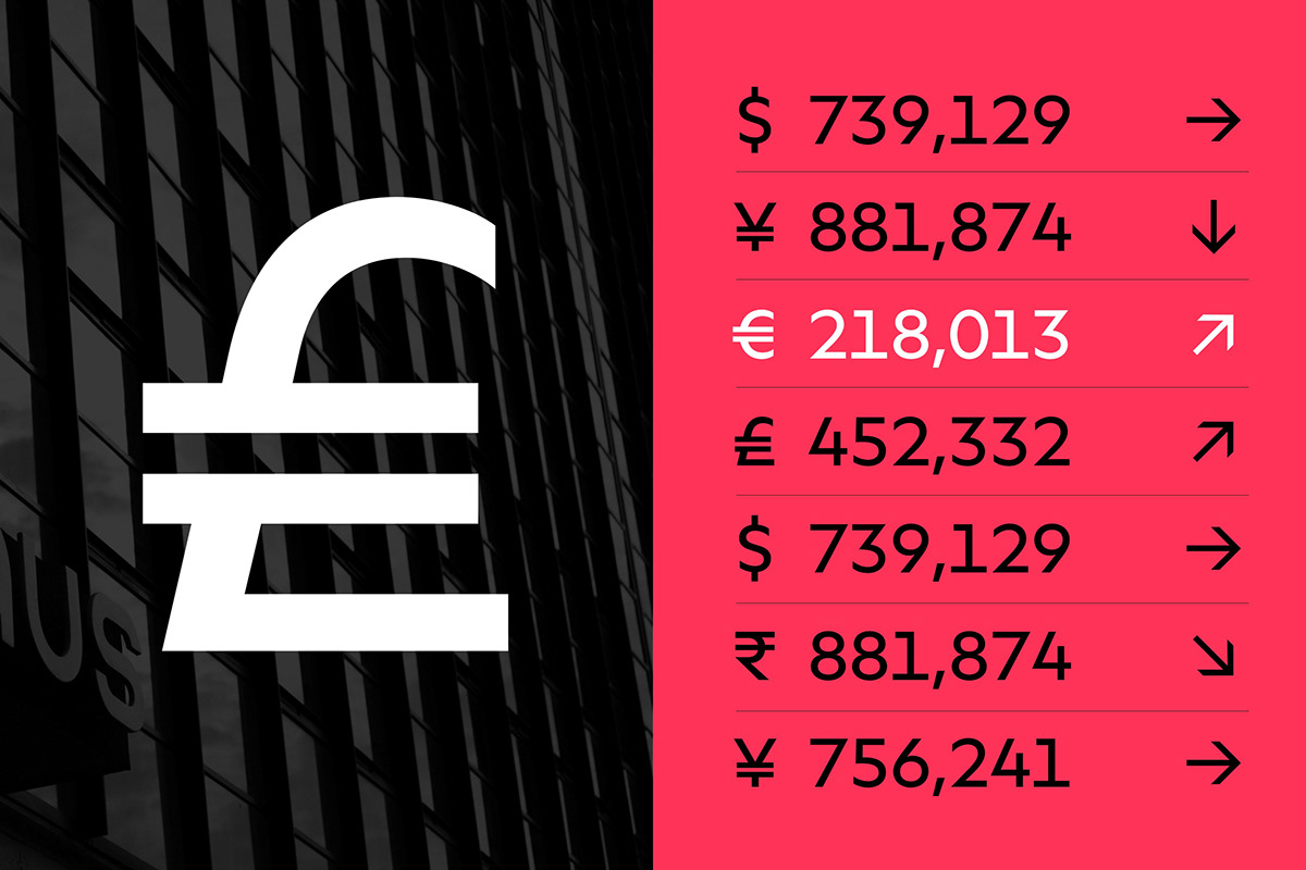
The Neurath family is equipped with various language-specific characters and supports more than 200 languages based on the Latin character system.
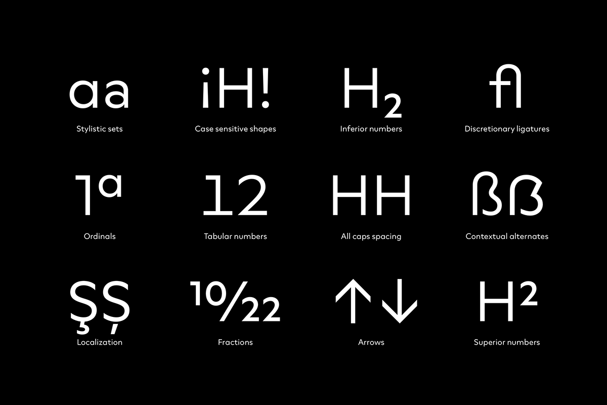
Opentype
Neurath is equipped with all modern Opentype features such as fractions, tabular figures, ligatures, contextual alternates and many more.
Styles
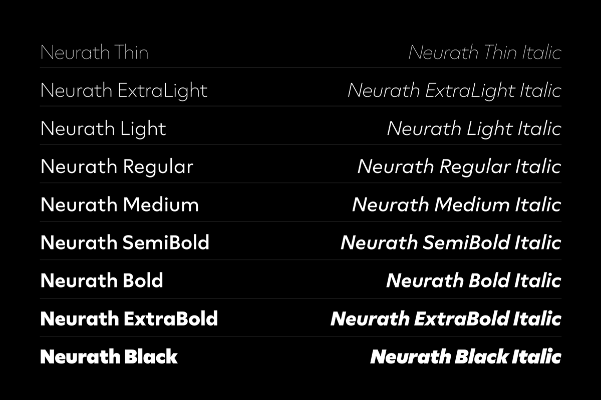
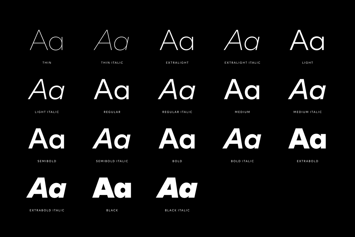
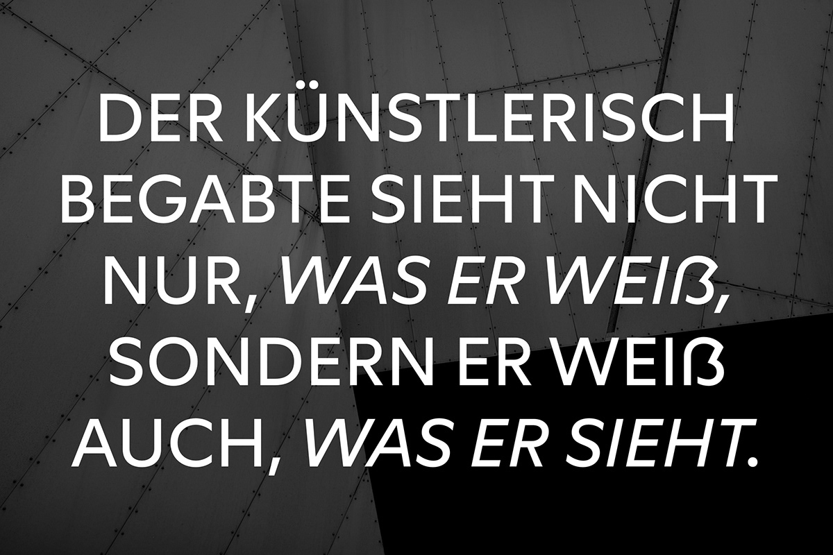
The family is available in nine weights with matching italics making it a truely versatile tool. The thin weights are a great choice for elegant surroundings, while the bold styles can easily attract attention when needed. All styles are optimized for digital and analog use.