MEKO X 汎羽
汎羽品牌企劃設計有限公司

MEKO品牌20年來以各式的美容美材小工具在台灣市場打出一片天,主要通路包含寶雅、康是美、屈臣氏等藥妝連鎖通路,從小工具品牌拓展彩妝相關品類,以平價好用與掌握流行的特色與風格,深獲廣大消費者的愛戴。近幾年除了實體通路外,亦努力經營自有品牌電商,小有成就。隨著自有商品開發愈來愈多,競爭者也愈來愈多的情況下,雖然營業額穩定,但既有的品牌形象個性不鮮明,整體風格的精緻度還有很大提升空間,到了要重新定位與整合形象的階段。
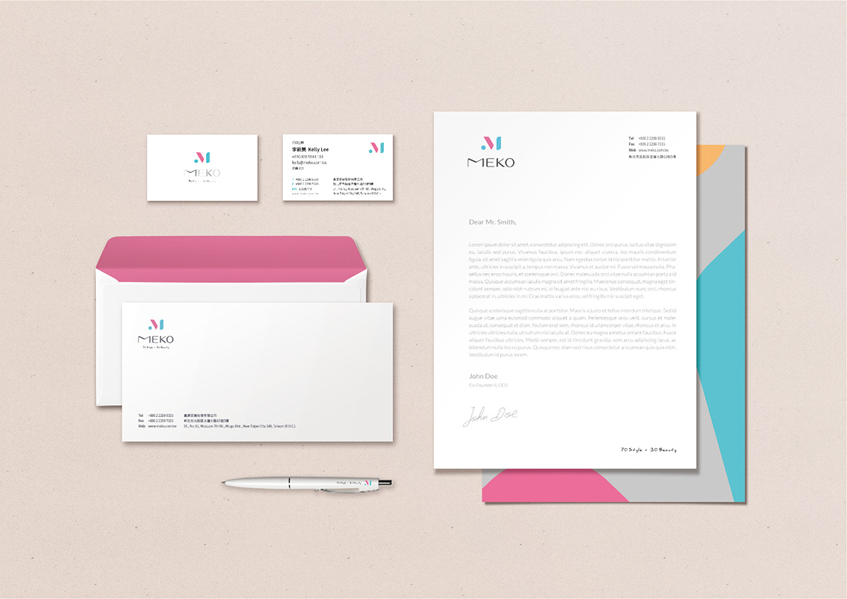
標誌設計風格上,以略帶層次的線條勾勒出品牌落落大方的質感。M比例略為寬,傳達品
牌對於品質與創新兼容並蓄的實在精神。在既有的粉紅色上,加入時尚感的藍綠色,傳達
MEKO品牌多樣的彩妝組合,深灰色則代表品牌商品專業的高品質。
The MEKO brand has carved out a niche for itself in Taiwan over the past 20 years with beauty products, but the brand’s personality is not clear. There was still room for improvement within the overall degree of sophistication. In 2019, the owner decided to refocus the positioning and integrate the brand image.
With “Mine” (a sense of exclusivity), “Easy” (easy to get started), “Key” (critical), and “Obsession” (addiction to ownership) as the brand positioning, we hope to deliver high-quality cosmetic products and youthful vibes. The brand tagline “70% style‧30%beauty” expresses how, with 70% MEKO cosmetic products and 30% natural beauty, every girl is 100% unique.
The logo design is made up of lightly layered lines that convey the easygoing quality of the brand. The proportions of the “M” are slightly wide, conveying the brand’s true spirit of bringing both quality and innovation. To the existing pink, a trendy turquoise is added to convey the diverse makeup combinations of the MEKO brand. The dark gray represents the professional high quality of the brand’s products.