和光蝦 X 汎羽 | 和諧共生,鮮淨一味
汎羽品牌企劃設計有限公司

「和光蝦」來自台灣最大的室內漁電共生科技養殖園區,採用SPF等級的種蝦與蝦苗,以AI科技先進魚電共生系統進行室內養殖,大幅降低環境污染風險,不投藥,不添加抗生素,透過24小時不間斷的環境水質監測,把關養殖的每個步驟;以生態永續,科學實證精神,持續研究紀錄每個養殖環節的定量與變量,不斷優化整個養殖流程,追求環境和諧的共生之道。
我們提出「和諧共生,鮮淨一味」做為和光蝦的品牌核心精神,並據此設計整體品牌形象識別,傳達適切的品牌訊息與樹立品牌形象價值,打造一個能帶給消費者安心信賴、盡情享用的養殖蝦品牌。
From the biggest indoor technology aquaculture area of fishery and electricity symbiosis, Sunny Shrimp adopts SPF-grade shrimp seeds and larvae, leveraging the power of AI technology for indoor aquaculture with an advanced fishery and electricity symbiosis system to significantly reduce the risk of environmental pollution. Without the use of drugs or antibiotics to cultivate our shrimp, we monitor every step of aquaculture through 24-hour continuous environmental and water quality monitoring. In the spirit of ecological sustainability and scientific evidence, we continue to record the quantitative variables of every aquaculture step, optimize the full cultivation process and pursue a symbiotic approach for environmental harmony.
We bring out the core value of our brand spirit “Harmonious Coexistence for the Freshest Taste,” and design brand identity to deliver the appropriate brand information and image value, hoping to create a shrimp aquaculture brand that gives customers peace of mind and enjoyable experiences.

日益受到重視的環境永續議題,讓全世界的人類都在思考,各種產業與環境共生的可能。
因此整體品牌標誌與形象,帶出品牌本身認真體現與環境和諧共生的畫面,以太陽能光電系統建置純淨無污染的養蝦場,不消耗過多能源,傳達產業的永續精神。標誌設計以簡潔俐落的線條勾勒出蝦子躍然水面、脫穎而出的姿態,帶入太陽能溫室與生長池的造型意象,讓消費者感受到鮮蝦的健康活力及優質的養殖環境。
The increasing importance of environmental sustainability issues has made people all around the world think about the possibility of coexistence between various industries and the environment.
The overall brand logo and image bring out how the brand itself seriously embodies living in harmony with the environment, building a pure and pollution-free shrimp farm with a solar photovoltaic system, which does not consume too much energy and conveys the spirit of industrial sustainability.
The logo design is outlined by neat lines around the vivid shrimp jumping out of the water surface. The top pattern is a radiant sun combined with the greenhouse roof, while underneath are rhythmic lines representing the pure and dynamic water, which deliver the brand's uniqueness and sense of vitality.

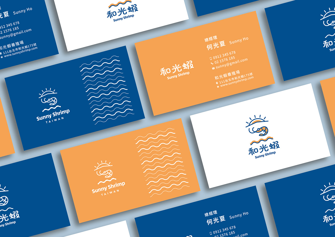
色彩上以水之純淨的藍色作為主色調,代表可靠和信任,象徵品牌專業精神與純淨自然的水質;輔以溫暖的橘色,呈現品牌的活力感。兩個色彩相互輝映,傳達「和光蝦」的可信賴、活力與和諧共生的品牌理念和精神!
The blue color embodies reliability, trust and stability, symbolizing the brand's professionalism as well as the pure and natural water. The orange color represents warmth, creativity and harvest, pointing to the brand's vitality and the illumination of a sustainable environment. These two contrasting colors bring out the elegance and splendor of each other, delivering the brand philosophy and spirit of "Harmonious Coexistence for the Freshest Taste."


