草沐心 X 汎羽
汎羽品牌企劃設計有限公司
我們將「草沐心」品牌塑造成有如一個專業的植物學家,帶有優雅、活力、可靠、友好、溫暖與愉悅的個性,並傳達出些許古典味與書卷氣的氣質。
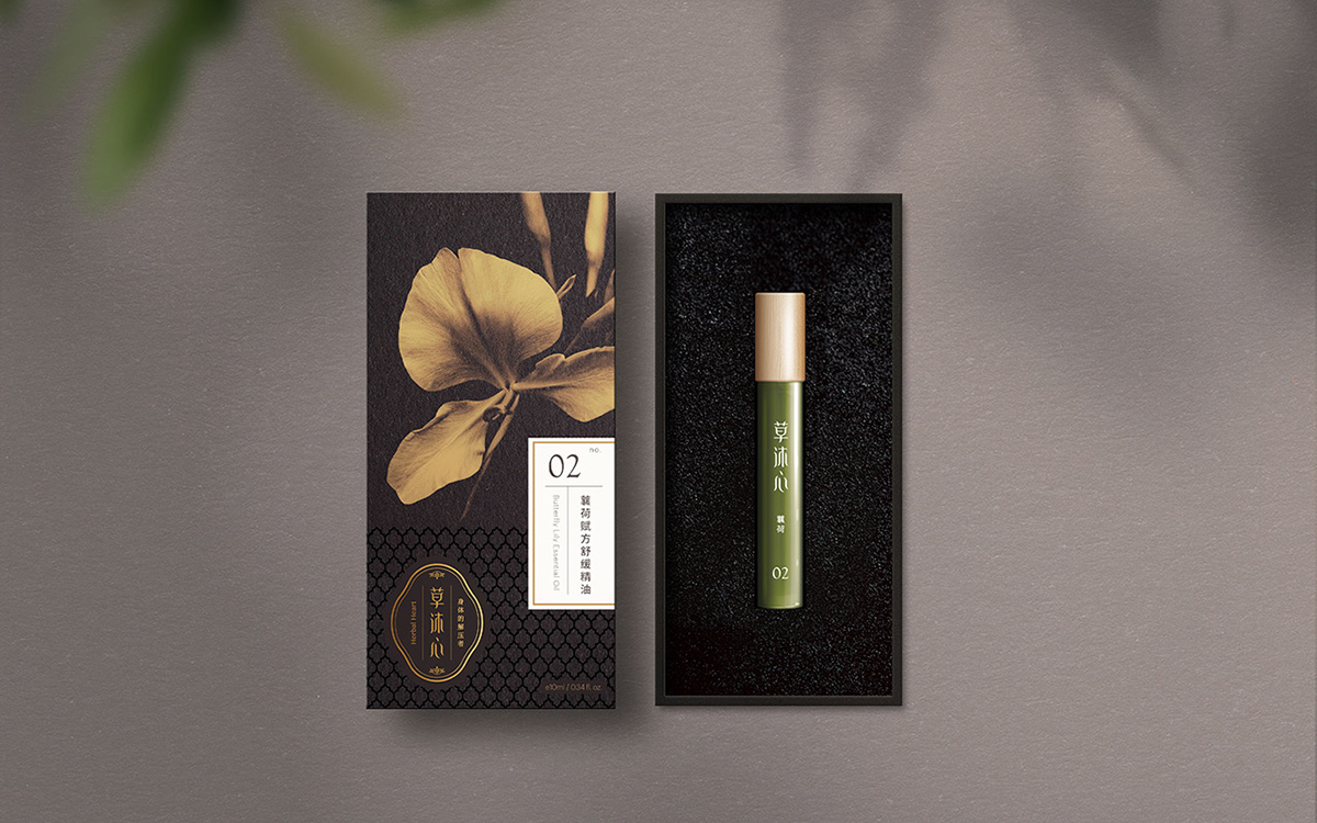
我們以中文品牌名稱「草沐心」為主要標誌來設計,勾勒出漢方草本沐浴身體與心靈的概念。在設計構成上,結合中國文化的「如意」造型,「如意」代表美好的祝福,將品標標語、英文名稱與草本符號,做為品牌主要識別組合。標準色制定上,我們以黑與金當成主要識別顏色,傳達品牌典雅高貴的氣質,並帶出草沐心專業「身體的解壓者」之品牌精神。
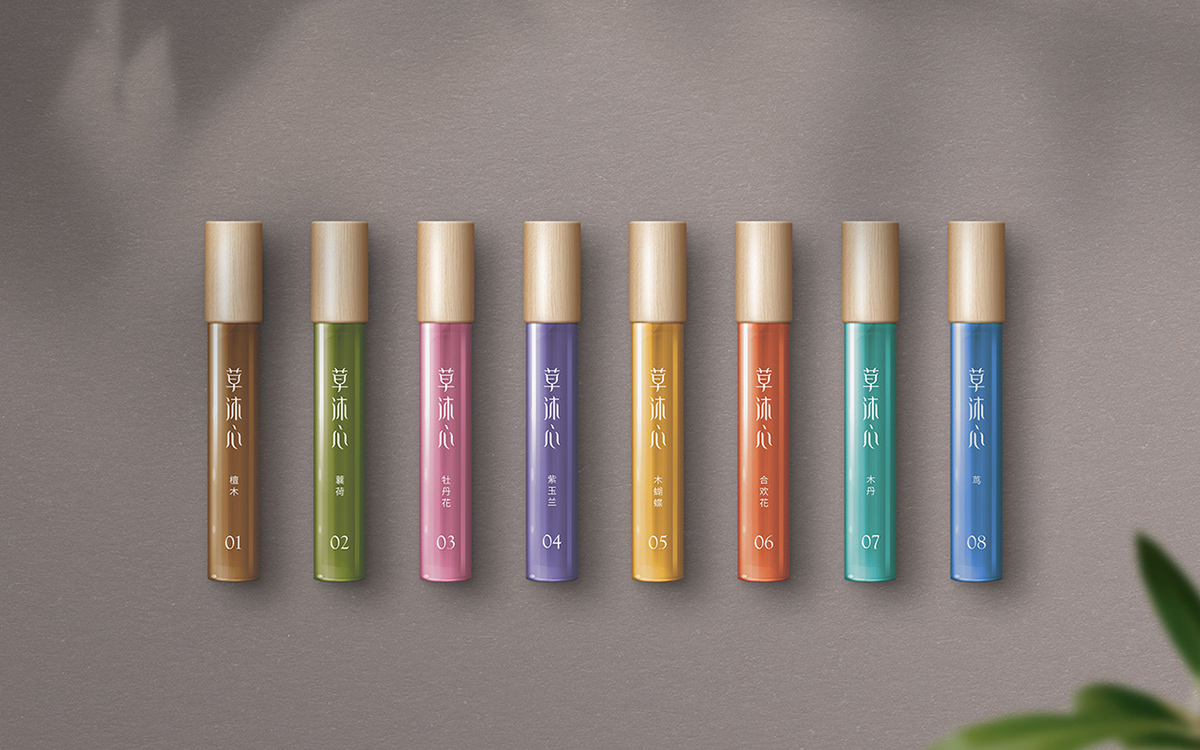
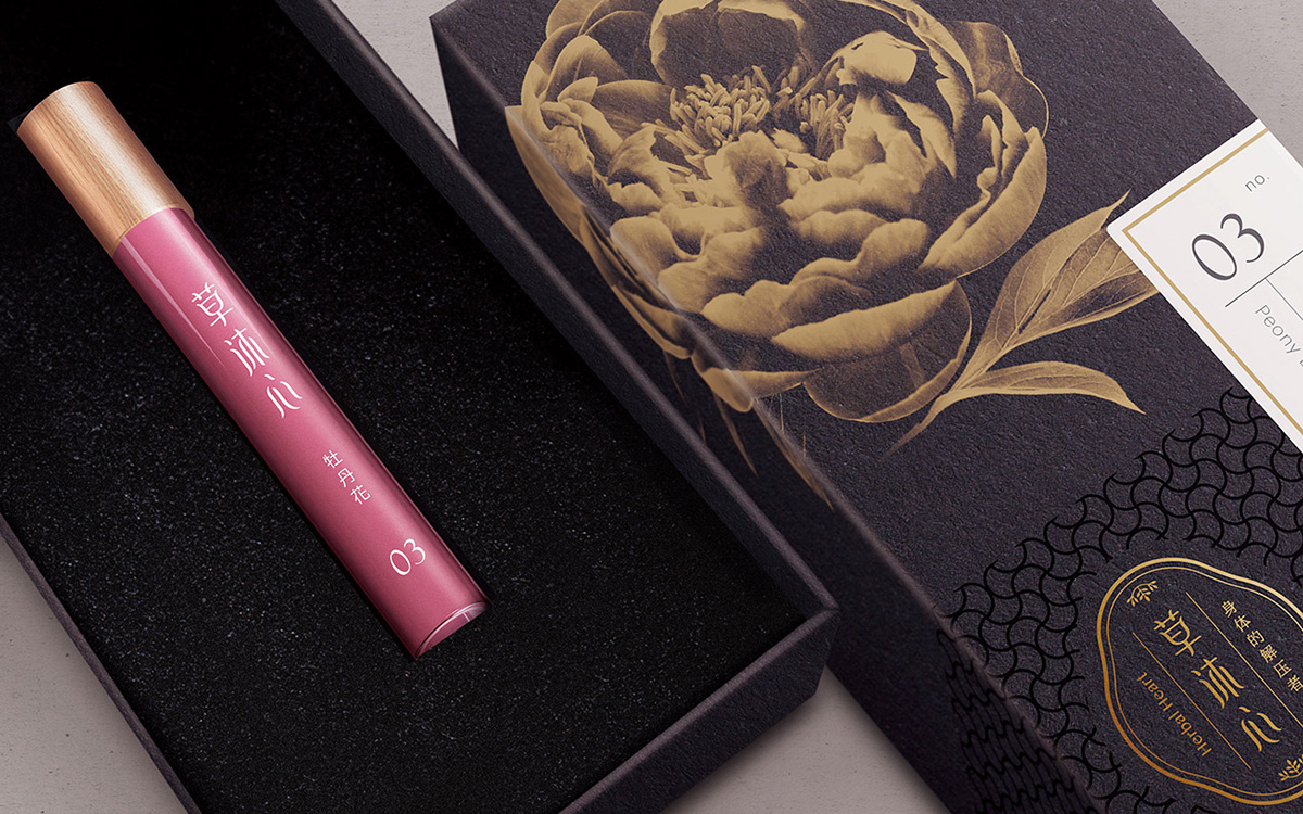
The premium 8-pack box packaging of CAOMUHSIN (Herbal Treatment) Essential Oil accentuate the core visual concept of herbal extract, providing a pathway forward in building consumers’ confidence in our extraction craftsmanship. Each pack is provided with a black identification card tooled in gold with our logo and engraved with unique print to reinforce the experience of relieving anxiety and stress. The artistic packaging paper with product information also conveys the premium and luxurious brand image of ours.