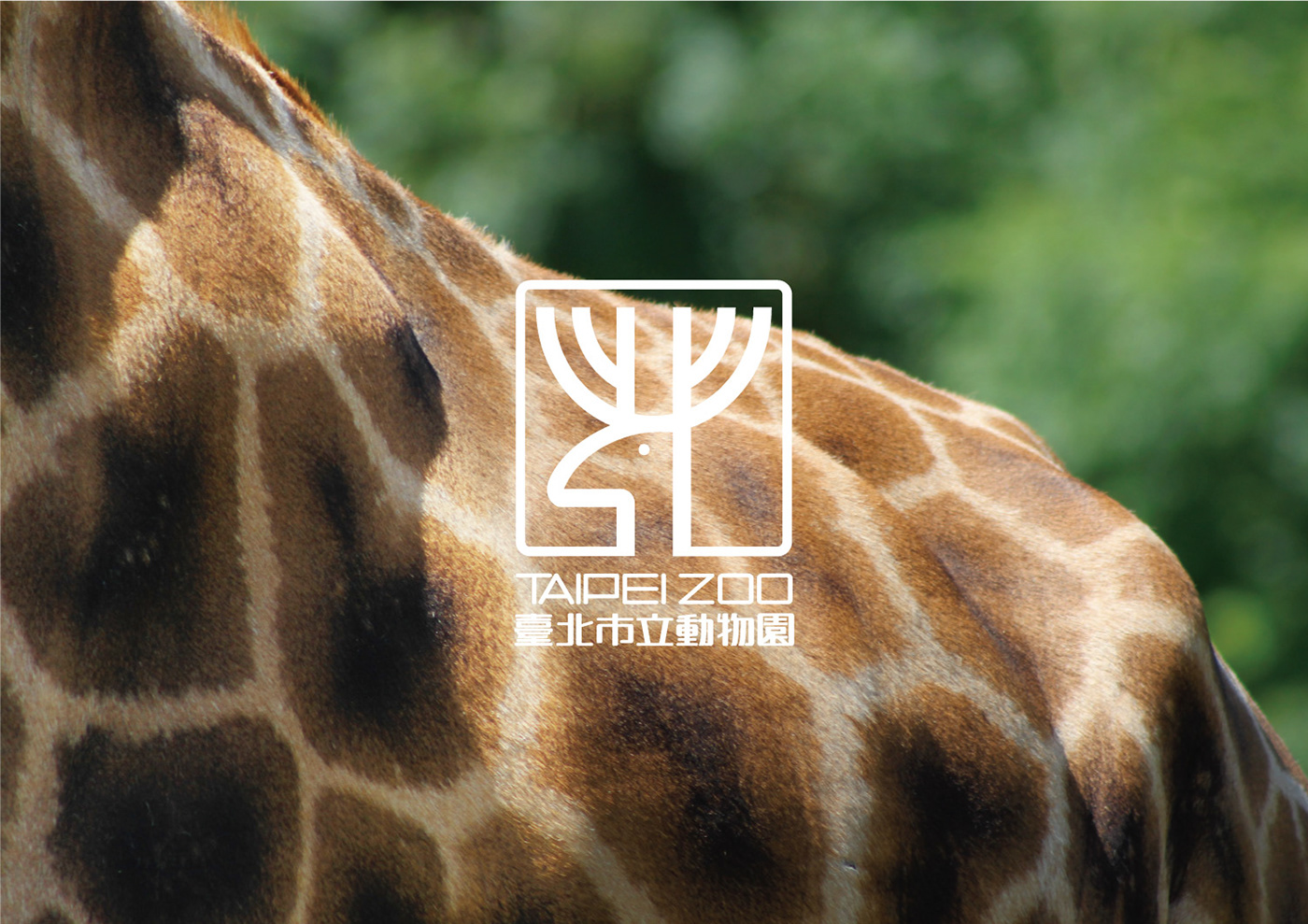
Taipei Zoo X 汎羽 | 台北市立動物園指標系統
汎羽品牌企劃設計有限公司
指標系統隱身在日常生活中,靜靜的告知我們自己身在何處、該往哪個方向前進。在偌大複雜公共場所,指標系統更要針對使用者進行設計,協助解決空間與動線問題,將指標融入場域並展現場域特色,達到功能與美學的結合。
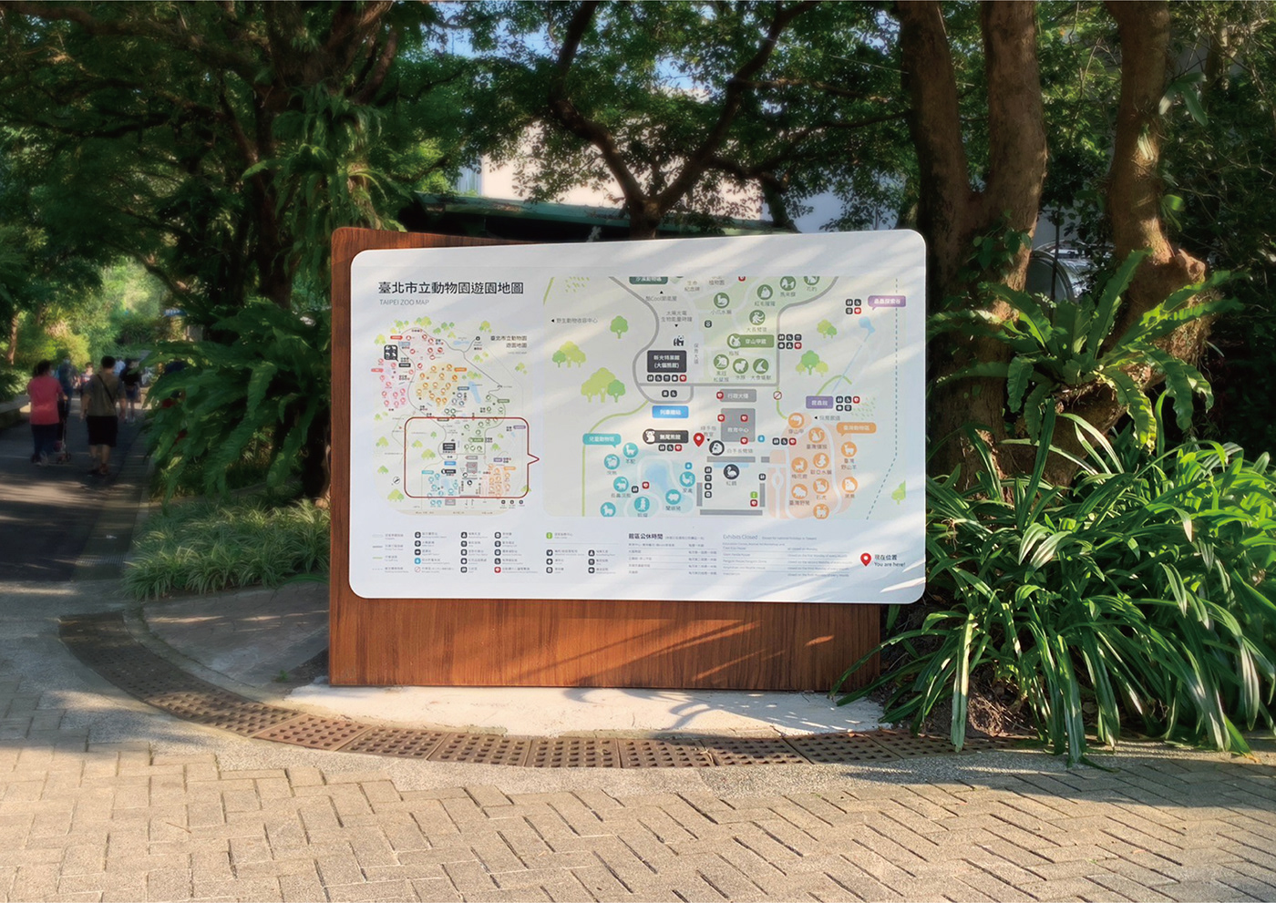
台北市立動物園是一座兼具教育、研究、保護及娛樂功能的親子動物園,自1914年開始迄今已經有一百多年的歷史,為台灣最大且最具代表性的動物園。園區幅員廣大、指標眾多,過去未針對指標系統進行統整,以致整體設計不統一與凌亂,因此我們在圖像創意、教育意義、易於辨識以及適配環境之間取得平衡點,並落實到指引牌製作規劃上,使得新的指標系統設計融入整體園區環境,帶來更好的遊園體驗。
The Taipei Zoo has a history of more than 100 years since 1914, making it the largest zoo in Taiwan and the most representative zoo in Asia. Before the epidemic, there were more than 3 million visitors from domestic and abroad every year.
We strike a balance among image creativity, educational significance, easy recognition and adaptability, which is implemented into the planning of the signage system in order to integrate the new indicator system design into the overall park environment for a better park experience.
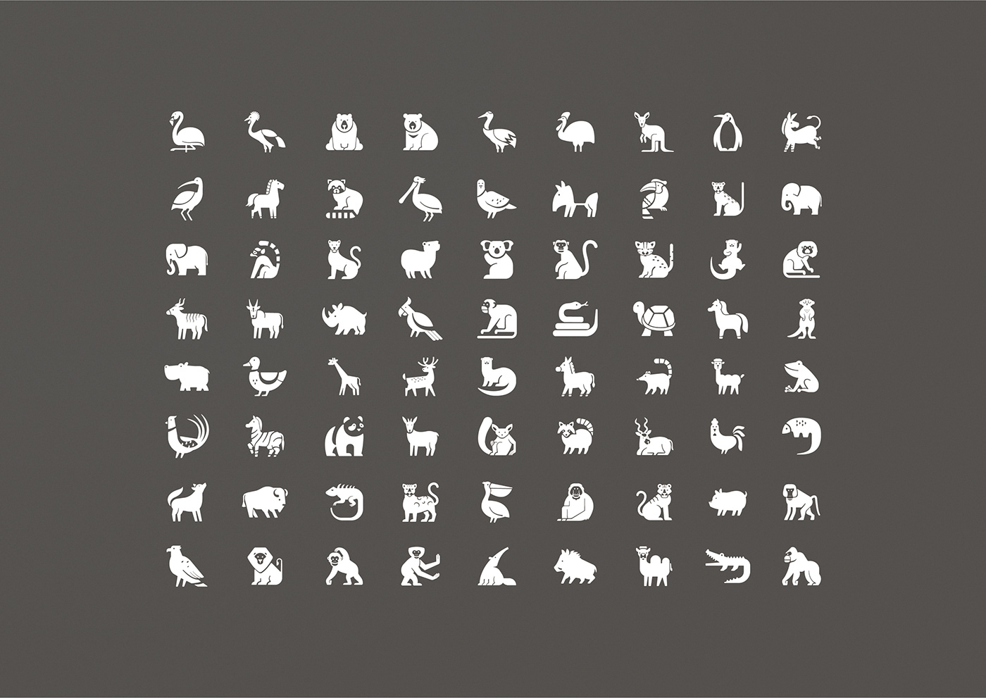
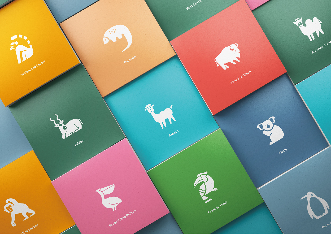
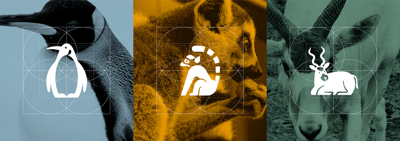
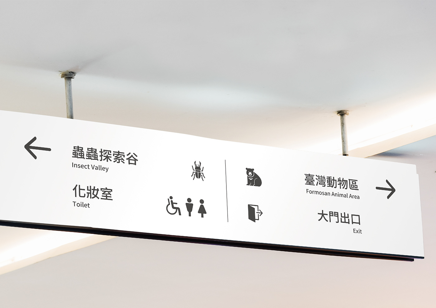
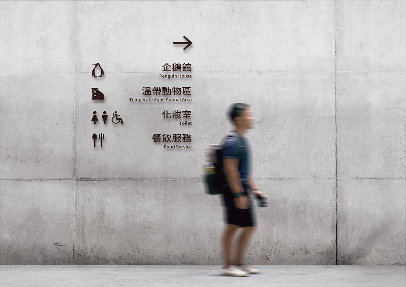
以幾何線條風格勾勒出略帶趣味的動物造型符號,呈現出各種生理特徵不失教育意義,除了呈現新的氣象外,也讓遊客更易於辨識與認識動物。
We design the geometric line style to outline slightly interesting animal pattern symbols, presenting various physiological characteristics without losing educational significance. In addition to presenting a new atmosphere, it also makes it easier for visitors to identify and recognize animals.
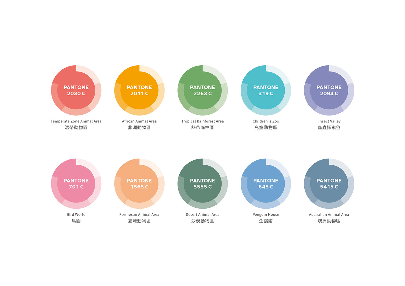
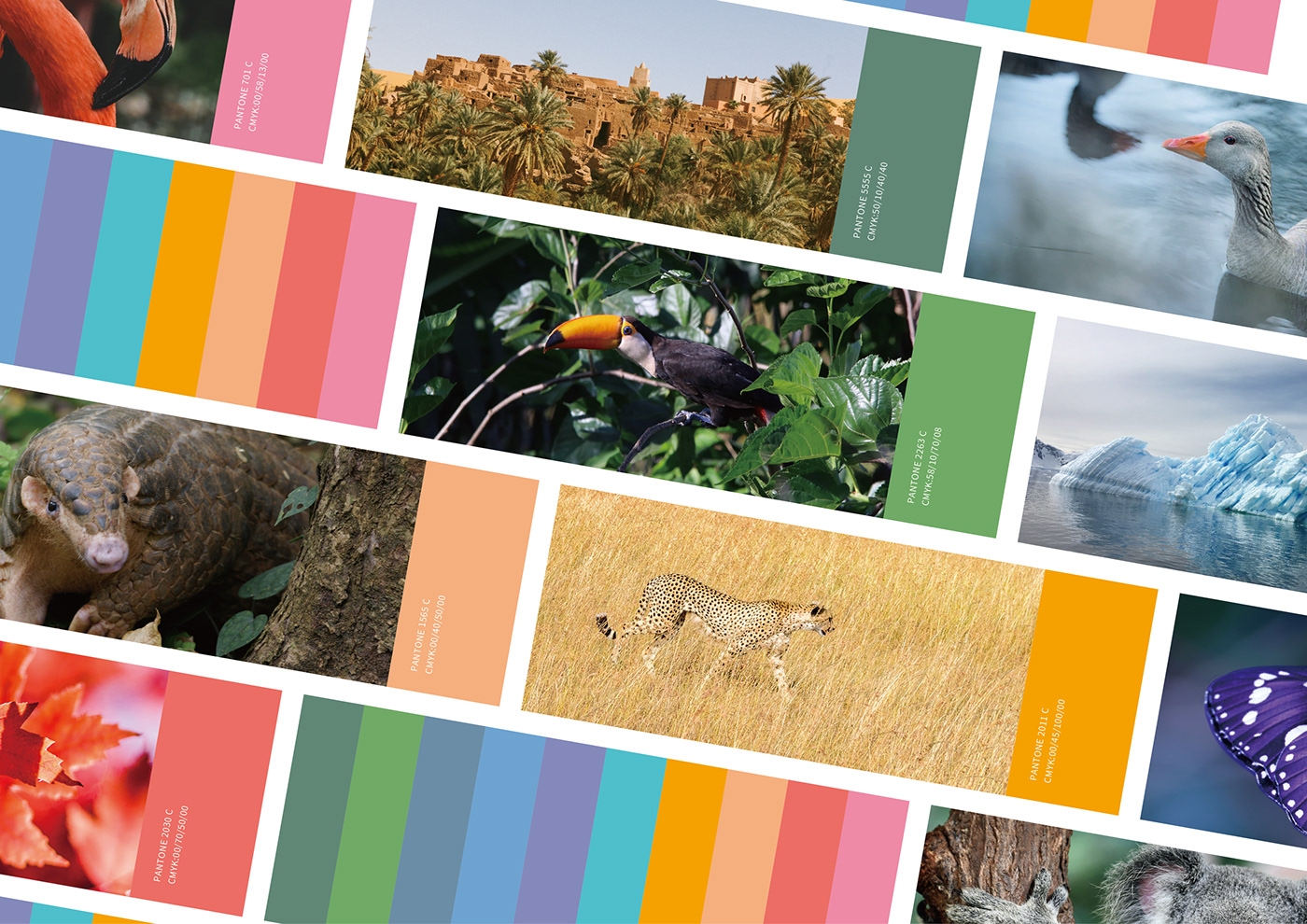
色彩上依據不同展示區域的代表性動物與棲息地風貌,萃取出相關的色彩基調,制定色彩計畫。
In terms of color, the relevant color tone is extracted based on the representative animals and habitats of different display areas, and the color plan is formulated as well.
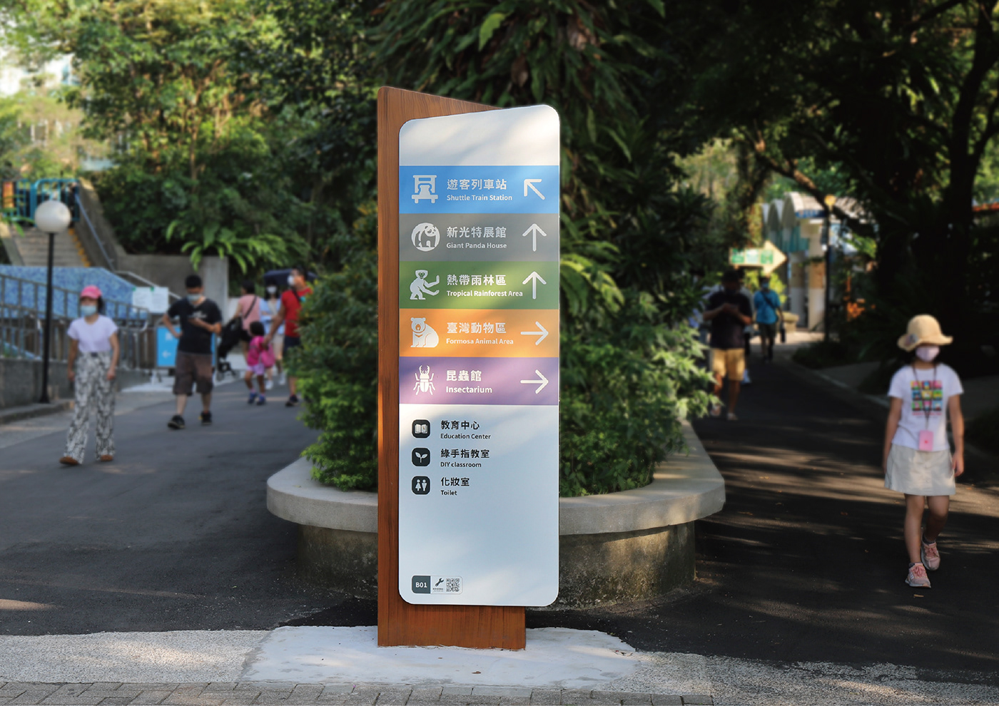
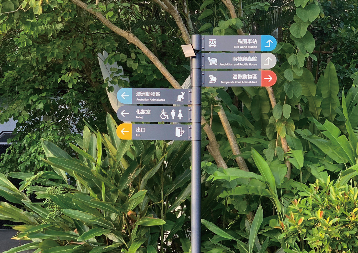
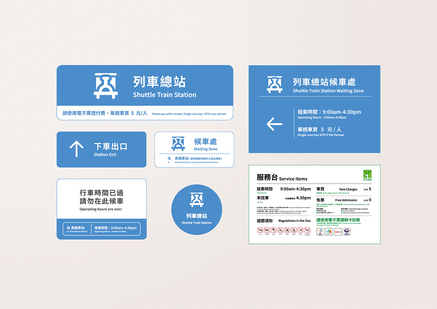
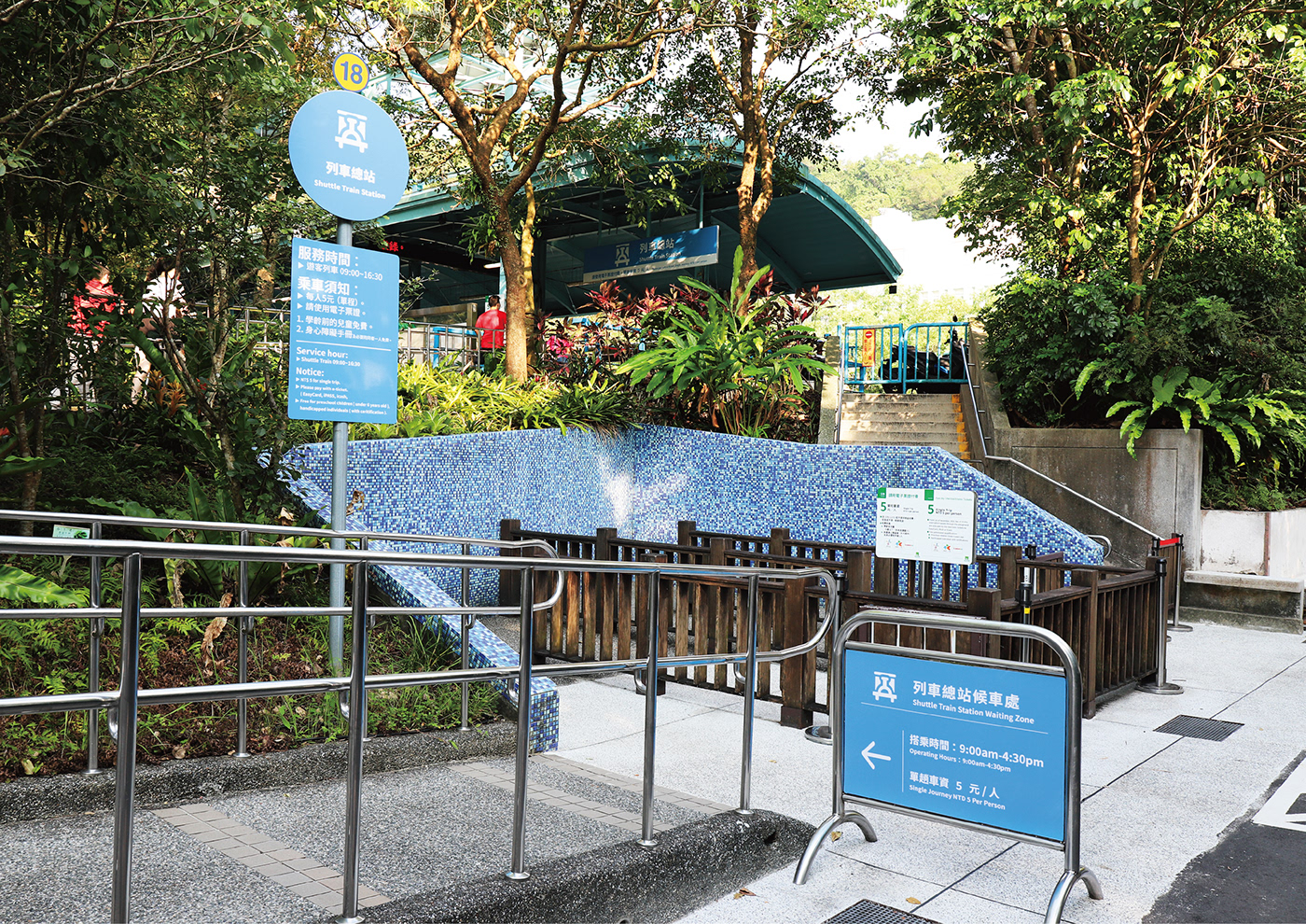
在指引系統規劃部分,因台北市立動物園指標牌數量繁多,重複性過高、整體缺乏系統性,因此以「減法」思維,將園區內訊息量過多、雜亂的指示牌進行彙整與刪減,並根據實地勘查進行指示牌的樣式增設與減少。
我們讓使用者在任何時候,需要指標牌的時候可以輕易看到,美感與實用兼具,不需要的時候不會特別發現指標牌的存在,為本次專案設計的核心精神。
In the planning of the indicator system, due to the large number repetition of index signs and the overall lack of systematization in the Taipei Zoo, we adopt subtractive logic to integrate and delete the signs with inappropriate information or clutter the park. Also, we adjust the patterns of the signs according to the on-site investigation.
We allow users or visitors to easily spot both the aesthetic and practical indicators at any time. They will not particularly find the existence of the indicators when they are not needed, which is the core spirit of this design project.
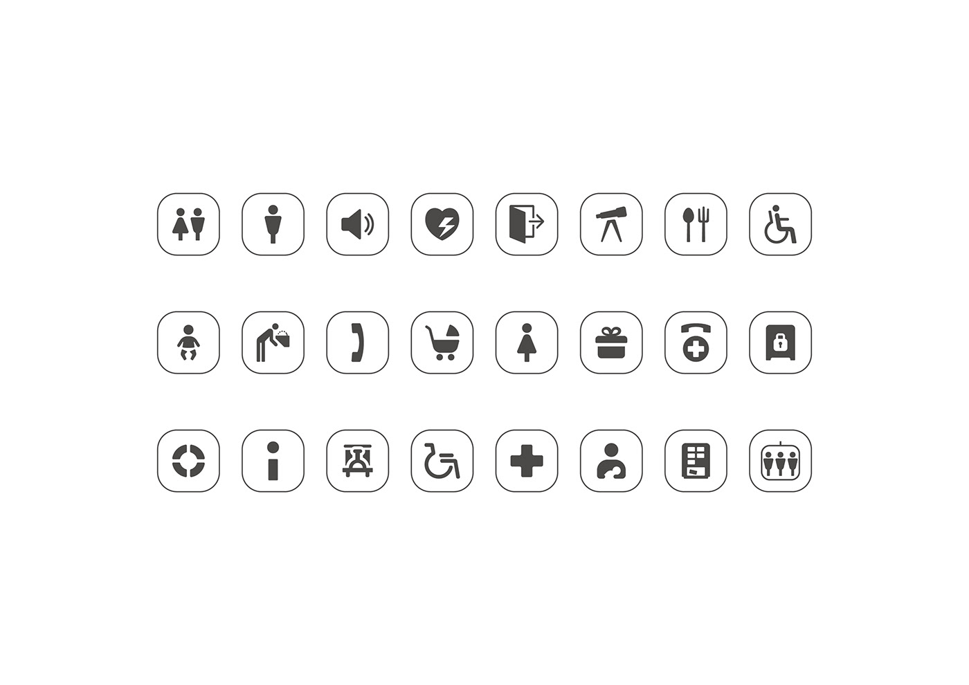
服務標誌造型以國際通用指標符號為基礎,繪製出較為飽滿圓潤的造型,傳達園區服務的親切感。
The patterns of the information signs are based on the common international index symbols, by drawing a relatively full and rounded model to deliver the intimacy of the park service.
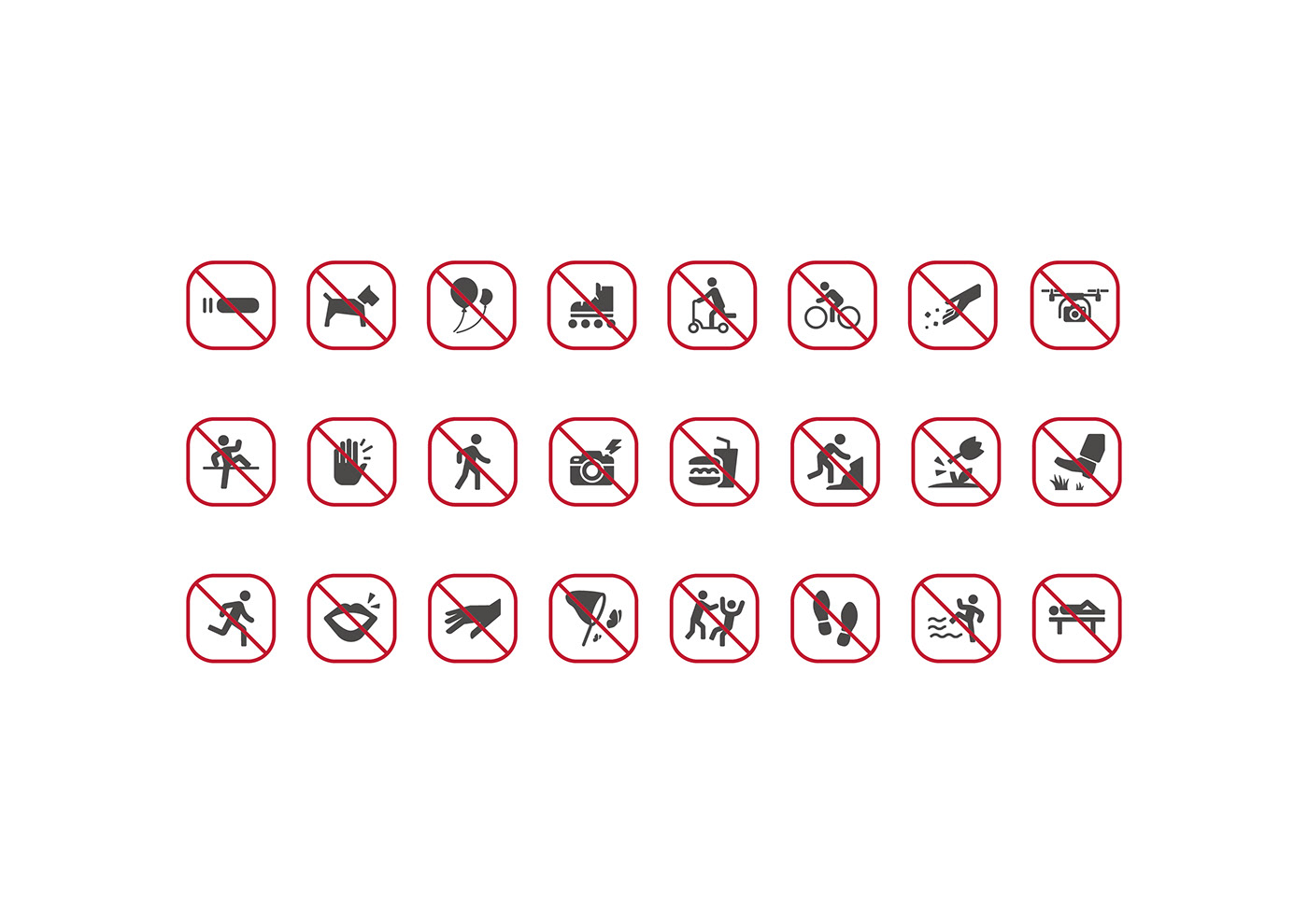
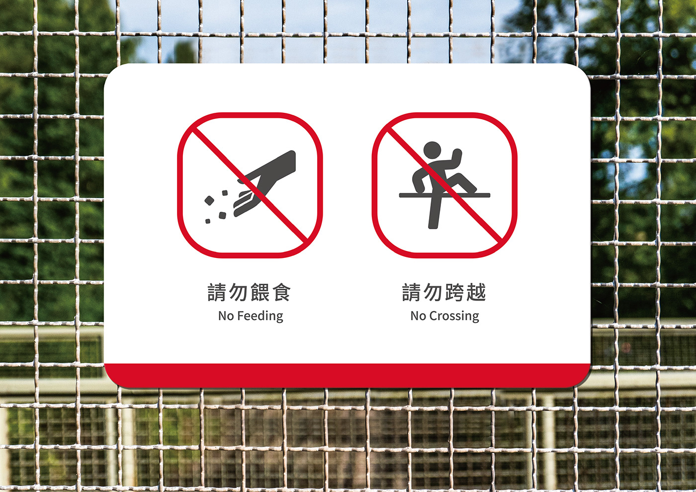
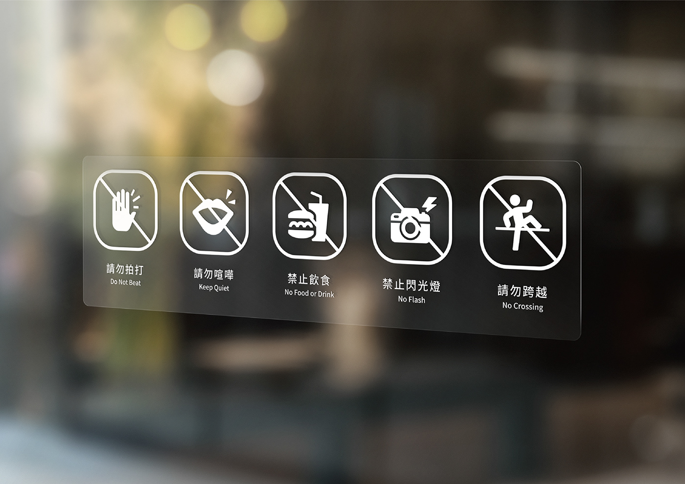
禁止標誌造型以較為硬朗的造型,傳達希望遊客重視這些符號的訊息,並使用圓角矩形外框取代一般圓形的設計,展現園區內嶄新的氣象。
The patterns of the prohibition signs are made with hard modeling to deliver the message that visitors are expected to follow these symbol indicators. Also, we replace the general circular design with a rounded rectangular frame to show the new atmosphere in the park.