


FR
.
No Logo est une agence marketing basée à Edimbourg axée sur les créateurs de contenu éco-responsable. Intermédiaire entre les marques et les créateurs (influenceurs), No Logo promeut les collaborations entre marque et influenceur à impact positif en favorisant l'émancipation de ces derniers.
Nous sommes intervenus sur la refonte d'identité visuelle dans l'objectif de fédérer à la fois les employés de l'agence et les adhérents externes vers une cause commune : Bien influencer.
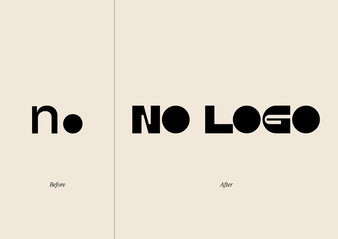
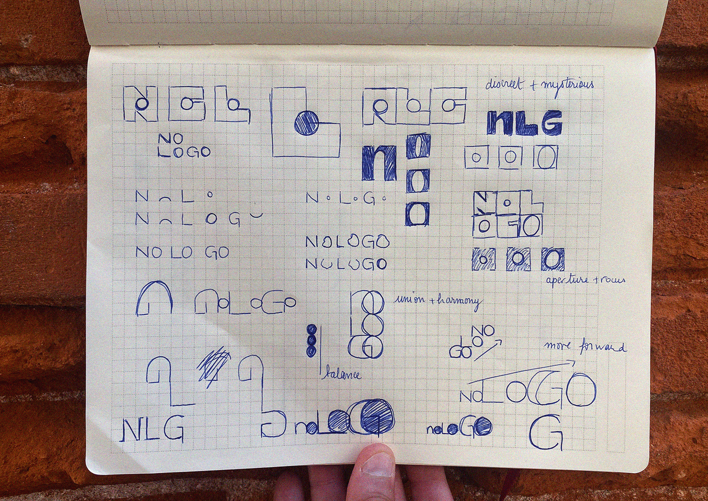
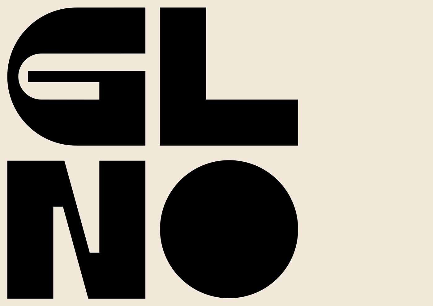
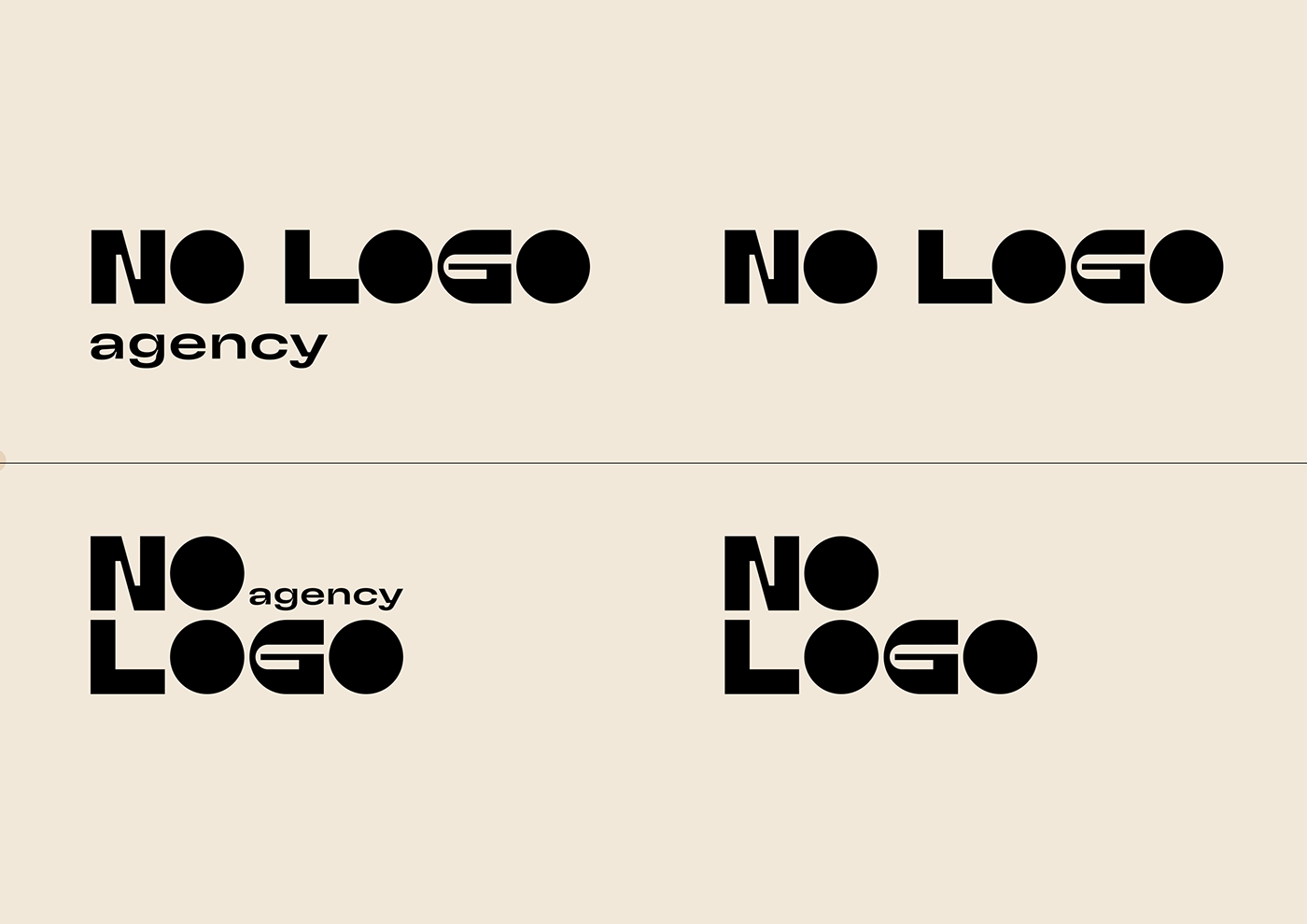
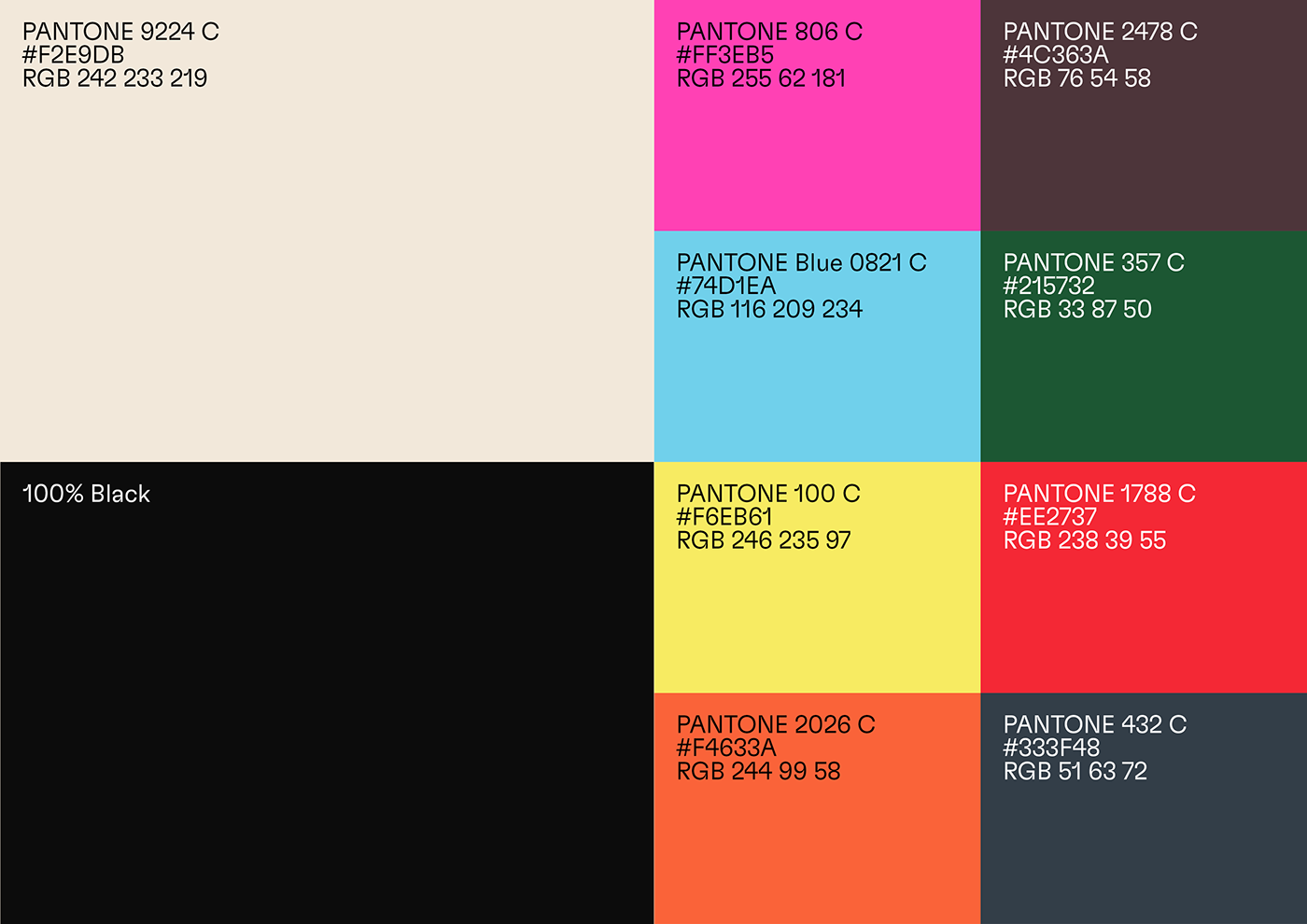
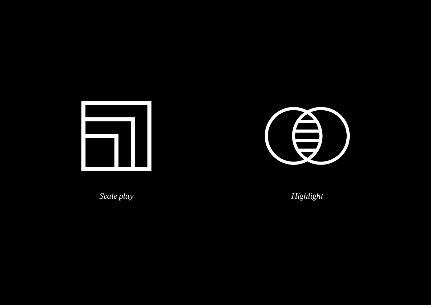
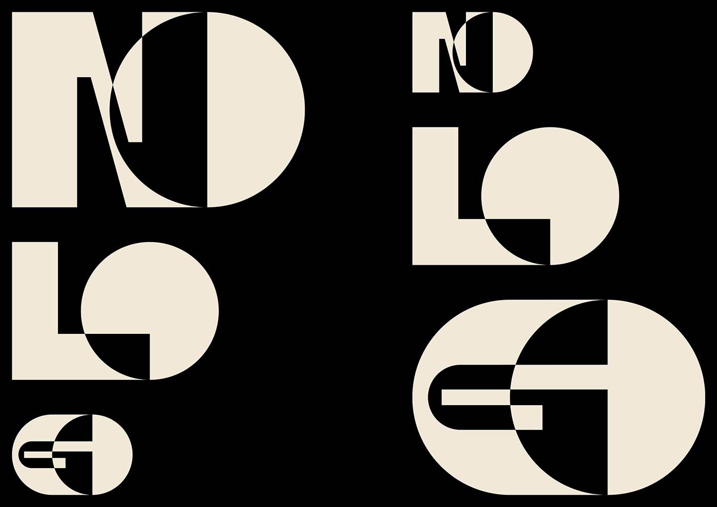
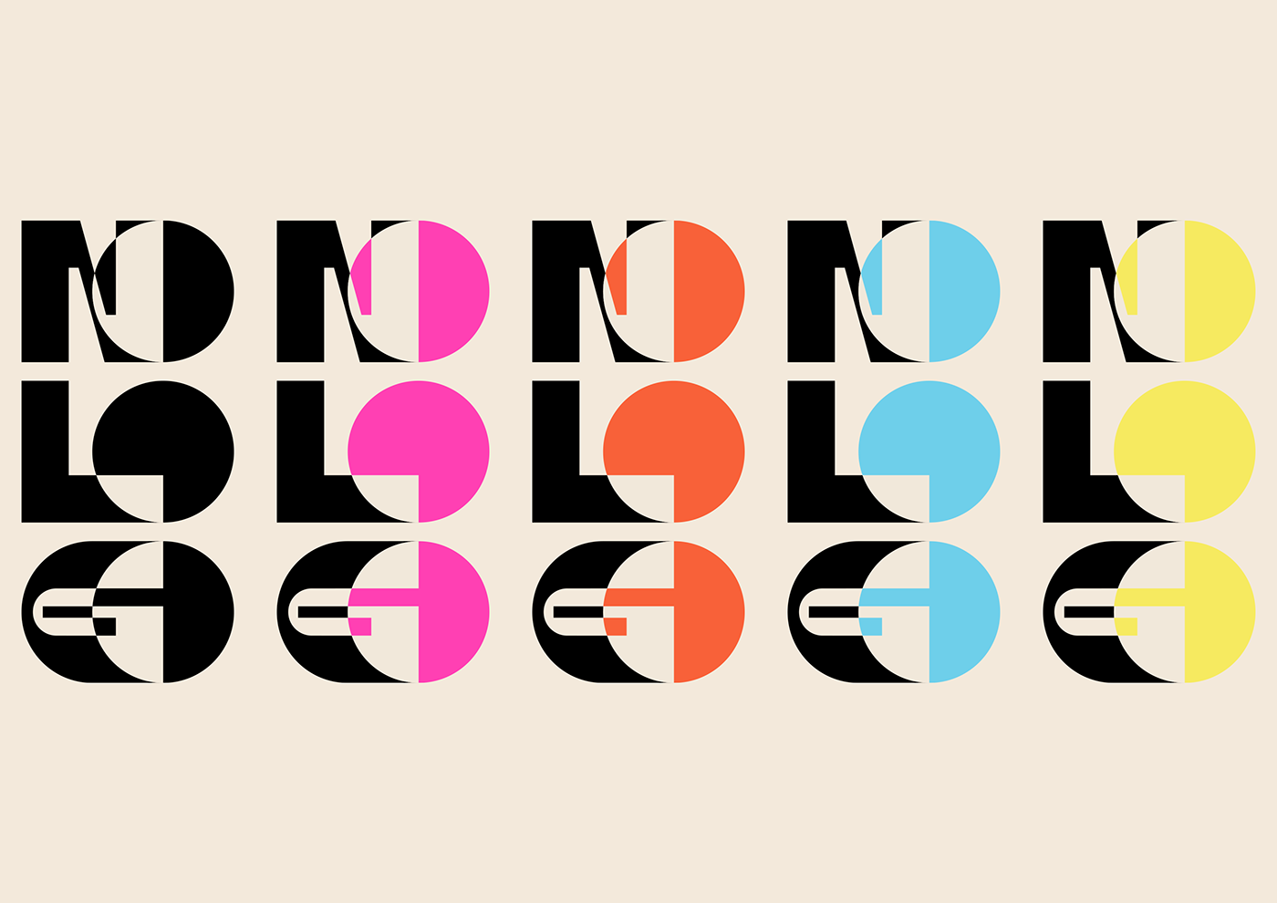
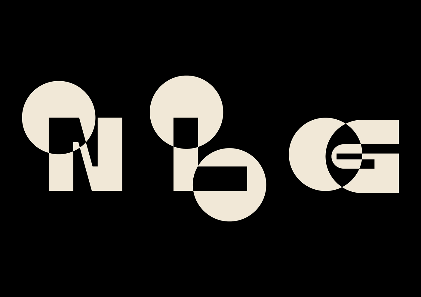
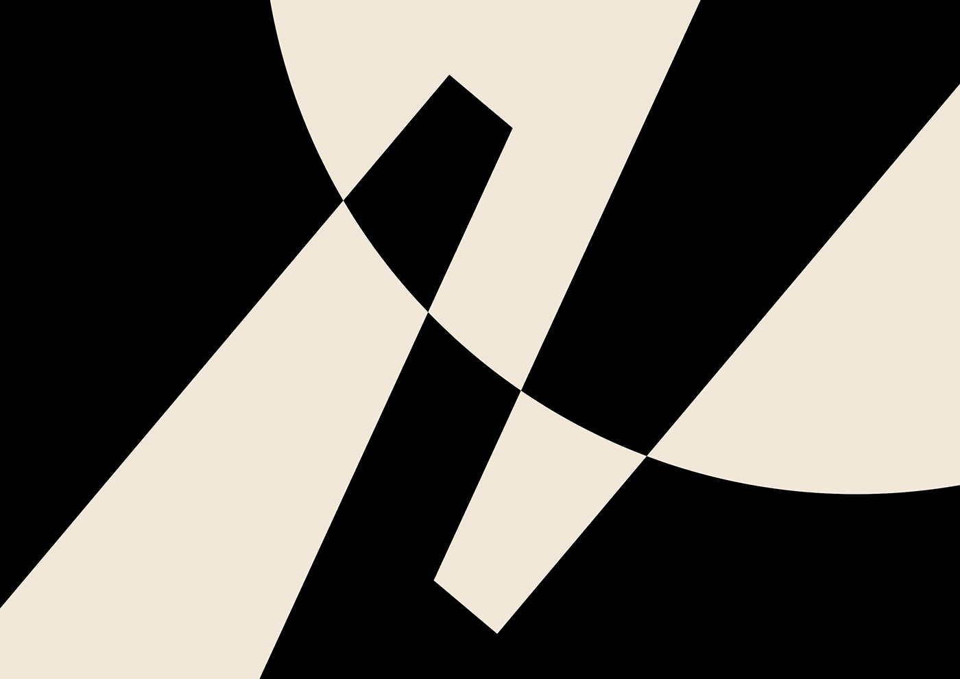
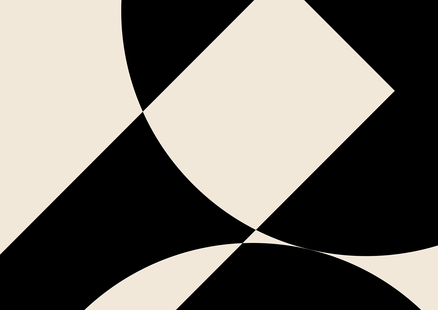
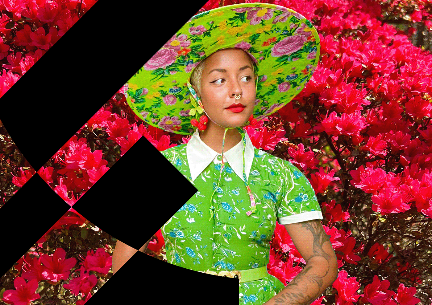
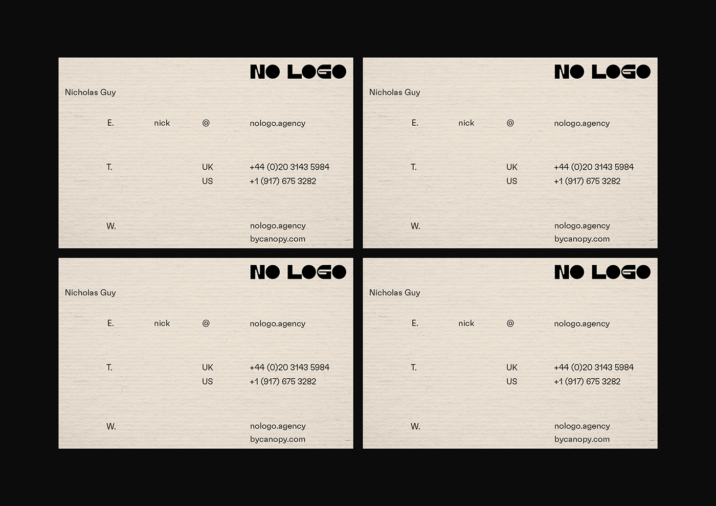
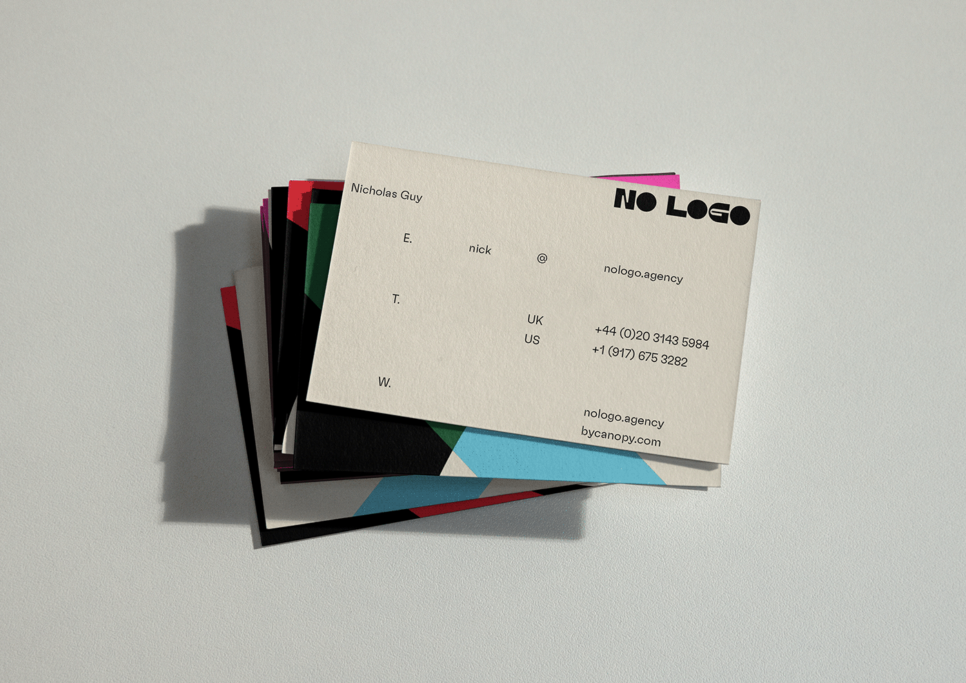
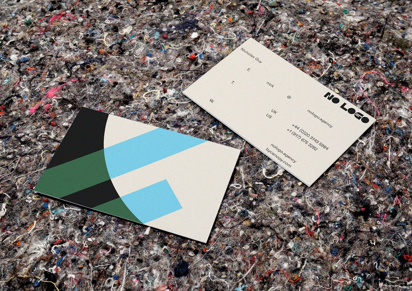
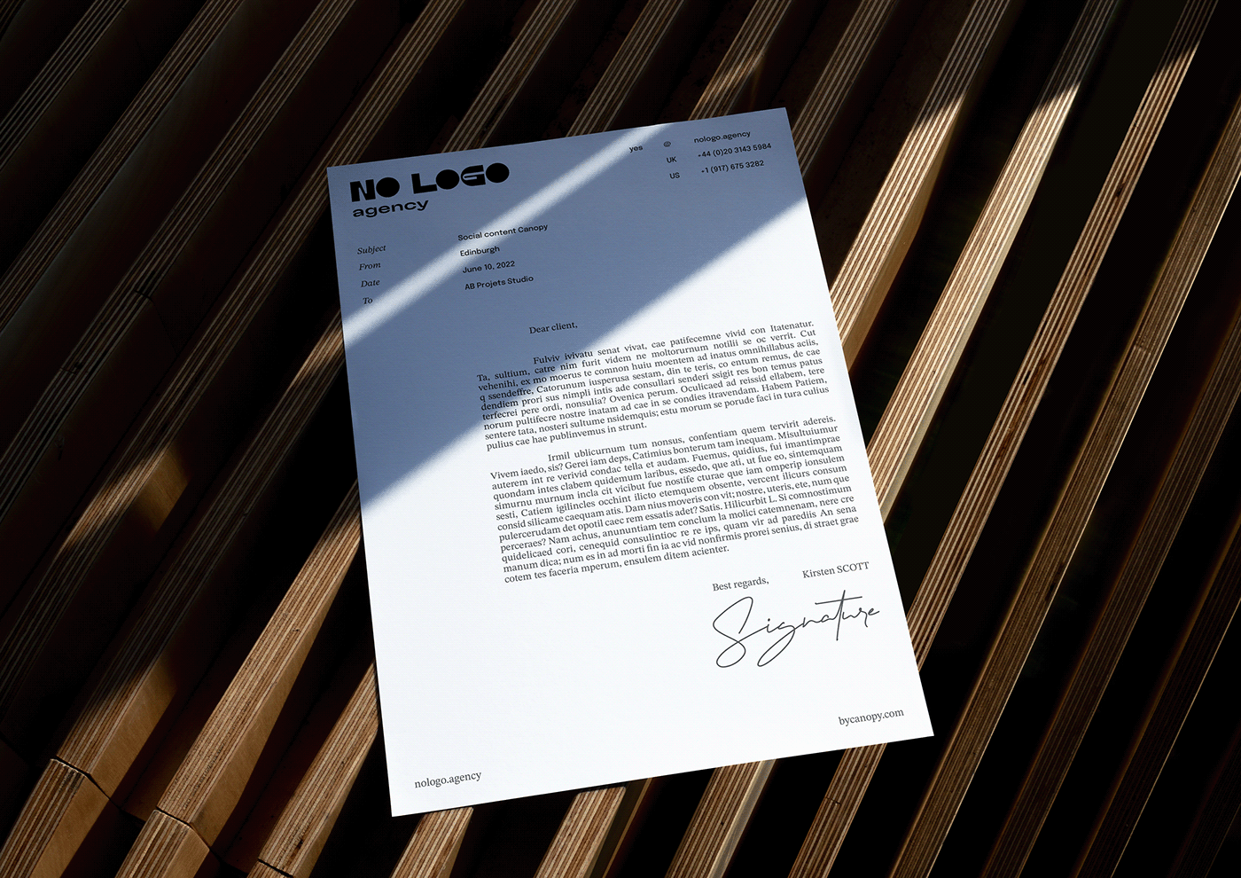
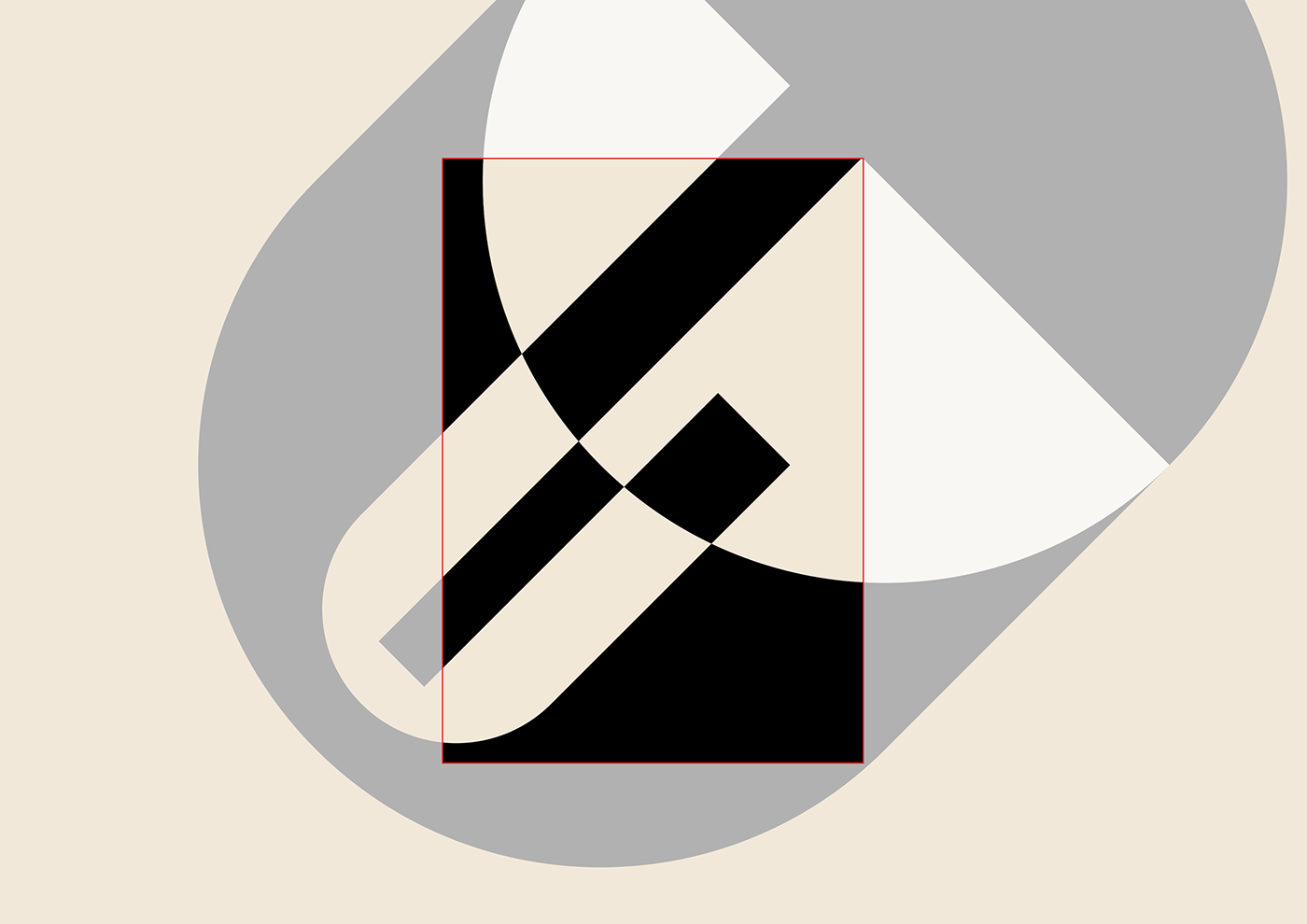
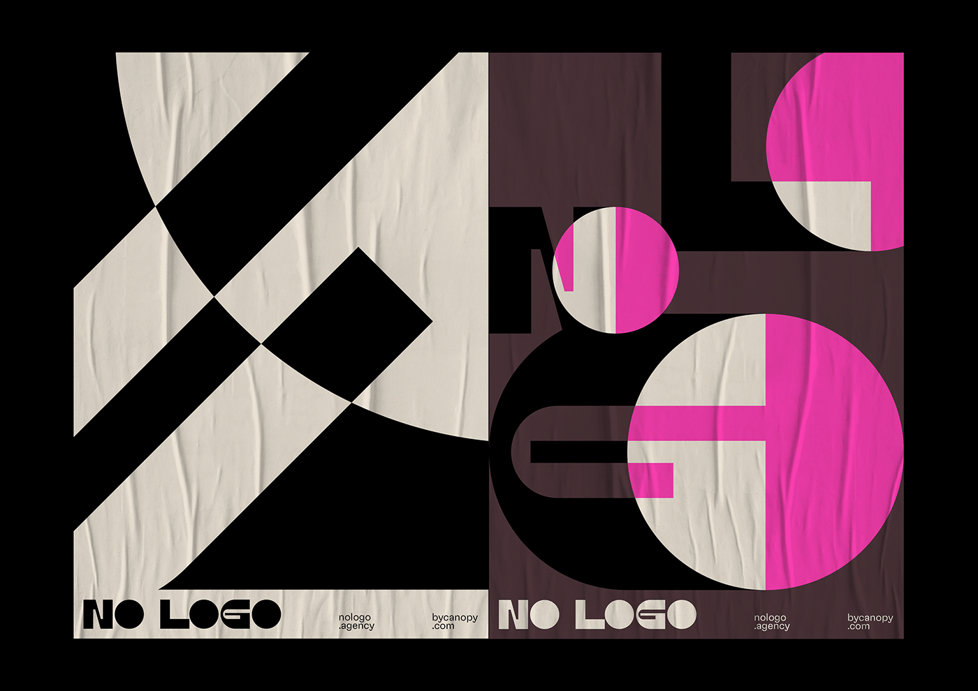
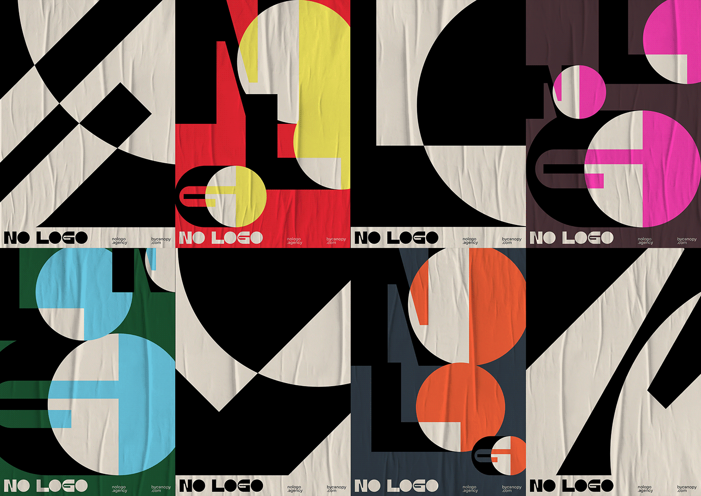
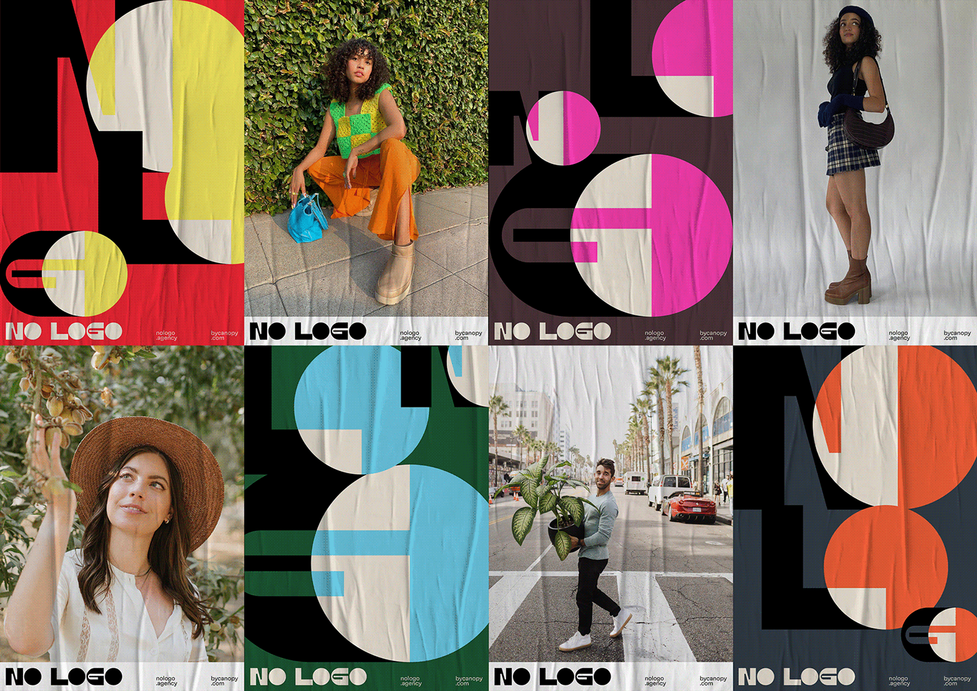
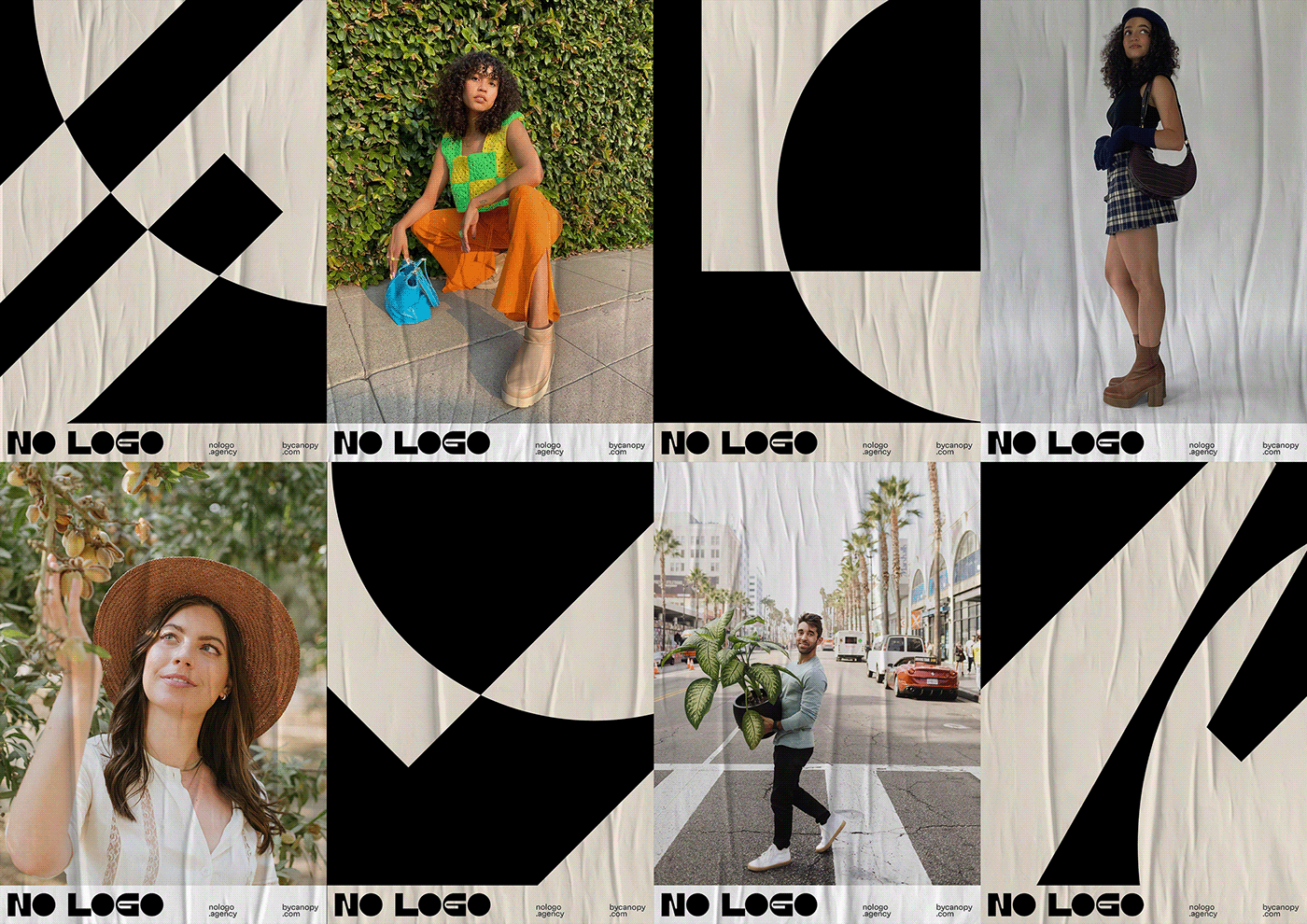
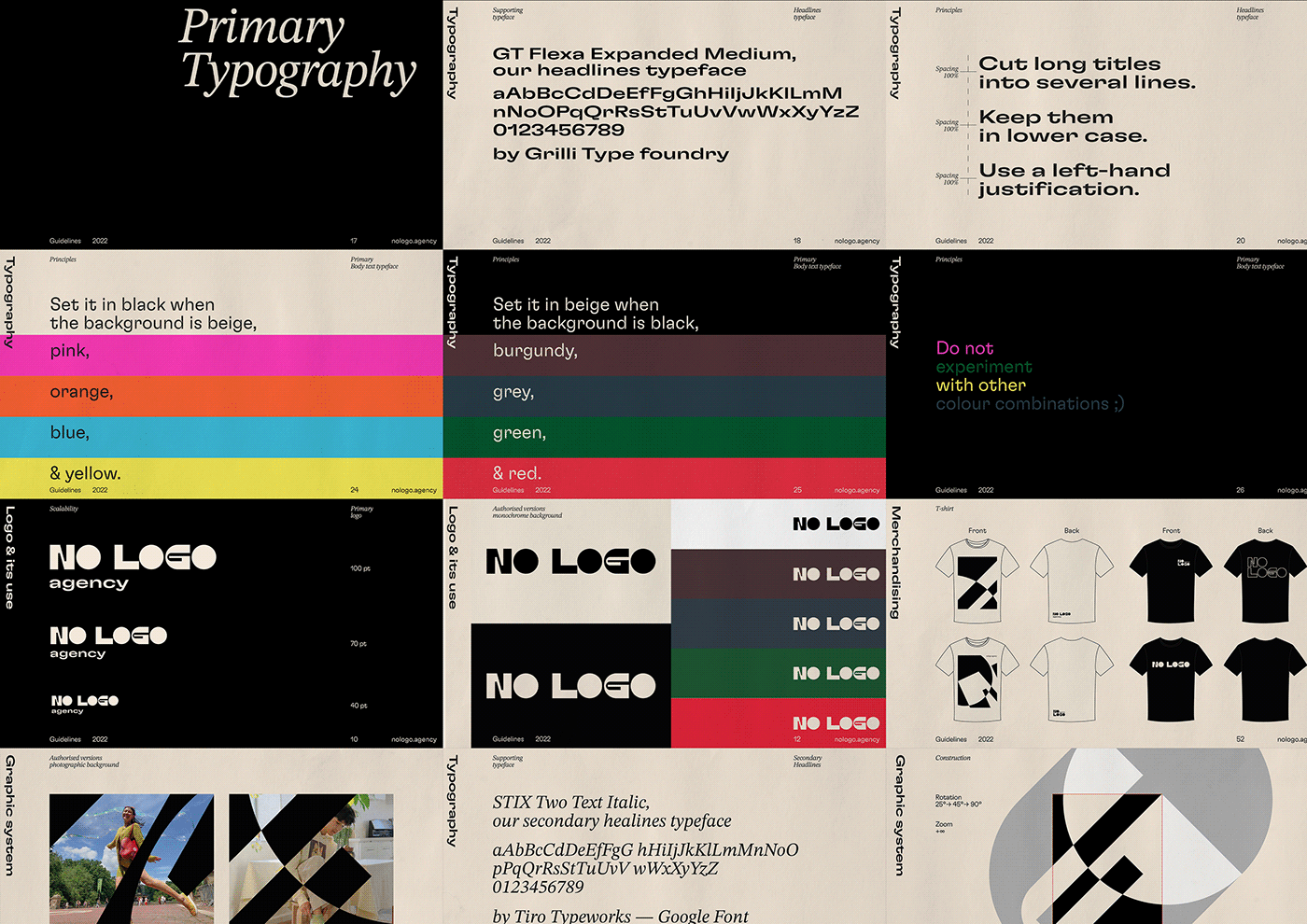
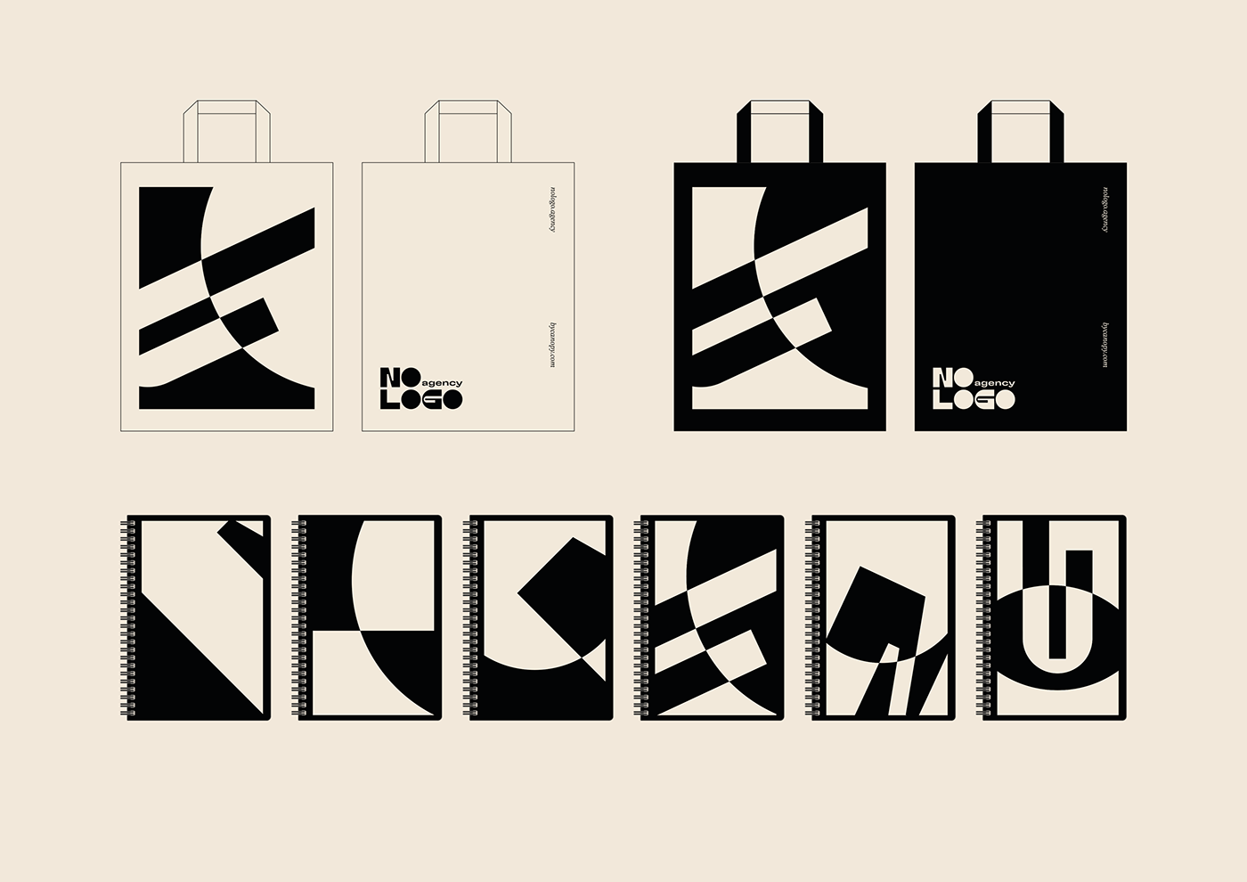
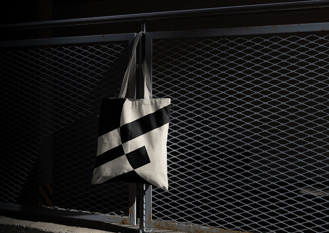
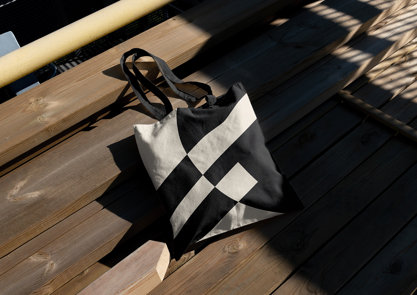
Nous avons travaillé sur un logo typographique audacieux avec des caractères imposants et géométriques. Le traitement des O en forme pleine sert de base pour mettre en place un jeu d'échelle typographique afin de symboliser le sens vertueux de NO LOGO en mettant l'emphase sur le GO plutôt que le NO. Dans cette logique, les cercles noirs sont le canevas du système graphique avec toutes les possibilités qu'ils représentent afin de promouvoir les personnalités singulières des créateurs au sein du groupe. L'identité trouve son équilibre entre la discrétion par l'usage du noir et du blanc et la créativité avec une palette chromatique large et contrastée. L'usage de la GT Flexa Expanded Medium (Grilly Type) assume entièrement ce parti-pris protéiforme et infini.

EN
.
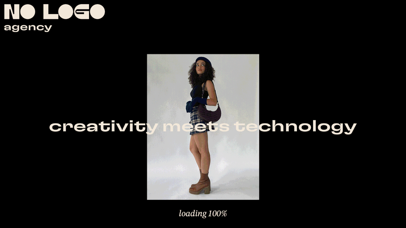
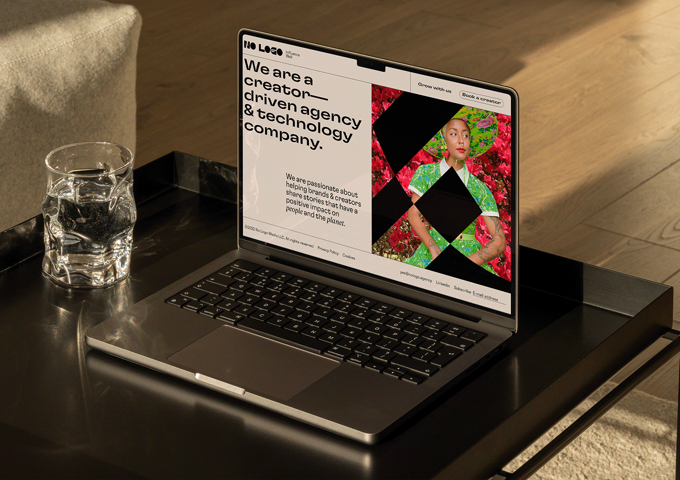
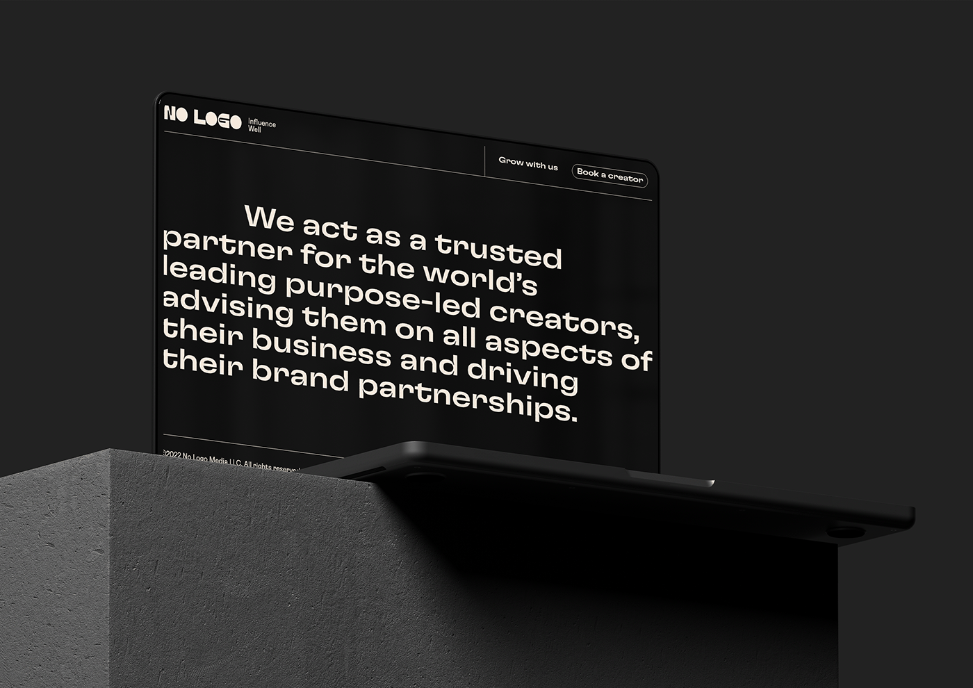
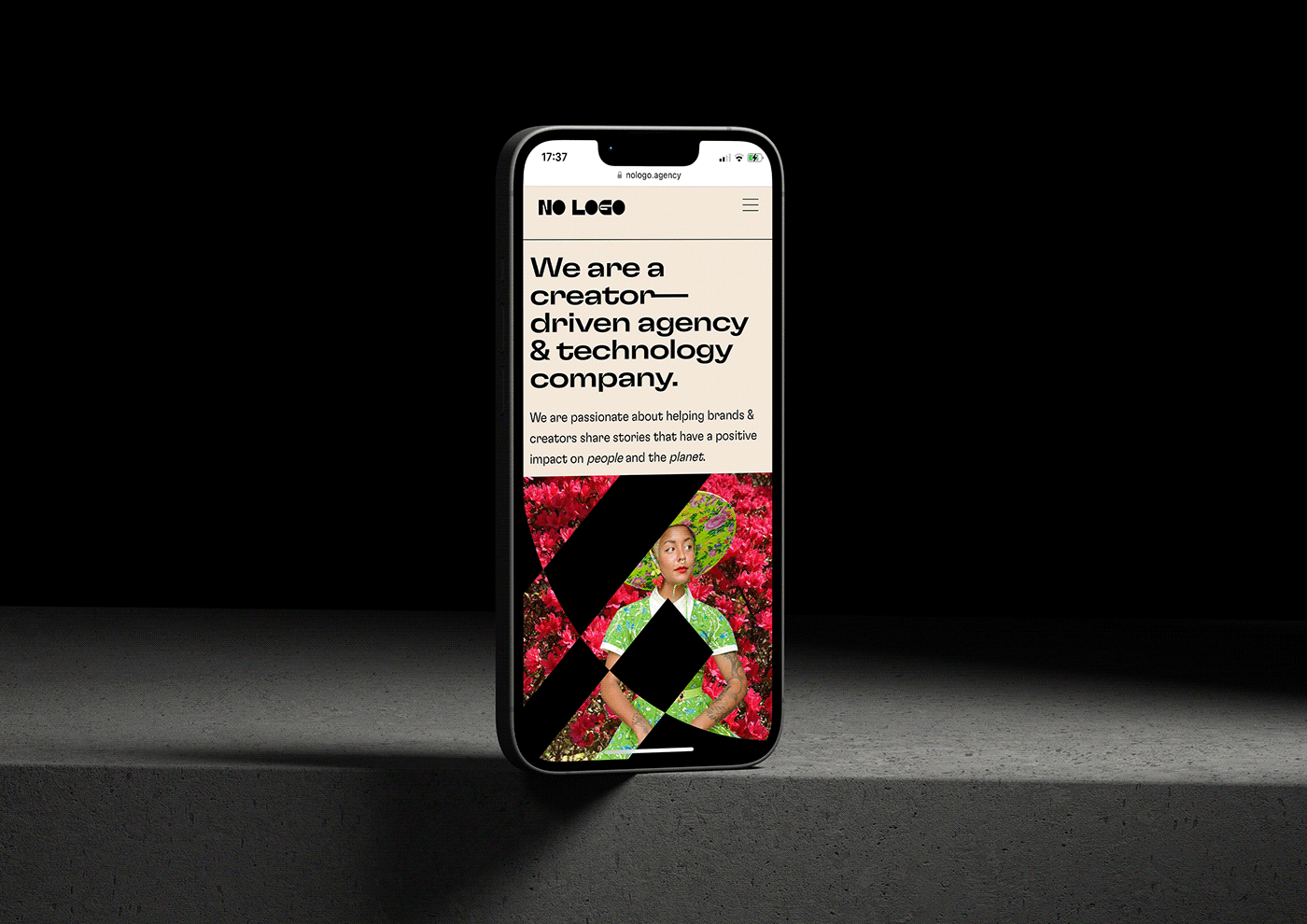
No Logo is an Edinburgh-based marketing agency and technology company focused on eco-friendly content creators. As an intermediate between brands and creators (influencers), No Logo stays in the background with a mission to enhance positive impact collaborations by empowering them.
We worked on the redesign of their visual identity to federate their internal actors and members towards a common cause: Influence well.
We worked on a bold typographic logo with imposing and subtle characters. The treatment of the solid black O's creates a rhythm and a base for the graphic system: a typographic scale play to symbolise the virtuous meaning of the term NO LOGO. In this way, the black circles are the canvas of the system with all the possibilities they represent to promote the singular personalities of the creators within the group. The identity finds its balance between discretion through the use of black and white and inventiveness with a wide and contrasting colour palette. The use of the GT Flexa Expanded Medium (Grilly Type) fully embraces this multifaceted and infinite approach.


Webdesign : AB Projets Studio
Développement : Jean-Rémi Massery
Site internet : nologo.agency
_
Webdesign: AB Projets Studio
Implementation: Jean-Rémi Massery
Website: nologo.agency


