
Solution: X-Sell Footer New Design
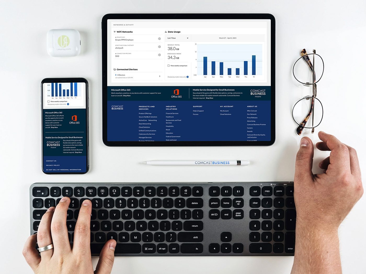
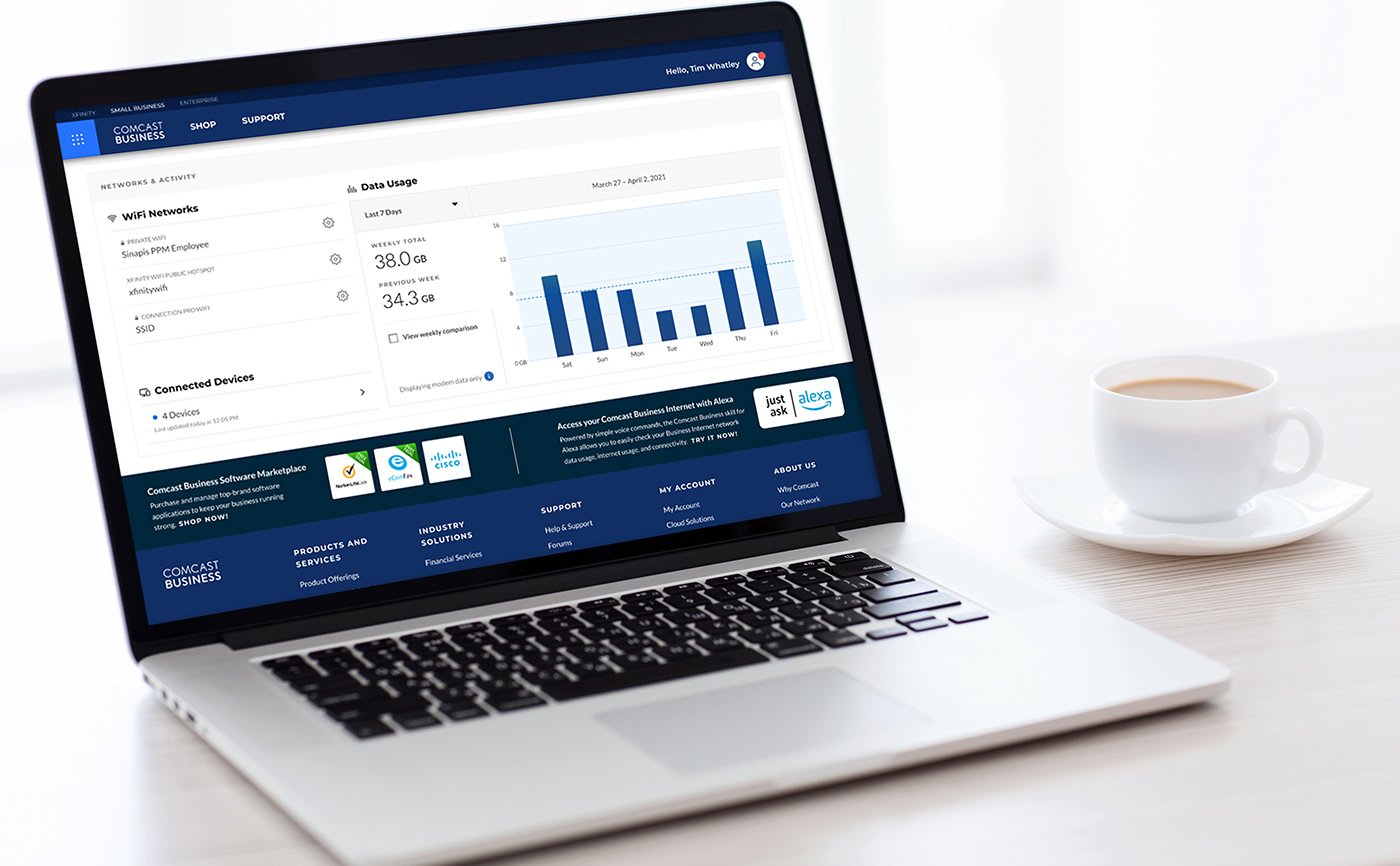
The cross-sell footer drives about 315 monthly sessions. The goal is to improve on those numbers by creating a more simple cleaner looking design. This project was not assigned to me at first, It jumped out at me and I asked my team lead if I could explore new options on my own and the above screens are the results of that effort and design explorations. The old designed used 281 pixels in vertical space the redesign got that number down to 136 pixels, every pixel is important and utilizing your web space is equally an important factor to consider when creating Ui/Ux components. Let's get that vertical scroll down to increase the absorption of more content quickly for the user who's time is of great value.
The cross-sell footer drives about 315 monthly sessions. The goal is to improve on those numbers by creating a more simple cleaner looking design. This project was not assigned to me at first, It jumped out at me and I asked my team lead if I could explore new options on my own and the above screens are the results of that effort and design explorations. The old designed used 281 pixels in vertical space the redesign got that number down to 136 pixels, every pixel is important and utilizing your web space is equally an important factor to consider when creating Ui/Ux components. Let's get that vertical scroll down to increase the absorption of more content quickly for the user who's time is of great value.
Challenge:
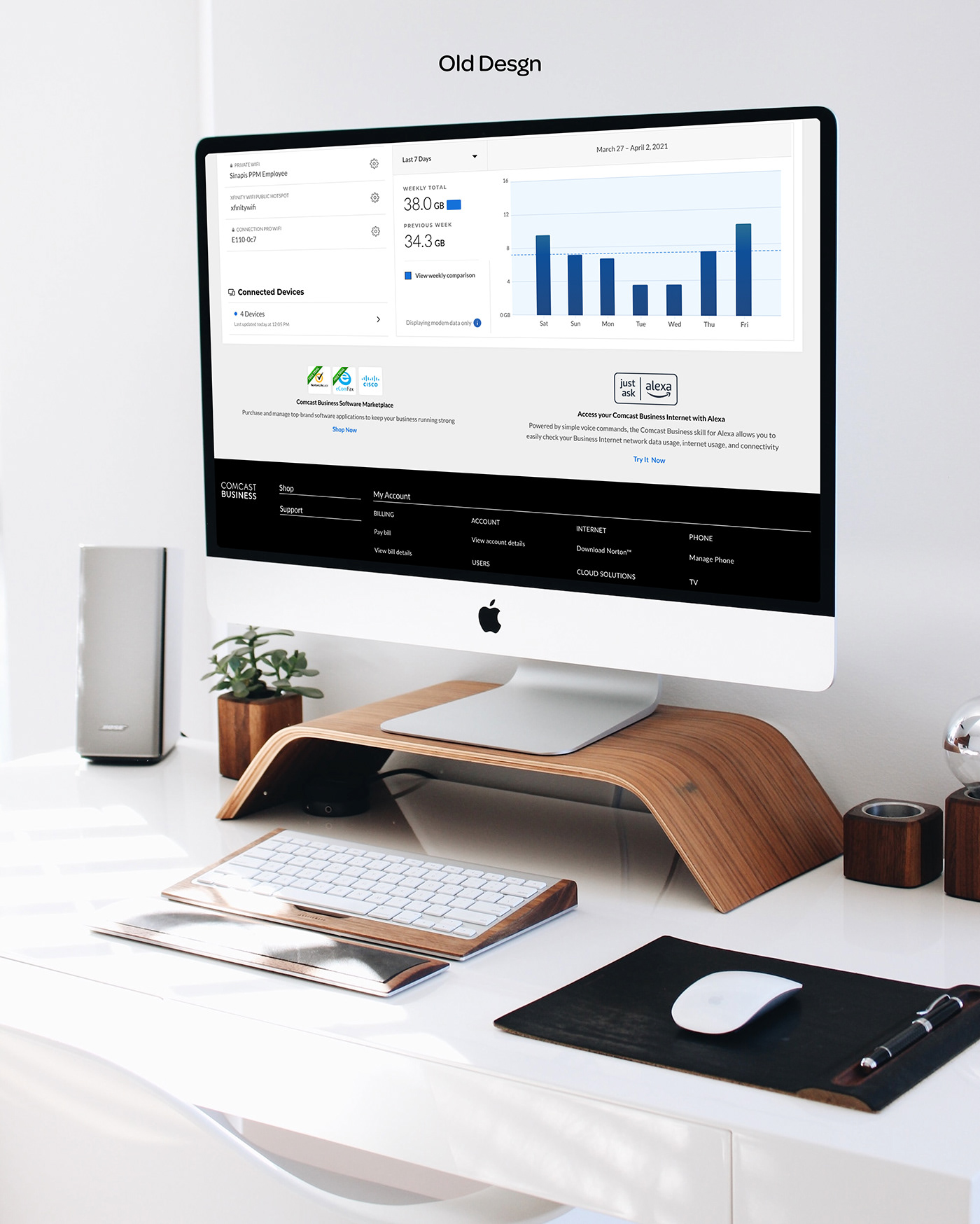
As I looked at current footer, I immediately noticed how much unnecessary vertical height was being used, icons where rasterized and immediately wanted to get to work on fixing that component. Users come to a site to complete a task and having to scroll more than necessary can negatively impact your bottom line. The current design used 281 pixels and visually needed to be redesigned for better flow.
Above and below are visual references on what cross-sell footer looked like before my efforts to rearrange this use of this space for visual aesthetics, with the main goal to drive more visits and increase sales bringing further value to the organization.
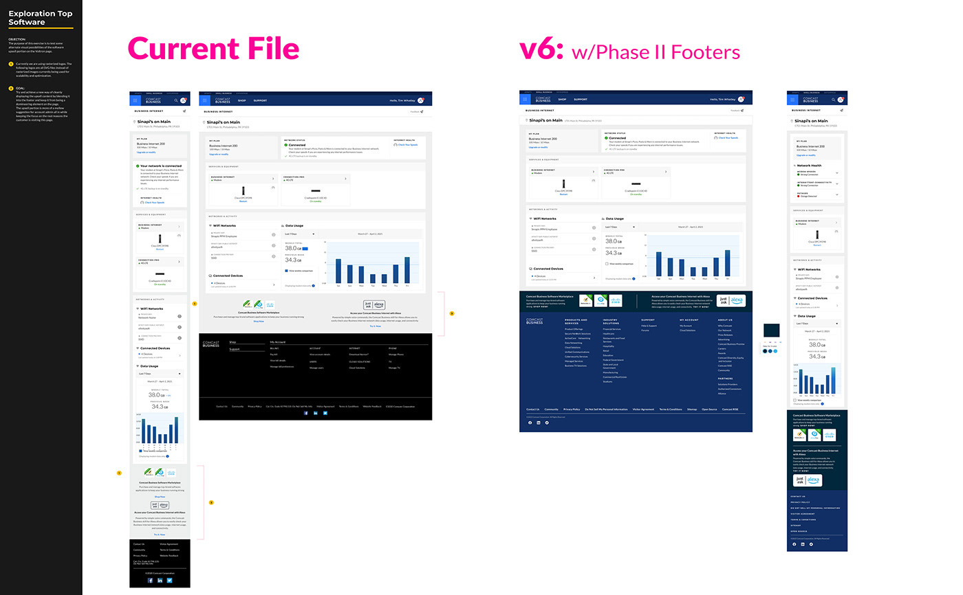
When presenting this project for approval to team and dev I always include documentation for all my work. You can see it briefly on the above screen.
"The goal of great discussion isn't to land on the same page. It's to explore different views.
Nods and smiles stroke your ego and close your mind. Thoughtful questions stroke your curiosity and stretch your thinking. Consensus makes you comfortable. Dissent makes you smarter."
-Adam Grant


