
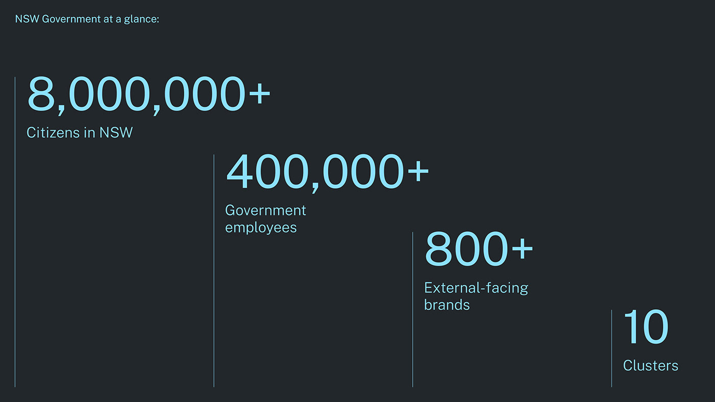
NSW Government at a glance
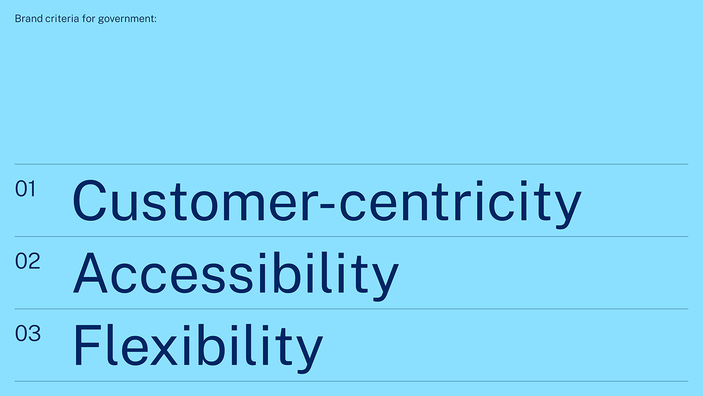
New South Wales is a vast state, home to nearly a third of all Australians across agricultural hubs, remote towns and dense urban centres. It is the largest organisation and employer in the country and they manage a complex array of services and responsibilities in communities across the region. These vast and complex requirements mean a customer-centric approach to communications is vital in delivering effective services and information to the residents of New South Wales.
A masterbrand, remastered
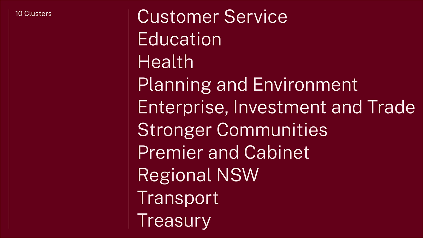
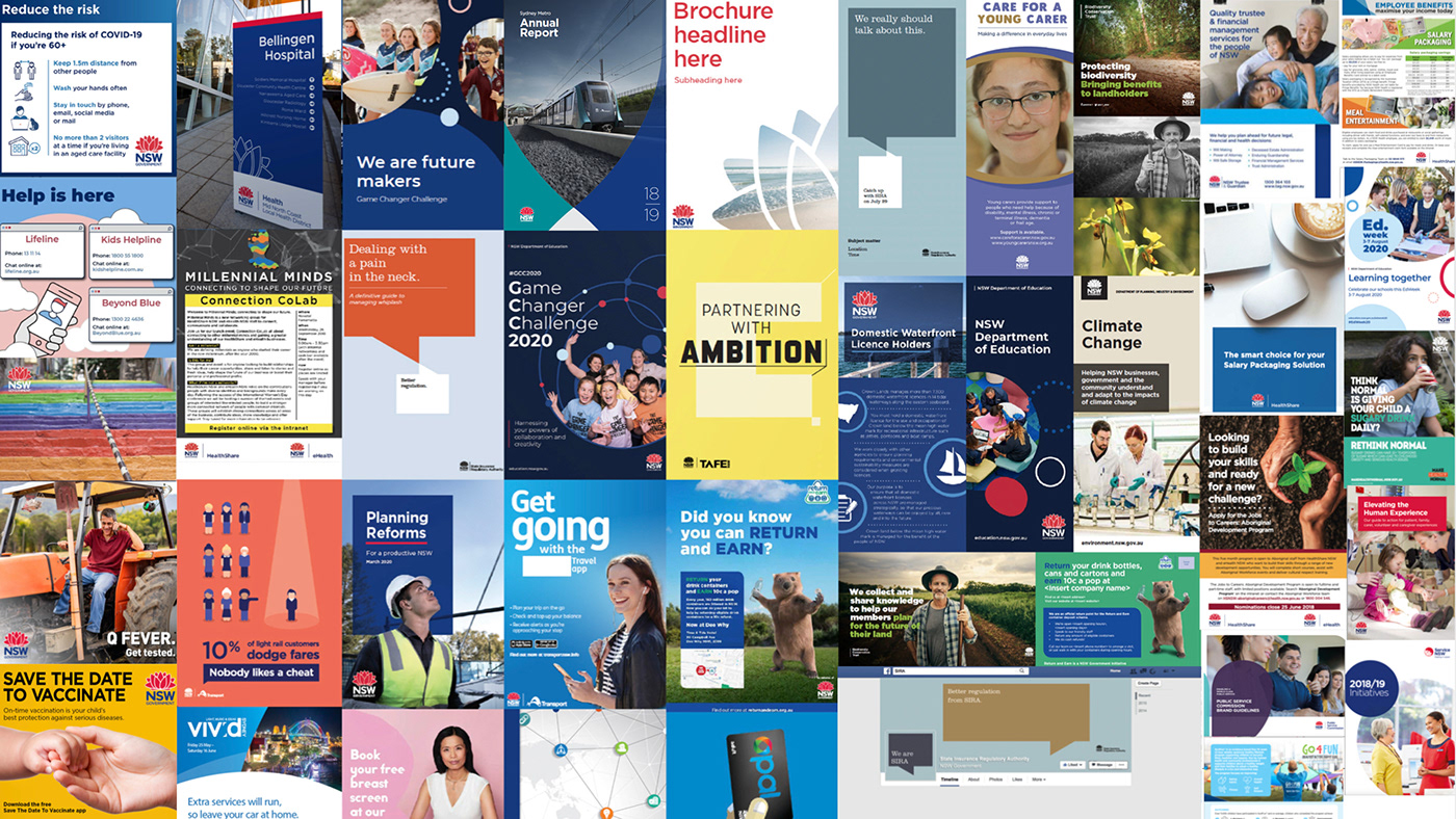
The NSW Government has over 800 external-facing brands, and over 400,000 employees. With the adoption of a masterbrand strategy in 2020, the Government aimed to bring greater purpose to how they communicate their priorities and engage with the public. The shift was also intended to increase attribution and understanding of the services NSW Government provides, whilst reducing the complexities typically associated with Government interactions. Prior to this transformation, The NSW Government was responsible for managing a large portfolio of departments, brands, sub-brands and initiatives each with a multitude of individual brand systems. Consequently, managing these diverse brand expressions required time and resources, and communications often lacked the necessary connections back to the NSW Government.
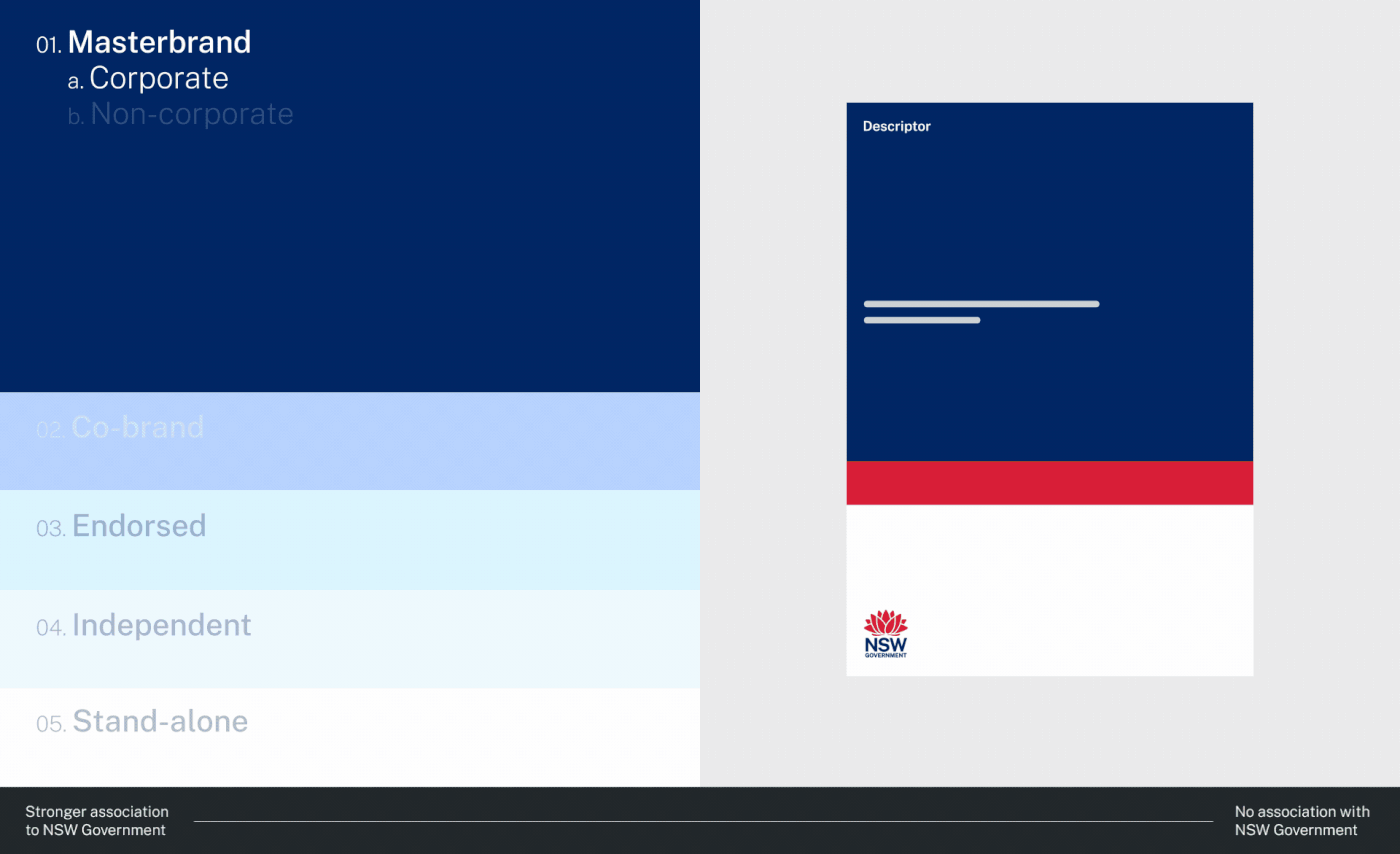
For the People were engaged to restructure the NSW Government’s brand architecture and develop a visual identity system that leveraged the existing Waratah logo. A holistic design system was built to support and respond to the needs of both Government and its customers across a range of services, such as Health, Planning, Education and Transport. The outcome was a new, more succinct, masterbrand approach — removing complexity, improving flexibility and driving equity across Government communications.
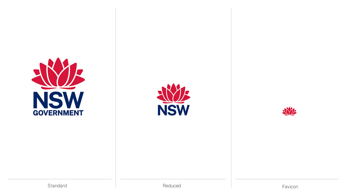
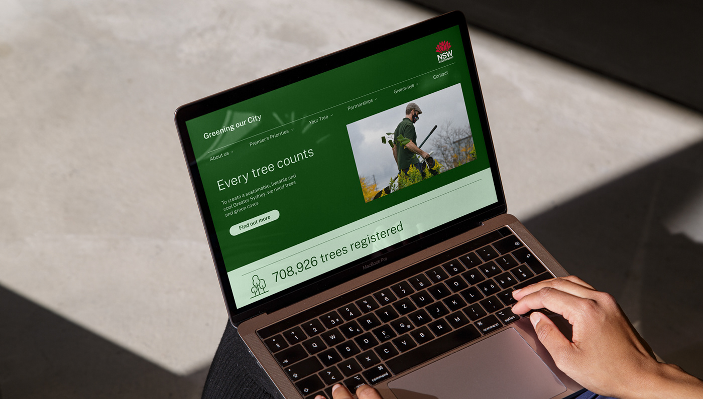
Design system
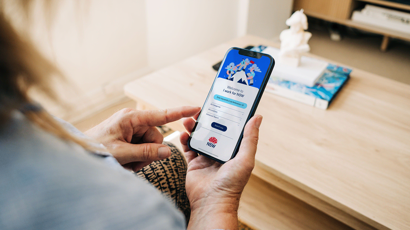
It was imperative that the new design system delivered a more customer-centric and intuitive communications approach, with greater flexibility across the full range of Government services. This shift would help build brand equity back into the NSW Government, improve brand portfolio management and support the delivery of better services, through better communications. For example, a navigational description system was introduced, giving the NSW Government logo prominence whilst helping customers navigate through different Government services and departments easily.
In the true spirit of service, it was crucial that the new system was built with a customer-first approach to enable clearer communication.
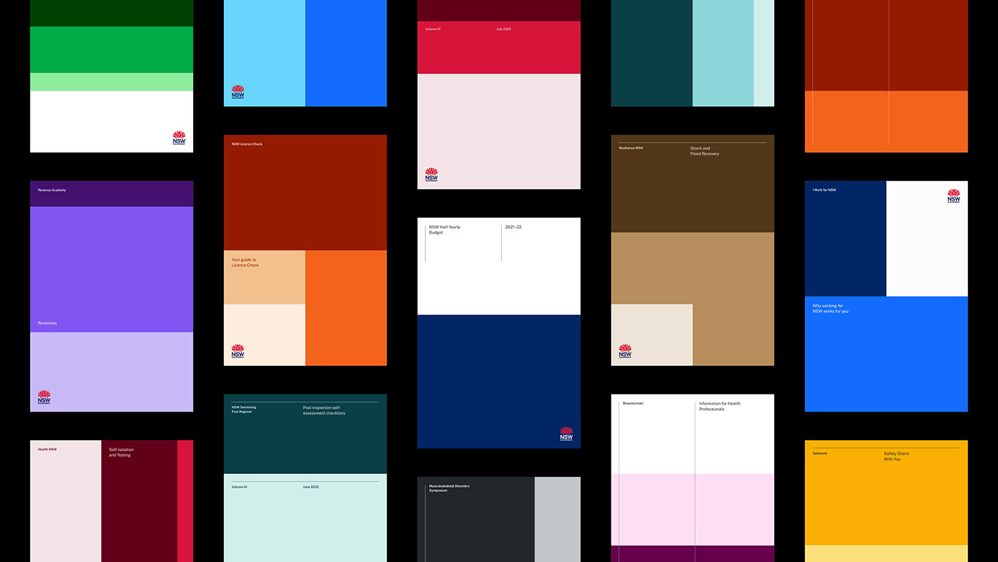


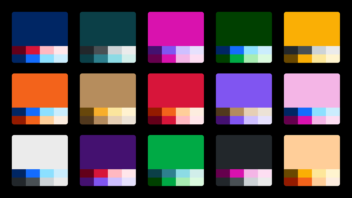
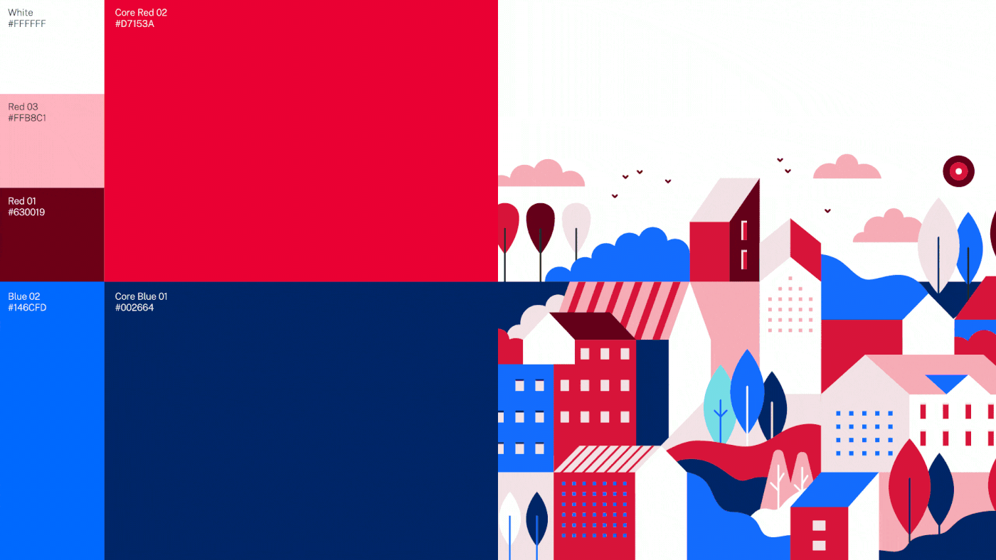
Colour
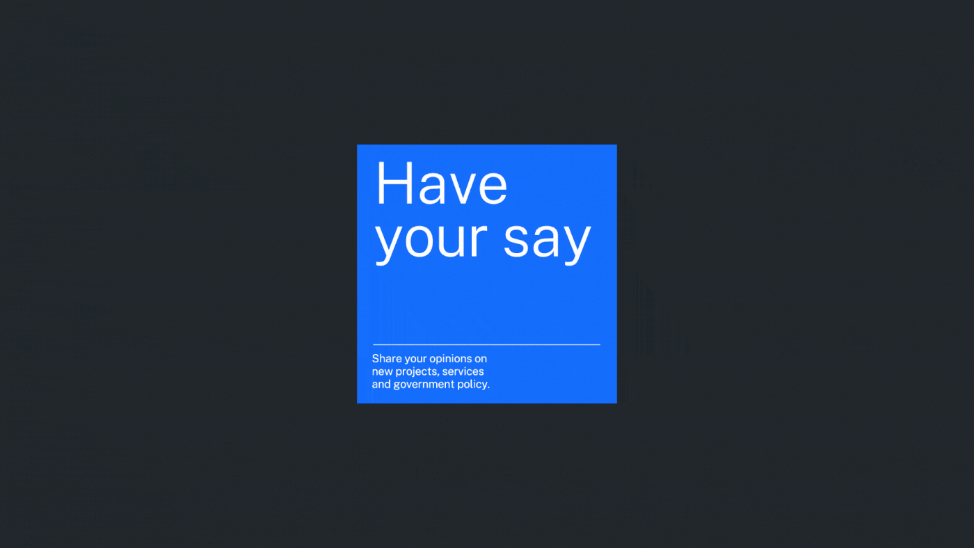
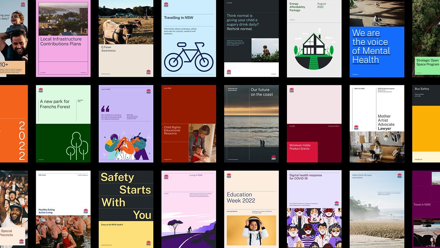
The NSW Government is often recognised by its long-held palette of dark blue and red. However, there were also over 800 colour palette variations used across the portfolio. To unify colour usage, a consolidated palette was implemented across the whole of Government that aligned colours, tones, and shades, with maintained flexibility for individual programs to differentiate themselves where needed. Accessibility was a key consideration, with coloured text combinations tested against AA and AAA standards from the WCAG guidelines to ensure readability across all Government communications.


An Open source typeface for broad use
With more than 275 different languages spoken in NSW, the new identity system needed a large typeface family with the ability to communicate in multiple languages.
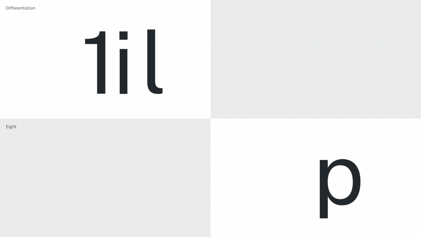
With this criteria in mind, the open source font, Public Sans, was adopted for use as the primary brand typeface. The typeface offers an expansive font family in 130 languages and pairs easily with supporting multilingual fonts. It delivers on key accessibility requirements with strong legibility and readability through larger x-heights, more open counters, and clear differentiation between similar letterforms (such as ‘1’, ‘i’ and ‘l’). The typeface provided the Government with an expansive, yet cost effective way to enhance their communications with all residents and visitors to the state.


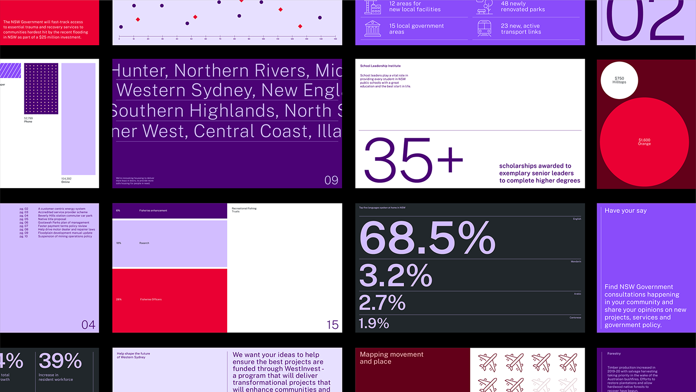
Intuitive layout system
To support a flexible and intuitive design system, it was important to create a clear framework for all visual elements and typography. The brand follows a cohesive and modular design system that relies on clear information navigation, and the ability to incorporate colour and imagery in a highly flexible manner, giving a level of individuality to each communication and ensuring clear masterbrand recognition. The result is a simpler, more intuitive approach that encourages the use of illustration, photography, composition, hierarchy, scale and proportion to create clear communications. This strengthens the masterbrand attribution across all Government services, activities and initiatives, without compromising the ability to tailor brand expression and appeal to different audiences.

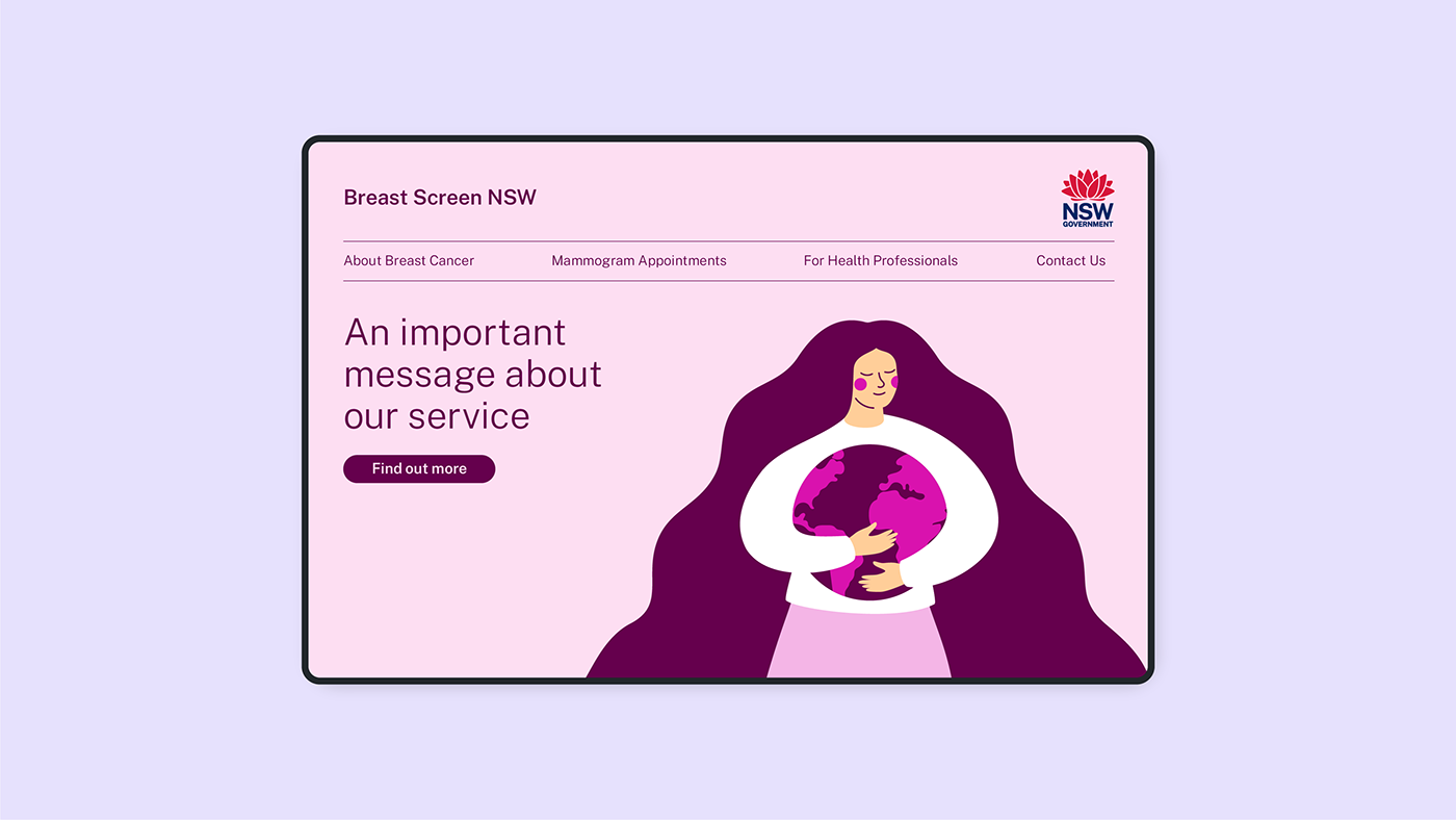
Illustration
The adoption of illustration has become a significant evolution in the new NSW Government brand communications. A powerful tool for conveying ideas, emotions, and complex or intangible concepts, illustration ensures a diversity of people and locations, to services and information.
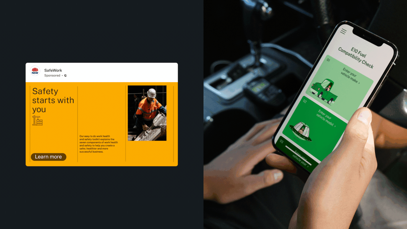
Because of the breadth of NSW Government communications, there is no single style of illustration. Instead, a high degree of flexibility ensures that imagery is always appropriate, engaging and current. Using the interchangeable colour palettes, these illustrations can be easily customised to suit a particular product or communication, and relate to the specific area it’s being utilised.


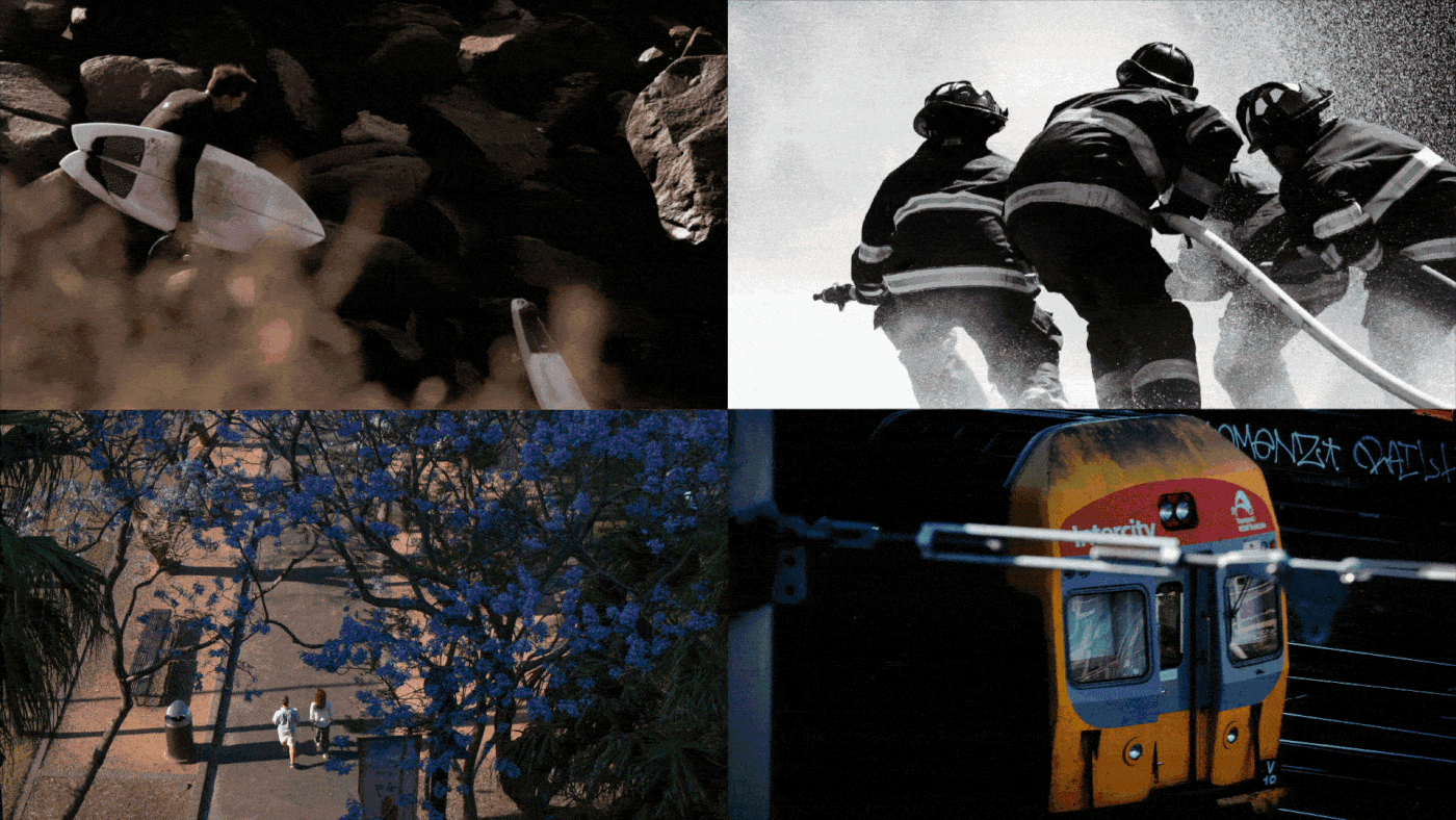
Photography
Imagery plays an important role in Government communications. The framework for photography conveys a more human representation of NSW Government, showcasing the local environments and diverse communities they aim to serve.
The new direction encourages an editorial approach, portraying people in realistic and relatable situations, and captures the regional and urban environments in which we live, work and play. The subject matter is diverse, encompassing the breadth of services across the many Government departments, agencies, programs, and entities. Tips and techniques relating to key photographic principles (such as depth of field, obscure angles, lighting, framing, and colour) are also provided to support and guide in the delivery.


Credits
ECD: Jason Little
Creative Director: Mel Baillache
Design Director: Nicola Ferry
Designers: Kimberly Luo, Atsaya Gabiryalpillai, Dash O'Brien-Georgeson, Dean Hastie, Andrew Sanney, Simon Blanckensee, Catherine Peacock, Kelsen Findlay, Georgia Urie, Cassie Ciccarelli
Strategy Director: Damian Borchok
Senior Strategist: Sammy Page
Head of Storytelling: Mat Groom
Writer/Storyteller: Daniel St. Vincent
Motion Design: Mac Archibald, Atsaya Gabiryalpillai


