Linet
2022
Client: LINET
Art director: Aleš Najbrt
Designer: Jakub Spurný, Iveta Bláhová
Cooperation: Michael Dolejš (webdesign)
Font: GT America
Type: Brand, Web
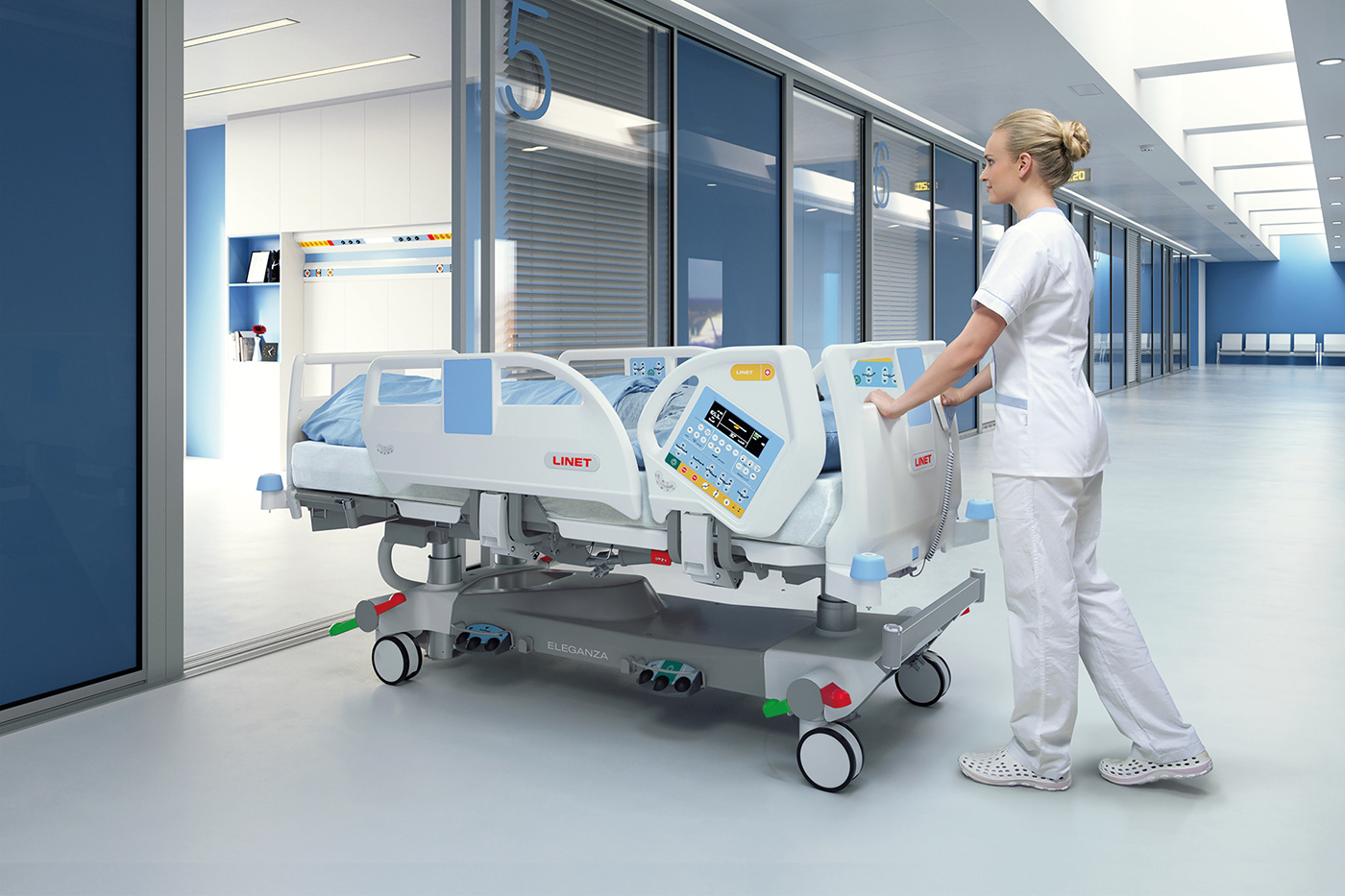
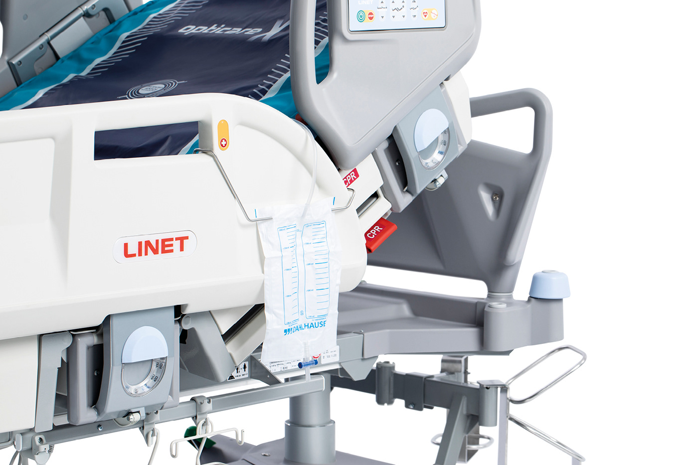
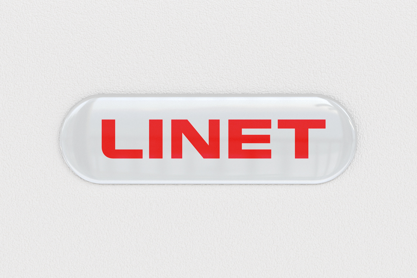
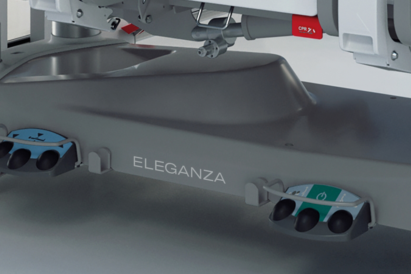
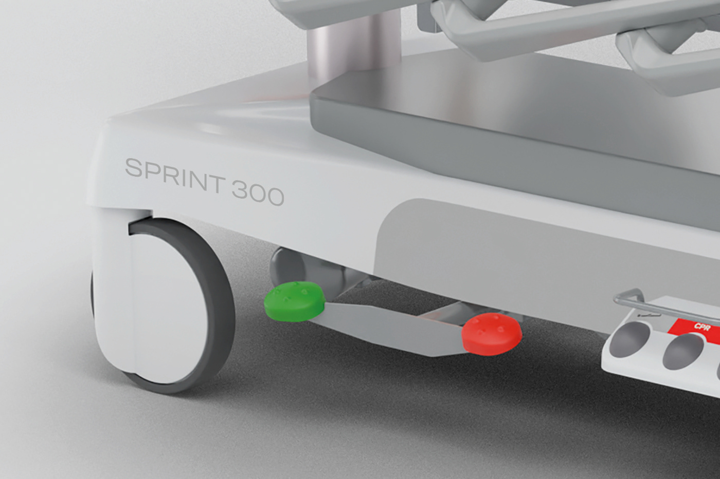
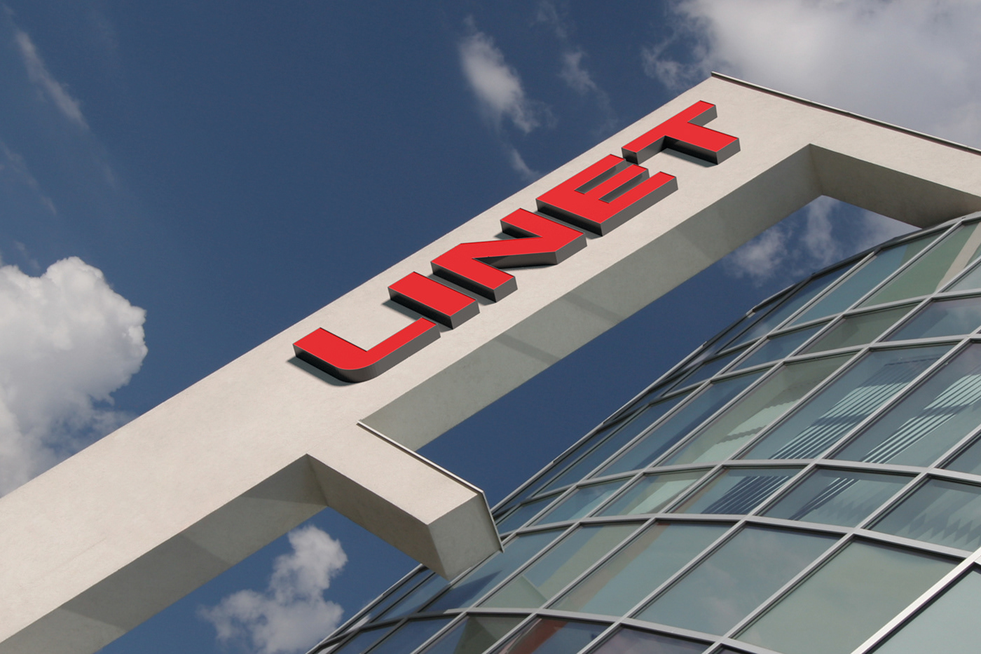
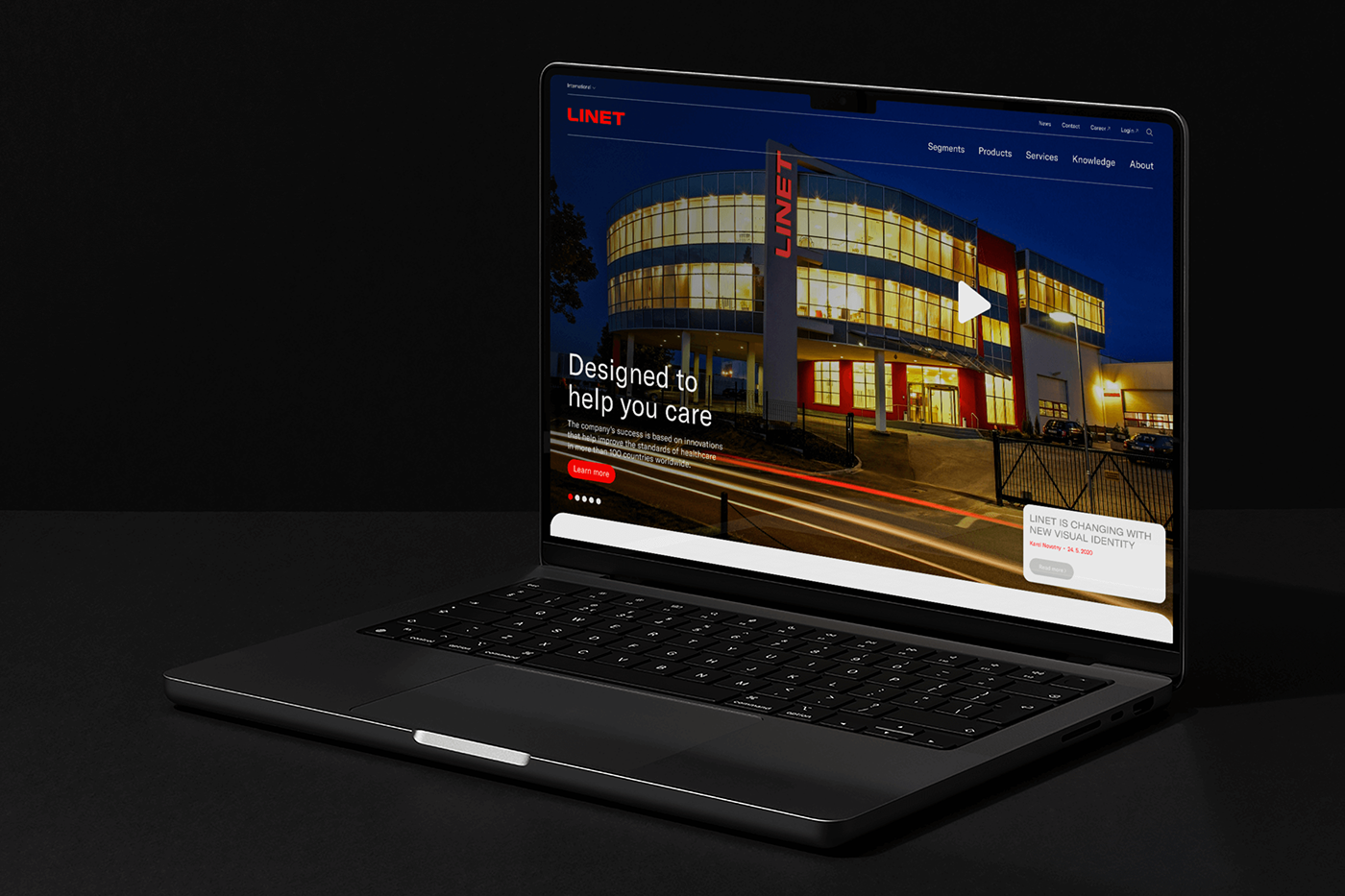
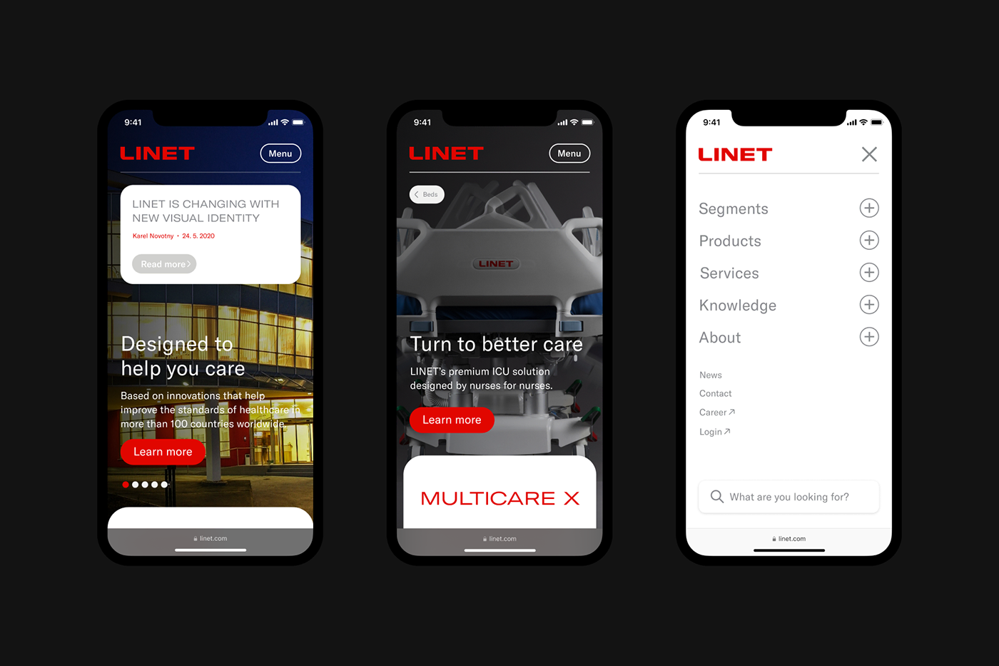
A redesign of the logo of the world’s largest manufacturer of medical and nursing beds pursued two main goals: to simplify and subsequently improve communication. In an environment full of data and characters where lives are saved obviousness has a special value, which is why the modernization of the entire visual style of Linet is aimed primarily at consistency, clarity and unification. We removed the already dysfunctional and unnecessarily sharp symbol of the partner company WiBo and softened the letter L with a round shape representing the user-friendliness which is crucial to the current concept of care. The function of the symbol (e.g., in avatars) is taken over by a positionable L demonstrating the “lateral tilt”, a key function of society's beds.