Reimagining The Green Dot — An open brief by @two_degrees_creative and @thebrandidentity
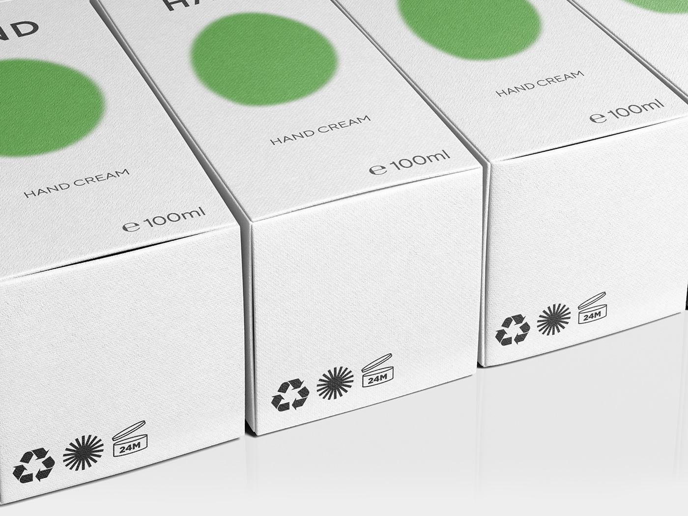
Many of us mistakenly think The Green Dot symbol stands for recycled/recyclable.
The truth is that The Green Dot logo merely indicates that a company or brand has joined The Green Dot Scheme (by a financial contribution to a waste recovery system) and not necessarily that their packages are fully recyclable.
Instead of visually representing this concept (difficult to interpret at a glance), I decided to indirectly recall it through the union of several lines that head in a shared direction: The Green Dot.
Doing so, the symbol metaphorically illustrates the cooperation between the industries that are sticking with The Green Dot system and working together for a brighter future (the symbol also recalls a sun).
Overall my redesign aims to create a simple, memorable and effective symbol which conveys unity and optimism towards the future.