ORKIDE OLIVE OIL Packaging Industrial Design (PET Bottle) & Graphic Design (Label)
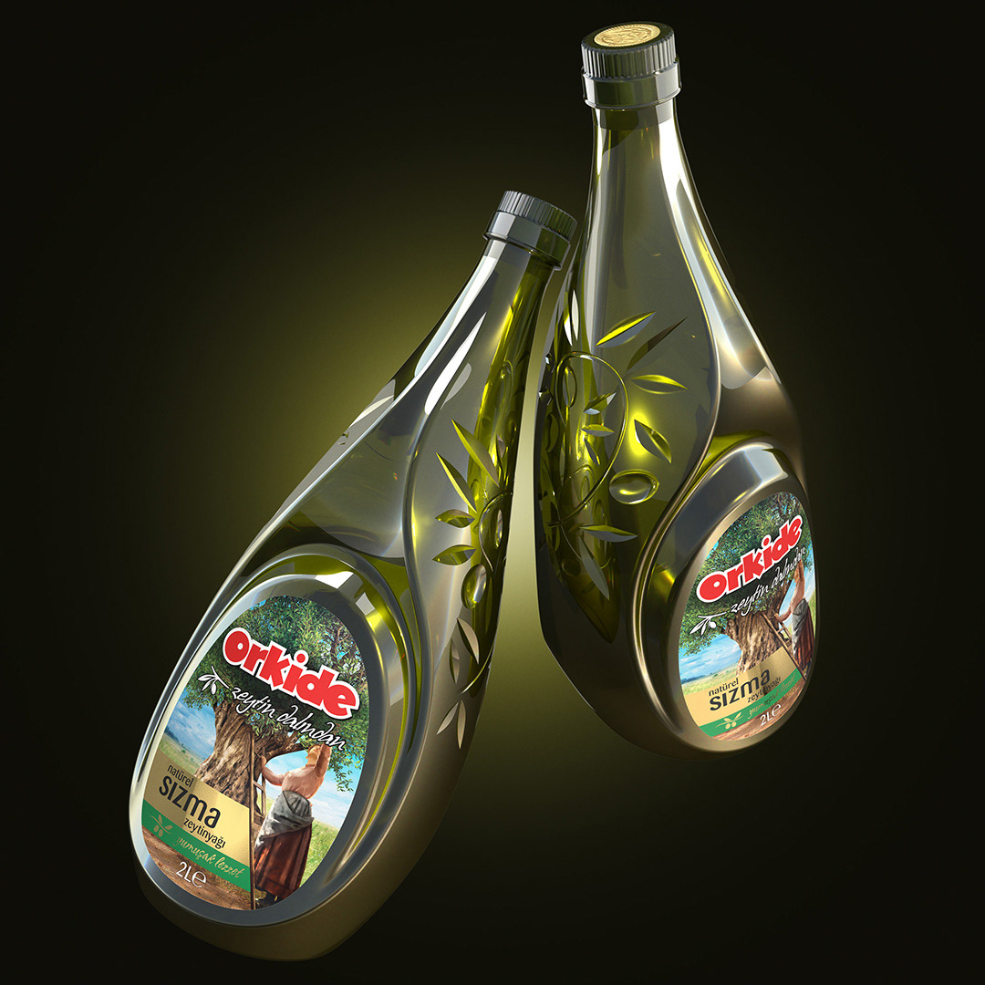
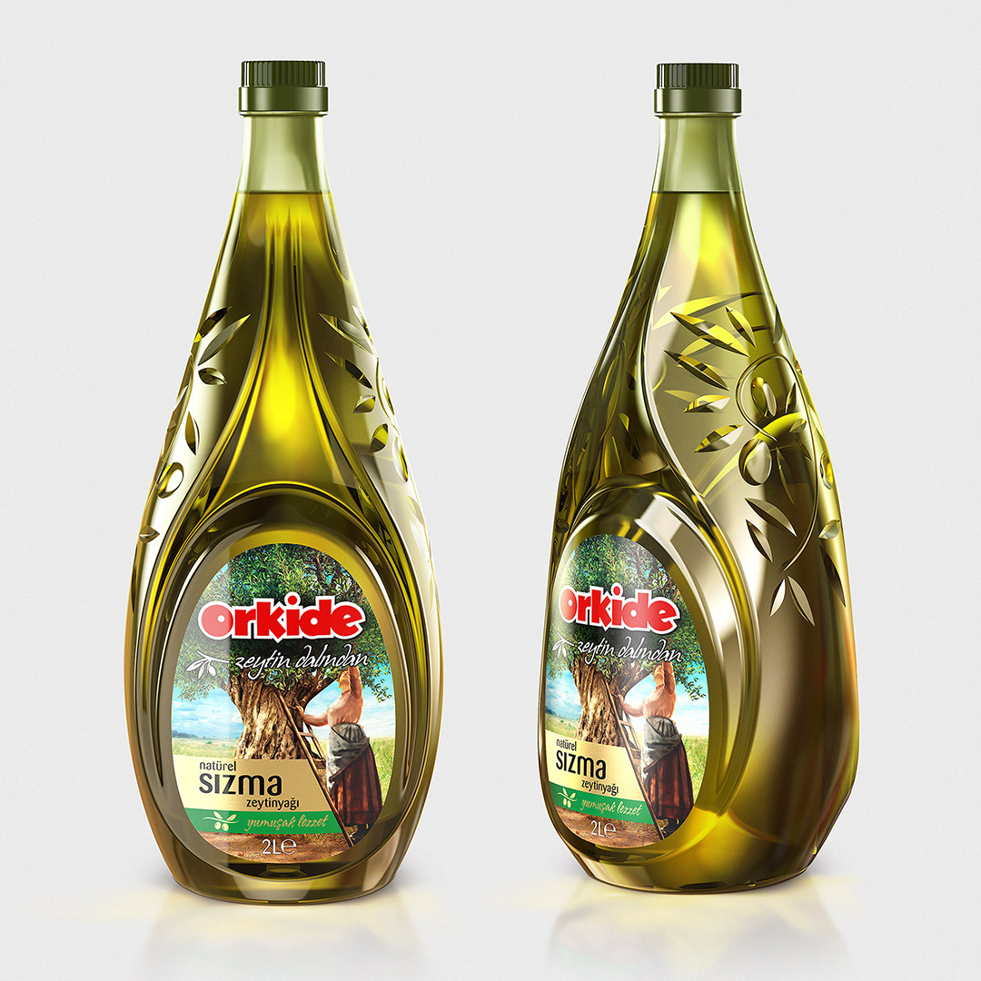
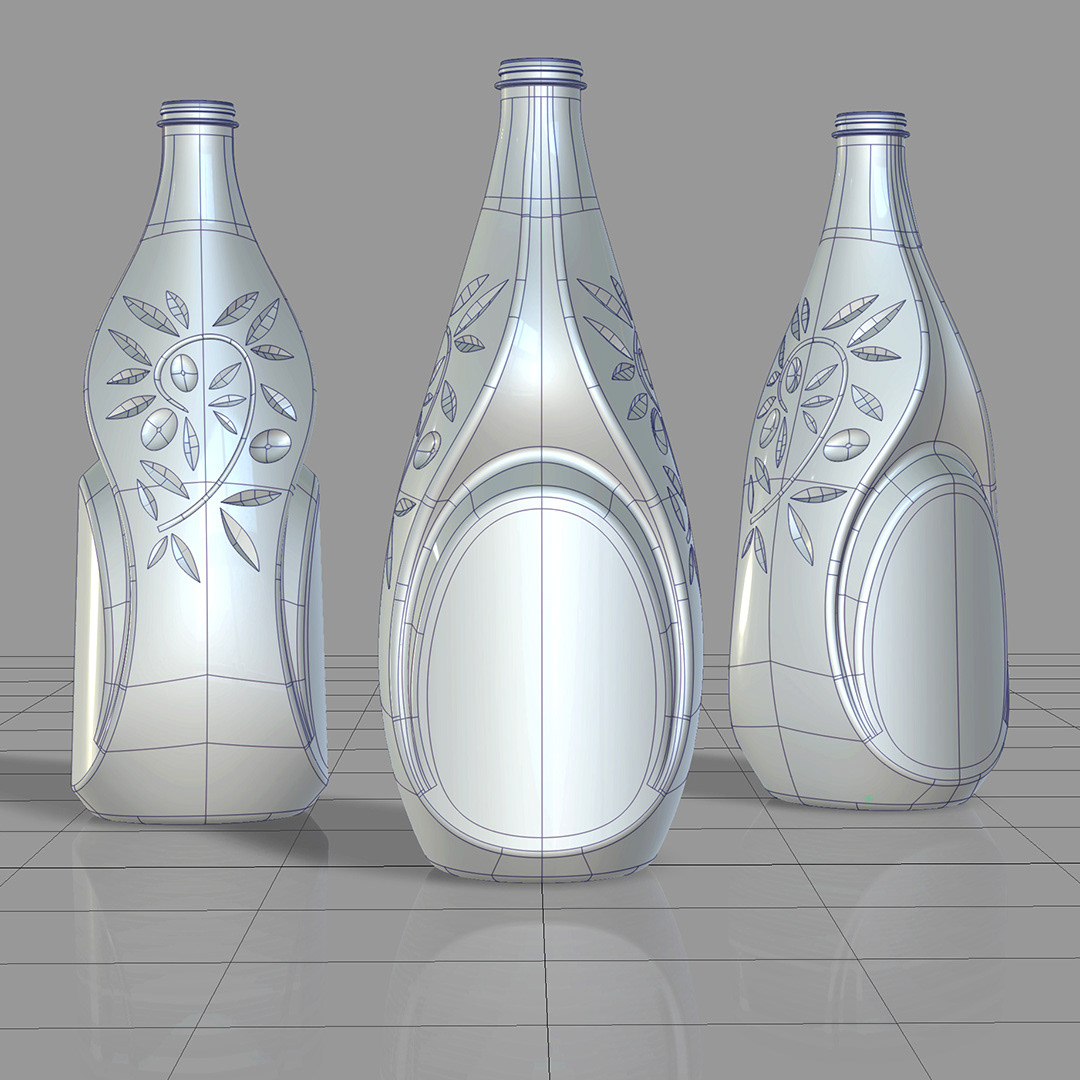
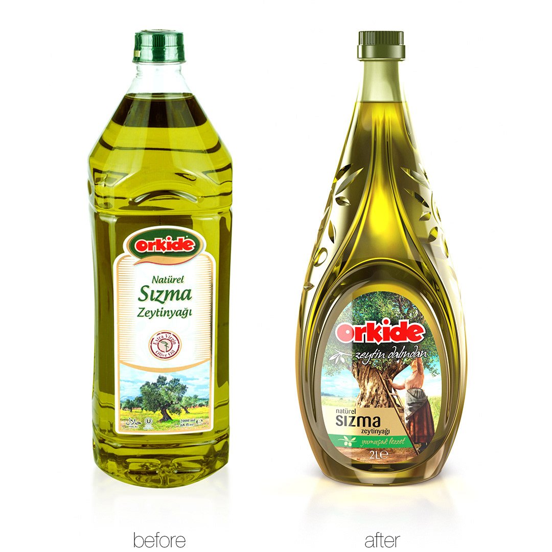
The objective of the forms used in the design that was targeting the identification of an olive oil product at the first glance and was shaping around the concept of dripping olive oil, was to provide an ergonomic grip and the target of the pattern and images was to create an appealing product.
The front side shape of the packing was inspired from the dripping olive oil drop in order to make it easily recognizable at the first glance as an olive oil product. The shape of olive that was embossed inside the drop form provides the suitable area necessary for placing the label. The concave structure of the olive oil drop contour that surrounds the olive is deepening in the middle part of the bottle, providing an ergonomic grip and at the same time increasing the bottle resistance. The purpose of the refractions caused by the olive branches, the olives and leaves applied concavely on the both lateral sides of the bottle was to create a glamorous and premium esthetic look. The deep respect paid by the trademark to the culture of olive cultivation and especially to the women workers, was expressed visually by the traditional illustration of women harvesting the olives that was placed on the label.


