


THE CHALLENGE
ACHIEVING GLOBAL
RECOGNITION FOR AN
UNDERAPPRECIATED
ASPECT
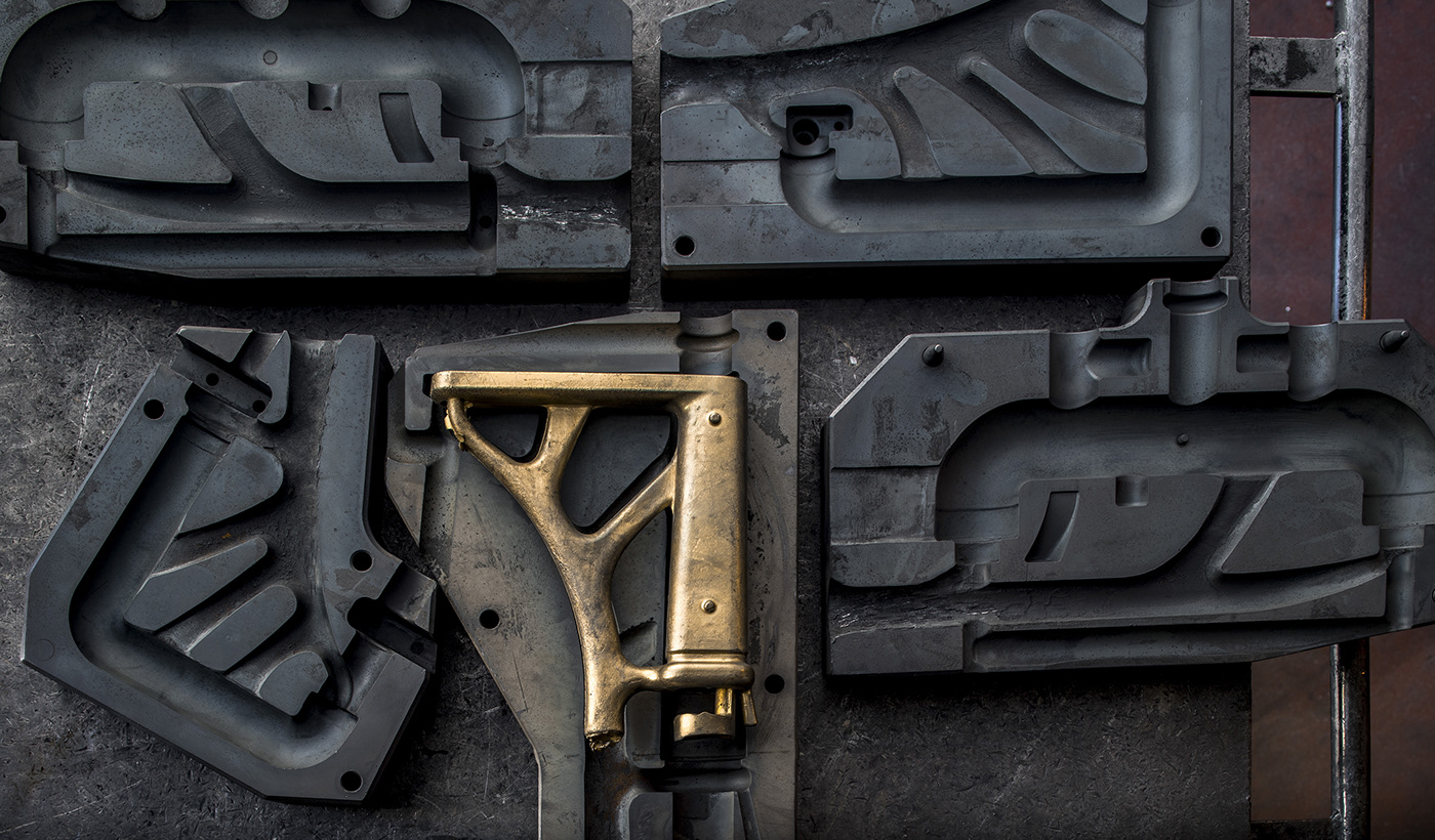
Many product companies we see today began their journey in the processing of raw materials. IB is a good example of this, originating as a small metalworking company which then grew to a provider of household taps.
When IB came to us their mission was clear, but difficult. They wanted to be internationally recognized as an innovative, design-driven business in the world of taps. To be understood as design-driven in this particular field is challenging, as the customer is not always design-focused. The customer is usually not even the user of the product. Architects and interior designers are most commonly those that choose which taps to buy, meaning functionality often takes precedent.
We came on board to establish a brand which could convince buyers of IB’s quality whilst conveying their core value of being design-orientated.
THE LANDSCAPE
KEEPING
EVERYBODY HAPPY
WHILST REMAINING
TRUE TO YOURSELF
When selling bathroom fixtures and furniture, there are a variety of actors that are involved in the buying process which must be considered. These actors have differing priorities and requirements, and to market medium-high end products in this industry, all must be met.
Businesses need to have a clear strategy regarding how they will portray their products and their brand to the end user, whilst satisfying the needs of all other actors, including architects, interior designers, bathroom installation businesses, stores and more.
STRATEGY
GETTING FROM
A TO IB
Our first step was to clarify the business’s goals and vision. In addition to becoming internationally recognised as a design-driven company, IB wanted to be counted among the most established brands in the sector - those that work with globally renowned designers - in the medium-term at least.
In order for this to be achieved we immediately outlined two aspects that needed to be addressed - art direction and the development of the brand language, and the creation of useful tools/guidelines for decision makers in the buying process.

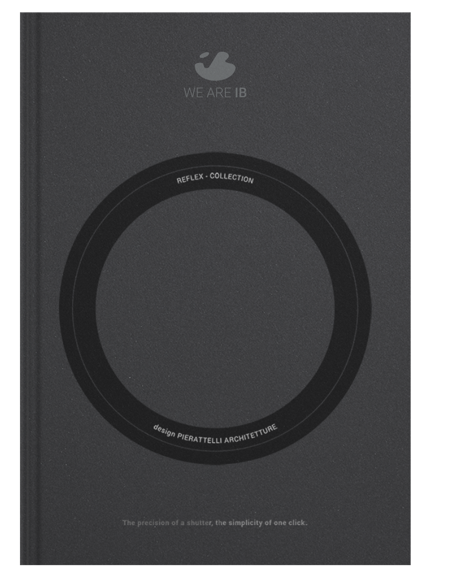
BRAND
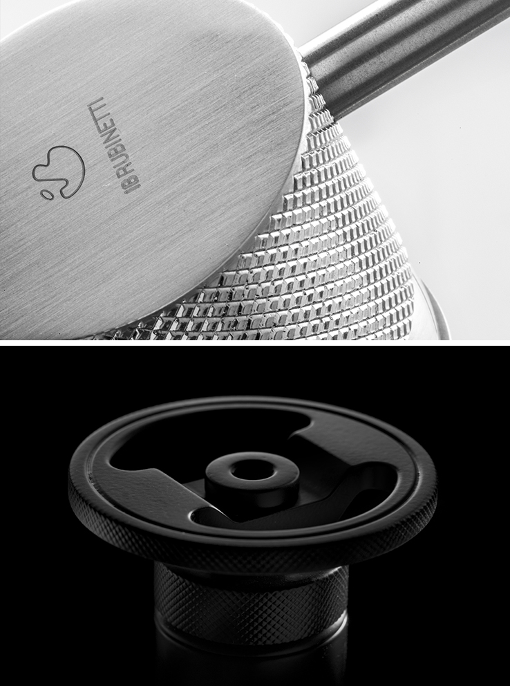
LOGO
Over the years the logo had undergone slight restyling in order to align it with new brand objectives, while remaining true to the original concept. The logo is recognizable, unconventional and represents the adventurous spirit that caused the company to grow so quickly.
Whilst it was decided that it needed enhancing, this posed certain problems as the brand already had an established profile. We needed to contextualise the enhanced logo in a new brand system and identity, whilst making it clear this was something that was being developed, not replaced. We feel the changes to the logo fit that brief.
Brand merger
During the company’s commercial expansion they had created a sister brand for distribution in the USA. This resulted in the company managing two very similar yet distinct brands with an increasing risk of resources being wasted. Together with the management team, we decided that it was necessary to bring the activities together under a single name - a strong identity that was proud of its origins. IB Rubinetti was simplified to become IB.


Aesthetic language
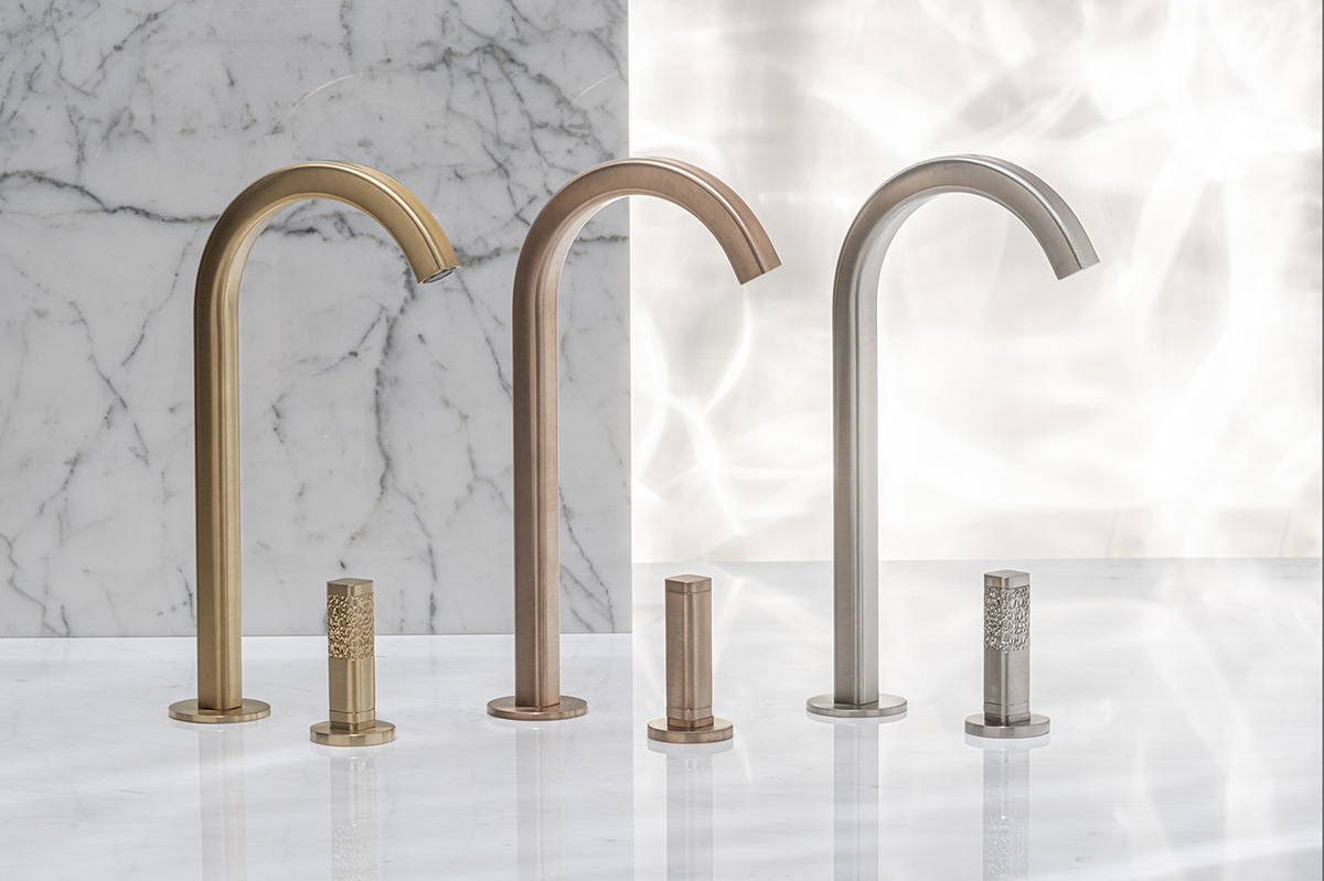
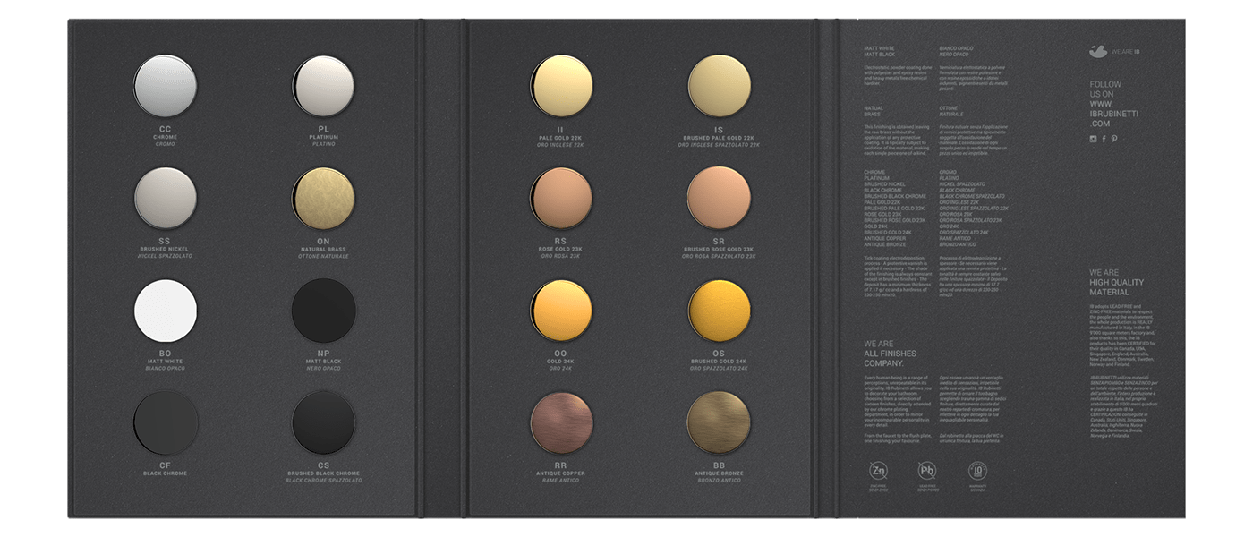
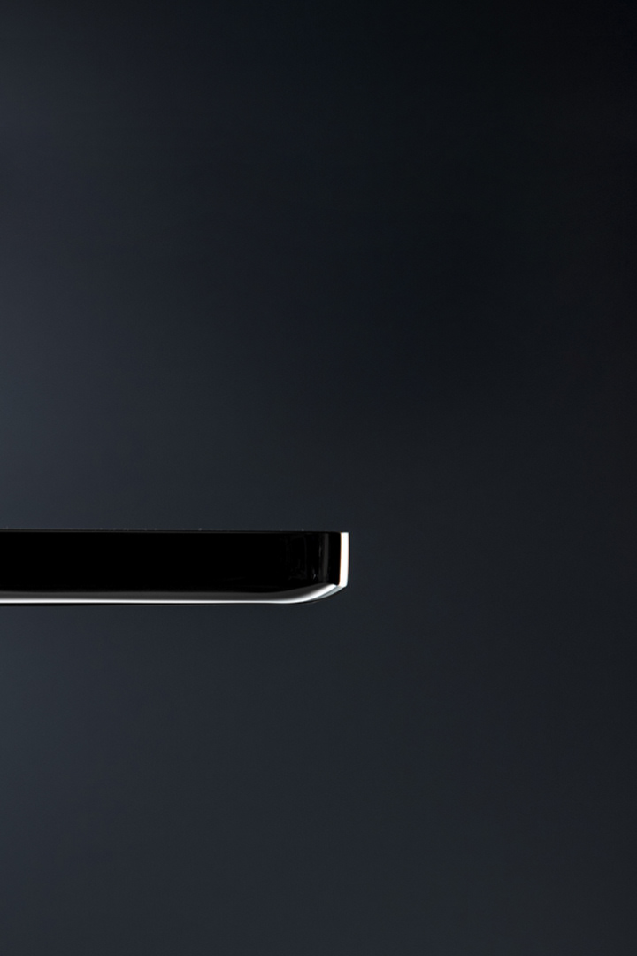
IB's visual identity can be described as clean, calm, reliable and trustworthy. The typography has a hierarchy that fits the site’s design grid in a geometric and linear way. The primary color is blue as it is the color most associated with tranquility, the secondary colors are a nod to the glossy and matte finishes of the products.


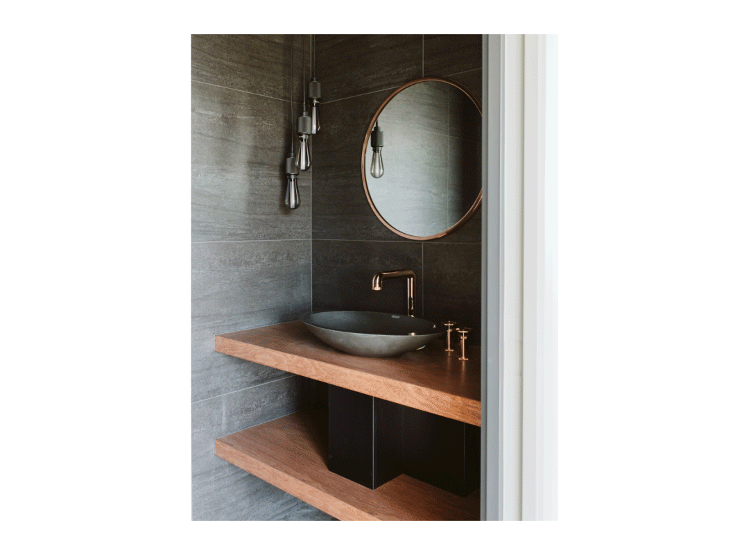
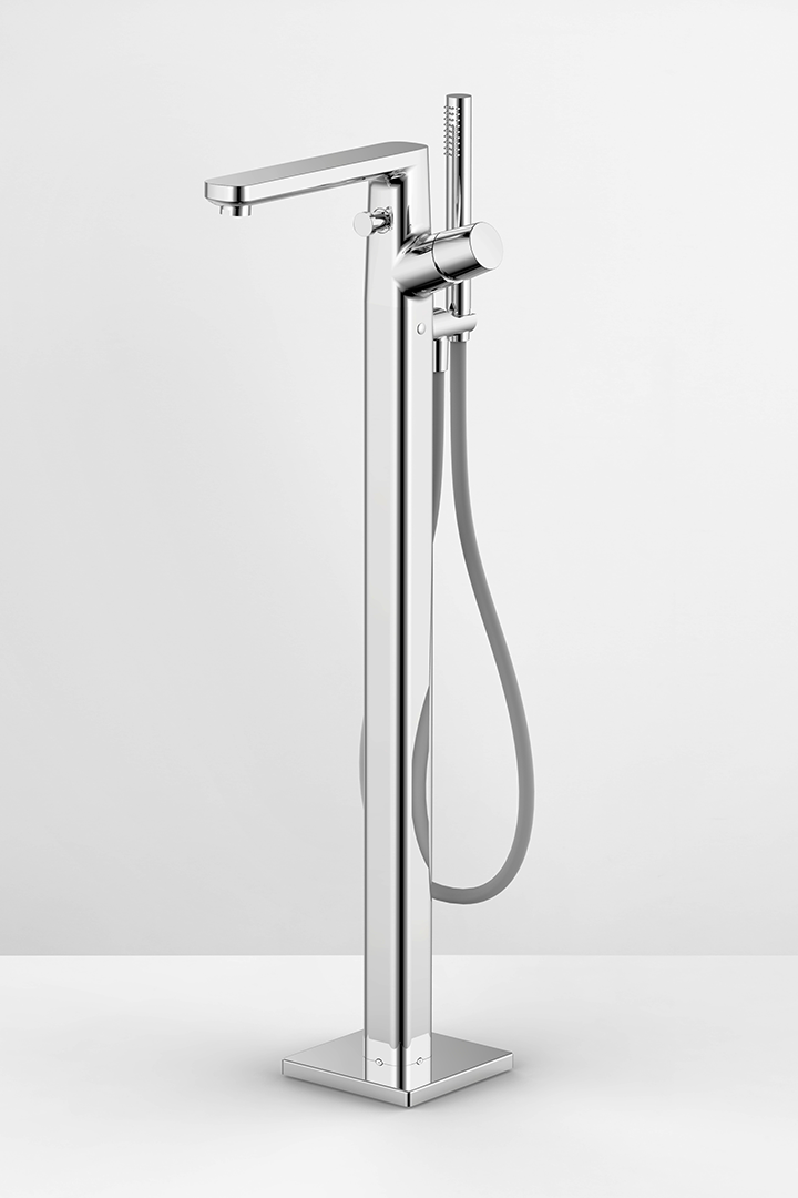
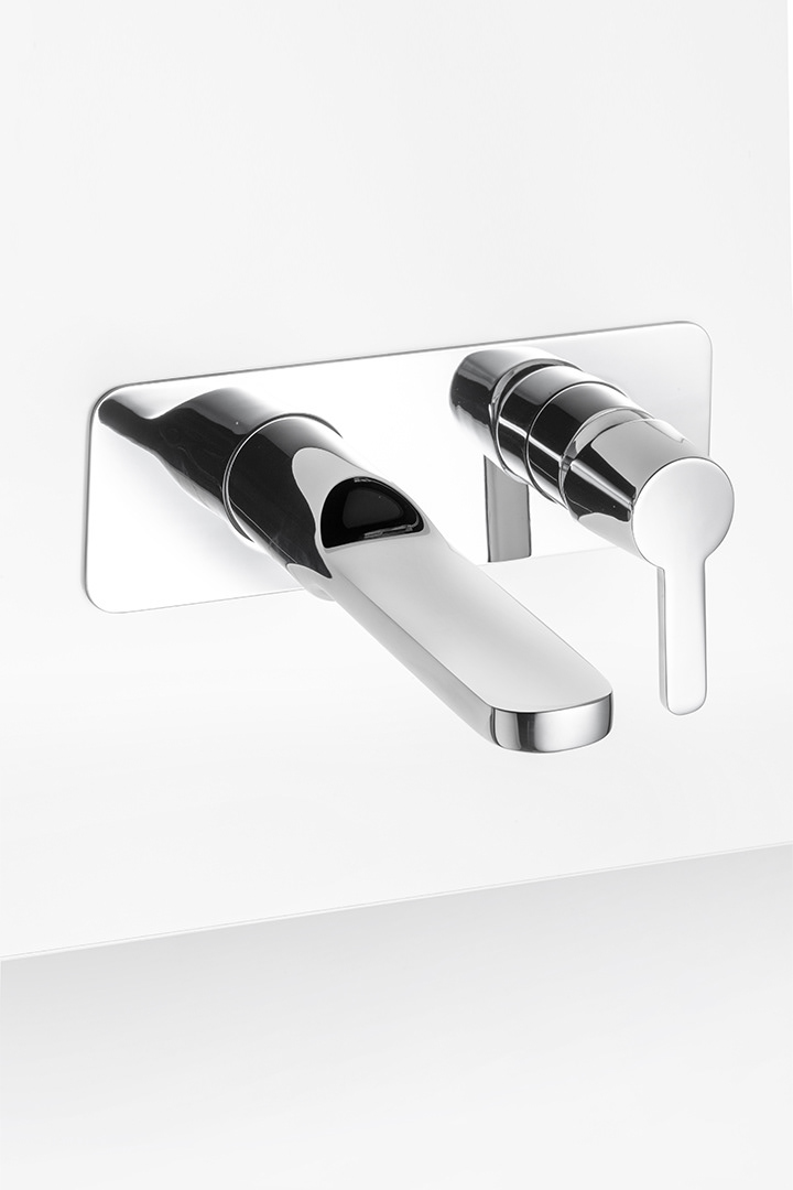
We decided to portray the products in two photographic contexts, both enhancing the content and highlighting how they can be used. The chrome plating is enhanced by the light-dark contrasts of a clean environment, as to emphasize the products’ shape and finer details. The second photographic context visualises where the products will be used as well as suggesting ideas to the intermediary actor that the brand will do business with.


Physical material
Despite the introduction of digital processes and the adoption of new channels for networking, physical material is still fundamental in the world of interior design.
During the many years we’ve collaborated with IB we’ve worked on various presentations, catalogues and product launches. The main piece of sales material, however, is XXL. XXL is a catalogue that collates all the company's collections and supports sales representatives and distributors in their commercial activity.


Showroom
When buying bathroom fixtures, physical contact with the product is essential. The capability to touch the materials, see their finer details and experience the precision of their movement are all important factors when deciding on products.
When buying bathroom fixtures, physical contact with the product is essential. The capability to touch the materials, see their finer details and experience the precision of their movement are all important factors when deciding on products.
We therefore designed formats for exhibition spaces that allow IB to both contextualise their products and underline their best features.

EXPERIENCE
ONLINE
PRESENCE
During years of regular collaboration we greatly strengthened IB’s online presence, first by building out the brand's identity on social channels and subsequently through launching a new website.
Social media
We wanted IB to be active on various social channels as we knew we could use each of them slightly differently. Instagram is used for the presentation of product design. IB can use Instagram to draw attention to their products being used by famous architects and designers, and also use it as their main platform for launching new products.
Youtube is used for technical presentation, offering designers and technicians in-depth details of each product.
Linkedin is taking on an increasingly important role in representing the brand and building new business relationships - assisting the business in its aim of international recognition.
SITE
The new site was a particularly important step to get right. When including all the different finishes to products, the catalogue boasts over 10,000 product variants. We needed to make it very simple to search for a specific product, yet also discover collections, for those who were approaching the business for the first time.
With IB wanting design to be at the centre of everything they did, we decided the best way to present both the products and projects worked on would be through design. As the old adage goes, a picture is worth a thousand words.
Having worked closely with decision makers in the buying process, we decided there should be two ways to consult the catalogue to facilitate each actor's needs. Products can be viewed by product family, allowing buyers to shop in a more impulsive, emotional sense. Alternatively, they can be viewed depending on technical variables, allowing them to be compared and filtered based on requirements.
PRODUCT
PRODUCT
COLLECTION
As well as assisting with IB’s brand development, strategy and online presence, our collaboration included the conception and design of 3 collections of taps, to be launched over 2 years. This enabled us to make that direct link between the improved brand and the products on offer.
MARMO
The first tap collection, MARMO, was the first tap to ever be made of marble, demonstrating that a product traditionally seen as functional and industrial can have a delicate and artisanal production process behind it. Not only this, but marble was perfect in positioning IB as an innovatie, design-focused brand - it is a beautiful material which had not been used before in tap design.

TAAAC
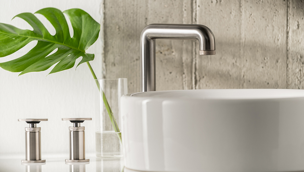
The second collection was called TAAAC, built on the concept of minimized forms, uses and functions in bathroom fixtures. The goal was to form a product which had an element of universality - suitable for any environment or style, inspired by commonly used objects in our day-to-day life. The name alludes to the Italian colloquial expression “it's done immediately” or “here it is” to underline the friendly, straightforward aspect of the project.


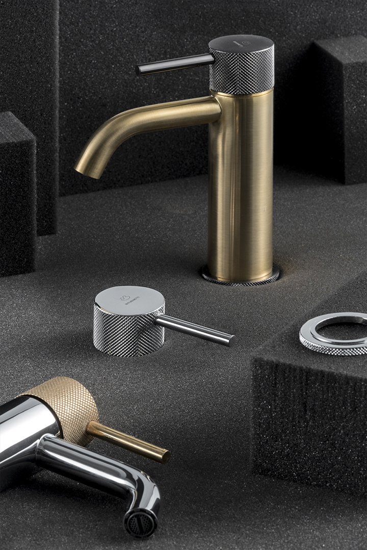
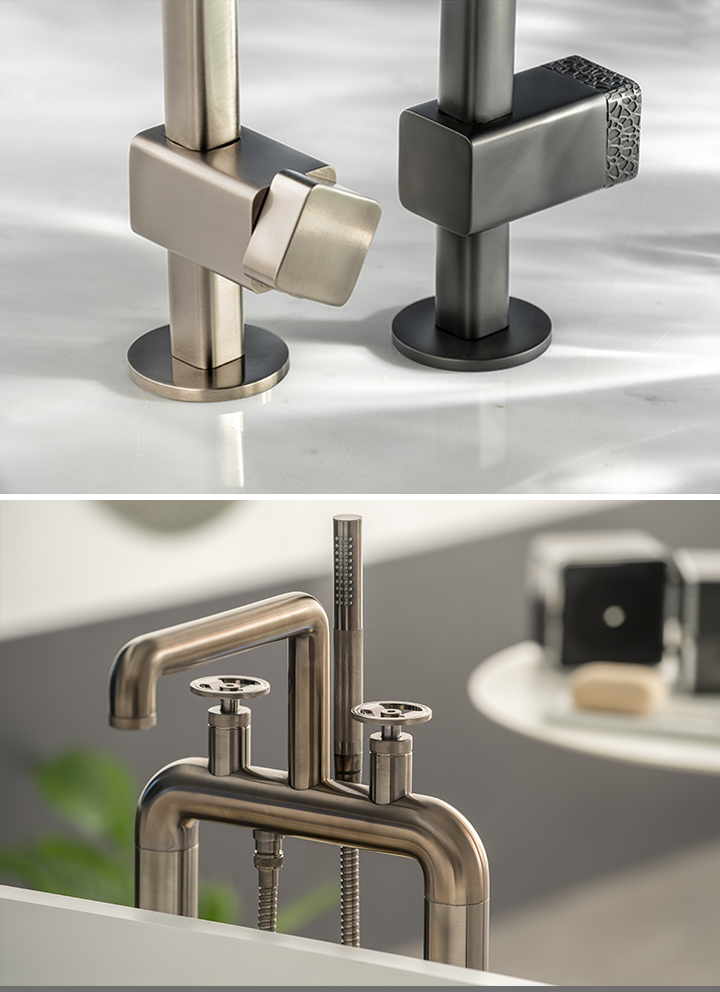
BOLD
The third collection, BOLD, had the objective of consolidating the brand with a high-end product that, aesthetically-speaking, would be attractive across the market’s spectrum. BOLD is inspired by the design of the metropolitan ball tap, with the salient aspects being its robustness, essentiality and movement functionality. We were pleased to later learn that the BOLD collection won a Good Design Award.


