Cocoa & Blush is a ficticious gift box company that sells world class chocolates, brandy, and cigars directly to it's customers. For this month I designed the website theme around a story of falling in love, getting married, and making a family. The layout has been created for easy online shopping. I usually use a white background for online retail, but since the product stays within three categories the website is not too busy for the customer so I used a pink which compliments the browns and is representative of the word "Blush" used in the title as well as the warm feeling you get from sipping brandy.
I will be uploading the user interaction diagram samples shortly.


Below is the company logo in it's plain form and in a gold seal.

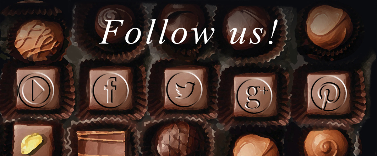
Here is another idea for the Social Media links that may be stationary or used as a pop-up banner. Most pop-ups are annoying, but if you make them clever and cute than visitors are most likely to respond.


When I create website layouts I like to stick to very simple clean designs. I like to use my own imagery because I'm not comfortable editing or manipulating another artist's work. Below is an example of a single page website. Back in the day these continuous scrolls were the way most websites were formatted and then came the multiple page pop-ups. However, single page sites are popular again but this time, they are much easier to navigate.


This ficticious website was created to show versatility in other products and themes besides the military. I prefer to use white when selling products on line. Using dark back grounds make the website heavy. Shoppers respond well to the white as it communicates clarity and honesty. It also makes finding the information easier for the user.


