

/identity /type design
Why Run visual identity
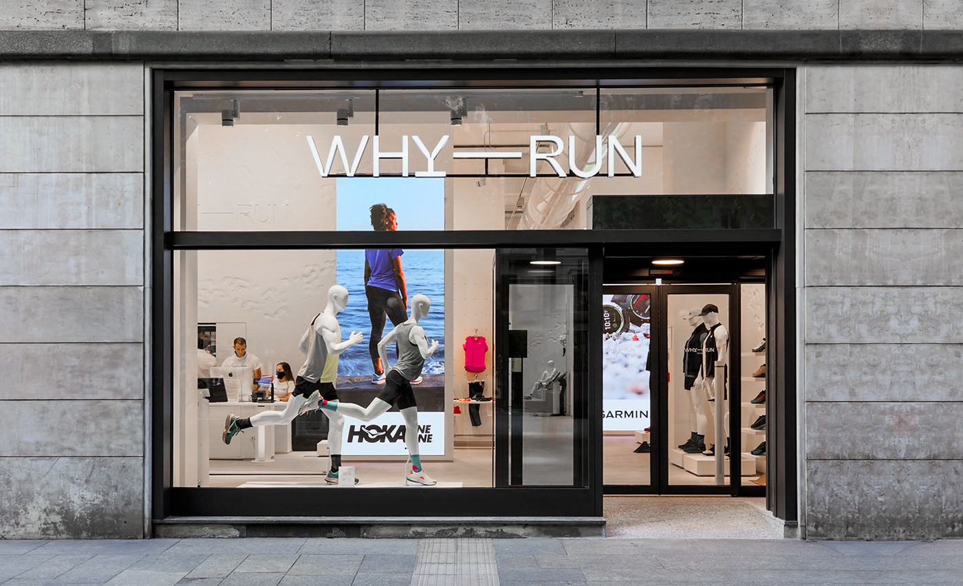
/ Branding design for a running-centered concept store that takes away every doubt. Why Run? Why NOT Run.
CLIENT
Why-Run is a new, Milan-based concept store for urban runners.
It is a new venture of Sportland, a stores’ network present on the territory for over 30 years, with 200+ shops.
It is a new venture of Sportland, a stores’ network present on the territory for over 30 years, with 200+ shops.
ASSIGNMENT
Projecting the Brand’s visual identity through the definition of an extendable design system. The visual elements obtained should be also involved in the creation of communication materials, social posts designs etc.
SOLUTION
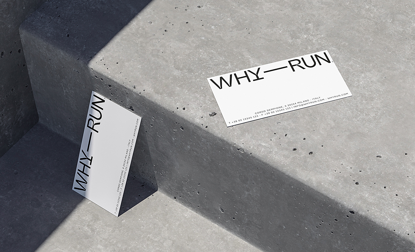
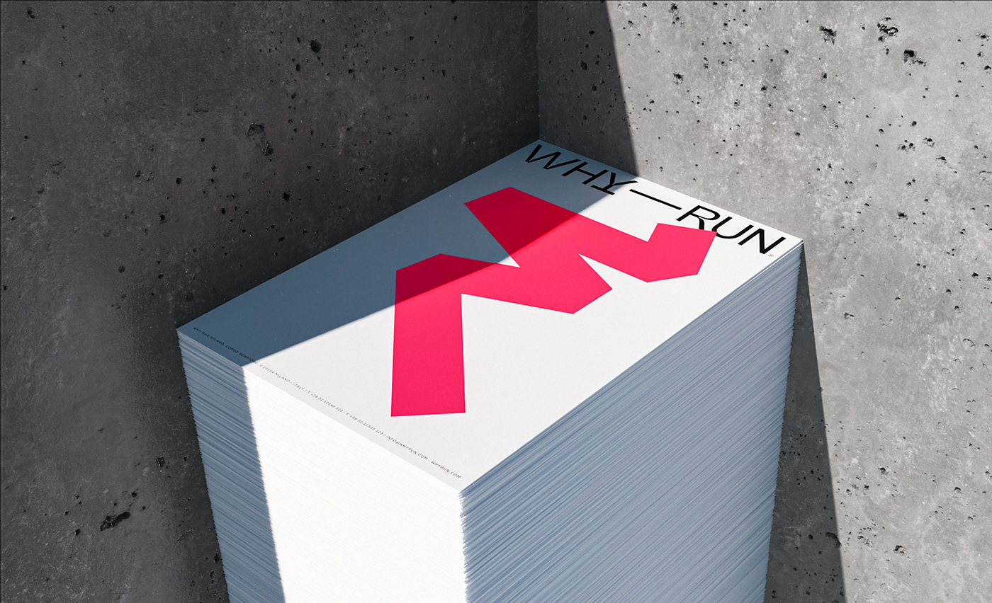
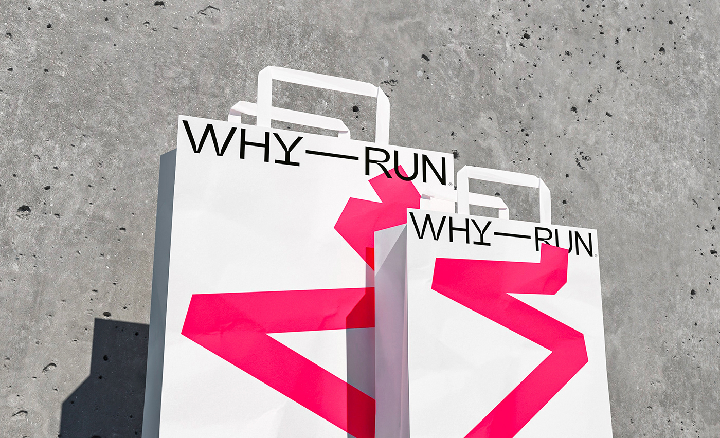
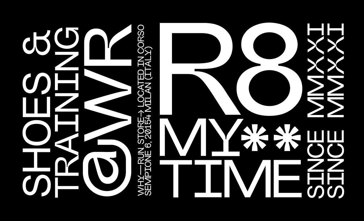
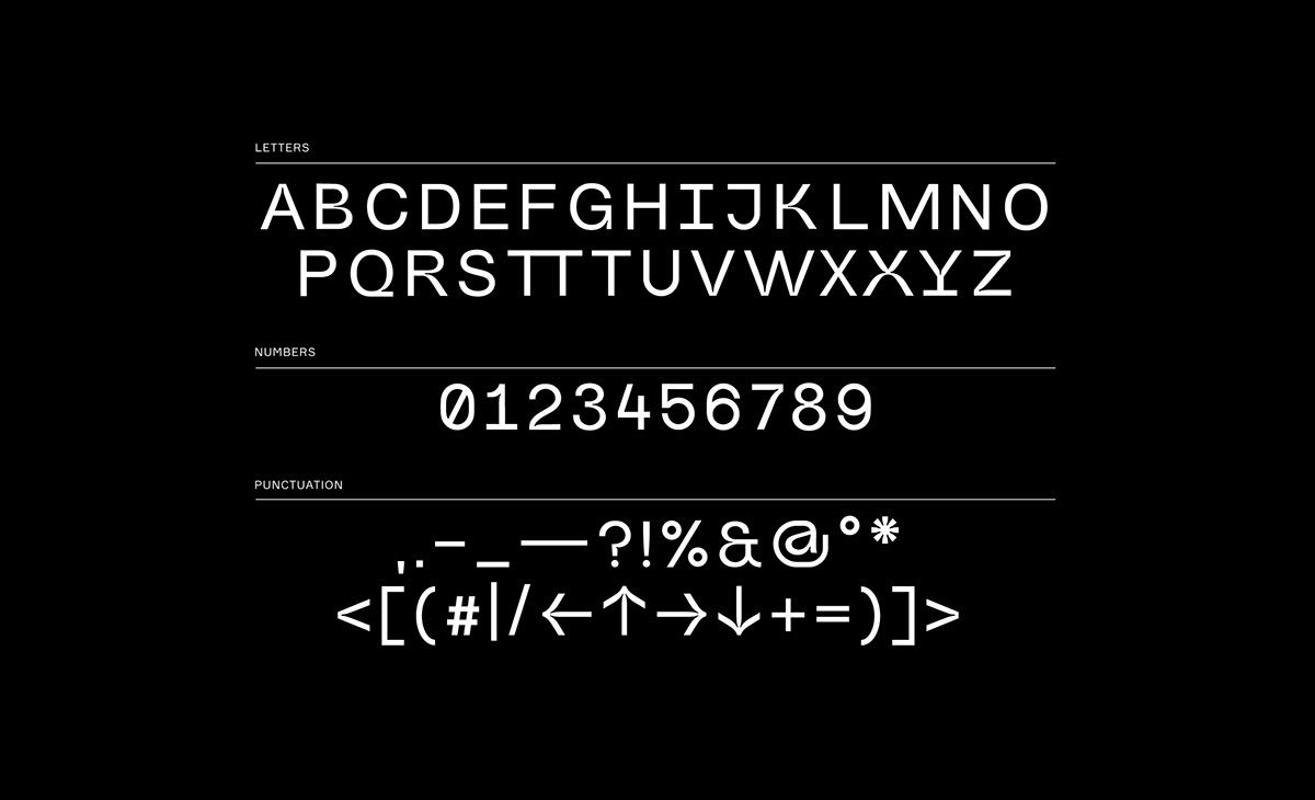
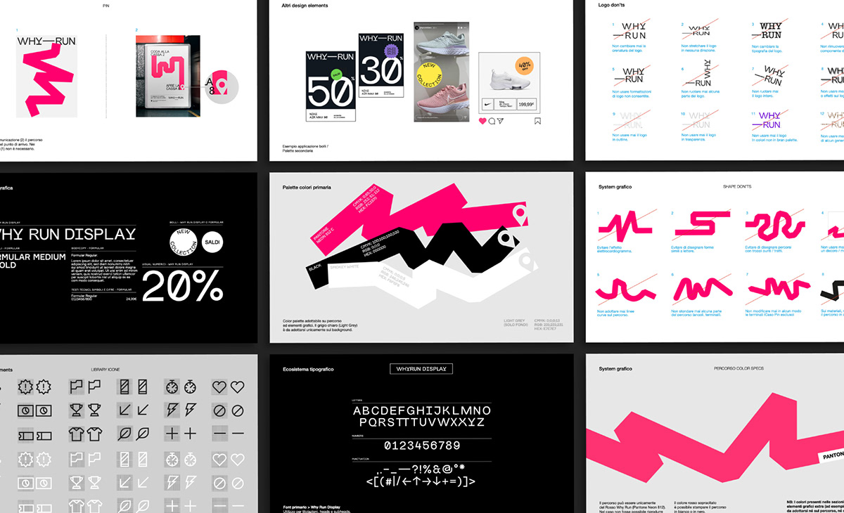
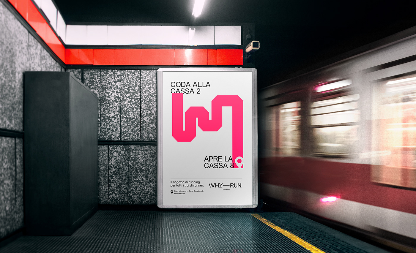
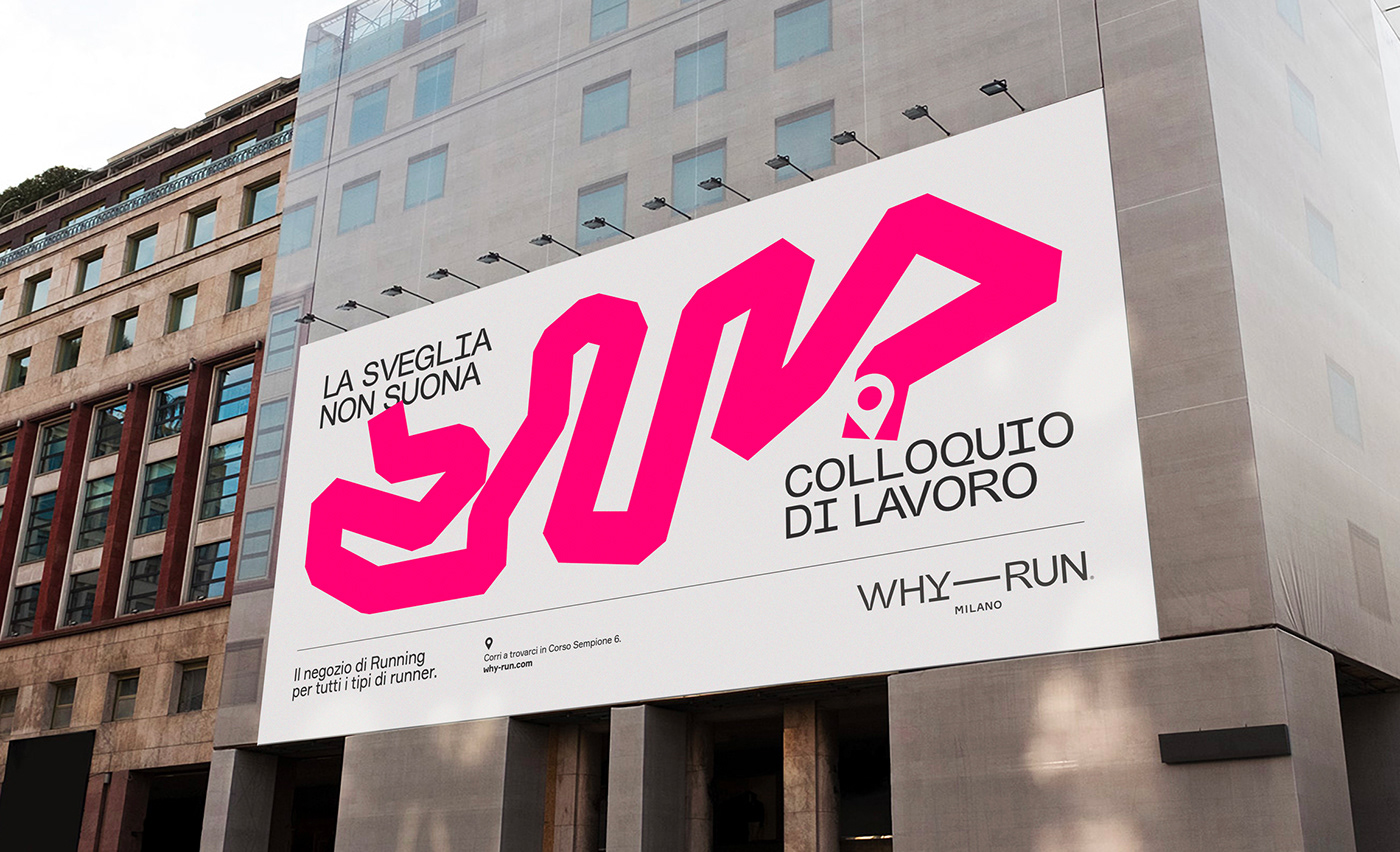
We developed a path-like stroke, connecting two design elements in a layout the same way as an ideal “start” connects to a “finish” on a race path. The path is depicted in a strong neon red/pink color, and its design is inspired by shapes of routes generated in urban running applications. This expedient allows the creation of an infinite number of visuals while making the designs directly relate to the reference imagery. As a support to the design system, we developed a custom typeface called Why Run Display, adopted both on the logotype and in all layouts.
PROCESS
Creation and definition of a brand identity involving a design system and a custom typeface; creation of instore materials such as discounts signs, tags, stickers and flyers; as well as the definition of branding guidelines and definition/supervision of the VI’s application on launch campaign.
---
Creative Director: Davide Mosconi
Designer: Giovanni Stillittano
3d Artist / Video maker: Gabriel Cellini
Campaign: Auge Communication
---
YEAR 2021


/ “The best shopping experience for those who have made running their greatest passion.”
Running Mag
Running Mag


Thank you.


