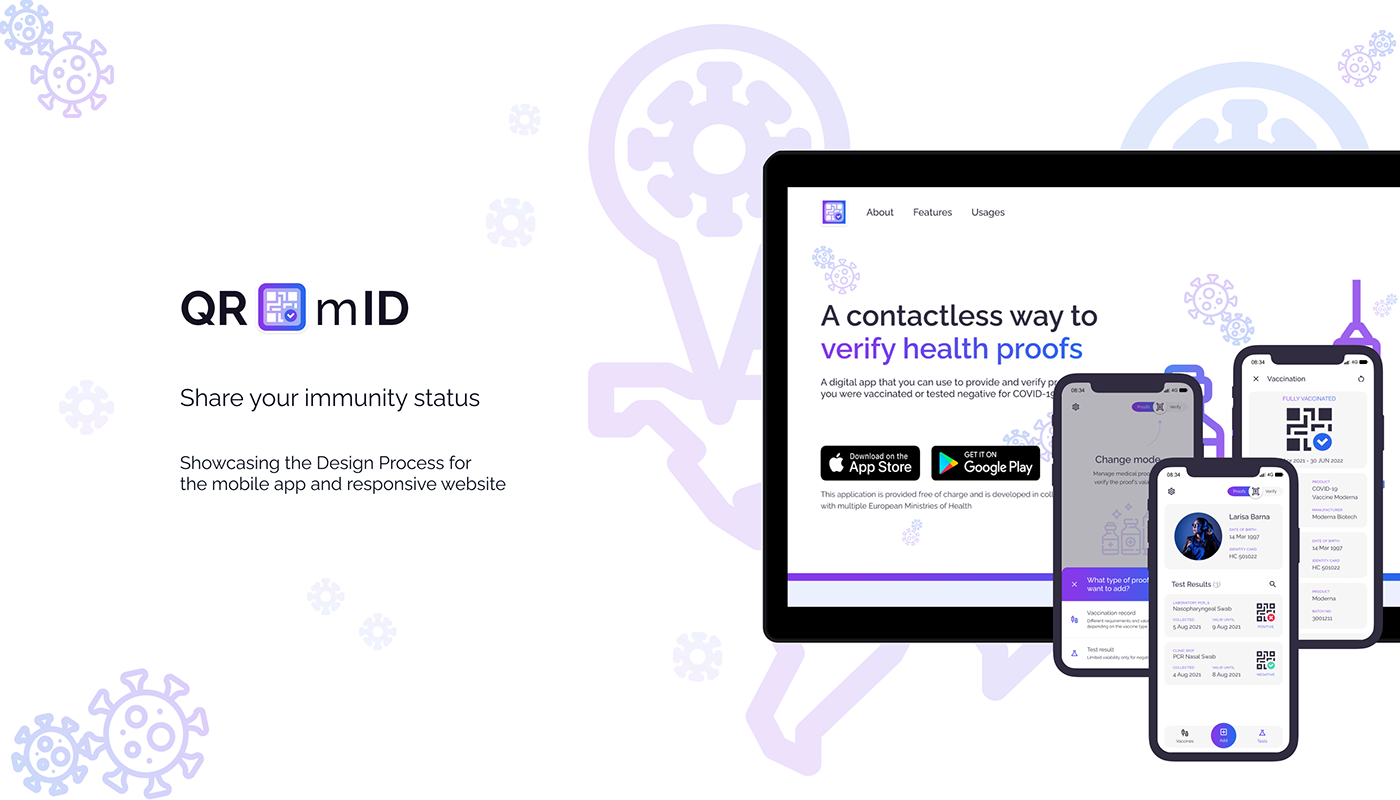
QR-mID
Share your immunity status
—
Personal Project, Design Process, Interaction Design, Graphic Design, User Research
—
About the Project
QR-mID wants to help people share their COVID-19 vaccination status or latest RT-PCR test results, for quick checks and other verification processes that can be requested in the transport, hospitality or entertainment industries.
QR-mID is a fictive use case I've explored during Google's UX Design Professional Certificate courses.
The theme of the course was focused on driving social good. The topic of the project was self-imposed.
The theme of the course was focused on driving social good. The topic of the project was self-imposed.
—
ROLE
In order to prepare the deliverables for the course, I've acted as an Interaction Designer, Graphic Designer, and User Researcher and showcased a typical design process.
—
Timeline
Jun - Jul 2021
—
Problem
In 2021, full vaccination status or recent negative test results are needed for admission at events or other crowded places, like institutions, transport vehicles, restaurants, concerts, etc. People usually lose, misplace the medical proof or carry an expired version.
—
Goal
Design a dedicated mobile app (& a complementary responsive website) where users can manage, share and allow verification of their vaccination status and related test results.
Understand • Define
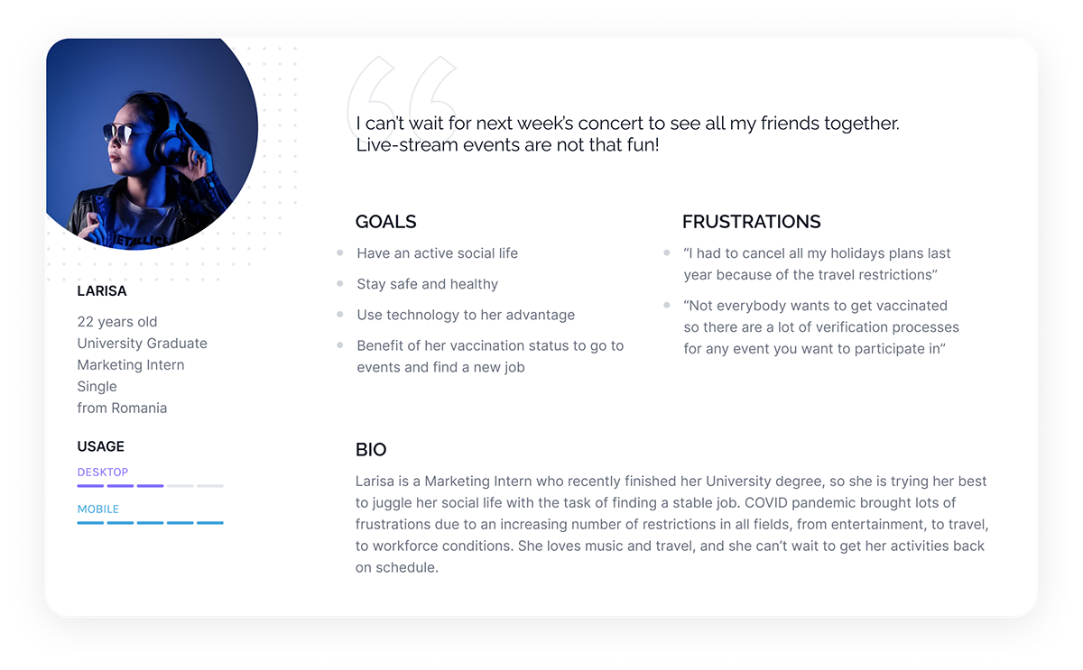
PERSONA
PERSONA
—
“Larisa is a music lover who needs a fast way to provide her COVID-19 immunization status because this is a public safety requirement for public events, like concerts.
Understand • Define
CONTEXT & SCENARIOS
CONTEXT & SCENARIOS
—
One of the first decisions to make (after the user interviews) was to select the use cases and problems statements related to COVID vaccination proofs and the context in which the mobile application or the responsive website was going to be used. Depending on the usage, I needed to decide if I'm going to focus on a progressive enhancement or a graceful degradation approach.


Research and interview discussions led to the conclusion that mobile applications were needed more since they allowed rapid verification, mobility, and scanning of documents. Several problem statements resulted during the interviews, focused on mobile app usage of a single person, a related group of people, or the rapid verification of a big group of people.


Explore
INSPIRATION
INSPIRATION
—
I'm usually using Dribbble to look for inspiration before tackling the sketch part. I have some ideas in my mind about what I would wanted the application to be, so I'm looking for trends and layouts in recent shots.
Collection example gathering ideas about "QR scanning", "COVID" and "passport checker".


Explore • Ideate
SKETCHES: App
SKETCHES: App
—
Initial sketches iterating different layouts and thinking about usage flows.


Explore • Ideate
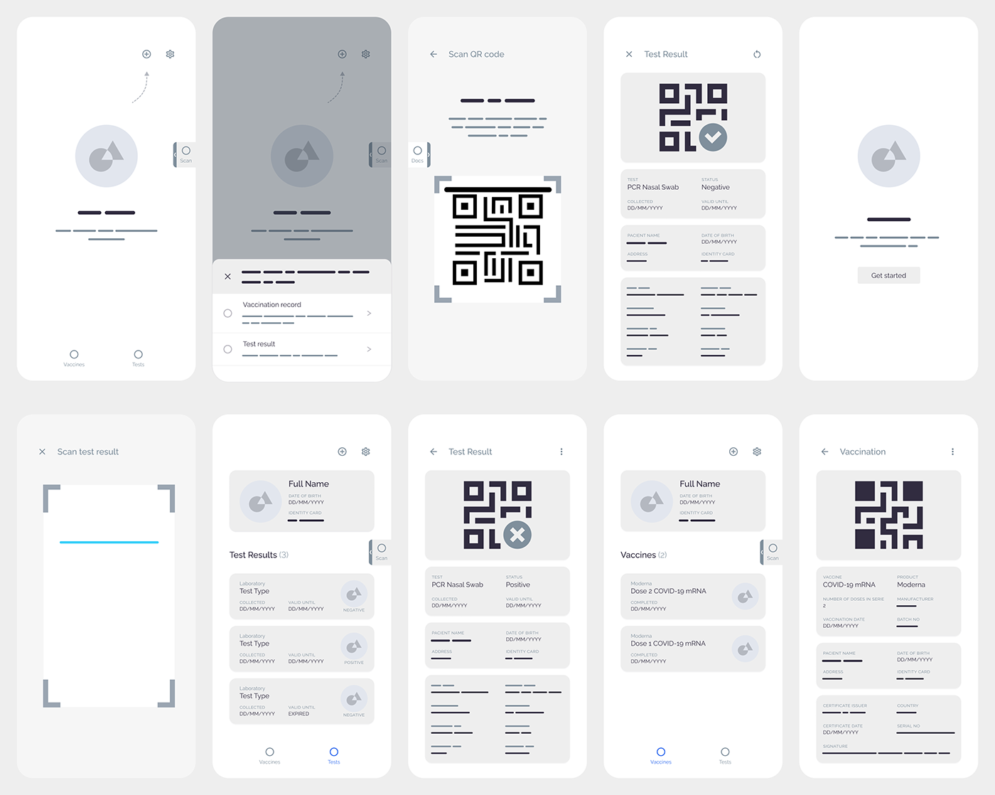
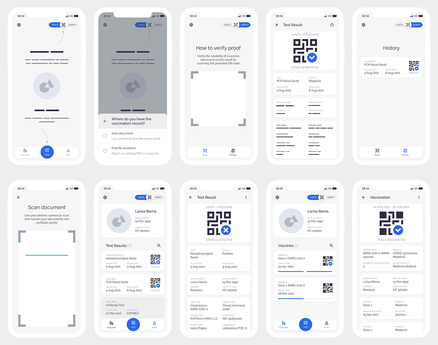
WIREFRAMES v1: App
WIREFRAMES v1: App
—
Initial wireframes
Explore • Prototype
PROTOTYPE WIREFRAMES v1: App
PROTOTYPE WIREFRAMES v1: App
—
I've iterated and tested multiple versions of wireframes prototypes. The first round of usability testing had clear issues (location, swipe interaction, naming) with the "Docs" / "Scan" mode switcher.
Materialize • Test
Usability Testing INSIGHTS: App
Usability Testing INSIGHTS: App
—
I've tested my wireframes with 4 users. Here is the Affinity Diagram and a summary resulted from the sessions.

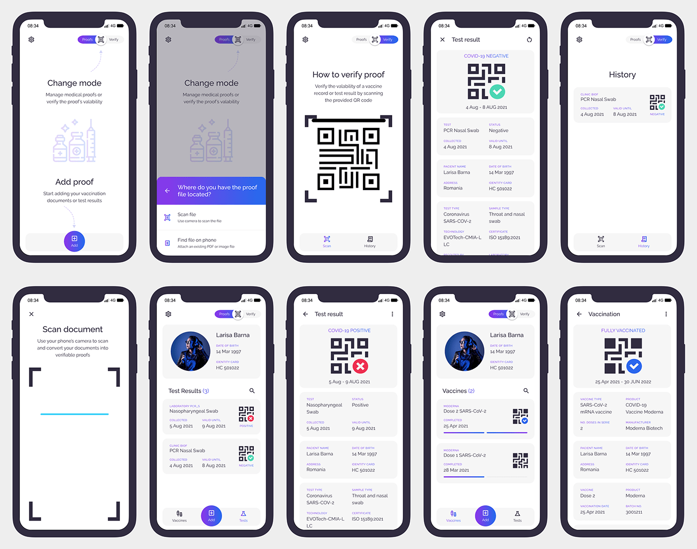
Explore • Ideate
WIREFRAMES v2: App
WIREFRAMES v2: App
—
Wireframes resulted after the first session of feedback.
Test • Prototype
PROTOTYPE WIREFRAMES v2: App
PROTOTYPE WIREFRAMES v2: App
—
Besides testing the copywriting and labels clarity, the main change for this version was the "Docs / Verify" switch design.
Explore • Ideate
MOCKUPS v3: App
MOCKUPS v3: App
—
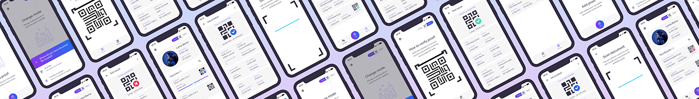
The mockups version of the app, including colors, icons and copywriting.
Test • Prototype
PROTOTYPE MOCKUPS v3: App
PROTOTYPE MOCKUPS v3: App
—
I've done a very quick feedback session on the mockups prototype. Some of the highlights of the feedback are that I would still need to iterate on the mode switch layout, there are some issues with missing functionality flows (how are the information about the user added, how to confirm the adding of a proof, how to manage the proofs and history), but also there are some usability issues remaining (scroll areas, confirmation button position, color and labels consistency usage).
Explore • Ideate
ITERATIONS: App
ITERATIONS: App
—
Iterations process for the interface from wireframes to mockups.


Explore • Ideate
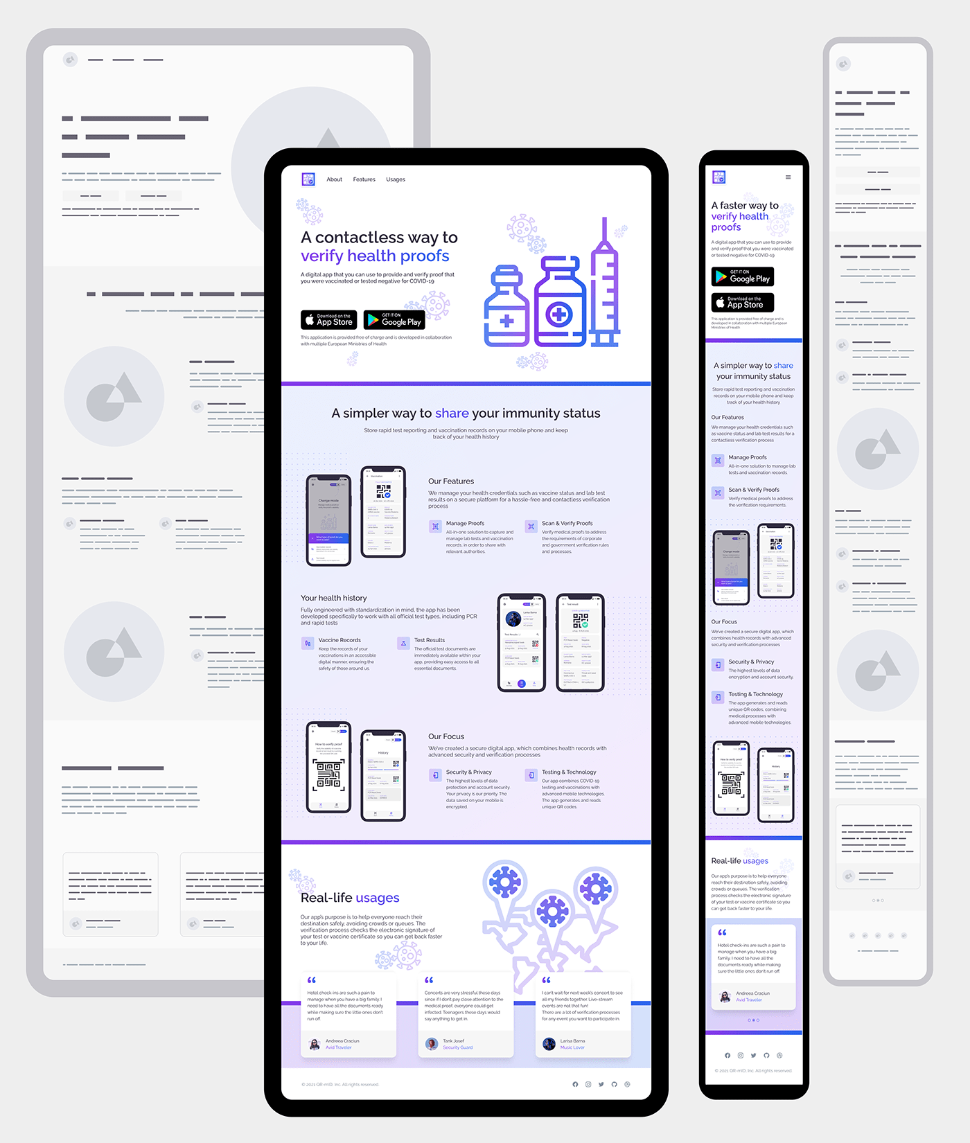
WIREFRAMES & MOCKUPS: Responsive Website
WIREFRAMES & MOCKUPS: Responsive Website
—
I've opted to create a presentational website for the application, showcasing the features, usages and ways of getting the application.
Test • Prototype
PROTOTYPE MOCKUPS: Responsive Website - Desktop
PROTOTYPE MOCKUPS: Responsive Website - Desktop
—
The website prototypes are provided to have a feel of how the page scrolls for the desktop and mobile displays.
Test • Prototype
PROTOTYPE MOCKUPS: Responsive Website - Mobile
PROTOTYPE MOCKUPS: Responsive Website - Mobile
—
Materialize • Implement • Design System
COLORS & TYPOGRAPHY
COLORS & TYPOGRAPHY
—


Materialize • Implement • Communicate
SLIDE DECK
SLIDE DECK
—

Takeaways
NEXT STEPS
NEXT STEPS
—
Further iterations would be necessary for the account creation or proofs management feature flows. Also security and trust are topics that would need to be addressed.
—
ACCESSIBILITY
I've used colors that pass the Contrast Check, ensuring there is enough contract ratio to meet the WCAG guidelines. I've also replaced the swipe interaction for the modes switcher to a click interaction. The icons used have medical references that are recognizable across the globe.
Accessibility is treated scarcely for this project and it should be an important topic since its target can be generic and global. Further usability tests and iterations should be done considering more use cases and personas.
—
KEY LEARNINGS
KEY LEARNINGS
I really value the feedback received each time I show the prototypes to a person. Designer bias is very prominent in each one of us. No matter how much time we invest in something, we always miss an angle, an use case, a bug. Showing your work, getting feedback and iterating is the only way of producing value for the end-user.

