


For this project, I was assigned to choose a non-profit organization that I connect with. I began with researching the current brand identity of Scholar Athletes to then compare it to competitors. The goal of this project is to redefine the visual identity of this non-profit organization so that it will stand out against its competitors. The new visual identity will help increase their visibility and show the organization’s personality. Through research and brainstorming, I developed a new brand signature. Then, the brand signature was carried across various aspects of the brand identity; signage, wearables, brochures, website, etc.
MISSION STATEMENT
“Scholar Athletes mission is to support academic achievement through athletics. The students in our programs – called Zone members – participate in our three core program areas: Academic Coaching and Mentoring, Health & Wellness, and College & Career Readiness. Whether participating in kickboxing through our We Are Fit program, playing an SA intramural sport, or on a rostered varsity team, each Zone member has the opportunity to find support and guidance from our program staff. Zone members receive support for their academic success and social-emotional skill development in a targeted and tailored way, integrating lessons learned on the field or engaged in wellness into their everyday experience. The goal is for each Zone member to graduate from high school with a plan that is focused on the future, with the support, skills and tools to put that plan into action.”
DISCOVERY PHASE
VISUAL AUDIT
logo, tagline, color palette, website, social media, gear, posters
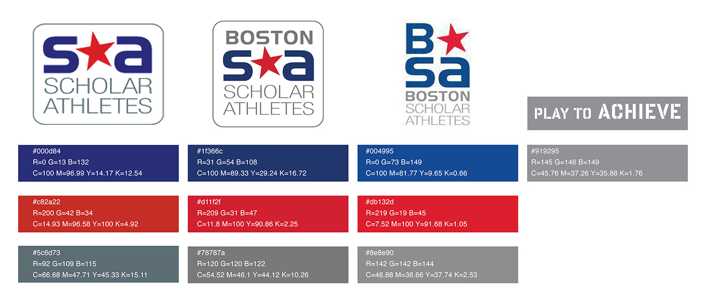
This is the official primary logo and secondary logo identity as well as the tagline. Being that I didn't work directly with the organization, I do not have the exact colors or typefaces.


The official website greets you with smiles and active students, whether it's doing sports or academics. The home page immediately informs you of who Scholar Athletes is and what they do. The website address, www.wearsa.org, is not ideal. It is not ideal because it includes the abbreviation for the organization and should be the complete name instead.


The social media pages are well established. The marketing strategy is casual yet informative. The casual appearance comes from the use of images captures on phones and the limited use of professional graphic designs and photography. This strategy helps create a more personal experience as well could help reveal the it is a non-profit organization because an experience is being captured rather than being sold.


TARGET AUDIENCE
High School students interested in sports or just fitness, looking to graduate from high school with a plan that is focused on their future with the support, skills, and tools needed to put that plan into action.
Student athletes are encouraged by their coaches to visit the zone at least once a week. Practices are delayed to provide time to students to focus on homework and beyond high school.
Parents are able to know that their child is getting their homework done and working towards a scholarship opportunity while staying active.
Students progress is reported to key school staff, including administrators, coaches, guidance counselors and other school partners.
Scholar Athletes partners with public schools in Boston, Everett and Springfield to provide zones for students.
Scholar Athletes work with colleges and universities to provide scholarship opportunities to students who accumulate hours in the zone.
STAKEHOLDER SURVEY
“Strong mission and dedicated people but clear disorganization.”
“Great way to make connections in the public schools.”
“Great opportunity to support High school students through sports.”
“I saw what I can become. Now, I don’t strive for anything less than that because I know I can be great.”
“As any new non-profit, there are many things that they need to work on. But I really like working for the organization. They have a culture of fun while accomplishing goals.”
“They were the first people to actually sit us down and say, ‘Hey, you can do it. You can achieve your goals. You can go to college. They really believed in us before we even believed in ourselves.”
“The Zone has become a second home to me. I’m more focused on my school work because of my time in the Zone and I’m building bonds with my teammates.”
“We have seen a direct correlation between athletics and academic achievement. Giving these young adults the additional support and resources they deserve, on and off the field, is truly a game-changer.”
Comparative Analysis
I searched words associated with this non-profit organization. Doing so allowed me to analyze the reoccurring symbols used in logos associated with or using the words listed below as well as allow me to brainstorm.
"scholars" "education" "school"

"athlete" "athletic" "sports"
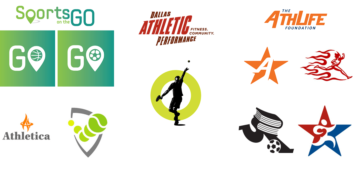
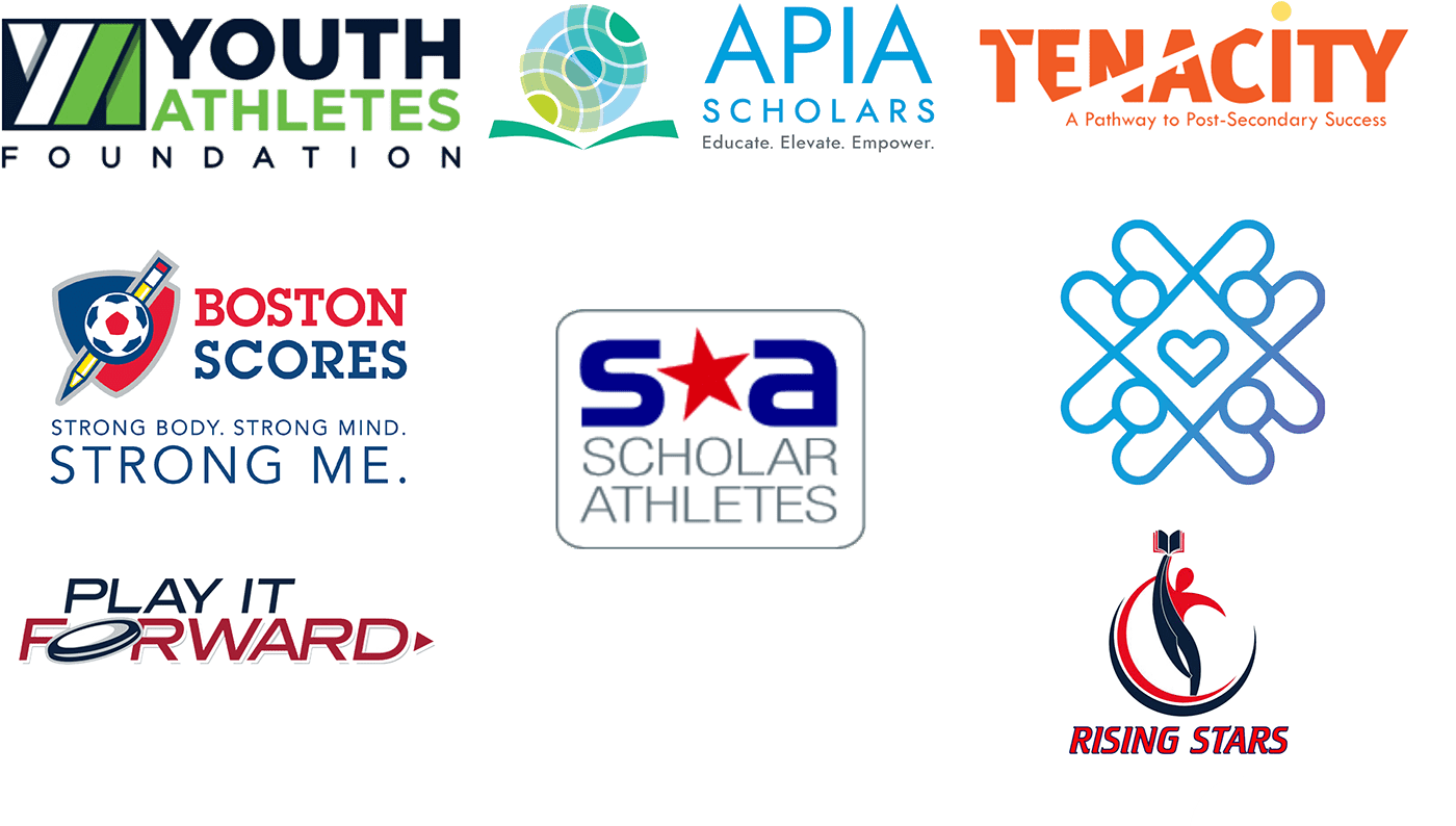
competitor analysis
I searched non-profit organizations with similar mission and/or goals to Scholar Athletes. This analysis is intended to reveal how well the current brand identity stand out against competitors. I noticed that red, white, and/or blue was a common color scheme used. When pared together, these colors scream U.S.A. Being that Scholar Athletes is only located in three cities in Massachusetts, I decided to change the color palette.
INSIGHTS
Scholar Athletes is often shortened to SA. There is a design system in place for the 3 cities this organization operates in: BSA (Boston Scholar Athletes), ESA (Everett Scholar Athletes) and SSA (Springfield Scholar Athletes). The branding is aparent in T-Shirts, posters, and social media. Being that the headquarters is in Roxbury and the majority of the zones are in select Boston Public Schools, most of the individual brand idenity is catered to Boston. This makes Scholar Athletes appear to primarily focus on Boston. One brand signature for all the zones will allow for them to be of equal importance in marketing. The current branding appears to have a primary focus on sports when in fact, academic is of equal if not more importance. Based on their mission to support academic achievement through athletics, I will rebrand Scholar Athletes to encourage the audience to succeed scholarly and athletically.
ENVISION PHASE
POSITIONING STATEMENT
“Only Scholar Athletes partners with Massachusetts public high schools to help close the opportunity gap for thousands of young people in grades 9-12. Scholar Athletes’ programs leverage the power of athletics and wellness to cultivate the discipline, confidence and social-emotional skills needed to support success in school, as well as success in life.”
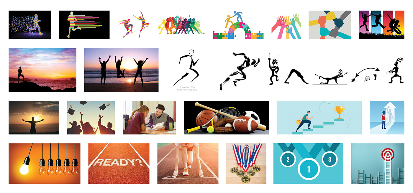
MOODBOARD
education, school, support, athletics, fitness, movement, active, sports, tutors, volunteer, scholarship, preparation, career, university, opportunity, wellness, health, discipline, confidence, social, success, study, homework, options, future, roadmap, life, college, community, fun, goals, students, star, rise, backpack, pencil, pen, notebook, teamwork, help, leadership, partners, zones, impact, team, support, academic, achievement, mentor, coach, guidance, impact, public schools, sports, readiness, high school, team, ready, supportive, sport-oriented, active, successful
SKETCHES

BRANDMARK CONCEPTS
letterform marks

word marks

pictorial marks
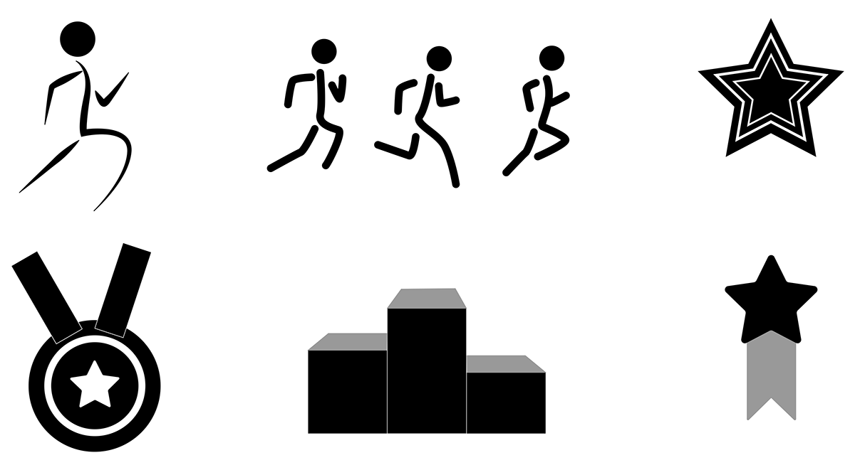
abstract marks

final concepts: phase 1

final concepts: phase 2

final concepts: phase 3
TAGLINE CONCEPTS
Fit to Succeed
Zoning Out
Work. Play. Achieve. Succeed.
Teams At Work
In the Zone
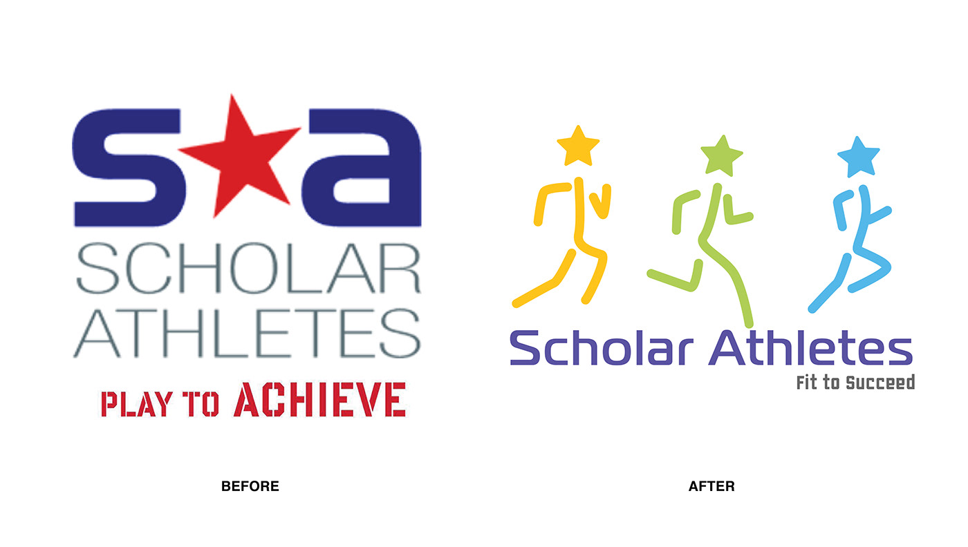
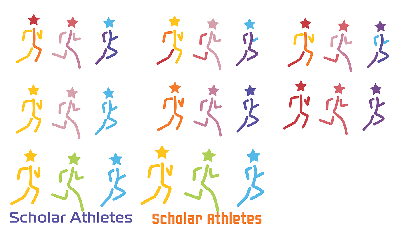
FINAL BRAND SIGNATURE

final ANALYSIS


EXPRESSION PHASE
CORPORATE COMMUNICATIONS
stationery system: personal business card

stationery system: company business card, letterhead, envelope, and pencil


ENVIRONMENTAL COMMUNICATIONS
signage


fleet graphics


hoodie

long sleeve shirt


jersey


reversible drawstring backpack


water bottles


college acceptance mug

MARKETING COMMUNICATIONS
brochure


posters


INTERACTIVE COMMUNICATIONS
website: home page

website: about page

social media: facebook and instagram


Thanks for viewing!
LINKEDIN | INSTAGRAM


