

Free Font Pack
‘Anyone who can write should know where our letters come from’
– Autobahn
This free font pack explains the history of our Latin alphabet, which originated almost 4000 years ago in the Sinai desert and come from images cut in stone: the A was actually an image of an Ox. When you turn the A upside down, you can still see the horns and head of the ox! All letters can be traced back to a historic representation.
The pack covers three of the most significant stages which lead to the final shape of the Latin alphabet as we use it today:
Proto-Sinaitic: the base form
Phoenican: the first adaptation
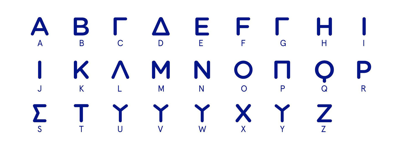
Greek: The second adaptation
Use these fonts for personal projects, educational purposes or just write a cryptic note to a friend!
Free for personal use. For commercial use, please contact us for licensing.
You will receive an email from us with the files after order confirmation.

Wadi-el-Hol inscription

Free Font 1: Proto-Sinaitic

Free Font 2: Phoenician

Free Font 3: Greek
Development of the letter A


Related project
A is for Ox
Award winning children's book about the origin of our alphabet
Anyone who can read knows the 26 letters of our alphabet. But where do those letters come from? How long do they exist? And who designed them? Autobahn and Bette Westera take you back to the time of our distant ancestors, who made a drawing if they wanted to 'write' something. Slowly but surely, their drawings changed into the first letters. If you look closely, you can recognise our current alphabet.
And guess what? A is not for Apple at all, but for Ox! After reading this book you will understand how this came to be. You will also understand why, whenever we send each other emoji's, we actually do the same as our distant ancestors over 5000 years ago. An educational and special letter book for all ages!
(Available in Dutch & French, English expected fall 2021, Simplified Chinese in 2022)
A is van Os is awarded with a Golden European Design award and a certificate of Typographic Excellence by the Type Directors Club in New York. The book traveled in an exhibition through the United States, France, Germany, Spain, The Netherlands, The United Kingdom, The People’s Republic of China, South Korea, and others. The publication also received a nomination for a D&AD award and a Dutch Creativity Award.
Product photography: Justina Nekrašaitė / De Monsterkamer


Related Project
GLYPHS
The Alphabetic Perfume Collection
Love typography?
Now you can smell like it!
Since publishing their award winning book, A is for Ox, designers Rob Stolte and Maarten Dullemeijer from Dutch design studio Autobahn (@autobahnstudio) have extended their work into a one of a kind, multidisciplinary design project, to dig deeper into the origins of the Latin alphabet. A is for Ox sprung from Autobahn’s conviction that ‘anyone who can write should know where our letters come from’, and now, through GLYPHS – The Alphabetic Perfume Collection, the designers have teamed up with French master perfumer Mark Buxton to determine the scent of letterforms, inspired by tracing them back to their earliest forms.
(Available through Kickstarter from May 1st)


