


Youthforia – A beauty brand without the boring bits
Visual identity, verbal identity, packaging, illustration, website design & build, 3D renders, photography
Visual identity, verbal identity, packaging, illustration, website design & build, 3D renders, photography
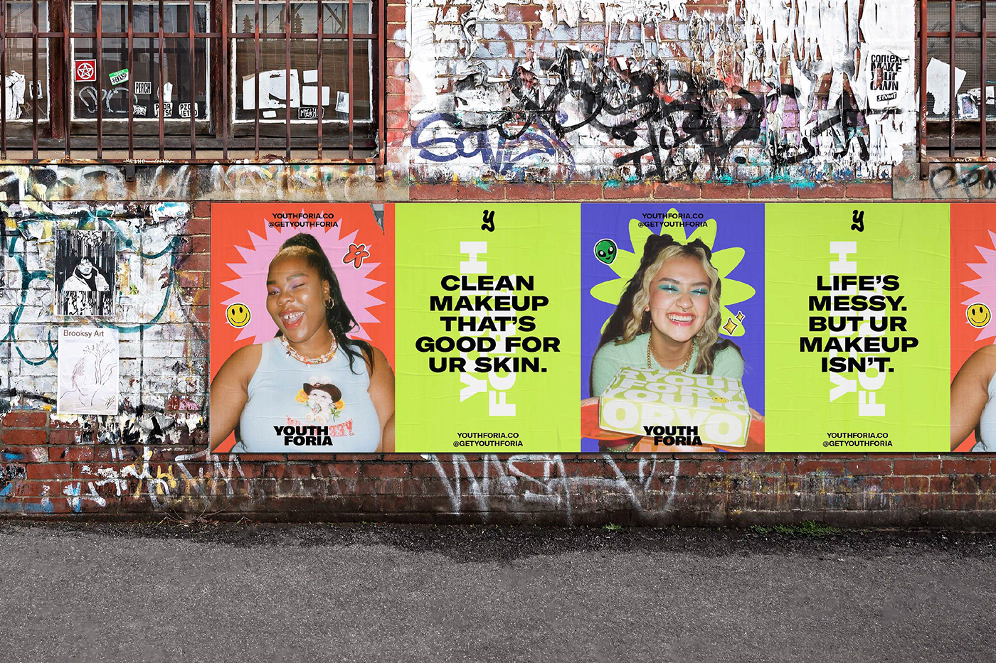
As far as brand experiences go, the beauty space is bland. Variations of the same thing, using makeup the same way. Youthforia wanted to break the beauty rules for a Gen Z market bored by what’s out there. We rolled out a visual and verbal identity dripping in 90s nostalgia that mixes and matches as joyfully as the brand’s product system and gives its audience permission to play with their self-expression.
Background
Youthforia is a digital-first, Gen Z clean beauty brand whose mission is make makeup more playful. They encourage people to use makeup whenever they want, however they want — strictly no rules. Their products are for a self-expressive youth market who want to have fun — whether it’s with their face, their place or how they fill space.
Insights
Gen-Z is a generation born into crisis. From regular teenage things (crushes, conflicts, school, social media scandals) to new teenage things (s*xting, catfishing, a life online) to global things (capitalism, climate change, COVID-19) — they’ve lived or are living it. Consequently, they’re leading the charge on a new world of branding where they control the narrative. Messy, maximalist, uncurated, raw.
Challenge
Youthforia came to us in need of a visual and verbal identity that would resonate with an always-online Gen Z audience while communicating the fun, offbeat, irreverent nature of the brand.
Solution
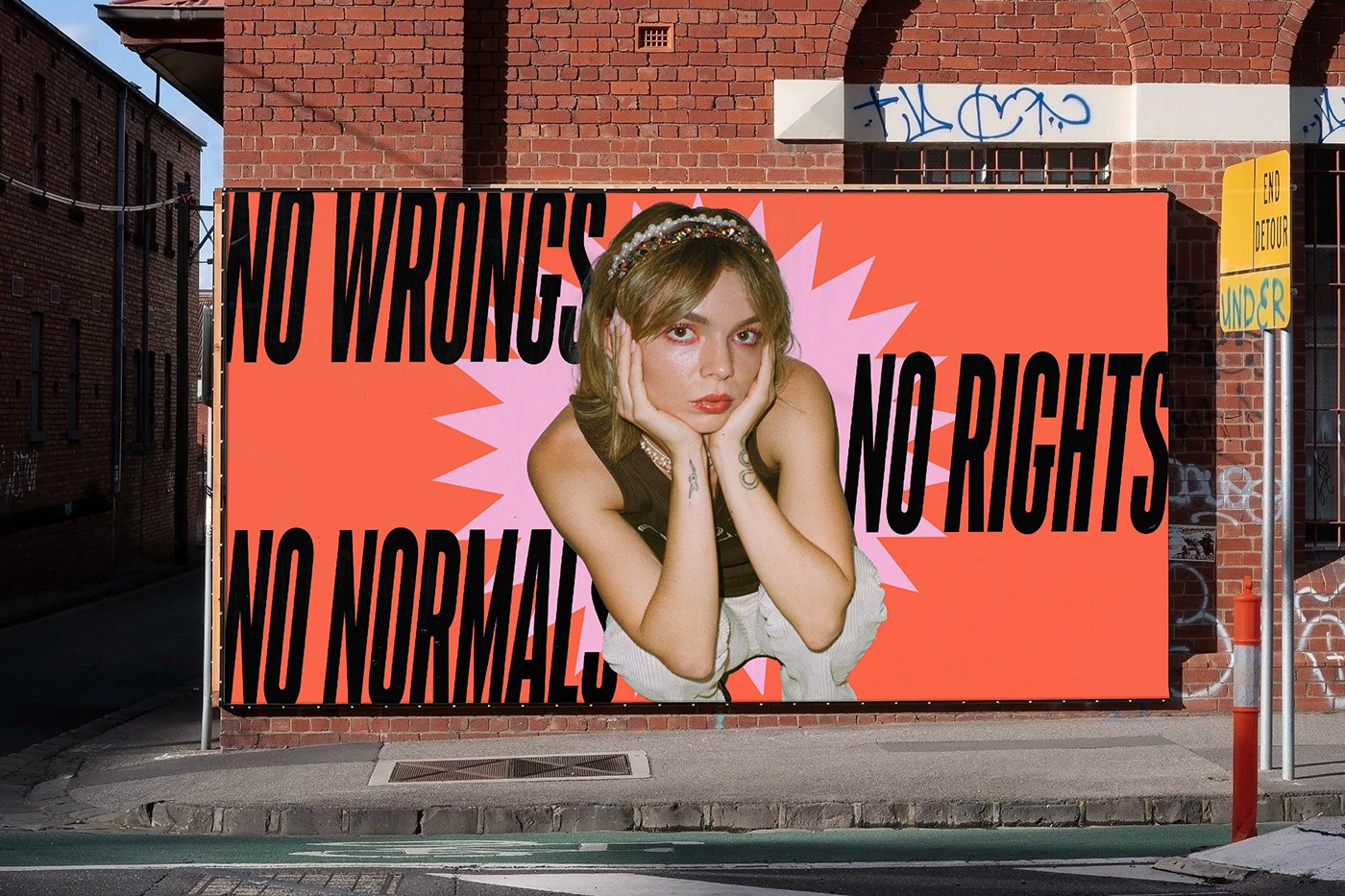
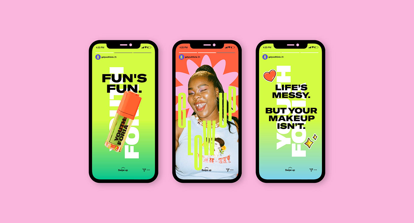
Taking lead from the younger members in our team, the visual identity throws straight back to late-90s internet aesthetic. It’s fun, it’s fluid and exciting with a blast of bold colour and comforting nostalgic quirk that extends an invitation to anyone’s inner-child.
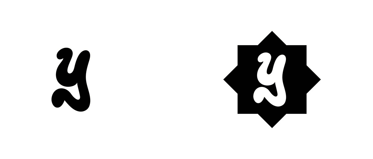
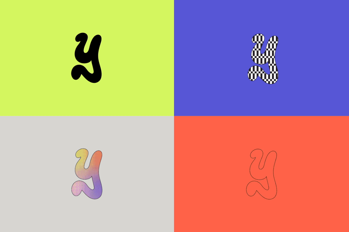
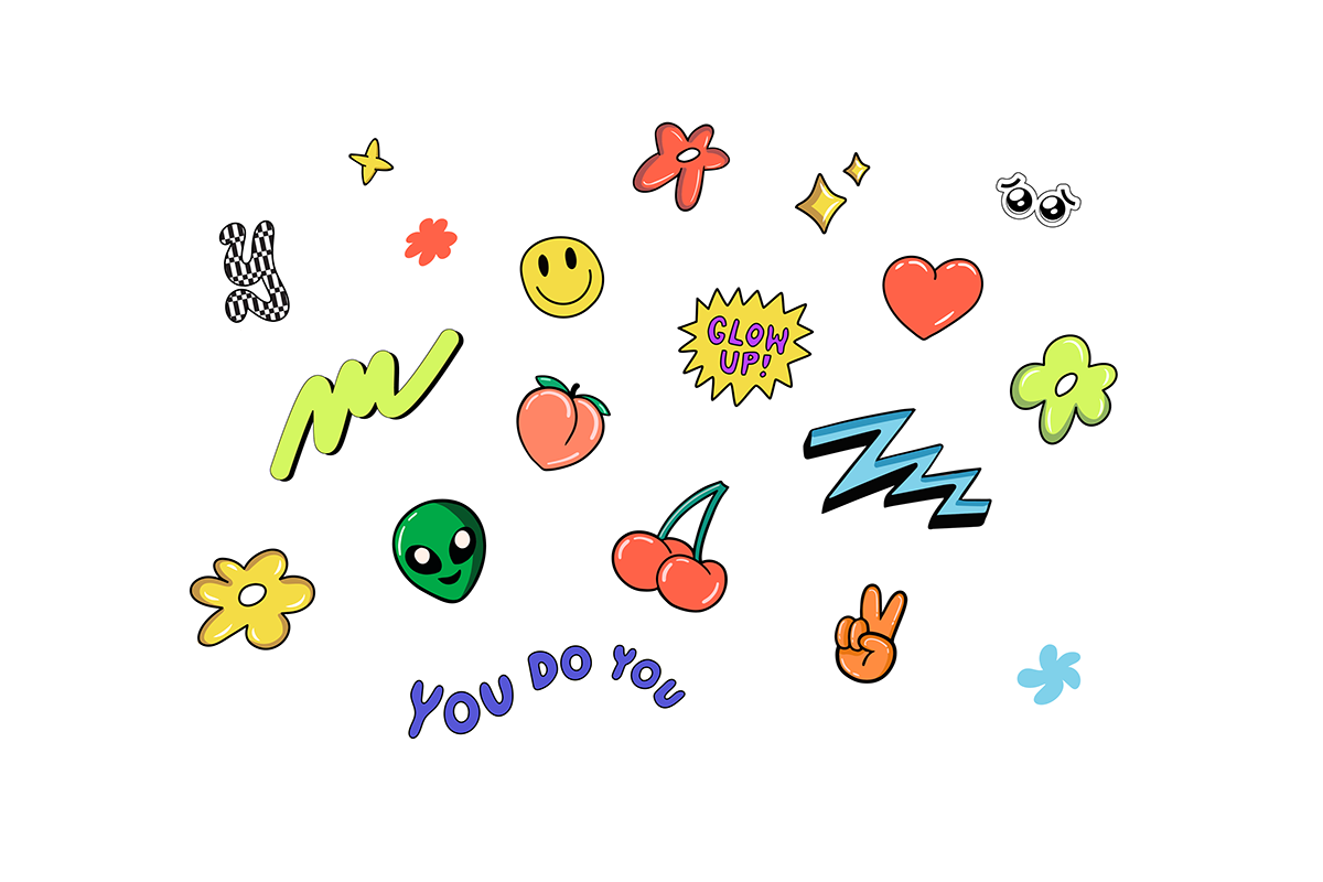
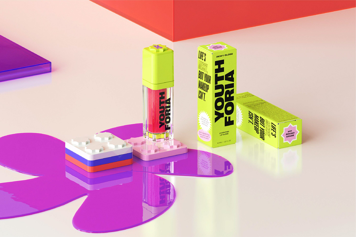
Drawing inspiration from 90s teen magazine mastheads, the “Y” mark not only feels accurately rebellious but also becomes a changing container (think classic MTV logo) that introduces the idea of mixing up your makeup based on your mood. Hand-in-hand (cute!) with this idea is a suite of energetic shapes and stickers rolled out across all touchpoints (packaging, product, digital) that reflect the brand’s intention to let you flex your self-expression.
Coupled with a cheeky, human tone of voice, the blend of verbal and visual identity encapsulates the care-free yet angsty attitude that comes with being a teen. When everything’s falling apart around you, at least your makeup can look cool.
Click 'n' collect made cool
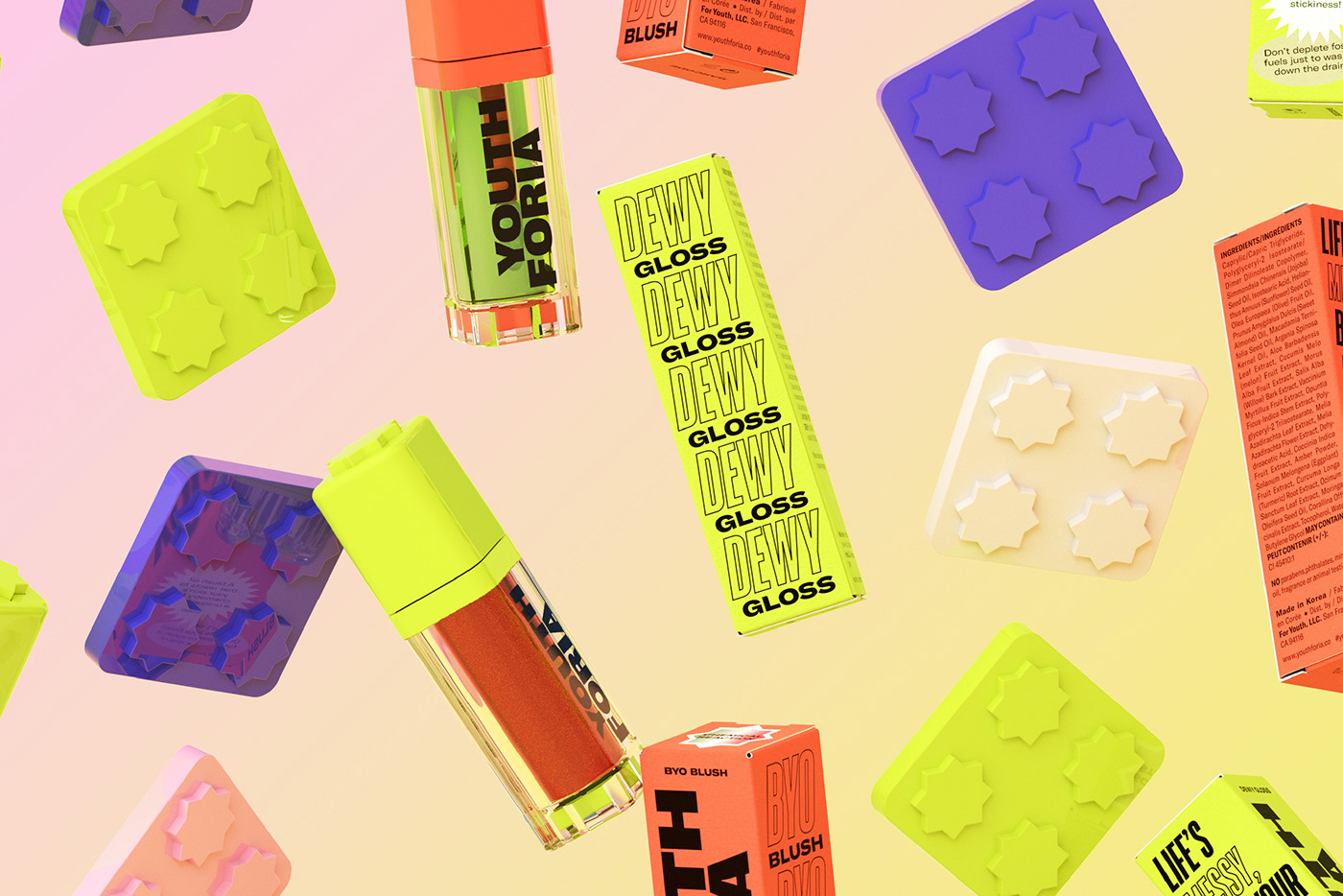
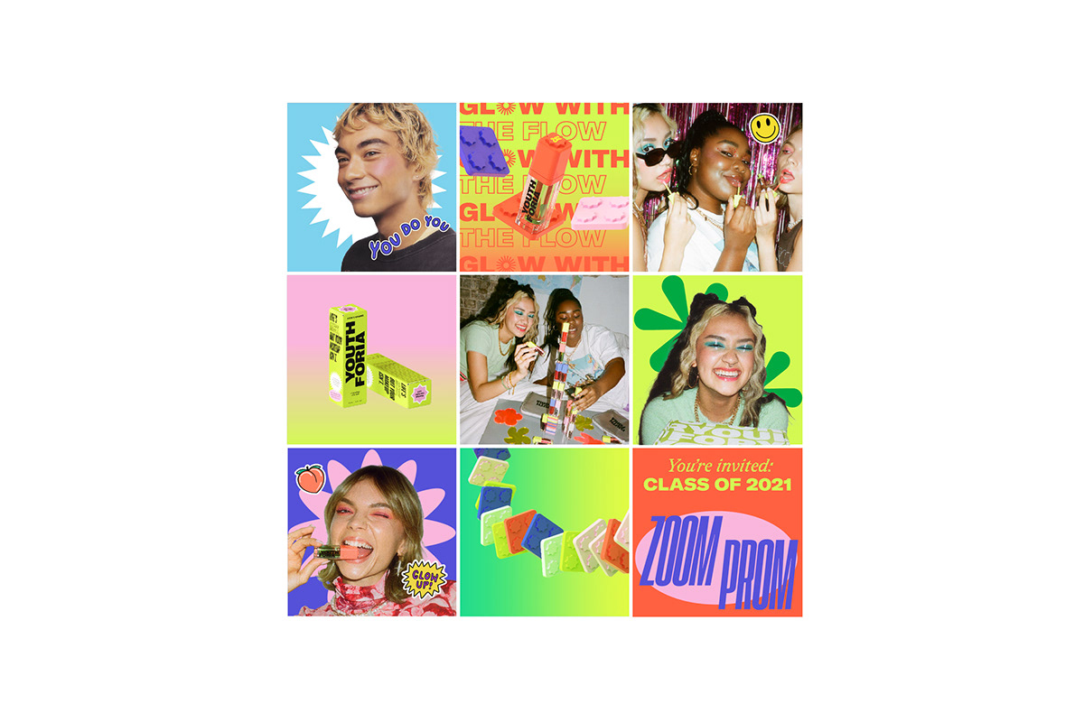
Then came products. The brand’s premise of having fun and playing around extends to its packaging but so does their environmentally-clean ethos — if they were going to use plastic, they wanted it to be something worth holding onto. Each item comes in different colours, with different holders to choose from, bringing back the thrill of coveted childhood collectibles and adding an extra element of fun
The magnetic pans designed into the suite allow users to click, combine, stack and arrange their Youthforia makeup to suit their mood — an idea also reflected in the logo. They can mix and match their product arrangements based on however they’re feeling that day. We worked with 3D2D to develop a suite of motion and still 3D assets that would showcase the modularity of the products and that could be used across their website and marketing.


Snaps like teen spirit
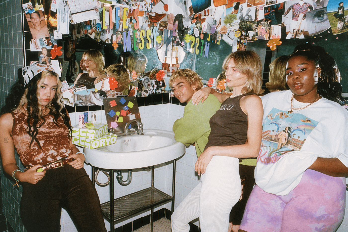
A makeup brand obviously needs a photoshoot and we knew this one was going to be something special. Working with Uncommon Agency’s Jamie Heath and featuring online icon Lil Ahenkan (aka Flex Mami), we art directed a lifestyle shoot reminiscent of getting ready with friends for a night out as a teen and all the excitement that goes along with it. A curated mess of posters, glitter and glam, the result was a cheeky, colourful collage of images shot on 35mm, VHS and iPhone — showing just how easily Youthforia can slip into your life and bring you back to youth.


A forward-thinking website taking a nod from the past
Given the Gen Z direction of the brand, nailing the digital experience was key. The website, as well as all social media assets, needed to both work together seamlessly and allow for flexibility to showcase a brand that’s constantly moving, evolving and flexing — much like its audience. The website is custom-built and gives you all the gradient-dense, Wordart-heavy, emoticon-happy vibrance of the internet explorers of the 90s, without any of the slow-loading clunkiness.

And the end result?
Youthforia’s universal. That first lip gloss. That cute text. The lights going down before your favourite band starts. Crushes. Summer break. Laughing until it hurts, then laughing some more. With the complete trust of the client to push the boundaries of the beauty marketing space, we were able to create a brand experience encapsulating the moments of utter mundane bliss you only get from the mess of youth.
Photography • Jamie Heath
Production • The Uncommon Agency
Set Design • Jordan Gogos & Brittany Wyper
Wardrobe Stylist • Hunter Blue
Makeup Stylist • Vic Anderson & Kim Pham
Hair Stylist • Laura Spinney & Christopher Byrne


