


Rebranding of the large retailer chain Perekrestok timed to coincide with its 25th anniversary. Perekrestok is a green modern brand that cares about the freshness and quality of products.
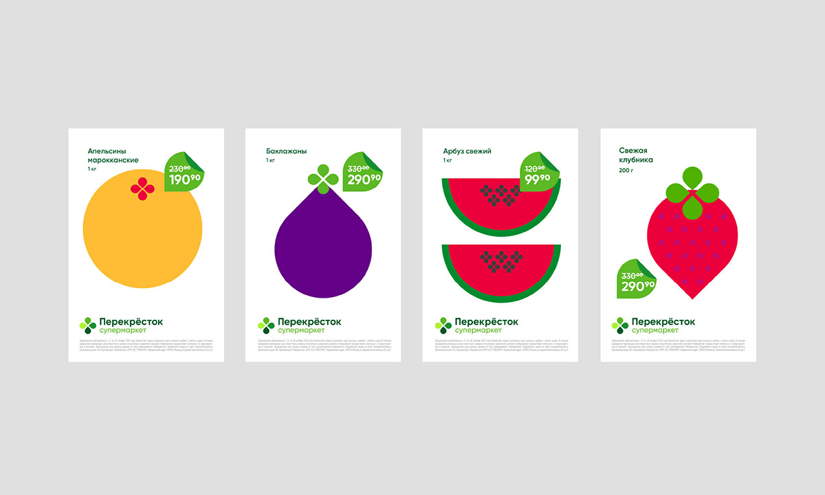
Simple, laconic, getting rid of hints of the road and focusing on the images of freshness and greenery, the sign allows, on its basis, to collect a whole ecosystem of symbols. The brand petal has become an absolute cross-cutting element for all visual communication of the brand. Price tags, illustrations, shelf talkers, patterns, wobblers are now held on to a single and recognizable element, thanks to which each style bearer always speaks of belonging to the brand.
The symbol is supported by corporate vector illustrations with a characteristic gamma, a clean grid for advertising and communication posters. And also the letter "ё", which returned to the logo and finally entered the entire visual communication of the brand.
Together with Possible agency.


