


Brand Name
NEKER is a brand name adopted from Necker’s Cube, a perceptive illusion that makes us believe what we want to see. The NEKER has a meaning of searching for your desired beauty and communicating with the reality of your own beauty.
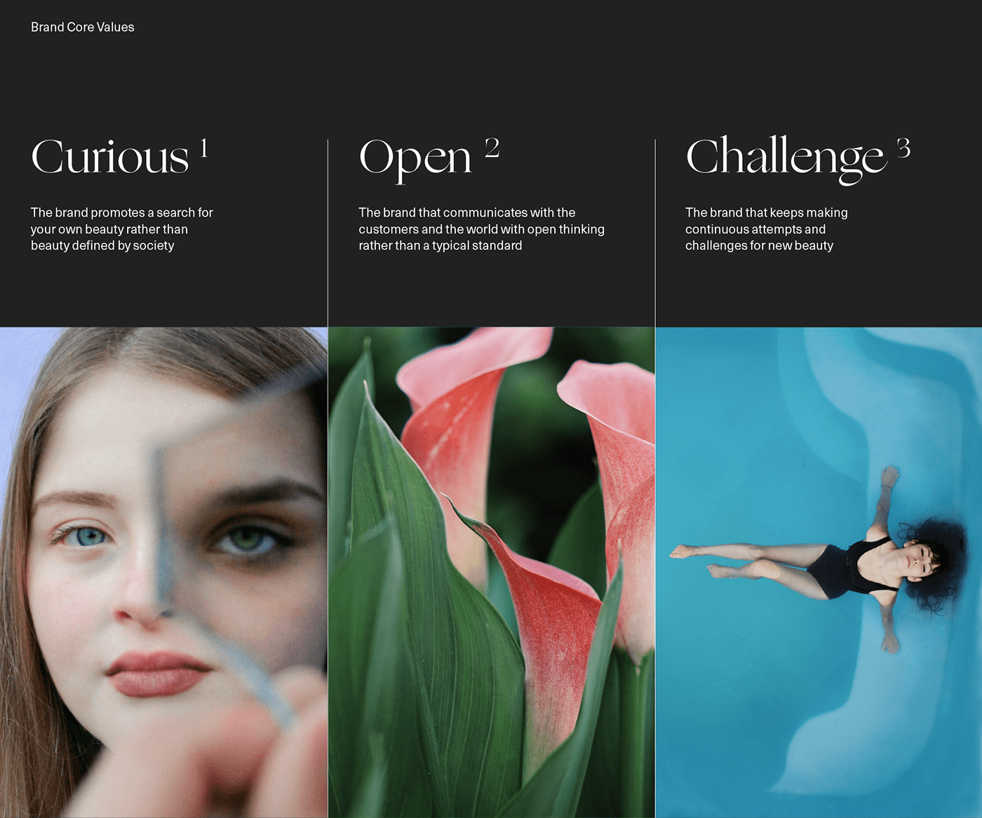
Brand Core Values / Brand Essence
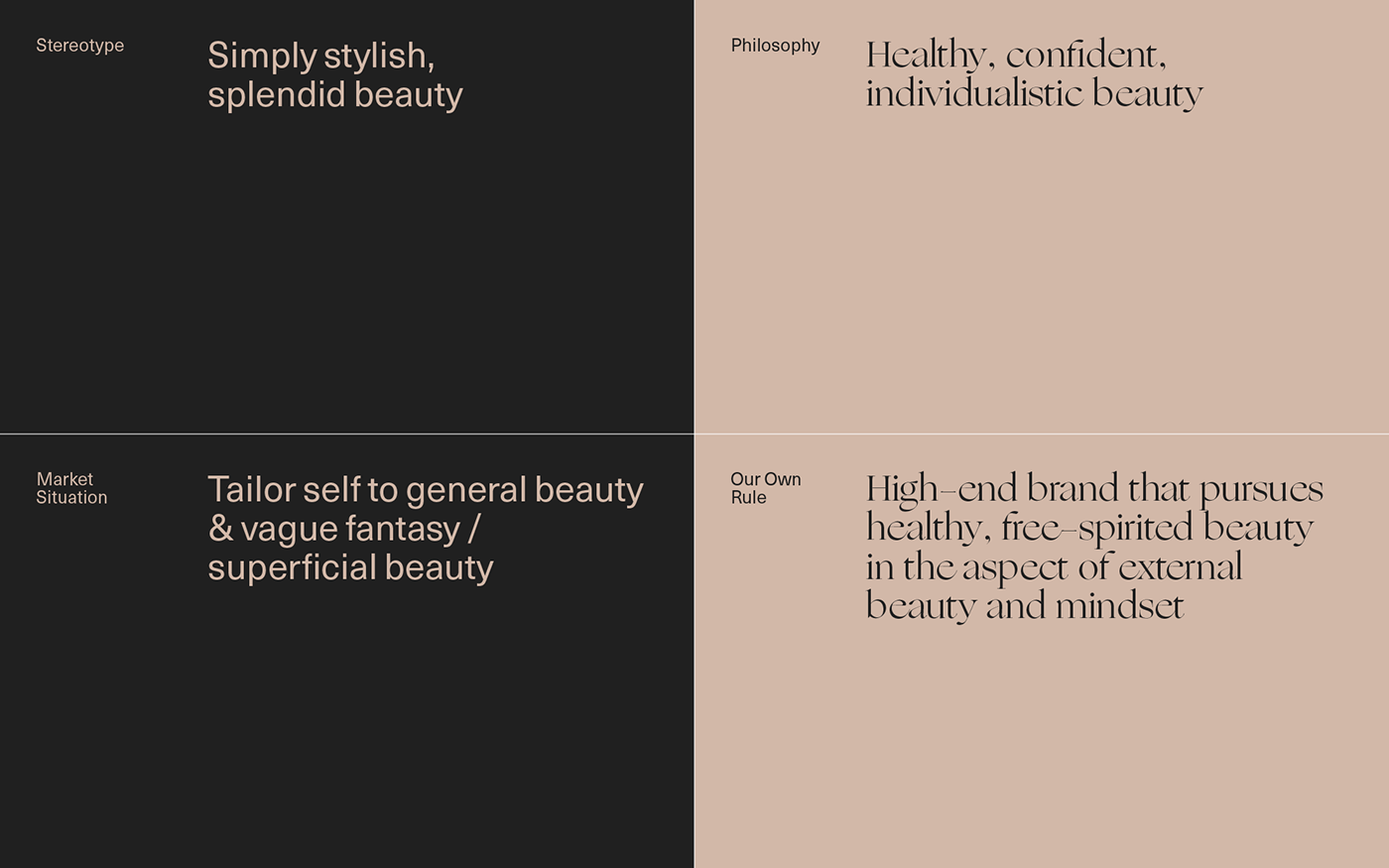
To define the fundamental meaning that symbolizes NEKER, we have established NEKER’s core value that we pursue by valuing the internal and external features.
Brand Essence suggests a direction for the brand with a concept that becomes the standard of all activities and reasons for existence of the brand. We define Brand Essence as one that reflects the brand’s core value and fundamental definition.

Brand Slogan
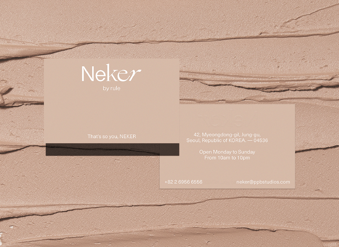
Under the value of the brand, which respects each individual’s beauty,
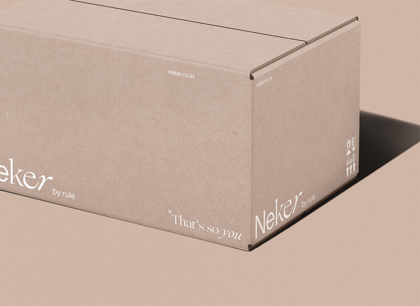
we have developed the brand slogan ‘That’s so you.’
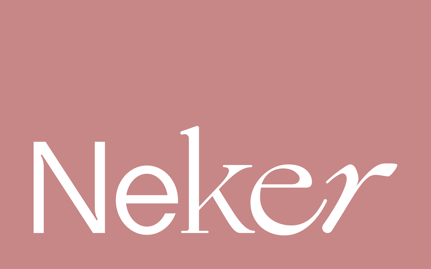
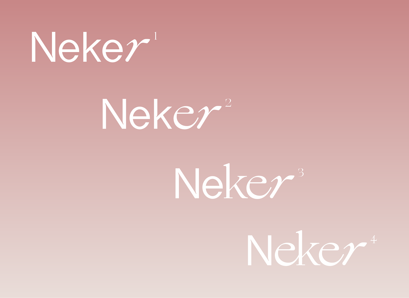
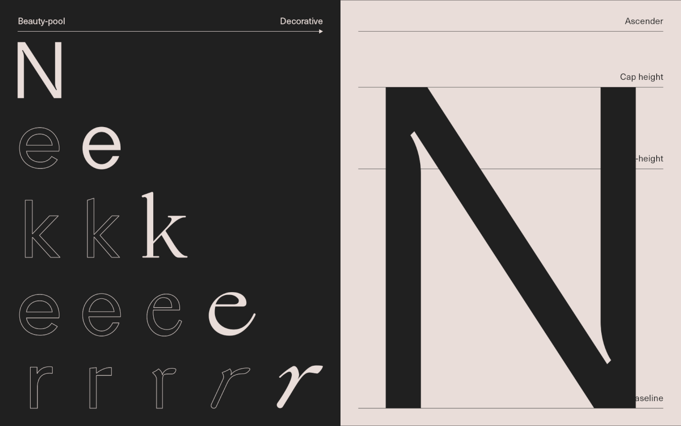
Brand Logo
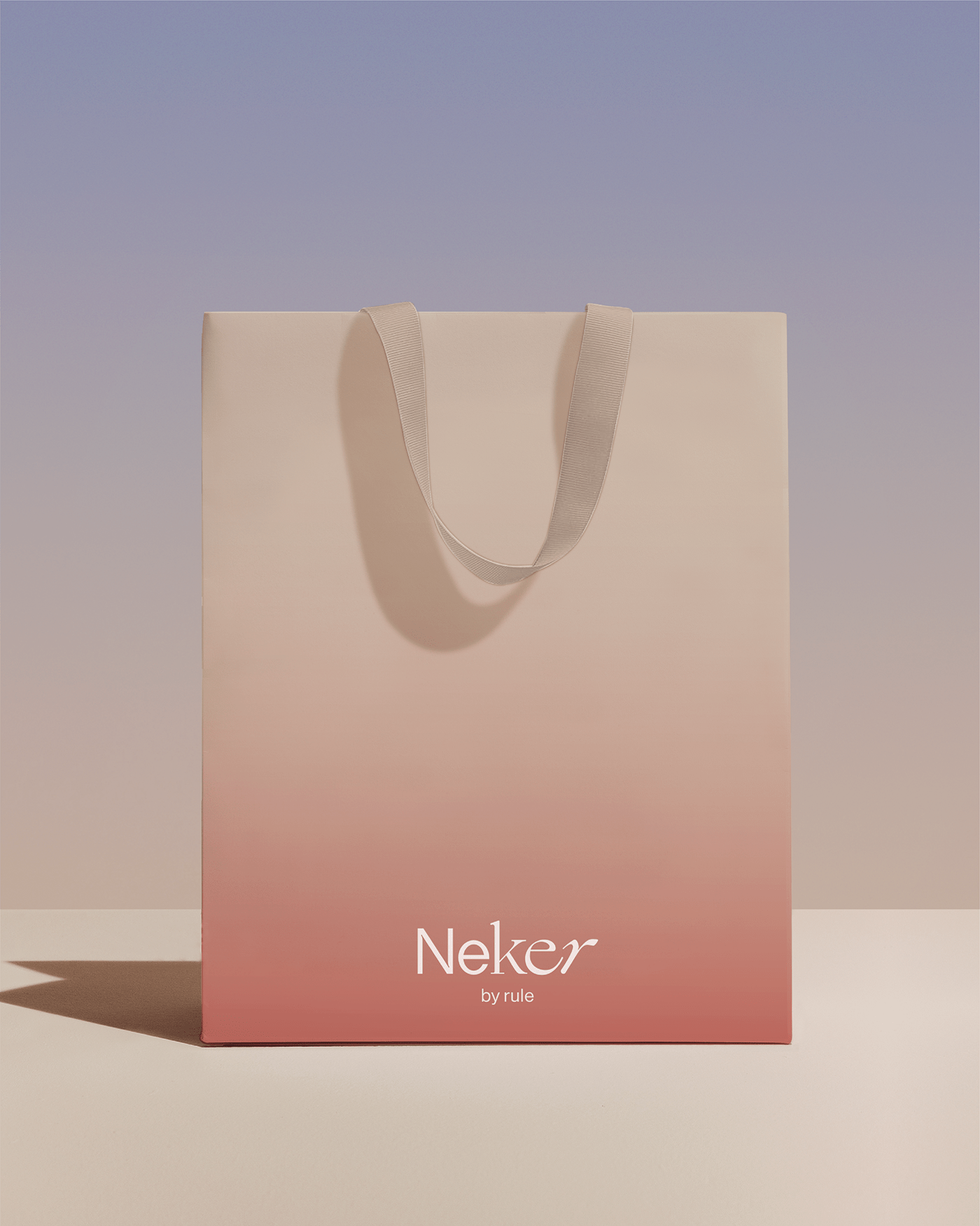
NEKER’s logo expresses a wide variety of beauty. The design of gradual change from minimal Sans-Serif font to decorative Italic Serif implies individualistic diversity and beauty. In addition, the flexibly expanding logo expresses Colorpool, the key visual of the brand that changes diversely. The typography of the logo consists of different fonts, but it uniformly develops with the same ascender and height.

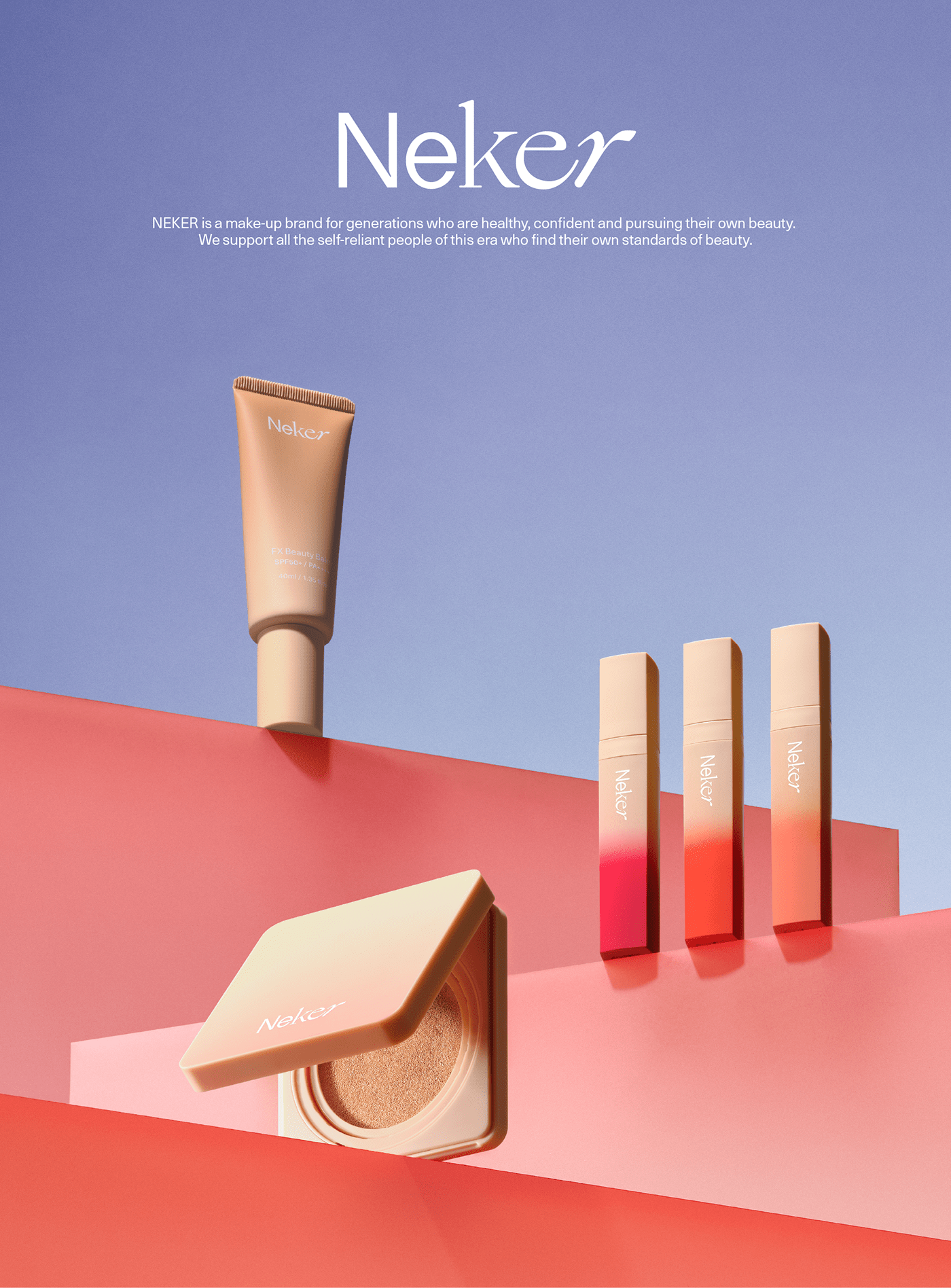
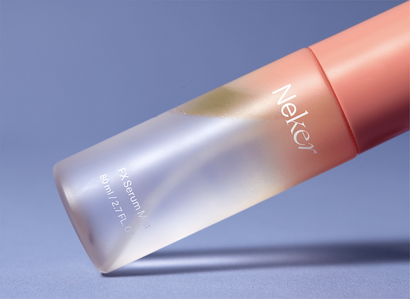
Brand Color
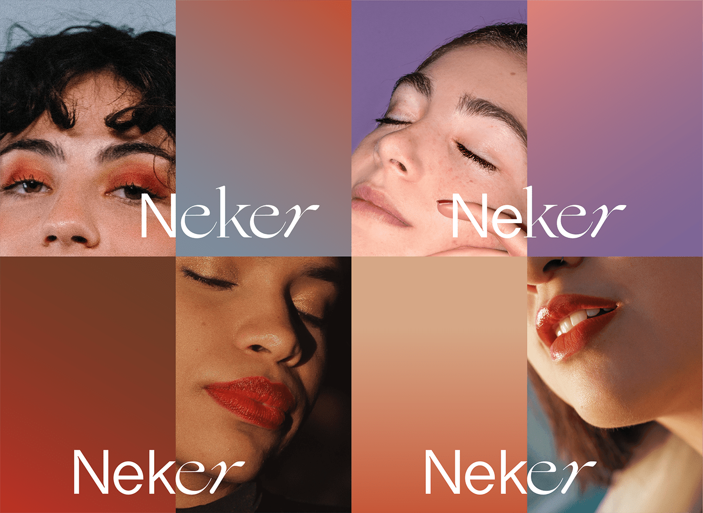
NEKER’s logo uses toned-down beige and pink as a whole to deliver a neutral image rather than a specific style. In addition, we use brightly adjusted black color to express a refined image while pursuing a good match with pastel tone as the main color. NEKER’s key visual, 'Color-pool' expresses the value being pursued by the brand and which represents various styles with individual sensibility, and each color is expanded freely according to the image of each product or model.


Brand Typography
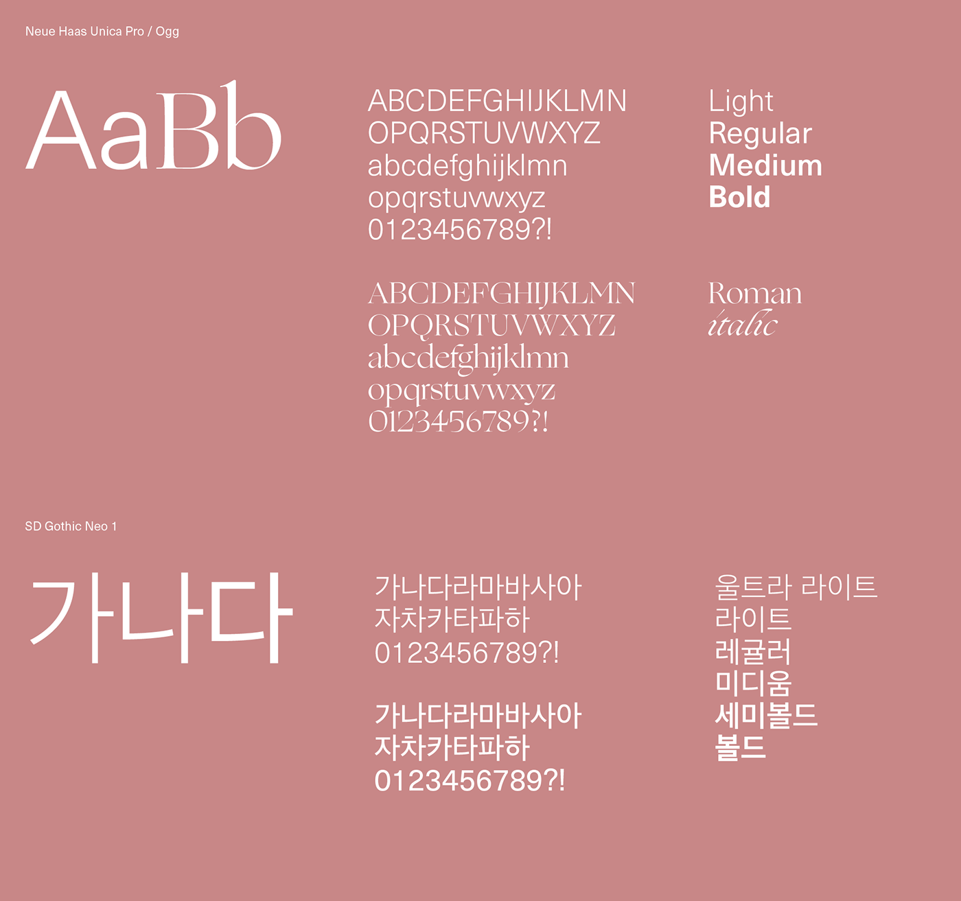
NEKER’s English typeface uses simple Neue Haas Unica Pro—which is neutral and able to express various beauties and individuality—rather than an association with specific gender, age, or tendency. Unica can be applied flexibly regardless of media due to its simple and clear shape and legibility, and it can deliver the brand image of NEKER more comprehensively. In addition, Korean typeface Sandoll Neo 1 has a good arrangement of black characters and white space within each module, so it can deliver a large amount of information in a legible fashion even on the narrow space of the packaging.


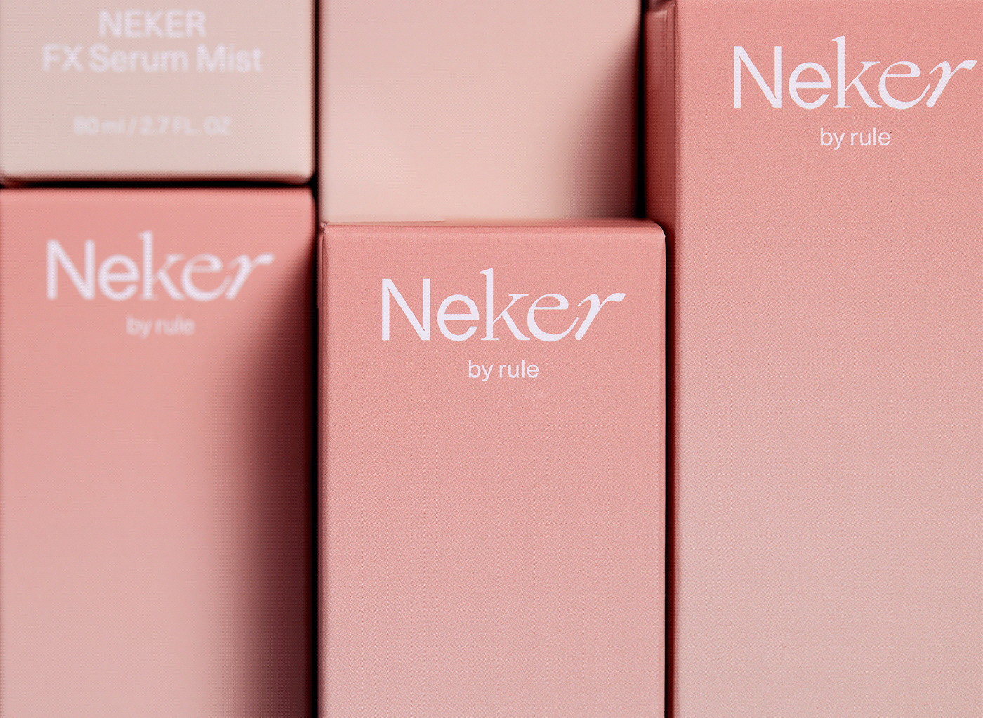
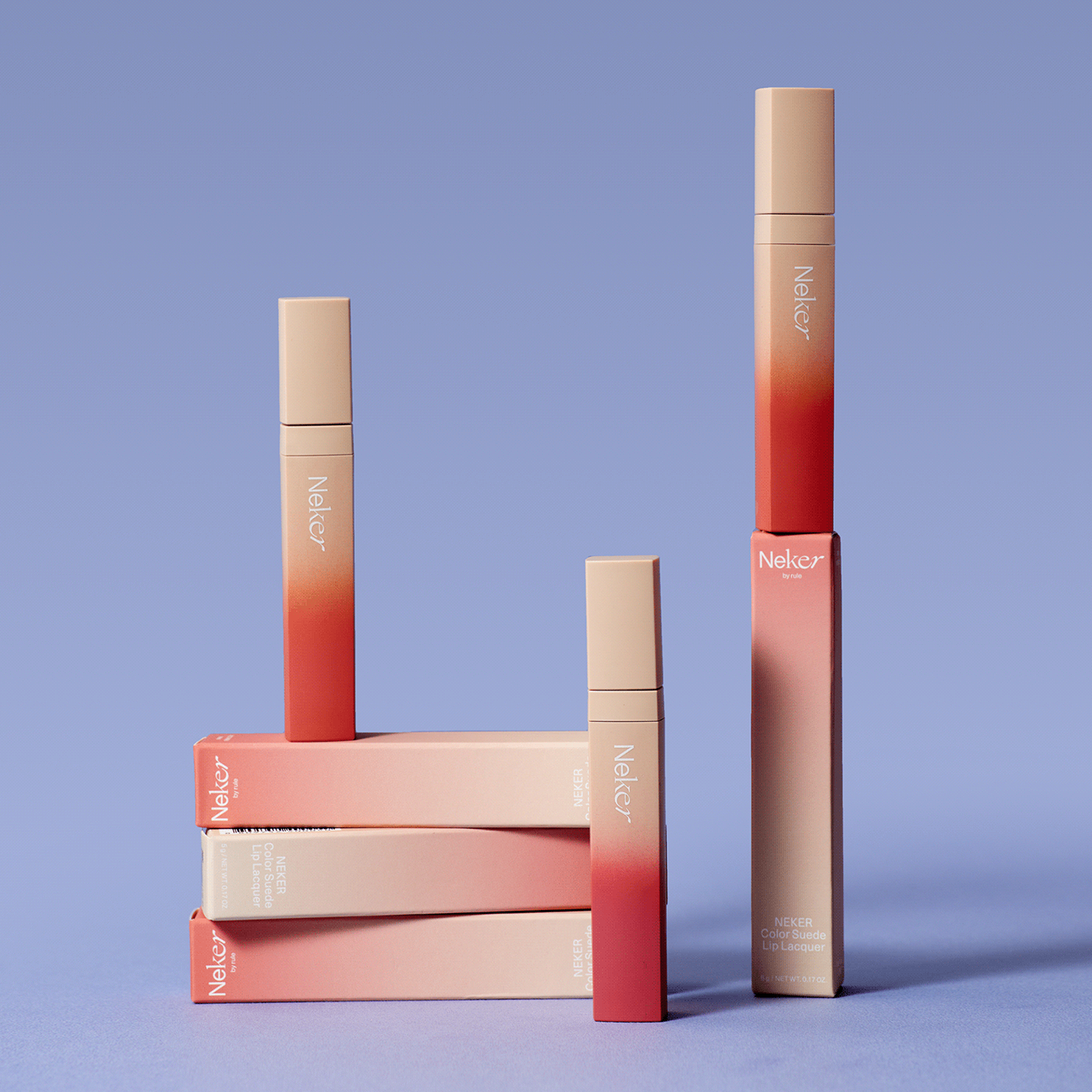
Brand Product / Package Design
NEKER’s packaging consists of simple look & feel as a whole. It intuitively delivers the identity of the brand by using the key visual and brand slogan. In addition, the packaging that uses NEKER’s core visual property 'Color-pool' actively delivers various individualistic brand experiences to customers.


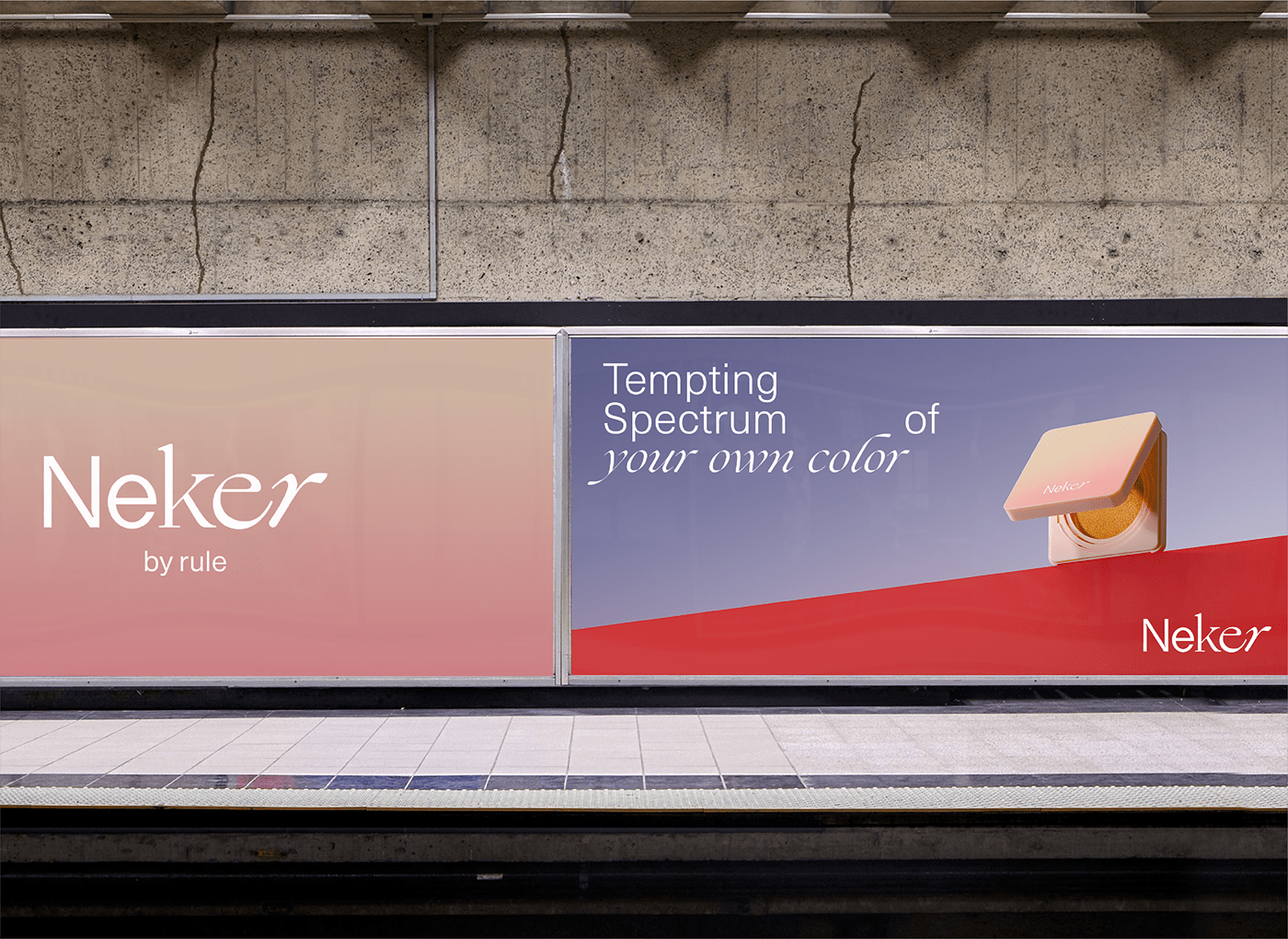
Brand Application Design
NEKER’s brand application design develops simple yet varied moods in various media such as web and mobile, including packaging. The key visual 'Colorpool', which expresses various individual characteristics and beauty, as well as logo-centered simple layout and typeface offer differentiated brand experiences to customers via online and offline contact points by using the core property of the slogan.

NEKER’s website is created to provide product information easily and intuitively, and the composition of simple menus provides consumers with easy access to products.
While excluding unnecessary graphics, continuously changing 'color-pool' is exposed to deliver the identity of NEKER to consumers.
That's so you, NEKER
New Brand Development / Brand Experience Design
© 2020 Plus X Co.


