


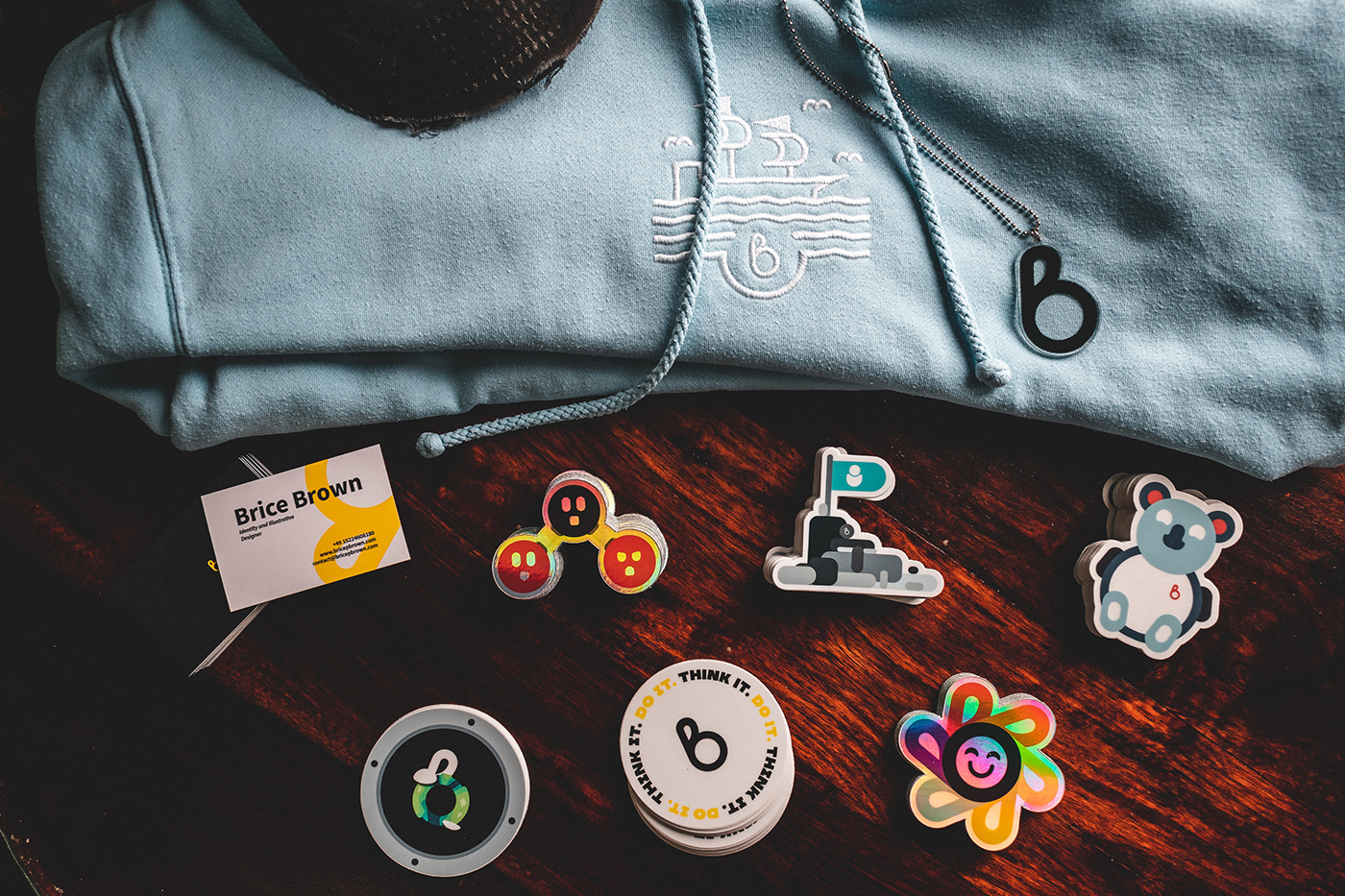
By Brice
ByBrice.com
Nearly two years ago I created this logo, and until then it has remained relatively dormant. That is until April, that is when I decided to create By Brice is an extension of me; therefore it is a personal brand. The naming for "By Brice" is representative of my personality of wanting to do anything. The brand is set up in a way to be launched in a series of limited run lines where each line has a certain mantra. The first line is called "Think it. Do it." The phrase is meant to provoke people to explore and push their boundaries as there is so much to gain from simply just "doing." Through out this line I created various designs to hopefully help in one way or another for driving that message.
The Think it. Do it. Line
Think it. Do it.
The design for this logo stemmed from a personal mantra which is to think of something and then do it. The logic behind this philosophy is you can only learn and grow as a person from doing more things. For example, you have been thinking about making music and you finally decide to release a single. After which you feel the accomplishment of actually doing it and being able to tell your friends or even your children you made a song when you were younger. The more you experience the more you know, living life to the fullest so Think it. Do it.


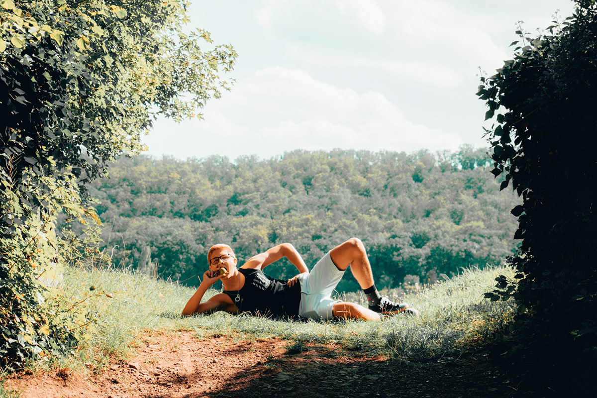
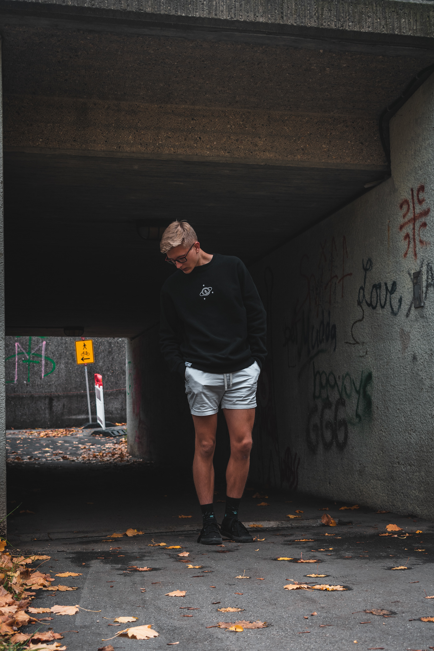
Think it. Do it. Tank Top
The tank tops were inspired by my recent habit of working out. I wanted something that I could wear to the gym but also were out and about. This is why the tank top is a minimalist look with some additions that make it function as casual wear.


Be The Change
I wanted to create a sticker the aligns with my beliefs. It is the start to most change, be the change you want to see in the world. With this simple metaphor, I wanted to provide an outside view onto Earth that allows for a better perspective of situations, and then you can take the best course of action. This is why there is a window frame and then a stylized Earth in the middle.


Be Happy
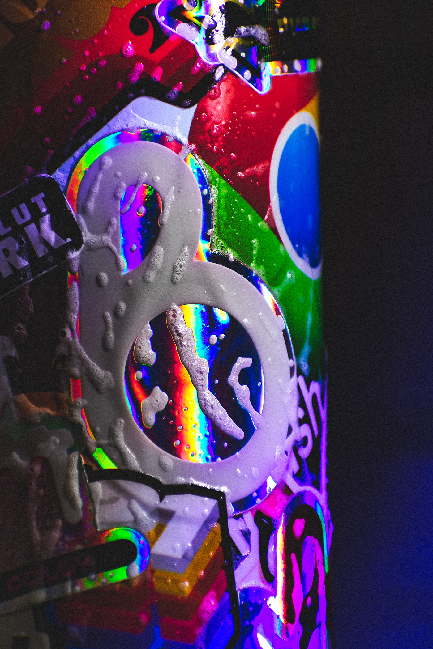
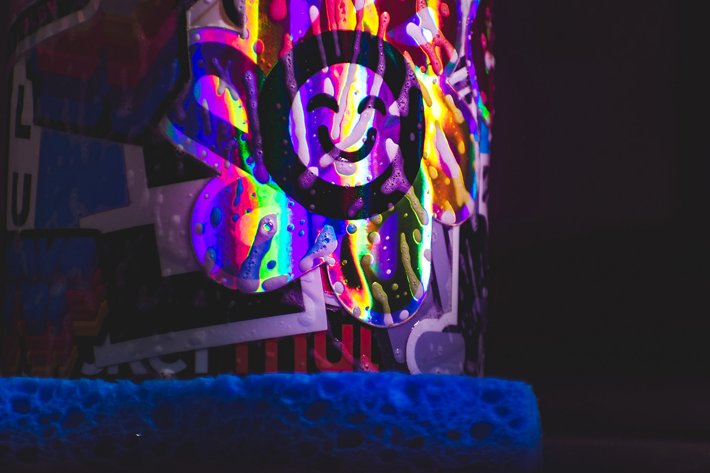
I wanted to create my own design of a rainbow flower. My logo perfectly fit as the petals of the flower with a cute happy face in the center. To make sure you got all the color the sticker is made with a holographic film so in any direction you can be bathed with colored light.


#TeamHuman
The design was somewhat based on the famous photograph, "Raising the Flag on Iwo Jima." This photo was chosen to be the inspiration because when I looked at it gives me the feeling that given enough perseverance through disaster and sorrow we as humans can prevail. In the new design, I made the flag's icon a human to represent that. Sadly, this utopian concept is hard to fulfill as we generally need a common enemy to come together. Maybe in the future, this will become less true.


Lil TJ
Lil TJ spawned from my long-lasting love from koalas (like over 3 years and 11 gifted stuffed animals.) I wanted to create my own rendition of a koala-based mascot and that where Lil TJ came from. When naming things around me Tim, Lil TJ, and Timmy are the go-to. But after designing Lil TJ I thought it would be really cool to have his belly fill up with food or drinks and that's why he's a bit... plump... but just look at how happy is.


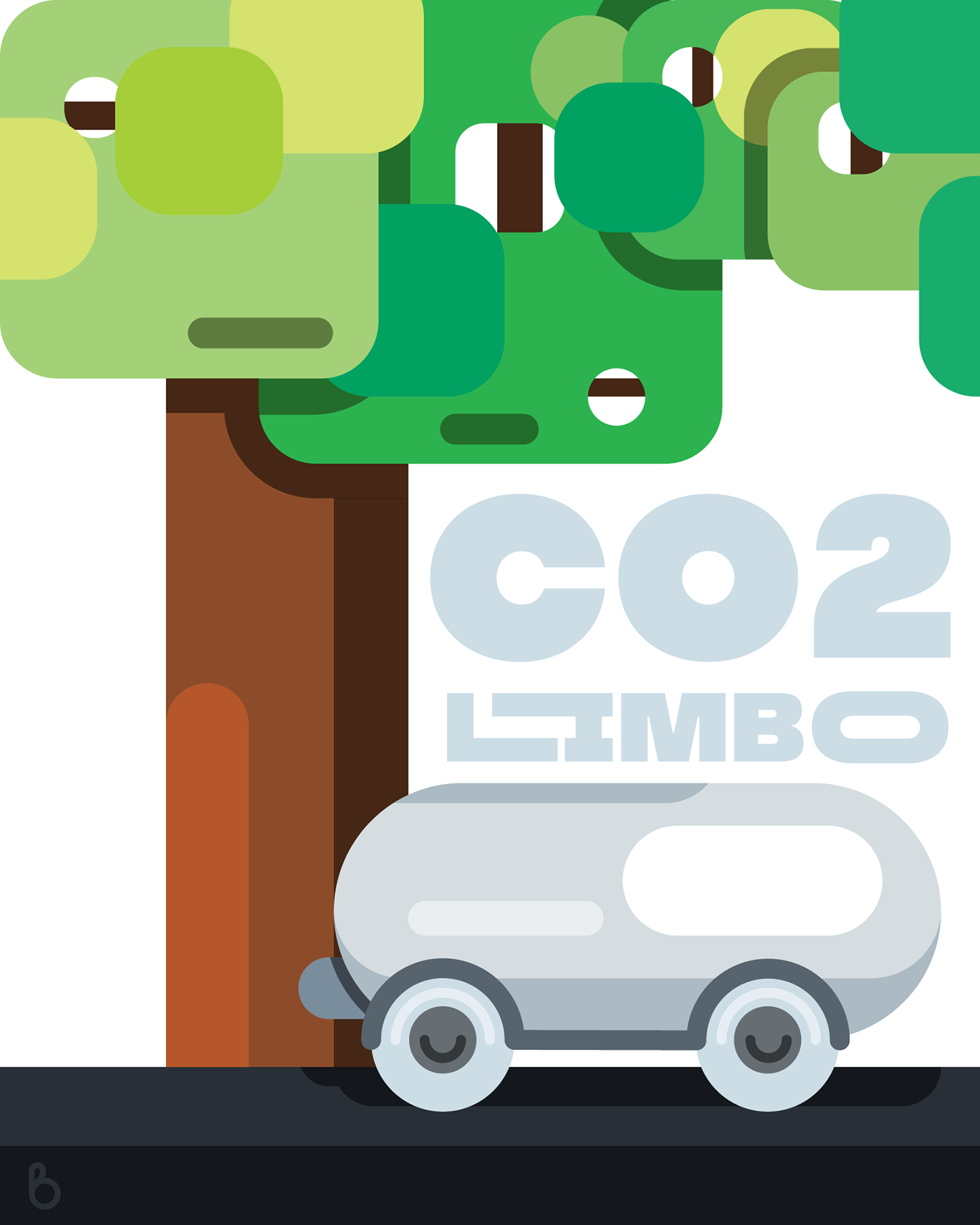
CO2 Limbo
CO2 Limbo was conceptualized as I began reading about how carbon dioxide can adversely affect biodiversity in the ocean column. With this in mind to fulfill the idea of "provoke introspection" this sticker was perfect as CO2 is simply more than just a good or bad argument. The faces are derived from power sockets and carbon dioxide is often a by-product of electrical generation.


B'Acrylic
Started off as a joke to be "iced out" but after actually wearing the necklace I became attached to it. It reminds me of everything I stand for and what I will work for in the future. For that reason, I keep the charm close to my heart.


What people have thought of the products so far.


Dream. Pullover
The Dream. Pullover is meant to drive people to dream, aim, and exceed the stars. The achieve this I used the night sky blackness and vastness of the universe to take of the majority of the pullover. Localized in the center is the By Brice logo with planets and stars surrounding it. This represents your aspirations. Additionally to make the hoodie a finished product I went with the Think it. Do it. woven label and ByBrice tag to connect it with the rest of the line. These photos were also self-timed portraits, it was a bit tedious especially not having a clicker but I am over the moon with how some of the photographs came out.


Marketing Material
In order keep the brand alive, especially its instagram page, I decided to use the designs to create posters. In addition I dabbled into film making and animation for the first time and I am over the moon with the results of my first attempts.
Be Happy Poster
This poster I wanted to emphasis the fun and vibrant nature of the Be Happy sticker. In addition to this I used some of the tools provided in Adobe Illustrator to create some dynamic type which helped give the idea of motion.


Be The Change Poster
I again wanted to explore typography. Using the zoom/scaling effect it puts an exigence on the icon in the certain which is important for giving awareness to the design itself. In addition I decided to give animation a go by giving the text a bit more of a dynamic feel.

#TeamHuman Poster
For the #TeamHuman posters I again wanted to continue the exploration of typography but also enforce the idea of solidarity and peace. I achieved this through the calm cool tones. A note on the peace symbol poster. I decided to go for the gradient in steps to help illustrate the illusion of depth.


CO2 Limbo
With this graphic I wanted to emphasis the relationship between cars pollution and trees absorption. To do this I placed only a tree and a car in the scene. The car feeds its exhaust fumes into the trees leaves with then fuel the trees growth.
Lil TJ
The 3D poster I decided to use the blend tool in Adobe Illustrator to create an engaging 3D of Lil TJ. I decided to use the coral color from Lil TJ's ears as it the emotion it gives off is a bit more emotional than the blue. For the Lil TJ on the right side I decide to use elements of the Lil TJ character to create a vignette around the text. Using my limited knowledge but growing knowledge of Adobe After Effects I tried to embellish on the cute clumsy nature of Lil TJ by using an overly squish and squash movement.


Advertising Videos
These are various videos I create to use in Facebook Ads as videos often have better conversions than still frames. To create this videos I used various programs like Adobe After Effects for animation, Adobe Premiere and Rush for video editing, and Adobe Audition for audio recording and mastering
Thank you
Thank you so much for reading this project. I would extremely grateful if you left an appreciation and/or a comment. This project is an ever growing one and over the last 3 months I have grown incredibly and cannot wait to see where it will continue to go.


