


Prönö is a company, launched in 2020, which helps ambitious entrepreneurs, "prönös", to succeed. Through their platform, Prönö gives a boost and pushes forward, enabling professionals and entrepreneurs in different fields to connect, find support, and seek advice in their business and growth challenges. Kokoro & Moi designed the visual identity, guidelines, and various brand applications for the new company.
We designed the visual identity to reflect the positive and energetic attitude that is found in entrepreneurs, the main target group of the company. The word 'Prönö' (derived from entrepreneur) doesn't exist in the Finnish vocabulary, which led us to design a logo with visual references to the phonetic spelling, by having lowercase letters, a hyphen, and square brackets.
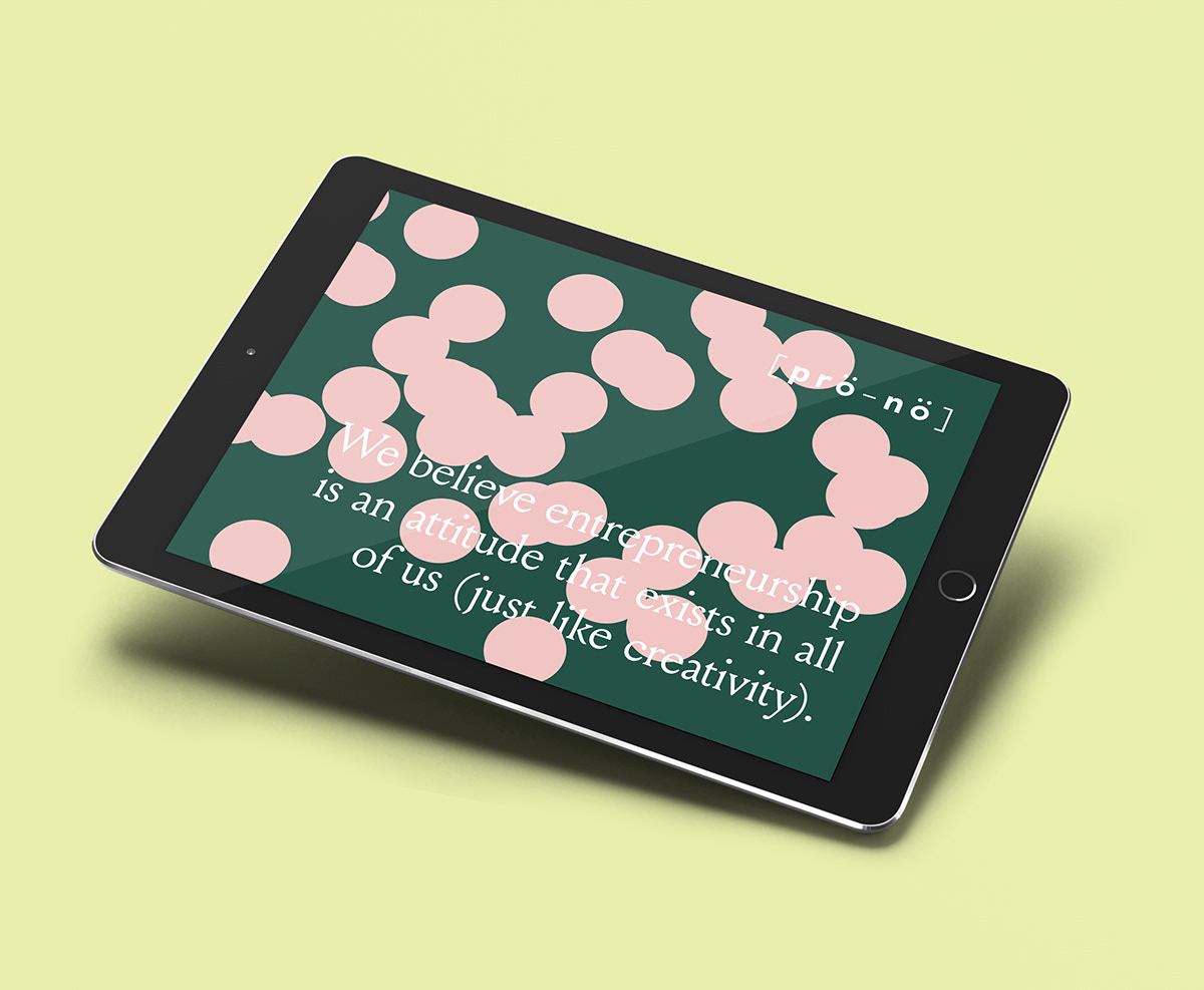
Prönö is a platform, based on the human-to-human interactions, and we wanted to bring this out also in the identity. The name and its "ö" letters provided the most prominent element for the identity, the dots. Presenting people and the networks they form, the dots randomly and actively connect and take over the surfaces.
The color palette consists of six earthy and pastel shades. The brand typography is built around clear and geometric Riposte, which is accompanied by a sophisticated Louize, a serif font with a wise and serene tone.


