


2020
STUDIO ASENSÒ
Scène de Bayssan
hérault's new CULTURAL HOTSPOT
BRANDING & TYPE DESIGN
—
[EN] Scène de Bayssan is the new cultural hotspot of the south-French Hérault department. It’s located on a site steeped in history, 70 kilometers away from Montpellier and near Béziers. This gathering place offers everyone the opportunity to enjoy the cultural and artistic events on offer, but also the green setting that has been arranged for the sensory pleasure of its visitors. Scène de Bayssan is placed at the meeting point of nature and culture, having a concert hall, a theater, a museum, but also a Mediterranean garden and several fitness trails for young and old.
[FR] La Scène de Bayssan est le nouveau pôle culturel du département de l’Hérault, situé à 70 kilomètres de Montpellier et à proximité de Béziers, sur un site chargé d’histoire. C’est un lieu de partage qui offre à chacun l’opportunité de savourer les événements culturels et artistiques qui y sont proposés, mais aussi l’écrin de verdure qui est mis en scène pour le plaisir sensoriel de ses visiteurs. À l’endroit où nature et culture convergent, ce lieu compte une salle de concert, un théâtre, un musée, mais aussi un jardin méditerranéen et plusieurs parcours sportifs pour petits et grands.
Presentation
[EN] Scène de Bayssan is led by the cultural department of the Hérault region, which aims to develop a high-quality artistic offer for all audiences. The project is directed by a team of passionate professionals who are creating multifaceted artistic seasons that include plays, circus shows, concerts and various other cultural events. Guided by the environment in which it is located, the venue highlights the cultural heritage of the Mediterranean region and its rich natural environment. This relationship between culture and nature and the interconnection between those two elements marks the uniqueness of Scène de Bayssan, where performance halls and a unique Mediterranean garden share the same ground.
The visual identity was designed to help Scène de Bayssan express itself with a powerful and distinct voice that embodies the place’s personality: a combined civilizational, artistic, intellectual and natural approach that highlights the Mediterranean art of living. Centered around the relationship between nature and Mediterranean culture, Scène de Bayssan's branding relies on recurring notions of these two fields: ornamentation, seasonality, chromatic range, etc.
[FR] La Scène de Bayssan est rattachée à Hérault-Culture, un établissement public (EPIC) du département de l’Hérault, qui développe une offre artistique de qualité pour tous les publics. Le projet est porté par une équipe de professionnels qui met en œuvre une saison artistique comprenant du théâtre, du cirque, de la musique et divers événements culturels ou festifs. Guidé par l’environnement dans lequel il est implanté, le lieu met en avant aussi bien le patrimoine culturel du pourtour méditerranéen que son riche environnement naturel. Cette relation entre la culture et la nature et la porosité entre ces deux domaines marque la singularité du lieu, où salles de spectacles côtoient un jardin méditerranéen unique en son genre.
La présente identité visuelle de la Scène de Bayssan, au service d’une communication grand public, représente et incarne tant un paysage culturel qu’un paysage naturel, et combine une approche civilisationnelle, artistique, intellectuelle, paysagère mais aussi un art de vivre, celui de la Méditerranée. Axée autour de la relation entre nature et culture méditerranéenne, l’image graphique de Bayssan fait appel à des notions récurrentes de ces deux domaines : ornementation, saisonnalité, gamme chromatique, etc.
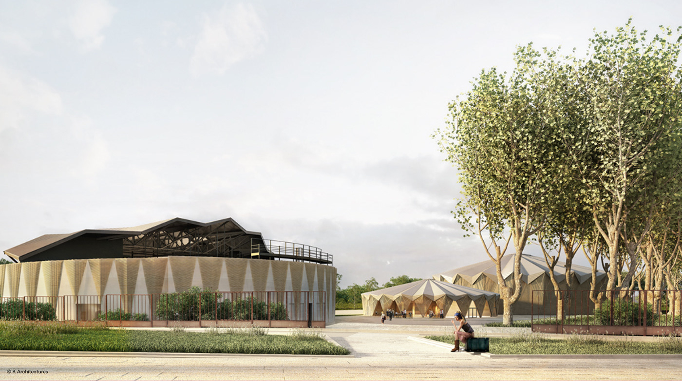


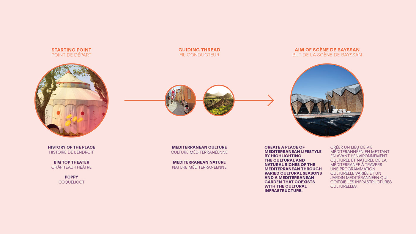
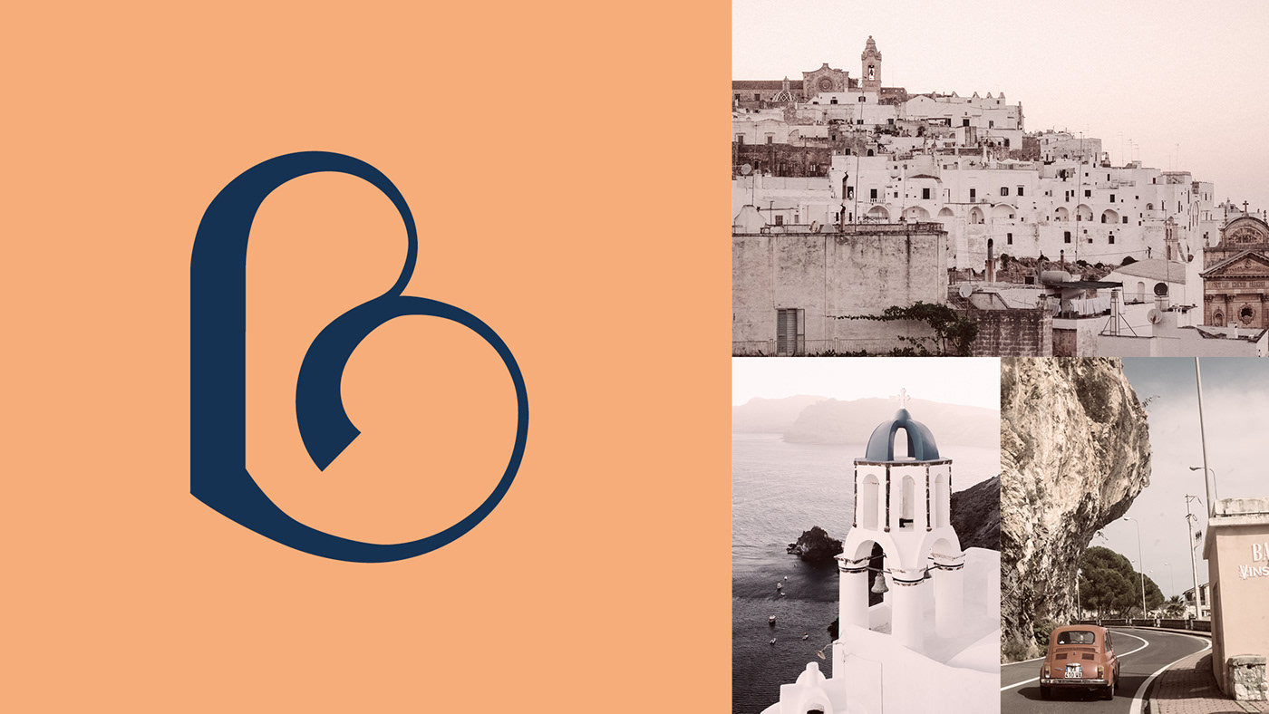
Architecture as a starting point for the visual identity
[EN] The location of Scène de Bayssan was previously used by Sortie Ouest known for its big top tent that was used as a theater. The new buildings’ architecture (theater, amphitheater, restaurant, ...) refers to the structure of circus marquee tents.
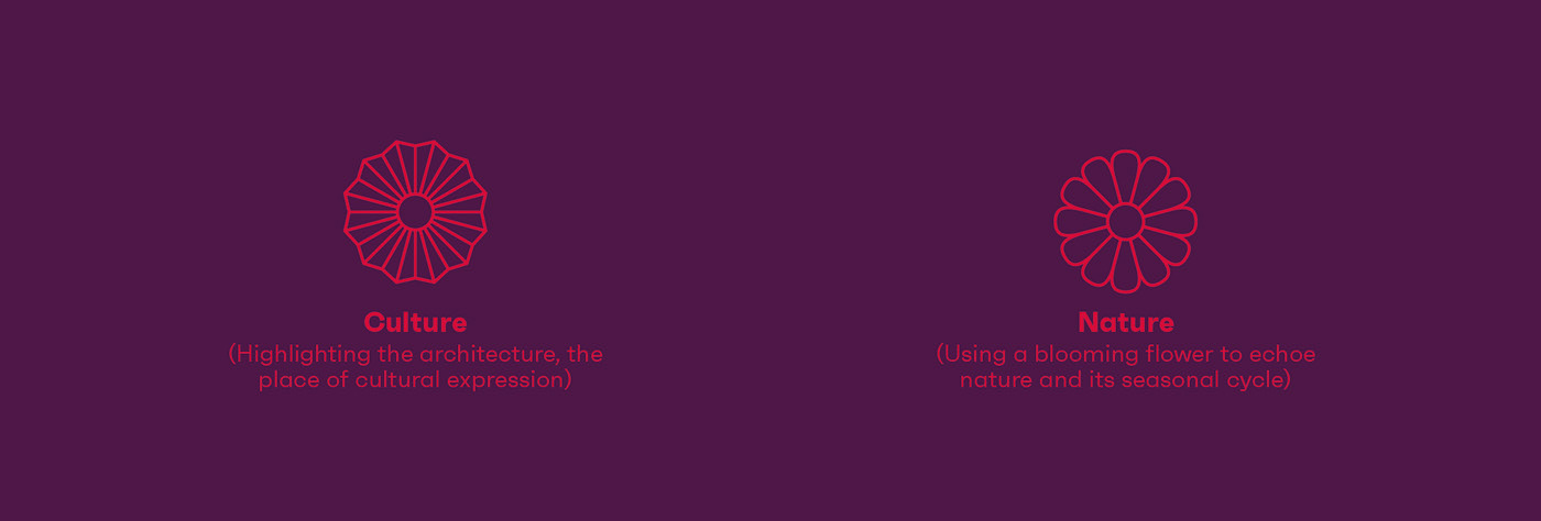
The place’s identity is built around the two notions that act as the branding’s foundation, namely culture and nature. The logo is first of all inspired by culture, by the singular architecture of Scène de Bayssan, by the buildings’ triangular and radiant shapes. Then nature, with an icon that is built like a flower and that creates a link with the identity of the previous theater that often used poppies in its visuals.
L'architecture comme point de départ de l'identité visuelle
[FR] À l’emplacement de l’actuelle Scène de Bayssan se trouvait Sortie Ouest et son chapiteau-théâtre (voir les photos ci-dessous). L’architecture des nouveaux bâtiments (théâtre, amphithéâtre, restaurant,...) font référence à l’architecture circassienne et à l’ancien chapiteau.
L'identité visuelle de la Scène de Bayssan prend forme à travers les deux notions qui rythment la communication, à savoir la culture et la nature. Tout d’abord la culture, en se réappropriant et en réinterprétant l’architecture circassienne du lieu dont la singularité des lignes des bâtiments, composés de formes triangulaires et rayonnantes. Puis la nature, avec un sigle qui se construit telle une fleur composées de pétales et qui nous rappelle là aussi le coquelicot (utilisé dans la communication de Sortie Ouest) et toute la poésie qu’il conte.

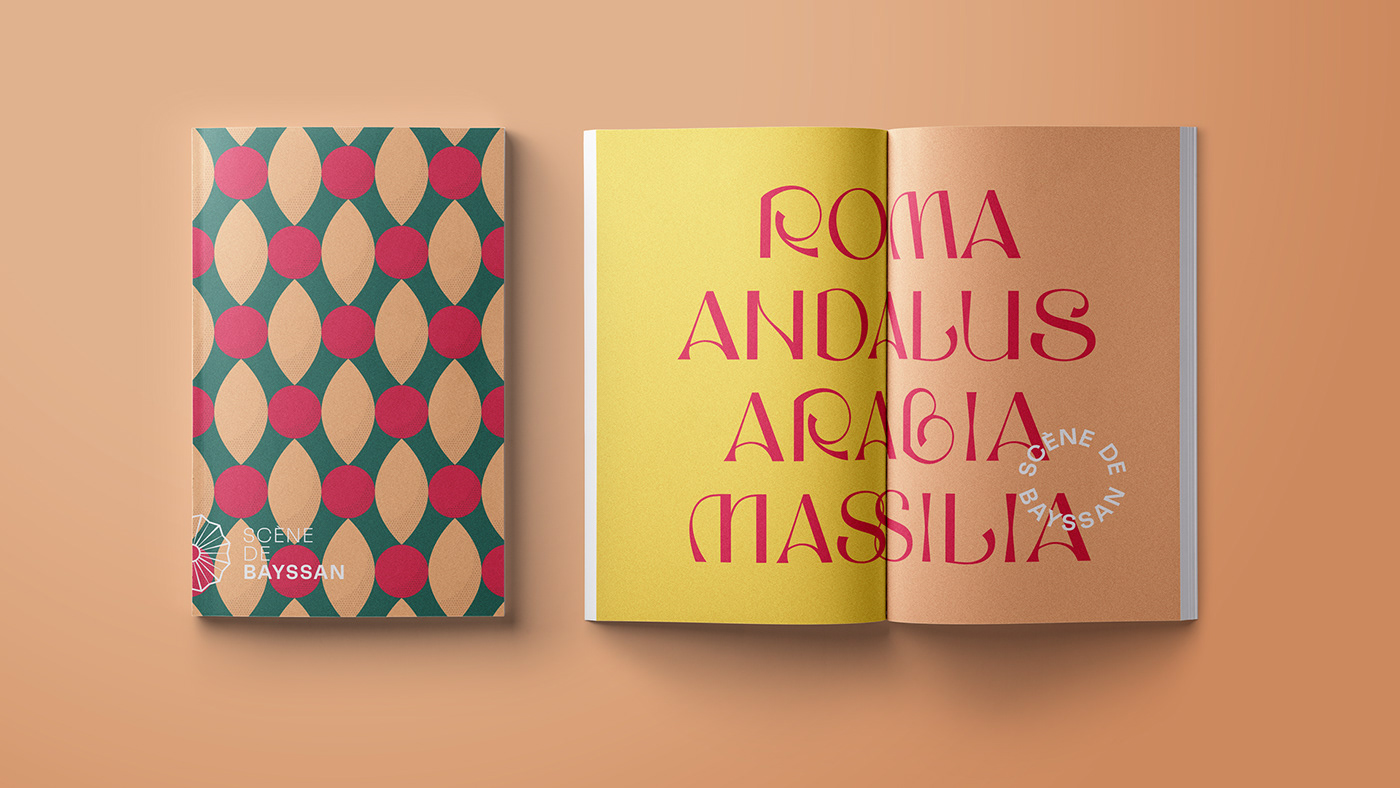
Mediterranean colors
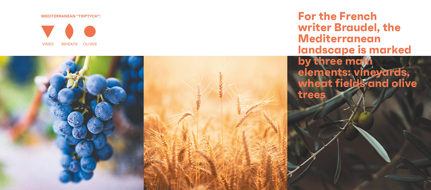
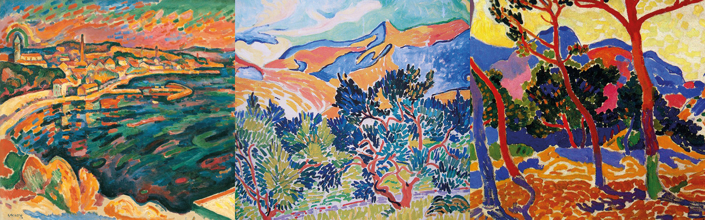
[EN] The place’s powerful cultural and natural identity (architecture, history, flora and landscapes) served as a starting point for the branding’s chromatic range. For the historian Braudel, the Mediterranean landscape is marked by three main elements: vineyards, wheats and olive trees. For him these elements form the Mediterranean triptych. This triptych or triad has inspired the place’s visual identity. The color palette has been taken from the paintings of Mediterranean landscapes of painters such like Braque, Gauguin, Cézanne, etc. It also echoes the history of the place and the poppy previously used by Sortie Ouest.
Une gamme chromatique méditerranéenne
[FR] L'identité culturelle et naturelle du lieu (architecture, histoire, flore et paysages) a servi de point de départ à la gamme chromatique à l'identité. Pour l'historien Braudel, le paysage méditerranéen est marqué par trois éléments principaux : la vigne, le blé et les oliviers. Pour lui, ces éléments forment le triptyque méditerranéen. Ce triptyque ou triade a inspiré l'identité visuelle du lieu. La palette de couleurs a été tirée des peintures de paysages méditerranéens de peintres tels que Braque, Gauguin, Cézanne, etc. Elle fait également écho à l'histoire du lieu et au coquelicot utilisé auparavant par Sortie Ouest.

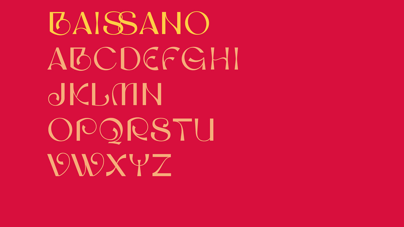
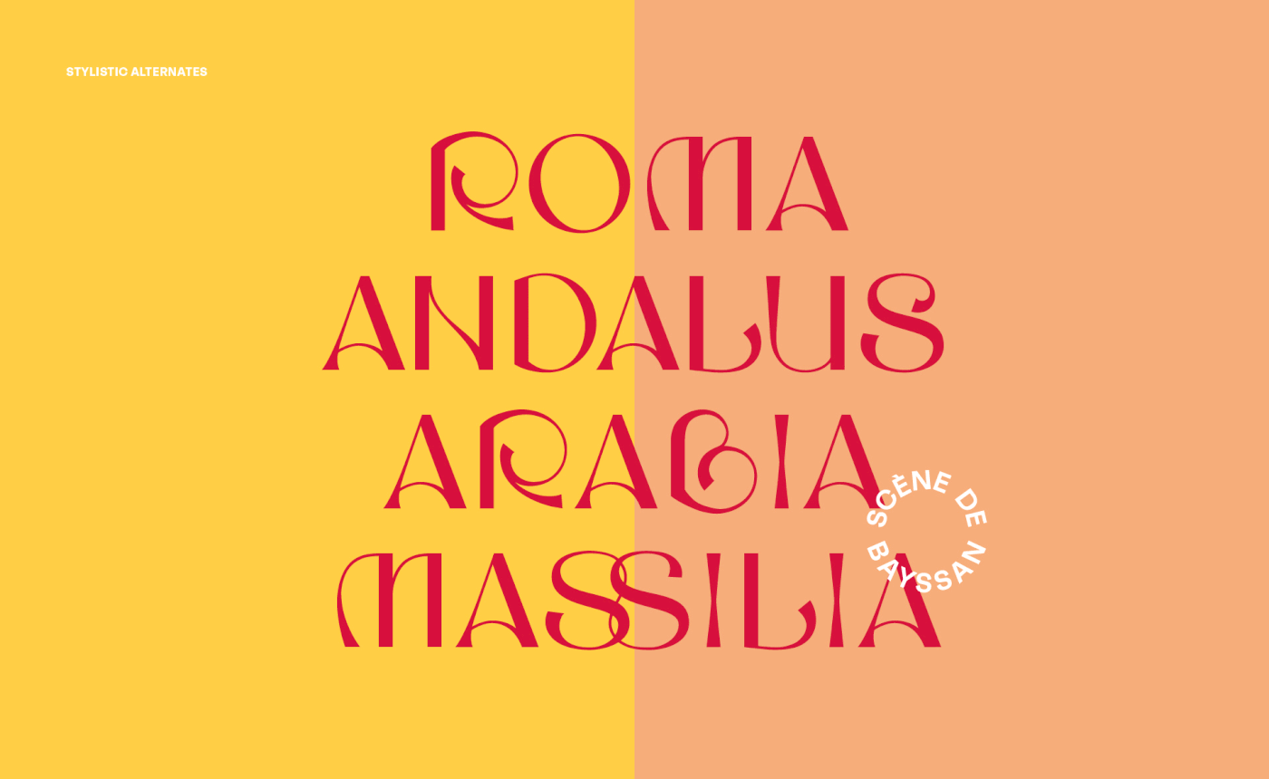
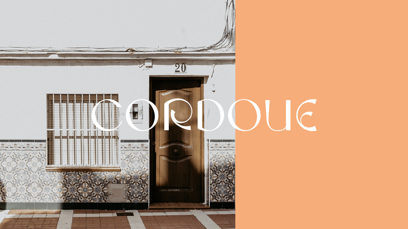
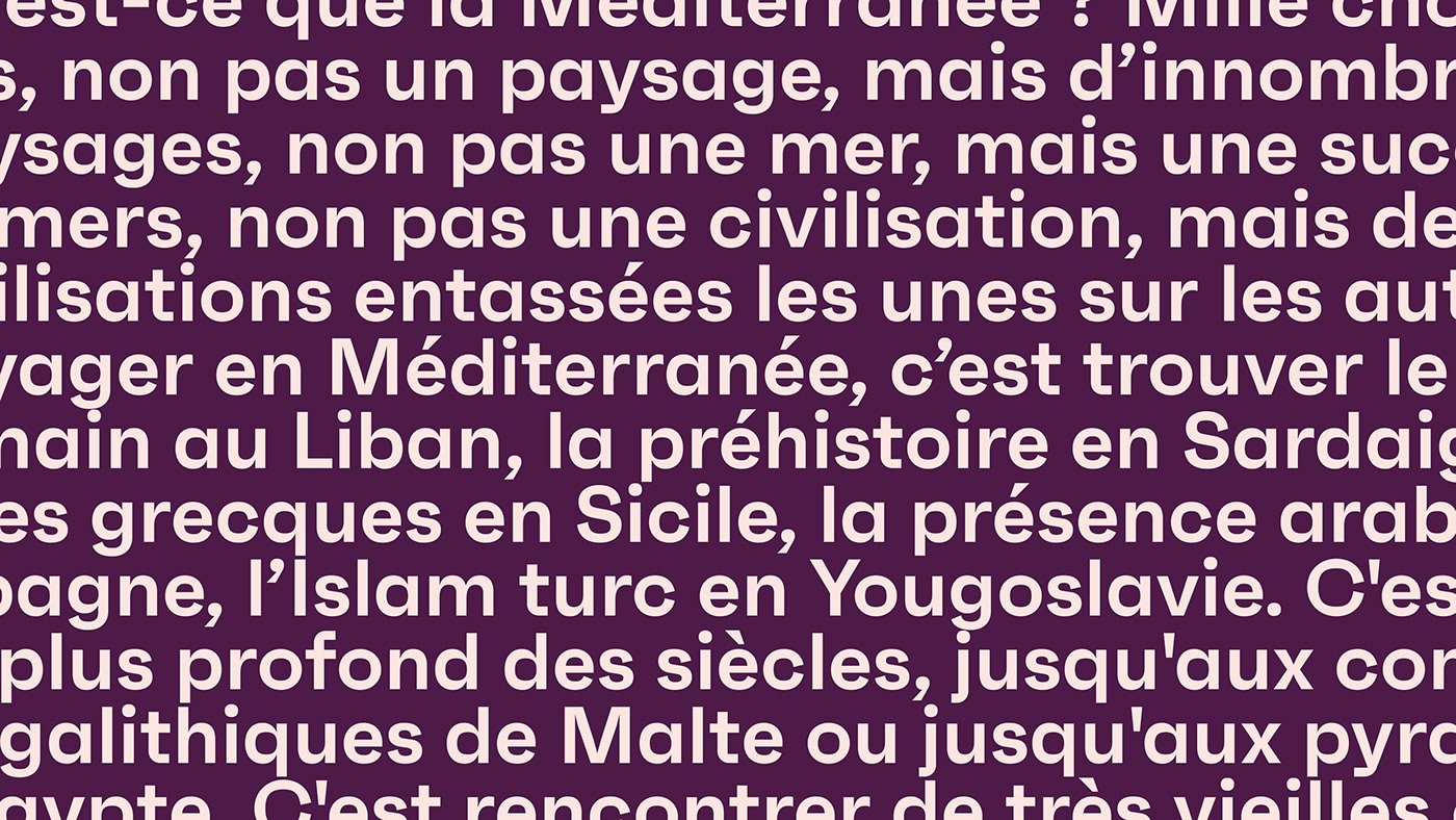
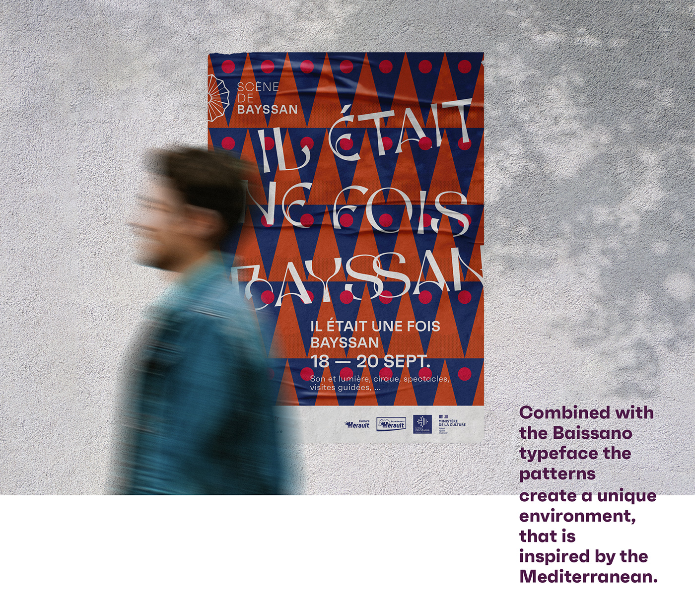
A custom typeface, inspired by Mediterranean culture
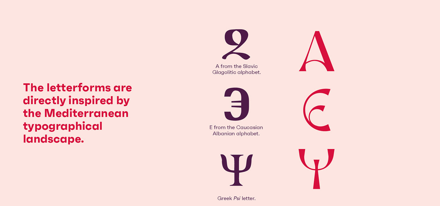
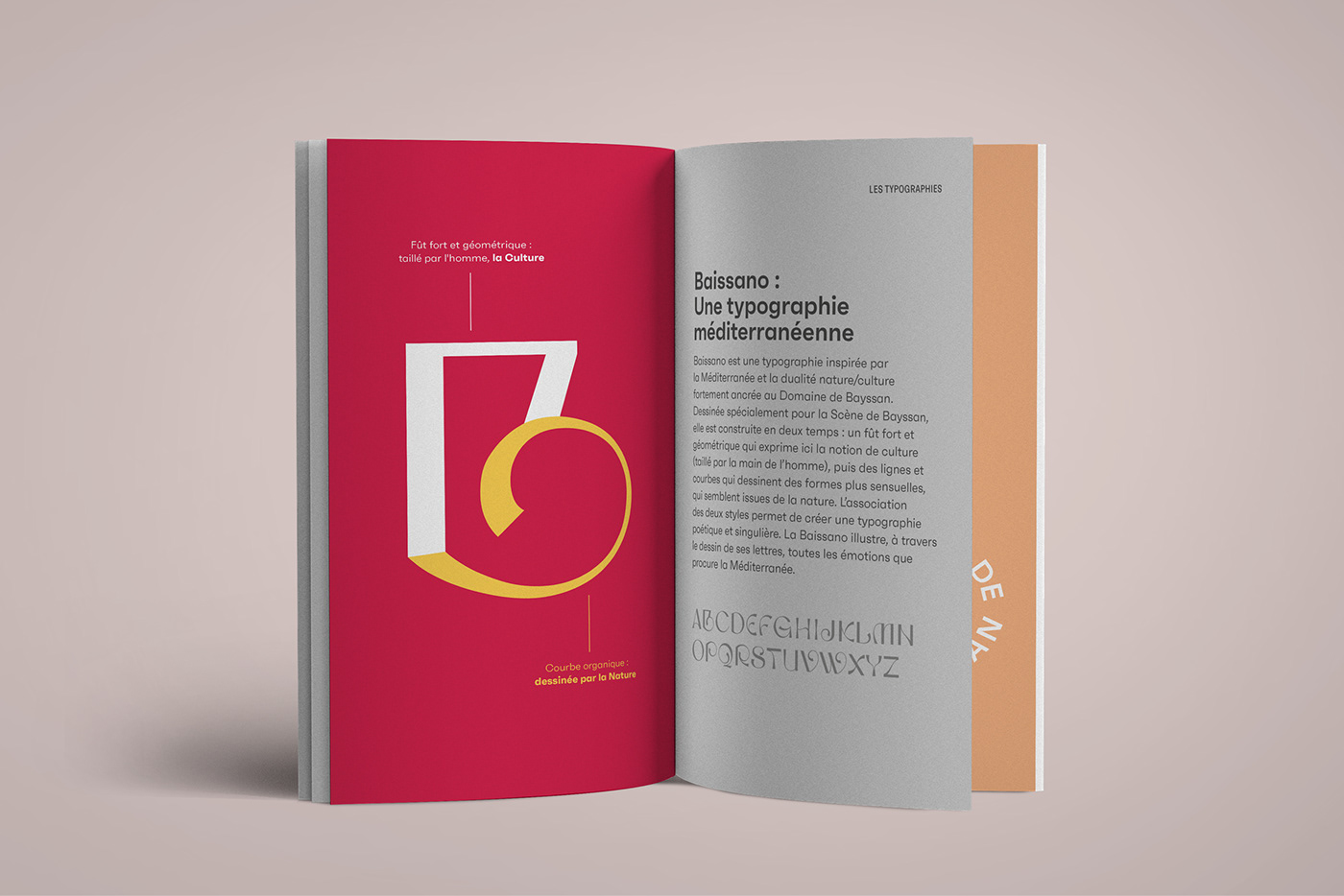
[EN] Baissano (click here to discover this typeface) is a Mediterranean-inspired typeface that reflects Scène de Bayssan’s identity and the strongly rooted duality between nature and culture. First and foremost, its characters have a Mediterranean personality, in that their shape and overall feel have been directly inspired by alphabets found all around the Mediterranean.
But it is also a typeface that expresses the nature/culture duality: a strong, geometric stem that expresses the notion of culture (a man-made element) that is combined with smooth and curved nature-like elements that refer to the organic world. The combination of these two elements creates a poetic and unique typeface: the Baissano typeface, a font that captures Mediterranean emotions and its history.
Une typographie inspirée par la Méditerranée
[FR] Baissano (cliquez ici pour découvrir cette typographie) est une typographie inspirée par la Méditerranée et la dualité nature/culture fortement ancrée au Domaine de Bayssan. Tout d'abord, c'est une fonte aux caractères résolument méditerranéens, en ce sens que leurs formes sont inspirés des alphabets trouvés tout autour de la grande bleue. Mais, c'est aussi une typographie qui exprime le manifeste de la Scène de Bayssan, pour laquelle elle a été spécialement dessinée, à savoir la dualité nature/culture : un fût fort et géométrique qui exprime la notion de culture (taillé par la main de l’homme), puis des lignes et des courbes qui dessinent des formes plus sensuelles, qui semblent issues de la nature. L’association de ces deux styles permet de créer une typographie poétique et singulière. La Baissano illustre, à travers le dessin de ses lettres, toutes les émotions que procure la Méditerranée, en faisant aussi référence au paysage typographique méditerranéen.


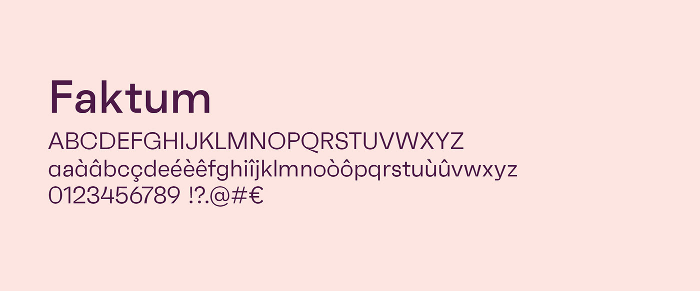
A functional secondary typeface
[EN] Faktum is a typeface designed by Berlin-based typographer René Bieder, and an is an exploration into the geometric sans genre, inspired by Mid-century modern architecture. This typography combines clear lines, organic curves and geometric shapes in a contemporary design. Faktum is available in 8 weights and 4 variants, offering great flexibility in the layout of publishing materials.
Une typographie secondaire fonctionnelle
[FR] Faktum est une fonte dessinée par le dessinateur de caractères berlinois René Bieder, et une exploration des linéales géométriques, un genre inspiré par l’architecture et le design moderne du milieu du siècle dernier. Cette typographie combine des lignes claires, des courbes organiques et des formes géométriques dans un design contemporain. Faktum est disponible en 8 graisses et 4 variantes offrant ainsi une grande souplesse pour la mise en page des supports en édition.
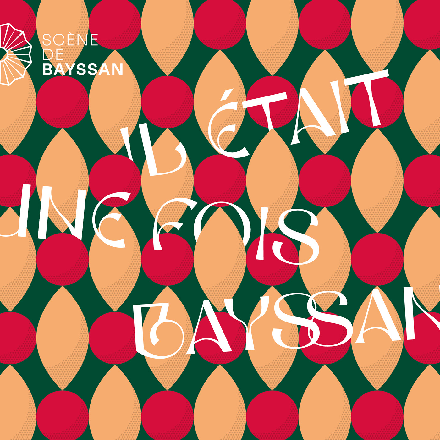
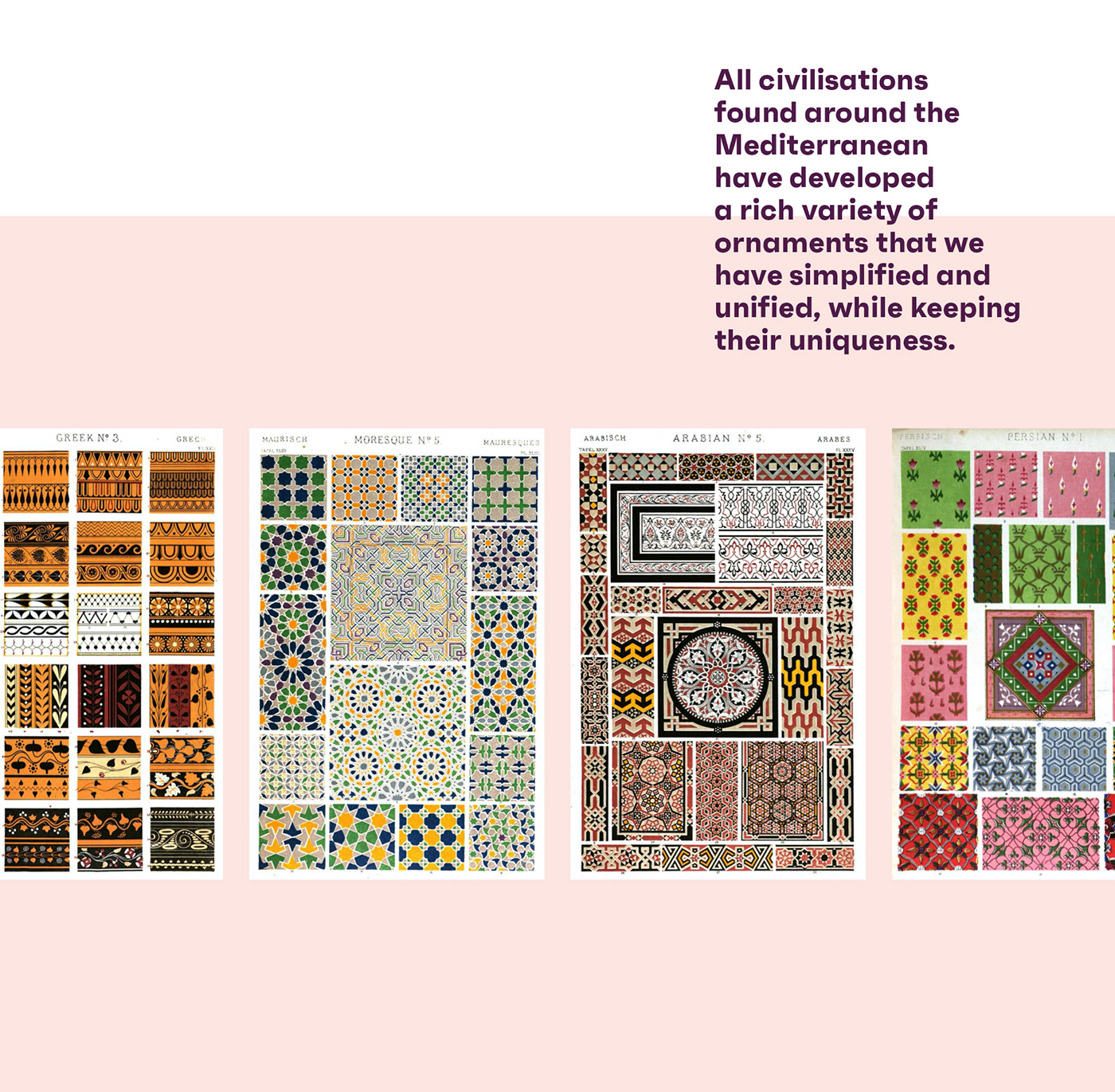
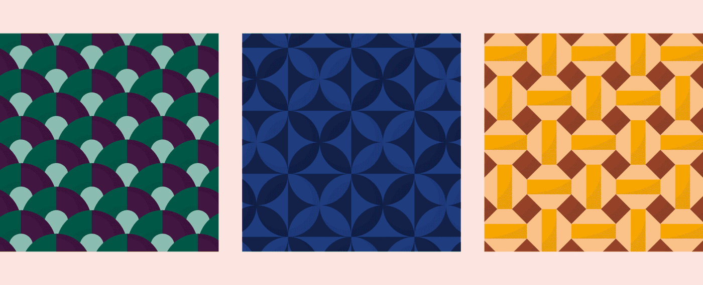
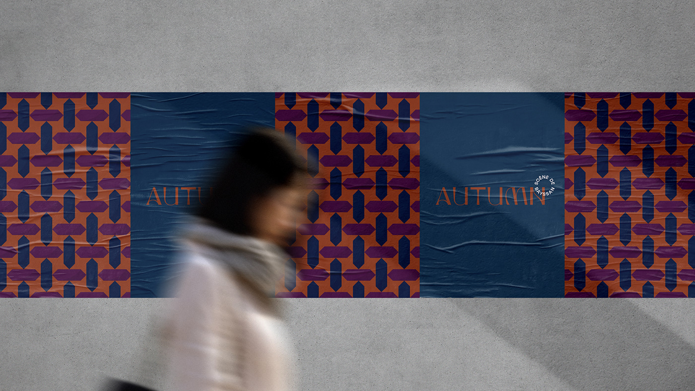
Ornaments inspired by the Mediterranean civilisations
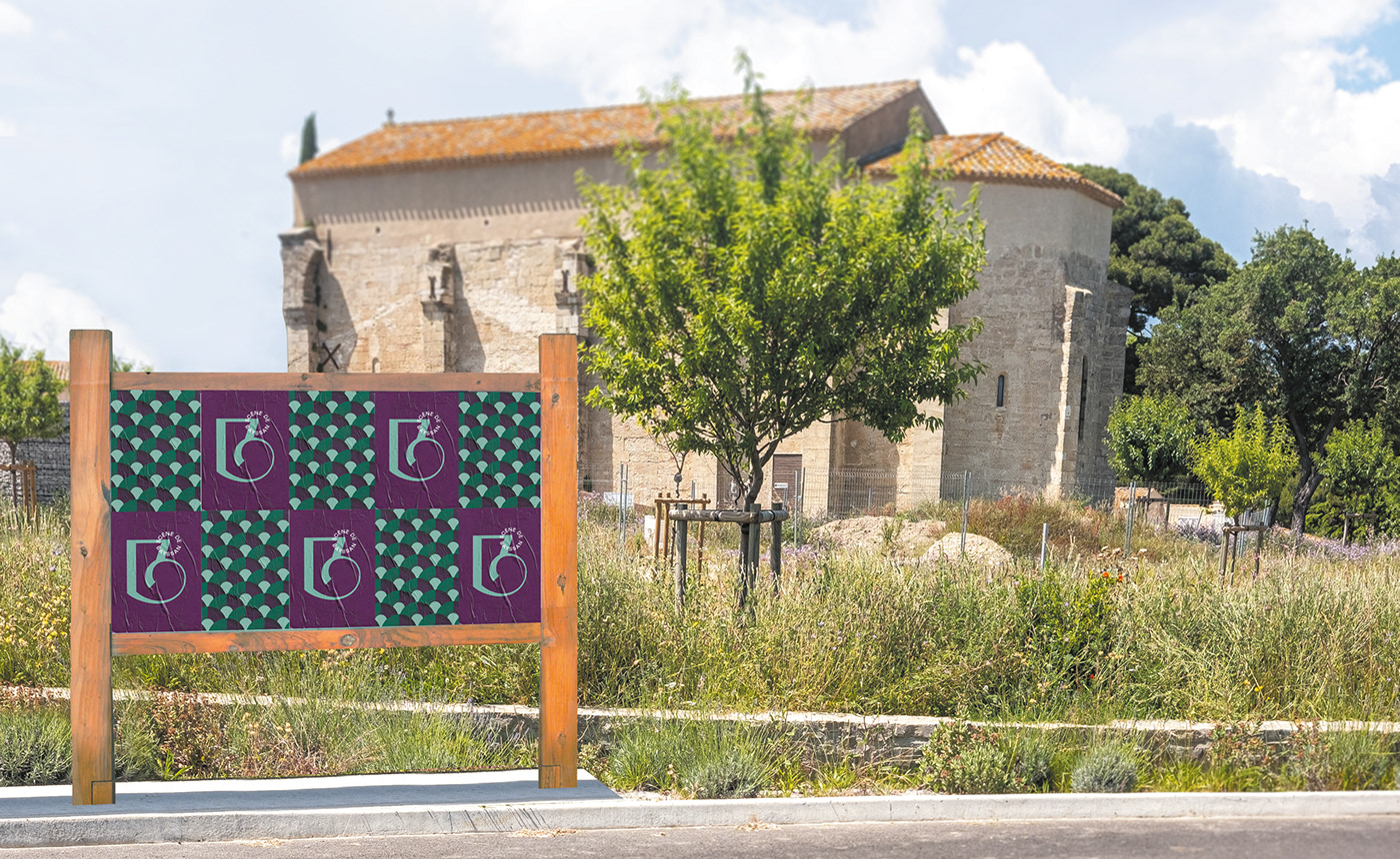
[EN] In order to complete the graphic universe, a series of ornaments, inspired by Mediterranean culture, has been created. This system of geometric and graphic ornaments is found in many civilizations around the Mediterranean: Spain, Italy, Croatia, Albania, Turkey, the Orient, etc..
The created patterns emphasize Scène de Bayssan’s new brand identity. By combining different ornaments and color schemes, different graphic atmospheres can be created so as to echoe different civilizations, but also different moods depending on the cultural and yearly seasons.
Un système d'ornementation inspiré par la civilisation méditerranéenne
[FR] Afin de compléter l'univers graphique, une série d'ornements inspirés par la culture méditerranéenne, a été réalisée. Ce système d’ornements géométriques et graphiques se retrouve dans de nombreuses civilisations du pourtour de la Méditerranée : Espagne, Italie, Croatie, Albanie, Turquie, Orient, etc.
Les motifs permettent d’habiller les différents supports de la Scène de Bayssan, tout en soulignant sa nouvelle image. En associant un ornement à une palette de couleurs, il est possible de convoquer différents univers graphiques et par conséquent différentes civilisations mais aussi différentes ambiances basées sur les 4 saisons qui rythment l'année.

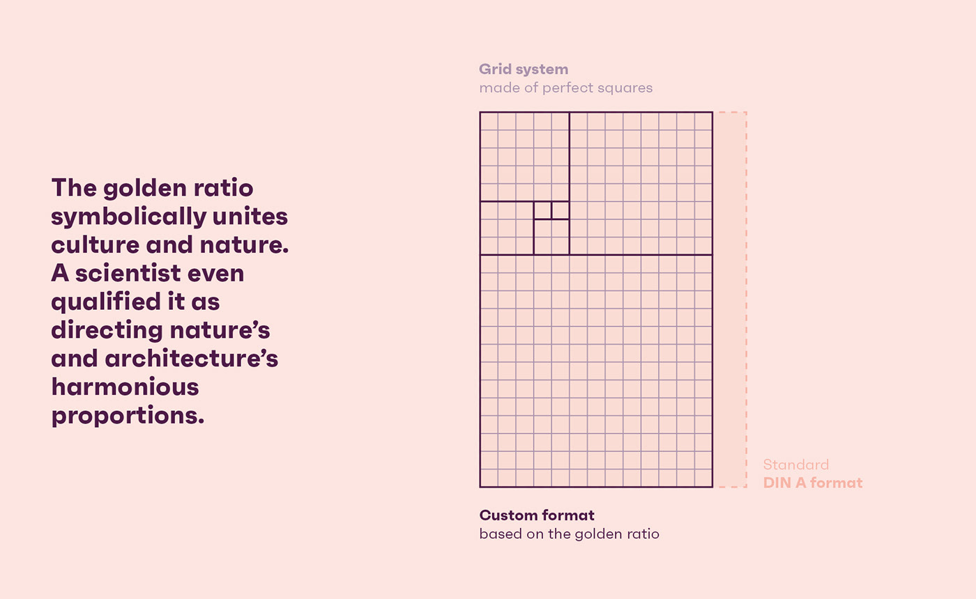
The Golden ratio as layout basis
[EN] The golden ratio conceptually combines the notions of art and culture, just as Scène de Bayssan does physically. Some botanists, such as Jean-Marie Pelt, have described the golden ratio as being "the director of nature’s and architecture’s harmonious".
The proportions and grid system generated by the use of the Golden ratio become the basis of Bayssan’s printed documents.
The use of formats based on the Golden ratio also make it possible to create harmonious and unique documents, which stand out from the widely used standard formats.
Le nombre d'or comme référence de mise en page
[FR] Le nombre d’or permet de réunir symboliquement les notions d’art et de culture, tout comme la Scène de Bayssan les réunira matériellement. Certains botanistes, comme Jean-Marie Pelt qualifient même le nombre d’or « en régisseur des proportions harmonieuses de la nature et de l’architecture ».
Les proportions engendrées par le nombre d’or deviennent le fondement des supports de communication de la Scène de Bayssan. La grille de composition et les futurs habillages graphiques peuvent aussi y faire référence.
L’usage de formats basés sur le rectangle d’or permettent aussi de créer des éditions harmonieuses et singulières, qui se démarquent des supports standards largement répandus, comme peut le démontrer le présent document.
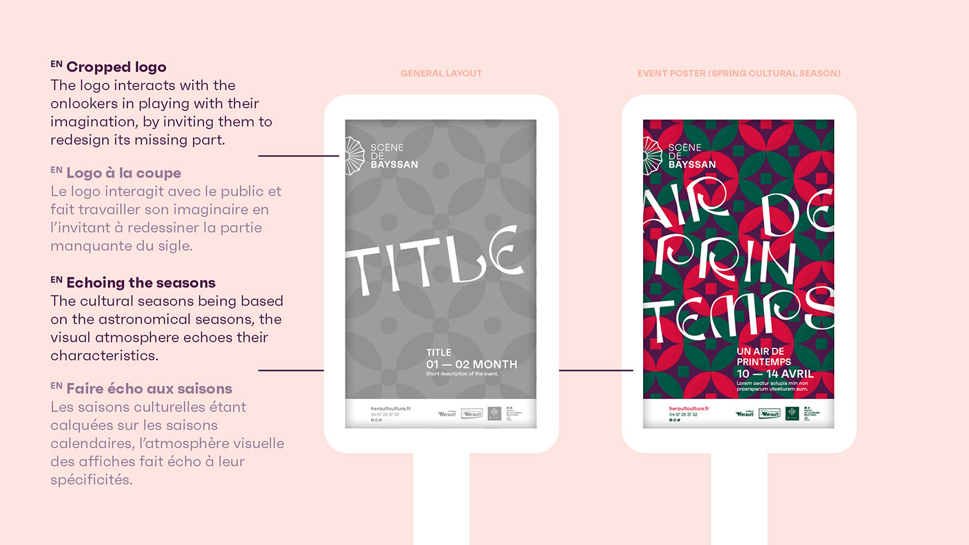
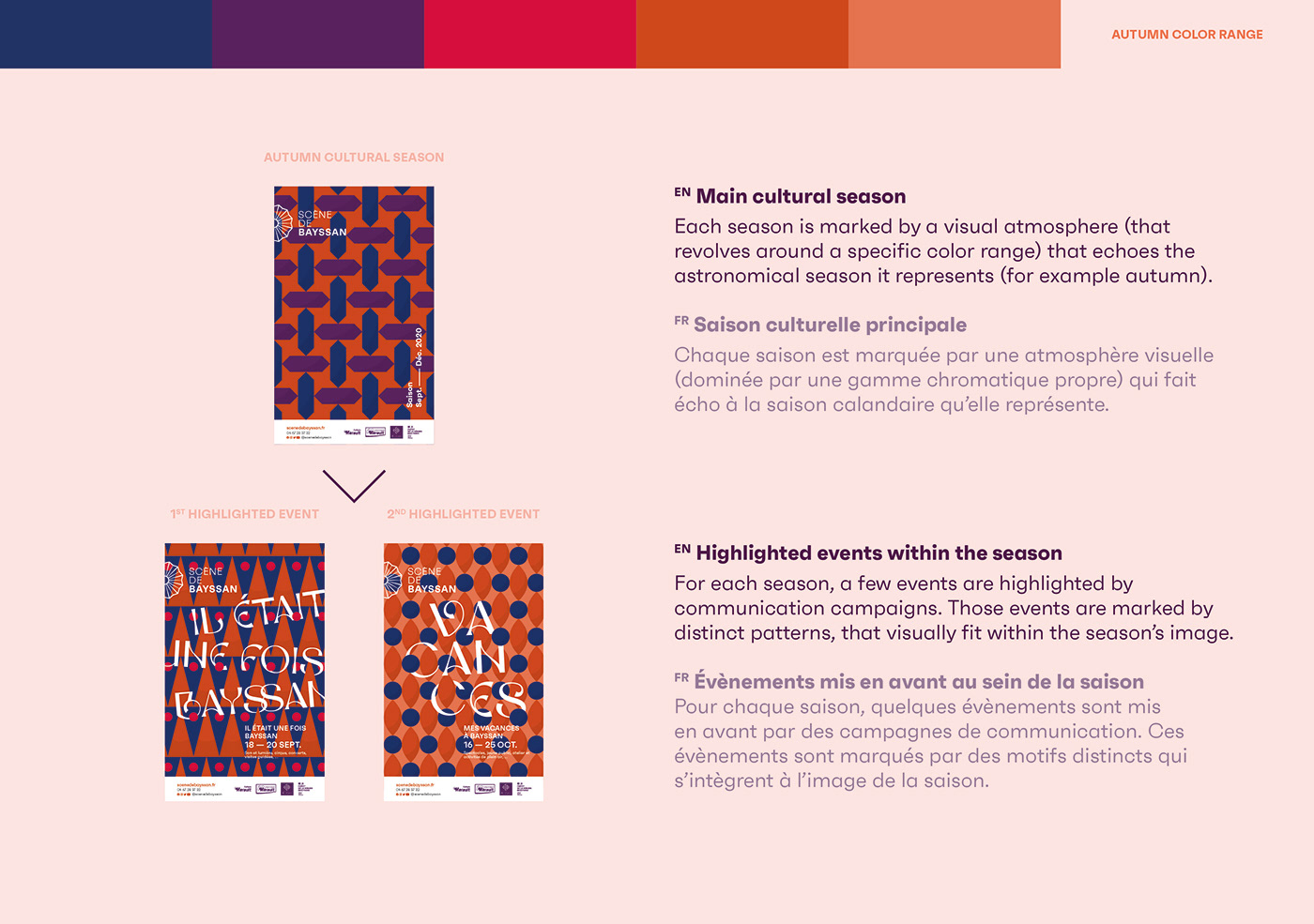
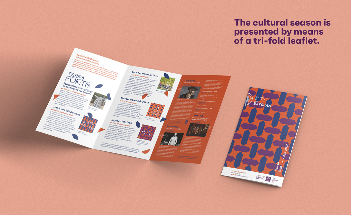
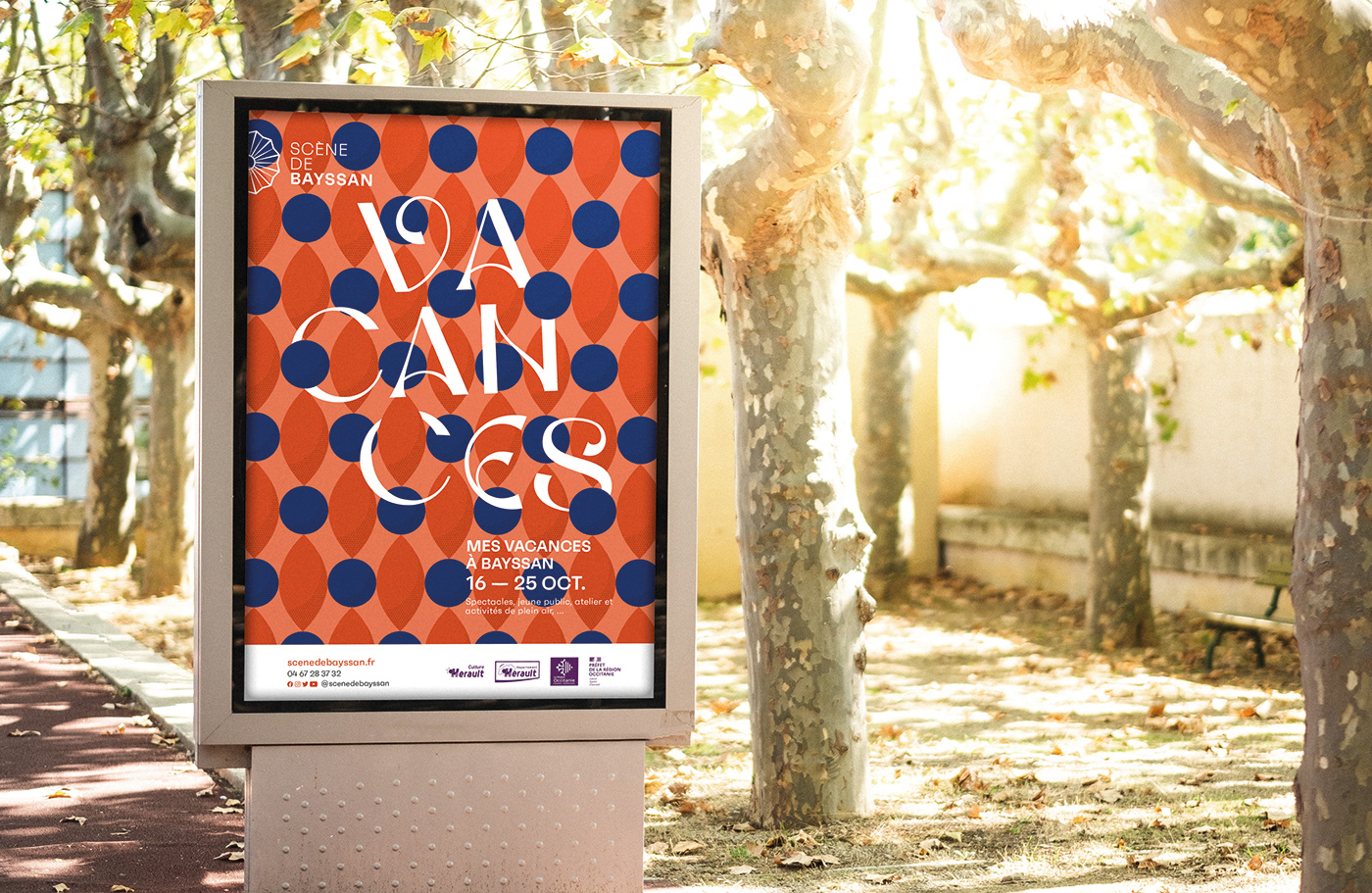
Event branding: the cultural seasons
[EN] The cultural seasons which are based on the yearly seasons (summer, autumn, winter, spring) are marked by a series of diverse and varied events. Each season is announced by leaflets that spotlight a series of highlights. Each of these highlights is announced by a large communication campaign (posters, social networks, ...).
Graphically, the season is marked by a visual atmosphere that is close to the season it represents (cold tones for winter for example). Each of the highlights features a unique pattern, which is integrated into the general mood of the season by using its chromatic range.
La communication évènementielle : les saisons
[FR] Les saisons culturelles qui sont basées sur les saisons calandaires (été, automne, hiver, printemps) sont marquées par une séries d'évènements divers et variés. Chaque saison est annoncée par des dépliants qui mettent en avant une série de temps forts. Chacun de ces temps forts est annoncé par une large campagne de communication (affichage, réseaux sociaux,...).
Graphiquement, la saison est marquée par une atmosphère visuelle qui se rapproche de la saison qu'elle représente (tons froids pour l'hiver par exemple). Chacun des temps forts arbore un motif unique, qui s'intègre dans l'univers général de la saison par l'usage de la même gamme chromatique.

PROJECT DETAILS
CREATIVE DIRECTION: ROMAIN DIANT
CREATIVE DIRECTION: ROMAIN DIANT
GRAPHIC DESIGN, TYPOGRAPHY: ROMAIN DIANT, SAMUEL ROGER
PHOTOGRAPHY: K ARCHITECTURES, MARAVAL ARCHITECTURE, ROMAIN DIANT
MERCI DE VOTRE ATTENTION !
THANKS FOR WATCHING !
More on www.asenso.fr
THANKS FOR WATCHING !
More on www.asenso.fr
Follow us on Instagram


