

2021
STUDIO ASENSÒ
L’Block
l'alternative esthétique
BRAND IDENTITY
—
[EN] L’Block® is a patented solution that allows building professionals to save time and money with style. L’Block® opens up new opportunities for them to completely rethink door and window framings, as well as the quoins of their construction projects. This innovative solution allows construction professionals to reduce thermal bridges in buidlings, to save money on plastering operations, to have more flexibility in the installation of the joinery, while offering an added aesthetic value.
[FR] L’Block® est une solution brevetée qui permet aux professionnels du bâtiment de gagner du temps, de l’argent et du style . L’Block® leur ouvre en effet de nouvelles opportunités, pour repenser totalement les encadrements de portes, de fenêtres, mais aussi les chainages verticaux des projets de construction. Cette solution innovante permet aux professionnels du bâtiment de réduire les ponts thermiques des constructions, de réaliser des économies sur les opérations d'enduisage, d'avoir plus de flexibilité quant à la pose des menuiseries, le tout en proposant une plus-value esthétique.


Concept
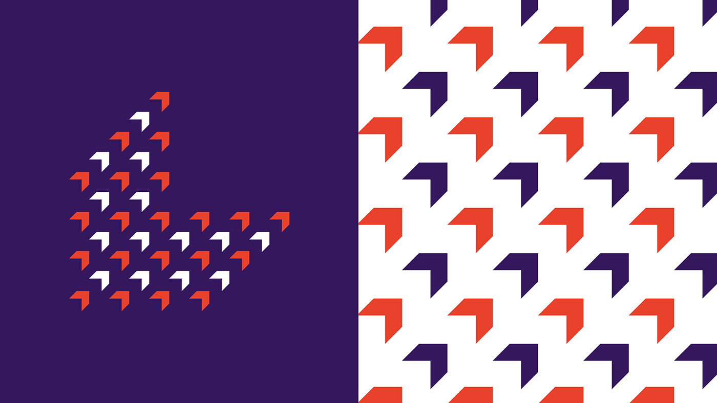
[EN] The L shaped L’Block® becomes the logo's main element and acts as a monogram that captures the essence of the product. A square is visible in negative space, it refers to the brick to which the L’Block® is fitted and to the house that is built. These elements give volume to the logo. Finally, the logo also refers to the main role of the product: insulation. The quarter of the orange circle radiates out from the L’Block® that contains its energy and keeps its warmth within the logo.

[FR] La forme distinctive du L’Block®, qui lui confère aussi son nom, devient l'élément principal du logotype et vient agir en monogramme qui synthétise l'essence du produit. Un carré apparaît en réserve dans le sigle, il fait tout aussi référence à la brique qui accueille le L’Block® qu'à la maison qui est construite. Cet élément met l’ensemble en volume. Un quart de cercle orange vient rayonner dans le L’Block®, qui permet de contenir l'énergie de cette forme. Une référence explicite au rôle principal du produit, celui d'isoler.


