


B2B Match
Rebranding
B2B Match is a Brazilian platform that fosters business generation and provides crucial knowledge for CEOs and C-level executives.
We were tasked with completely redesigning the brand's new identity to embody the concept of connecting people.


Concept
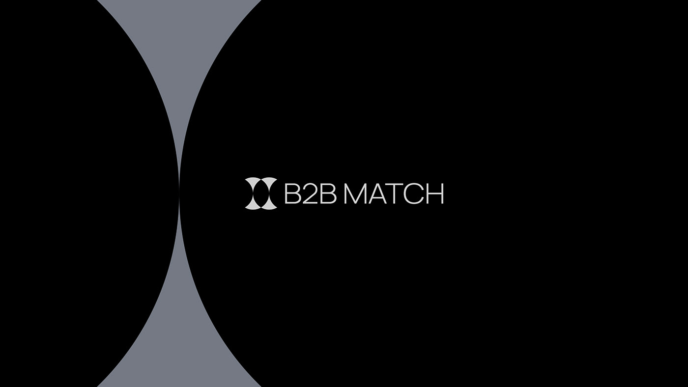
The B2B Match logo features symmetrical crescents forming a circle, symbolizing the union of leaders, ideas, and companies in an elegant, harmonious way.
This central gap represents the heart of the brand, a crucial space where partnerships and opportunities thrive.

Challenge
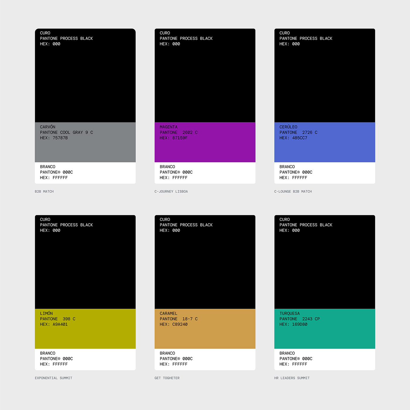
The key challenge was creating a hierarchical identity system for B2B Match's diverse events and experiences.
To address this, we chose to create a modular visual system, where the main identity is monochromatic and specific colors distinguish each event or experience, thereby creating a cohesive visual unity.

Solution
Alongside the color system, maintaining a simple, functional, and adaptable identity was crucial. For this, we used two graphics derived from the symbol, named 'Vela' and 'Cálice'. These two will guide the entire visual language.


A project by Duck Design Studio for B2B Match
Team
Vinícius Germano Müller (Designer)
Gabriel Sauer (UX Researcher and Designer)
Eduardo Matos (Designer and Webflow Dev.)
Emanuel Peres (Motion)


